A study of what-if scenarios which posit what KDE would look like if it took a different approach to certain aspects of design. Note that these posts are in no way “the direction KDE is going” and are simply a study done to reference designs and ideas we may never have investigated.
Forward
First, a brief overview of Windows 8;
Windows 8 was Microsofts’ first step towards creating a unified ‘experience’ between the range of products running Microsoft Windows. Before Windows 8, early tablets which ran Windows typically ran a traditional Windows desktop; because desktop Windows was designed for mice, it typically required a stylus, trackball, or other similar input; keyboard solutions were universally sub-par. Microsoft ideally wanted its mobile audience to use laptops and phones instead of tablets. Apple and Google later devoured the tablet/phone market with iOS and Android respectively, and touch-screen devices became the norm. With their advantage in touch input, these two systems grew into tablets. This left Microsoft in a bind; Windows mobile was not capable of delivering a capable experience, so instead of taking the route Android and iOS did (growing their OSs’ up) Microsoft decided to begin shrinking its more capable desktop OS down. Windows 8 was the first step in this process, and essentially laid a touch-centric layer on top of a traditional desktop OS. The end result was an OS with split personalities and it required desktop users to work around touch components, while mobile users more/less had a decent – but more limited – experience.
Windows 10 is Microsofts’ attempt to correct the design flaws of Windows 8; Mainly by allowing the interface to vary between form-factors, such as including a start menu and introducing a multi-desktop mode.
Consumption vs Work-Oriented Design
In terms of design, Windows 8+ has a much more consumption-oriented design, as opposed to a work-oriented design; and it has a large amount of data throughput even in the main menu. This is appealing to mass-market users who desire quick access to information, and the ability to quickly act on it. For example, the twitter live-tile not only shows the latest updates, but is a one-click access point to that data. We don’t have that efficiency; we can launch applications, or display plasmoids, but we don’t have an efficient solution that does both. On the other hand, users have complained that the live-tile interface can become chaotic, with literally dozens of tiles calling for attention.
Desktop Linux and KDE have traditionally kept towards work-oriented designs, and consumption efficiency is left in the hands of the applications. This is trouble for KDE, because we don’t bundle simple applications which other environments do; i.e weather, maps/directions, or a clock/timer/alarms app. We do keep these as desktop components, but instead of simply launching applications, KDE requires a user to use complex editing tools to add and configure those widgets. In addition, if we did bundle those applications plasma widgets still do not launch relevant applications; our weather plasmoid does not launch a weather app, our photo widget does not launch a gallery. This poses another problem because a user must also know how to create a dash with independent widgets and know how to invoke that dash if they do not wish to crowd their desktop with plasmoids.
One way this could be solved would be creating a class of “launcher widgets” which are read-only QML widgets the system would treat as icons. Additionally, we might create a new file-level protocol for a QML “icon widget” format which could enable dynamic icons for application launchers. For example, a weather app might have a QML-based icon which displays todays’ weather. Though this could cause serious performance ramifications if implemented poorly, and adds dramatic complexity to simple file-browsers.
It should be noted that you can launch plasmoids in KDE through KRunner, but this method is pretty much inaccessible for regular users. This feature is much more slanted towards development than actual real-world usage.
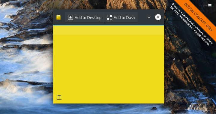
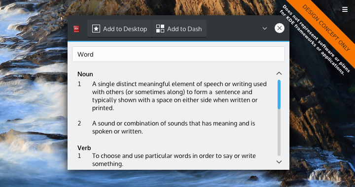
KDE should consider allowing widgets to flag themselves as being “launchable” – allowing them to be launched similarly to applications from a proper applications menu. Sometimes you need to make quick notes about something without the need to save files or open the “KDE Advanced Text Editor”. Maybe you just only need the dictionary once in a blue moon. Allowing these to launch as KDEs’ version of “modern apps” might be highly beneficial, and give access to KDEs well-designed plasmoids without the need to modify the desktop. Also, our container application which actually contains the widgets could offer buttons to do things like quickly add the app to the current desktop, panel, or dash. This could later be integrated into Martin Gräßlins’ server-side-decorations.
While a great deal of applications are being written in QML, launchable plasmoid applications for KDE might be a good option when use-cases are simple-enough to be desktop-ready, but still useful enough to work as ‘standalone apps’. This might also make plasmoid development more attractive to developers who work more in traditional applications. Things like maps, directions, notes, cloud-based services, contacts, and other simple utilities – especially those which piggyback off the system – would be especially viable if developed under this model. Not only would we have our own ‘metro apps’, but these ‘Plasma Apps’ would be incredibly flexible in their ability to integrate to the desktop.
Start Menus
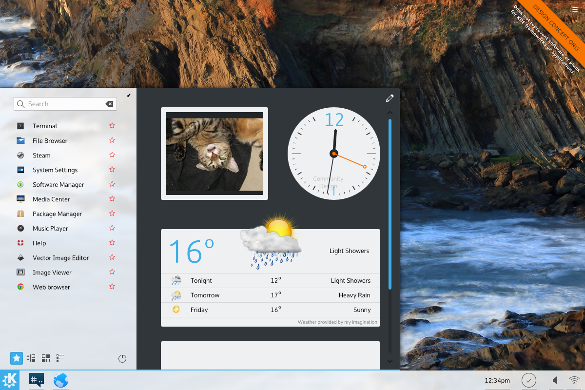
The Windows 10 Start menu has embedded live tiles. For plasmoids which aren’t big enough to be launched as applications, or not used consistently enough to be placed on the desktop or in the panel, Plasma could offer a launcher that has an embedded widget tray, or offer pop-up containments which could house collections of plasmoids.
Technical Challenges
For the most part, Plasma is already flexible enough to allow us to extend plasmoids into ‘Plasma Apps’. As a matter of fact, the plasmoid preview utility used by developers already gets us most of the way there. For the most part, there’s no real (obvious) technical hurdles.
One design aspect would be making a ‘native’ plasma theme for plasma running in an application mode.
Pros
- Launching plasmoids as applications offers extreme occasional-use convenience.
- Ensuring widgets can easily launch related full applications fits the “simple by default, powerful when needed” mantra.
- Application developers might be more interested in plasmoid development when KDE users could launch it as a ‘real app’
- It would help fill KDEs’ need for simple applications.
Cons
- Users might not appreciate their program lists getting filled with plasmoids, especially if they can’t be hidden.
- Plasmoids looking to be used as applications would need to account for more static contexts or alternate storage locations.
- Everything listed here would add redundant applications to the system.
- If plasmoids launched generic types of applications, we would need tonnes of default application types; default weather, default stock ticker, default dictionary, etc.
- Applications lists would need to be overhauled to display plasma-apps.
- Adding widgets to widgets (for the ‘start menu’) would need a clever editing UI, adding complexity.
Notes
Overall, the main issue KDE has is the disconnect between simple applications and simple plasmoids. KDE does have the functionality of other desktops in plasma, but it can feel more cumbersome to access it, especially if it’s in a situation where you may only need it on occasion. Plasmoids like the dictionary are the perfect example of this; I know no-one who refers to a dictionary often enough to constantly need one, but I can also say everybody likely needs one on occasion. For me, launching a browser and doing a Google search is faster than digging out the plasmoid. I don’t use the dash either, but even still do we want the KDE dash to be the junk-drawer of occasionally used widgets forever?
I found that adding live tiles was beneficial to the start menu, as it does become a simple notification area; I think it would be beneficial if we were capable of embedding widgets into launchers or secondary ‘container plasmoids’. I think KDE did do this at one point – can anyone let me know? I also think launching applications by directly clicking on plasmoids should be added; opening a full weather application would be great if we could package them together, and the same goes for stocks, maps, etc etc.
Chime in!
What are your thoughts on creating a more consumption-oriented design? What did I miss, any addendums? Let us know!


