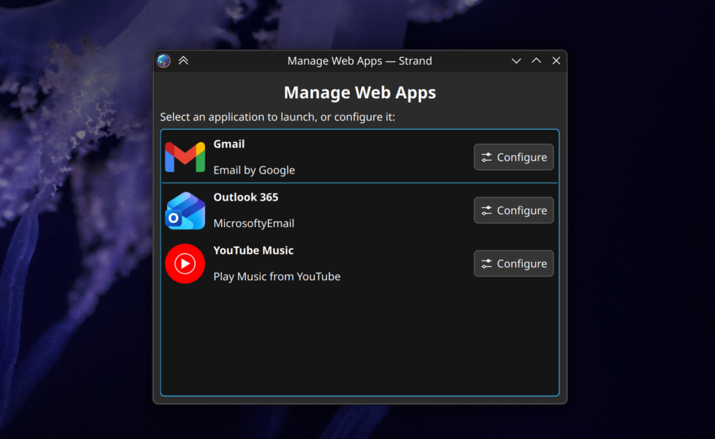
Strand is a PWA runtime for running web applications in a more integrated manner for KDE Plasma.
Right now Strand has two parallel development tracks; an AI-driven prototyping track to test the feasibility of features, and a second human-driven track where I’m building the final product.
I’ll mostly cover the events of the AI track in this post, which I’ve been dogfooding as I slowly get the human track on-rails. The usual caveats of code quality and security are in full effect.
Performance & Structure
The first version of the runtime used one WebEngine per application process. Part of this was me receiving incorrect information from the AI. After understanding the WebEngine and WebEngineProfile structure more thoroughly, I decided a system of dynamically determining the host process would lead to better resource efficiency.
Now, instead of one process per app, when a webapp starts it generates a “Process hash” based on the configuration and flags being applied to WebEngine. It will then see if there’s a Strand process running with that hash, using it if available. This immediately lead to hundreds of megabytes in savings when running multiple instances, while still allowing apps to potentially use alternative settings if required.
One major pain point is hardware acceleration. I’m having significant of trouble getting it to work as it really requires the stars to align quite precisely. Right now there’s just no acceleration for reasons ranging from my specific hardware, to Wayland, to a witches brew of flags – and if anything is wrong there’s just no acceleration. I checked to see if I could run another KDE QtWebEngine-oriented app at full speed – Falkon – but it also suffered. Commentary online is underwhelming.
New Features Tested
The most significant new feature is header integration, which is the culmination of 3 smaller features.
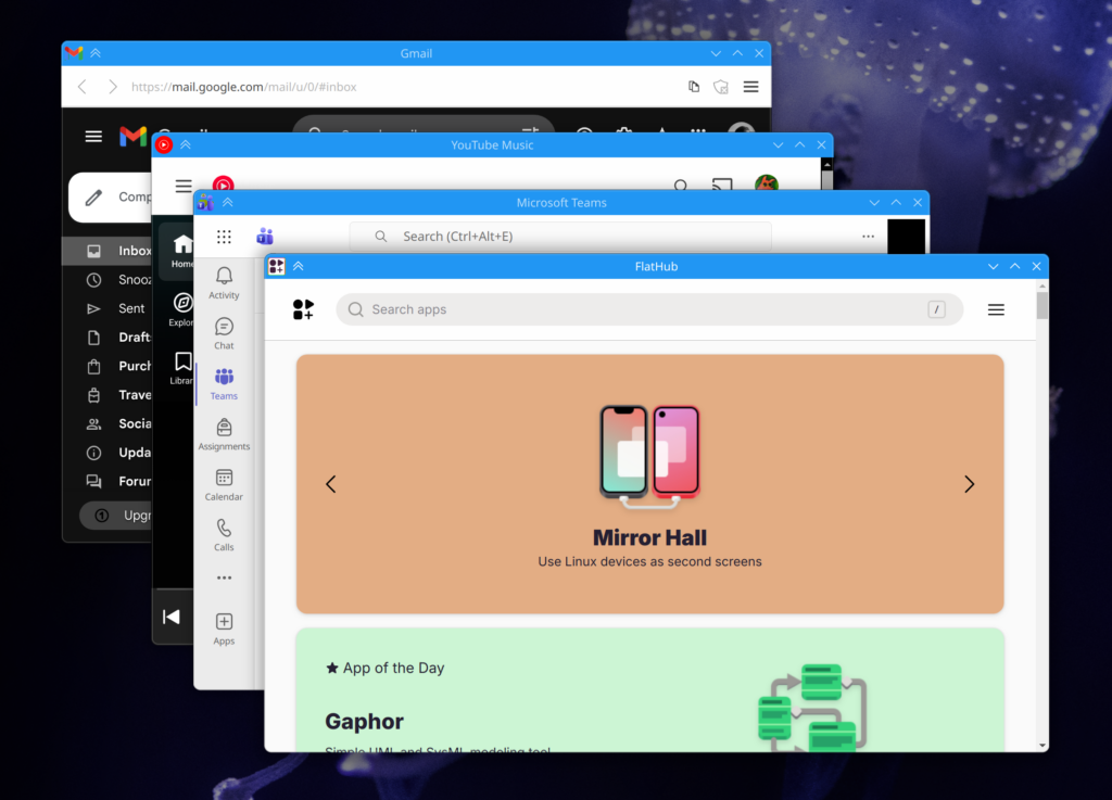
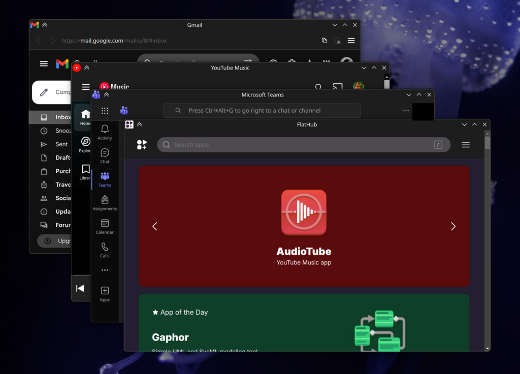
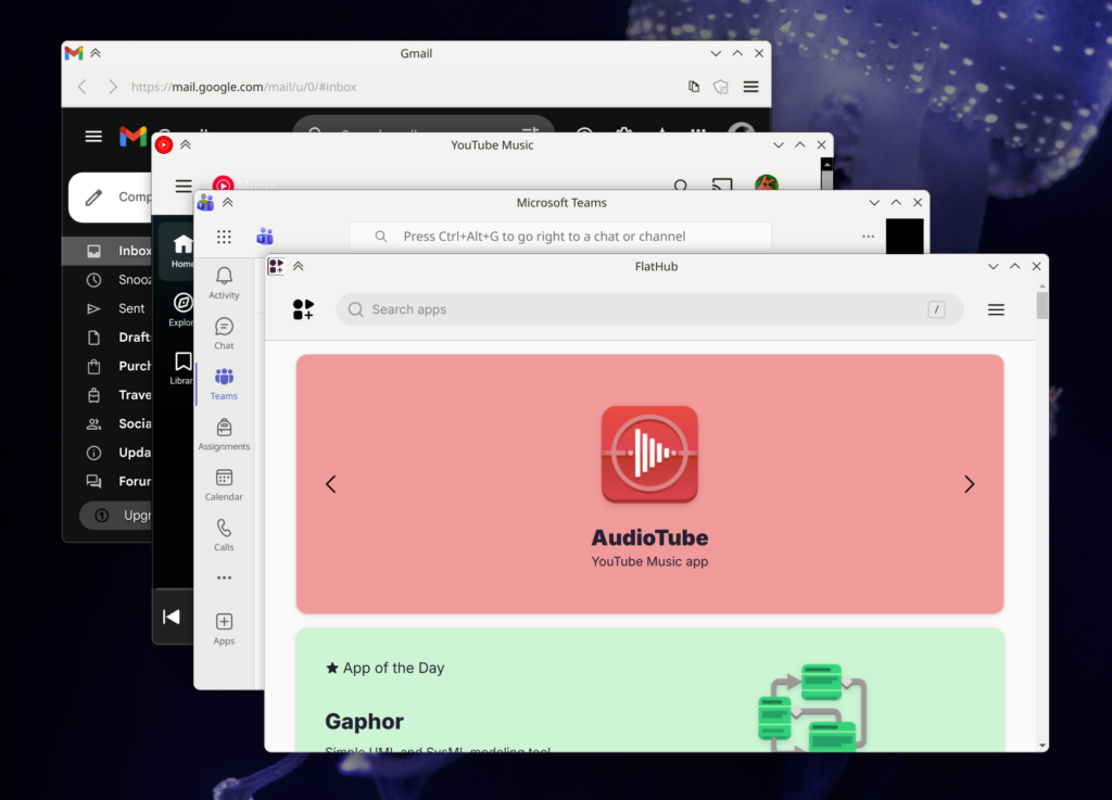
The most visually obvious is the addition of custom CSS with system color support. Strand injects CSS variables into applications with system colors, and when used by the custom CSS, can easily give web apps much more cohesive headers. Strand pays special attention to header-oriented colors, guaranteeing their availability along with the accent color. These apps are also smart enough to update their colors when changed on a system level. Of course, custom CSS can be disabled. The only caveat is that some apps still have the scrollbar peeking in, which could potentially be fixed case-by-case with CSS.
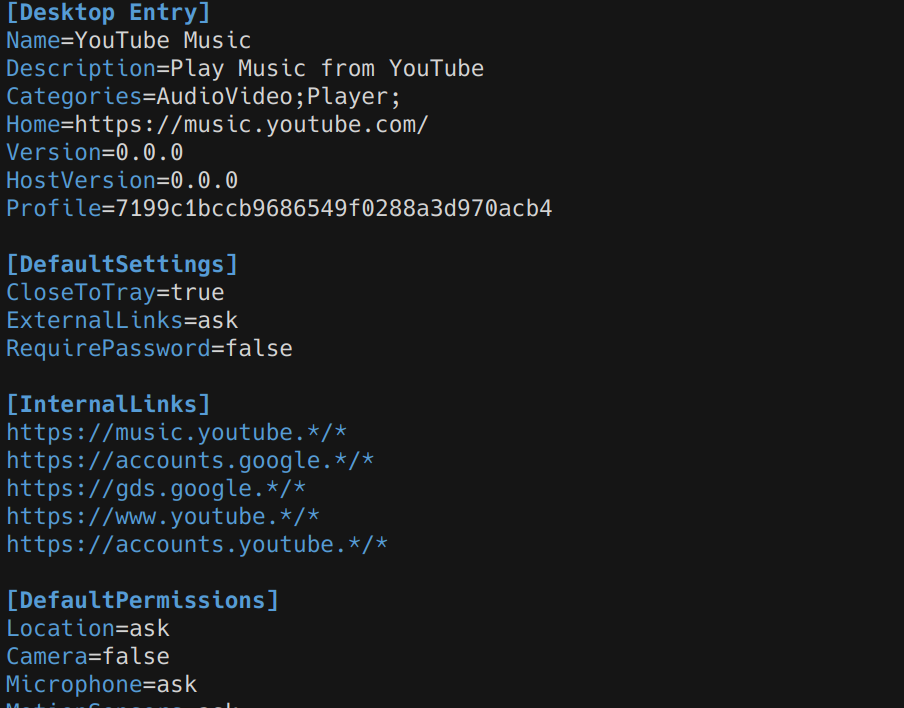
The next addition is the ability to list “Drag Region Selectors” in the manifest files. These are simple DOM selectors which trigger native window dragging when an element matches the selection criteria. This system accounts for interactive child elements, so things like buttons and fields in drag areas work as-expected.
Toolbars and menubars are no longer mandatory. In the manifest file you can specify “Safe Toolbar Removal” selectors paired with URLs. If the selector criteria is met and “Allow Smart Hiding of Toolbar” enabled for the app, Strand will auto-hide the toolbar. This works very well! The toolbar will re-appear if the app navigates away from a “Safe Situation”, allowing users to access browser-like navigation. A good example of this is an SSO flow; if SSO is occurring, the toolbar re-appears, and the user can navigate back to the app if the sign-in process is interrupted. Even then a user holding the alt key will re-show the toolbar, and if Strand blocked an outgoing link, the toolbar will resurface so the user may interact with that event.
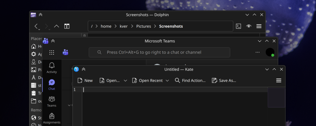
These 3 features together make headers in web apps feel shockingly native at times. I’m particularly impressed by how integrated Teams feels. Placed between Dolphin and Kate it looks great, and the dragging behavior of the header areas are spot-on.
The header-centric features are also designed to degrade gracefully. We are connecting to ever-changing websites and I didn’t want to introduce injections libel to break entire applications. In the event a web app changes significantly, only the integrations should be lost, so at worst you’ll still have a functional web app. This is also one reason why I won’t be introducing app-specific Javascript injection.
Stand applications can now be added to menus via the welcome screen, and applications are appropriately categorized when added. The next step will be to have a complete installation flow.


Conclusion / Future / The Human Track
Right now the AI track is getting very, very close to what I’d like in terms of functionality and main-window presentation. As the AI churns overall code quality goes down, but it does continue to feed me methodologies which would have easily cost me weeks of research, letting me research on the actually important topics. It also continues to show me what’s possible in general, and when it starts to fail I know I’m probably moving in a bad direction.
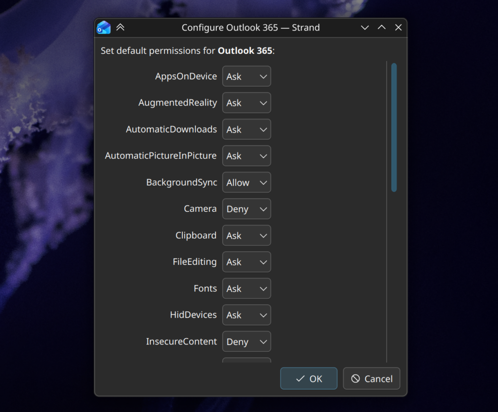
Next steps for the AI track are likely going to be in the permissions system, and ensuring advanced functionality like streaming and various portals work. After that there will only be minor additions to the prototype software.
I’ll end with an update on the human track; progress is going intentionally slowly. I wanted to flesh out the process management in the AI track first before over-committing to what will ultimately be the final structure. The human track has the first steps of the startup sequence, and a much better organized set of utilities and data-management classes. I’m also re-assessing the use of Kirigami/QML for building the GUI, as it just leads to nicer interfaces and I do have some experience with it.
Anyway, that’s the updates so far!
If anyone knows the secrets of WebEngine + Wayland + Nvidia, I’d love to hear. I might assemble some memory benchmarks in the next week or two as well, too. There’s also a .deb package I can produce of the AI track; I wholly would NOT recommend installing it, but if people want to see where this idea is going, or even the AI slop source, I can put it up. But I’ll literally name it the “eatYourCat” deb and put it in the “shootYourDog” repo, and it will be with the express understanding that it’s not fit for use and will not be maintained.


