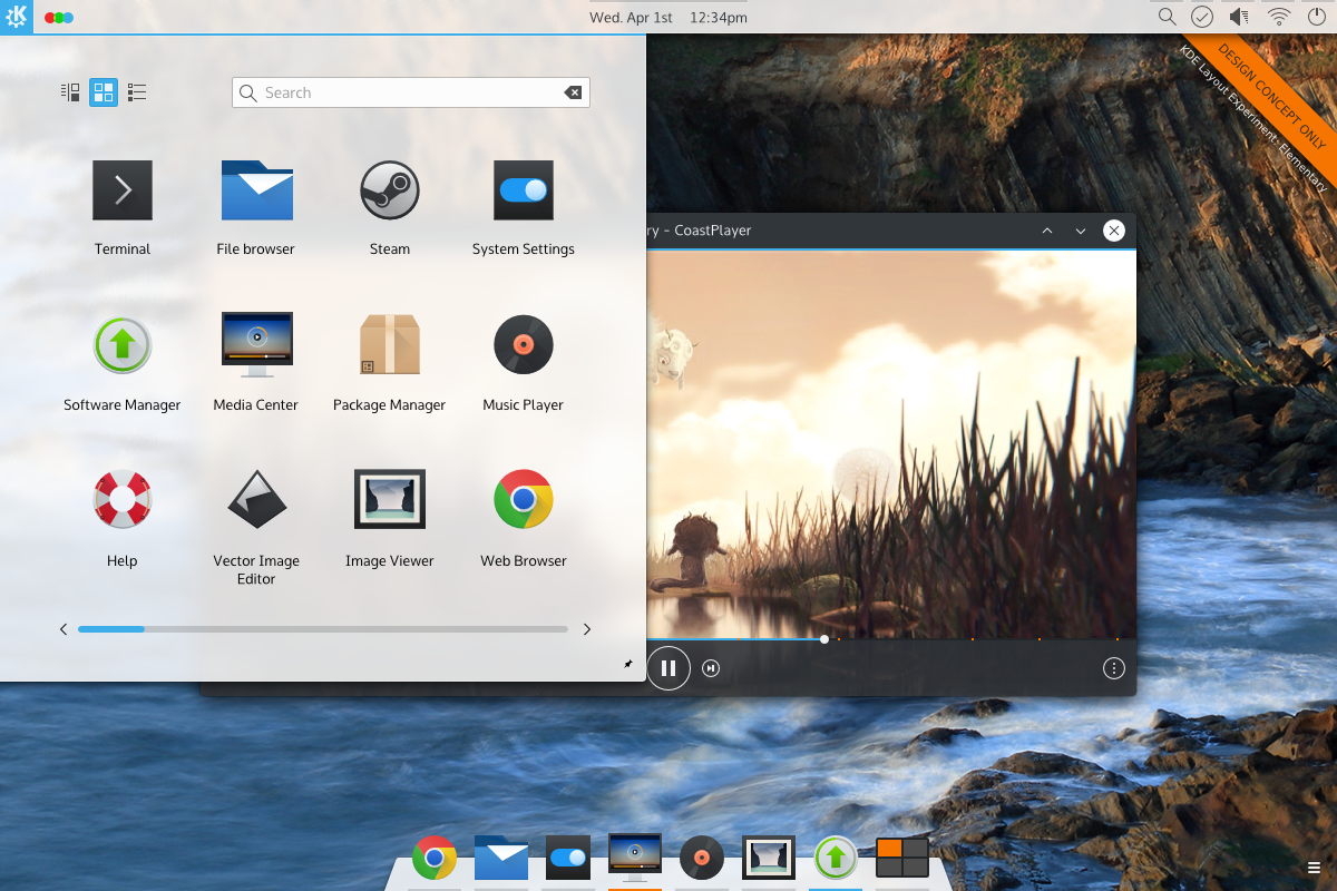
A study of what-if scenarios which posit what KDE would look like if it took a different approach to certain aspects of design. Note that these posts are in no way “the direction KDE is going” and are simply a study done to reference designs and ideas we may never have investigated.
Forward
KDE and Plasma has several methods of launching programs; simple list menus, quick short-cuts, powerful multi-component menus, and task ‘pinning’… Command line. Plasmas’ default setup is to use two of these in tandem; ‘task pinning’ and multi-component menus.
Other environments tend to use the same methodology, but usually with far less configuration options. Windows, for example, often allows pinning applications as quick launchers, and a multi-component menu. Apples’ OSX takes a different approach, using a multi-component quick-launcher (the dock) and opening components via the file manager. Elementary OS takes a middle-road having a multi-component dock, and a simple launcher. Gnome uses a multi-component dashboard which serves as the ‘nerve centre’ for application launching and management.
For the sake of brevity (hahah! Like that’ll happen!), part one of this what-if will focus on Elementary OS; in addition to looking at launchers, the overall feel of the systems will also be briefly explored and discussed separately.
What if… Plasma Used Launchers from Other Systems & Environments Elementary OS?
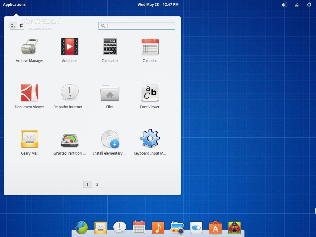
Elementary OS is a distribution of Linux which makes used of a highly customised desktop shell called “Pantheon”, which originally started as a set of modifications to the Gnome desktop. It consists of a panel at the top, and a dock at the bottom. While visually similar to Apples’ OSX, Elementary aims for a mono-tasking approach on all actions, and has a simpler approach to task/application launching and management.
I’m going to mention “Mono-Widgets“, “Compound Widgets” and “Multitasking Widgets” several times; this is because my analysis of KDE/Plasma and Elementary presented the need for some vocabulary.
- When I refer to Mono-Widgets, I’m referring to a widget which performs only one operation. For example, the Elementary Launcher very strictly finds and launches applications. It does nothing else, and dismisses itself when the single task is complete.
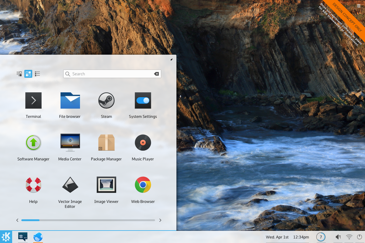
- Compound Widgets perform several functions, but when a user enters a compound widget they only do one thing, then the widget exits. They only ever use one part of the widget per invocation. KDE Launchers fall into this category, bundling power, application, search, recent documents, places, favourites, and other functions into one area; however you only ever do one at a time, and then the widget dismisses itself.
- Multitasking Widgets are widgets where you’ll enter them, work on a task or two, and eventually dismiss them when you are finished. For example, the network widget will have you create, modify, update, select, and delete networks and basic network settings. Where this differs from Elementary is that Elementary will only list existing networks, opening a separate program to edit them.
Comparison to KDE/Plasma
EOS desktop components such as the Plank (the dock), and Slingshot (applications launcher) are extreme mono-tasking widgets, simplifying the work-flow substantially but also necessitating more individual widgets. A good example of this is the exclusion of power options in Slingshot, but the addition of a power widget on the far side of the panel. Ironically, KDE contains a much more comprehensive legion of widgets, many of which mono-task similarly to Elementary widgets – but instead Plasma defaults to compound widgets and multitask widgets.
Elementary supports minimal customization options out-of-box. Because they have chosen to avoid customization Elementary must approach their static configuration with much more discipline. Combined with their minimal approach, there’s a distinct feeling that every UI element added was harshly scrutinised before inclusion. Elementary almost never hides UI elements in their desktop environment; if a widget would not have space to include all the options necessary, it will instead attempt to include the options for most use-cases and provide access to a more comprehensive application. On the other side, Plasma widgets don’t tend to launch applications.
“An undiscovered feature really doesn’t exist to people who haven’t found it.”
“Simple by default, Powerful when needed”
The Plasma default layout tends to focus on displaying fewer compound widgets which rely on more robust configuration. Compound widgets come with all functionality enabled by default and tend to be “configured down” in a way that users must pick what they [i]don’t[/i] want; this is directly counter to “Simple by default”. Elementary on the other hand has exceptionally focused mono-tasking widgets, but no configuration options. In other words, Elementary meets the first half of the mantra (Simple by default), but the plasma desktop achieves neither (Powerful when needed)
Widgets in plasma which do focus on mono-tasking (such as the calendar) tend to have a higher focus on design, and are exceptionally intuitive. KDE developers could and should investigate the creation of more mono-tasking widgets for areas currently dominated by heavy-duty compound widgets. Developers could also re-investigate the default layout after mono-task widgets are complete to relegate much heavier widgets to configuration options. By packaging simple widgets into the default configuration and keeping heavier widgets as options KDE would further achieve the “Simple by default, powerful when needed” mantra.
The best example may be the Kickoff launcher which features favourites, applications, places, recently used files, account info, search, and other options. Some of these exist in other widgets, and the launcher could be forked into its remaining constituent parts; a launcher, a recent files widget, a computer widget, an account widget, etc. Plasma fails in intuitiveness when it packs this functionality into a widget and hides some components to keep the design clean such as hiding search in its launcher – where Elementary refuses to hide any feature. While this makes individual plasmoids powerful, it actually reduces the functionality because an undiscovered feature really doesn’t exist to people who haven’t found it.
Technical Challenges
If KDE were to attempt to lean towards an Elementary setup the largest hurdle would not be the addition of features or new monotasking widgets, but instead the streamlining of the desktop and its options into a functional, streamlined, and focused desktop without upsetting its user-base. This is less of a technical problem and more of an emotional one: KDE users tend to worry when applications become ‘dumbed down’ despite the fact that functionality remains. Granted, Marco Martin has done some fantastic work which eases operations like the swapping of widgets, so the road to quickly allow users to reconfigure to more complex setups has been paved.
Pros
- Elementarys’ static structure requires far less cognative throughput on its users
- Mono-widgets are lightweight, and visually more appealing. They have high discoverability.
- Mono-widgets are simple to understand and intuitive. Search will want you to type something. Launching opens applications.
- Configuration options which do exist are easier to understand, and will likely be better understood.
- Elementarys’ highly disciplined approach packs similar functionality into a much smaller package
Cons
- Mono-widgets are functionally a step back.
- Each mono-widget requires a way to get to it, pushing complexity up the UI to areas like the panel.
- Sometimes operations are complimentary or highly similar, and that is lost in mono-tasking. For example, a launcher search and a file search are highly complimentary.
- Mono-tasking can result in a “good enough” experience where widgets get the job done, but sacrifice power and convienience.
- Mono-tasking can make an otherwise capable tool feel oversimplified or underpowered.
Notes
In Plasma, default widgets should enforce a minimal configuration by default to present core functionality first, then allow users to “configure up”. For widgets added to the system via configuration tools, we should remain with the “configure down” approach to expose functionality when a user adds a (presumably) unknown widget. This is much more in-line with the “Simple by default, Powerful when needed”.
While Elementary is considered Linuxs’ most “elegant” desktop, KDE has more technology to quickly and easily iterate. KDE5/Plasma5 makes far better use of text and design elements, and actually feels more “designed” compared to Elementary in some areas; when you inspect an individual widget in Elementary they can be surprisingly utilitarian and uninsipred. The calendar is a prime example of where KDE has more visually appealing design. When Elementary Freya is released, I have no doubt that if KDE/Plasma developers hunkered-down and focused on design, we could “out-Elementary” Elementary by their next release.
On the inverse, KDE developers tend to lean towards “proper” system-level design, making them less willing to make technical exceptions for strictly design reasons, or at least slow KDE design down while better methods are engineered. This is not a bad thing. For example (as far as I know) KDE will not kludge in code to make docks adjust their colours based on wallpapers; but when similar functionality eventually does hit, it will be done in a way that is technologically superior, where plasma theme designers could easily tap well-designed APIs. Often, this comes down to the “glue” libraries used by KDE when adding APIs to QML.
Overall, technology-wise, KDE is capable of easily out-designing Elementary OS in a sustainable way; but where KDE has Technology Elementary has tenacious focus and dicipline we should learn from. They don’t try to please everybody, and perhaps KDE/Plasma shouldn’t try either. Focusing on a simpler default desktop enviornment and having power-users configure-in more powerful widgets where they want it may ultimately be a better model; power-users can be expected to “configure up”, but casual users won’t “configure down”.
Chime in!
What are your thoughts on Elementary OSs’ design merits? What did I miss, any addendums? Let us know!
