This week has been the lowest-level backbone things for the Fiber Browser. Mostly I’ve been designing the manifest class, which accepts a JSON file and produces a nice reliable API to interpret. Most of this browser will run on extensions, so the Manifest is one of the most important parts of this browser. It’s largely based on Chrome manifest files, however it differs in naming conventions (e.g. camelCase) and structural areas, the largest being “services” support. Services include things like “history” and “bookmarks”. Services will have clearly defined APIs, and extensions using those services don’t need to know what extension is offering the service.
Earlier I put up a G+ post of one of my UI experiments for Fiber. I had created the following design based on the idea that the address bar is becoming obsolete, and needed feedback on my thought process. The idea is that the address bar is hidden inside the tabs, and when a tab is double-clicked it would expand to reveal the address behind the tab.
 Aside from some KDE integration, the original (nearly chrome-identical) design added nothing to the browser space. I didn’t want to make a browser that was the same, but I don’t like changing things just for the sake of being unique.
 My G+ post was a fleshed-out version of my favourite pencil wireframe. The first thing I looked at was the wasted space in browsers; the current “space race” has lead to one generally accepted design with tabs on top and content controls on a second row. Sometimes a bookmarks bar. Lots of smart engineers at Google, Mozilla, Apple, Microsoft, and Opera have looked at UI controls in browsers, it’s not an accident that this is the current “best design”. The current browser layout offers immediate access to important controls, with the two expanding elements (tabs and address) being on two rows. but the address bar didn’t to anything the search bar couldn’t, aside from address a very specific URL.
So, after my design and some more thinking I took a look at browsers again, and I found only IE broke from the trend by putting everything on one row with approximately half the toolbar going to the address bar, and other half going to the tabs. The benefit was saving vertical space, but with the downside of limiting how many tabs a window could multi-task easily.
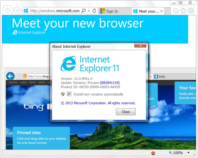 This was very close to my design with the sole exception being that the core functionality of the line input is an address bar – where mine was search. I was actually a little shocked at the back/forward buttons too, because mine looked similar. Granted, I was actually aping an older Firefox design, but that’s beside the point. 😛
So I took a more thorough look at more factors, and settled on my current design goal (pending YOUR feedback!); please note that the new tab page is a placeholder.
 The first thing going on is moving the search bar in a position to the IE address bar. After careful consideration, I realised the search bar was going to be much more heavily used, so it needed better placement closer to users’ muscle memory. Additionally, since websites tend to place navigational elements on the top or left, it made sense to have the search be nearer to where the mouse might be. The search bar will also search your bookmarks and history, so it should find regularly accessed URLs efficiently. Depending on the extension rollout, the capabilities of the search bar should be adjustable.
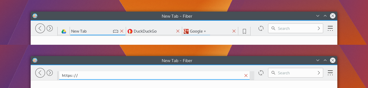
Bookmarks have been moved from a tab to a menu button. I don’t know what I was thinking putting bookmarks as a tab. Too bad I don’t do drugs, or I’d have an excuse. I also put in the ‘new tab’ button.
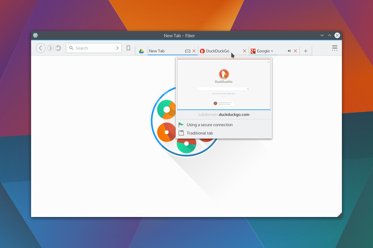
Next is the preview. There’s the thumbnail, the loading status bar, the highlighted domain, https status, and tab type.
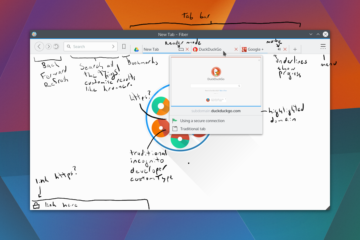 Not seen would be the transient URL bar. The bar would be colour-coded, and extensions could augment it to add icons or snippets of text. For example, it would be neat to have a phishing extension warn users before they even click a dangerous link, display if the link will run a popup, etc.
One thing mentioned in the original G+ post was phishing and the address bar; with no address bar, how can you spot phishing? Simply put, I don’t want to rely on the address bar to warn users about phishing. I just think it’s a bad idea which shouldn’t be relied upon, as I don’t believe most users understand how URLs are composed – and while it may be simple to many of us, addresses have many moving parts. Additionally if a website looks convincing enough, users may not feel the need to double check the address bar.
Far, far later in development, possible a version or two after release, I plan to add safety extensions. I’m interested in the Google Safe Browsing API.
Otherwise, the only thing not shown in the new screenshots is the address bar which, like the first designs, would expand by double-clicking a tab. I may also look at putting in a toggleable button for the same purpose, as some persons have difficulty double-clicking, or may want faster access.Any C&C would be deeply appreciated, this is an evolving design and I’d like to have it well thought-out before I begin programming that aspect of the browser.