It’s been one heckuva road, but I think the dust is starting to settle on the UI design for Fiber, a new web browser which I’m developing for KDE. After some back-and fourth from previous revisions, there are some exciting new ideas in this iteration! Please note that this post is about design experiments – the development status of the browser is still very low-level and won’t reach the UI stage for some time. These experiments are being done now so I can better understand the structure of the browser as I program around a heavily extension-based UI, so when I do solidify the APIs it we have a rock-solid foundation.
Just as an aside before I get started; just about any time I mention “QML”, there is the possible chance that whatever is being driven could also alternatively use HTML. I’m looking into this, but make no guarantees.
As a recap to previous experiments, one of the biggest things that became very clear from feedback was that the address bar isn’t going away and I’m not going to hide it. I was a sad panda, but there are important things the address bar provides which I just couldn’t work around. Luckily, I found some ways to improve upon the existing address bar ideology via aggressive use of extensions, and slightly different usage compared to how contemporary browsers embed extensions into the input field – so lets take a look at the current designs;


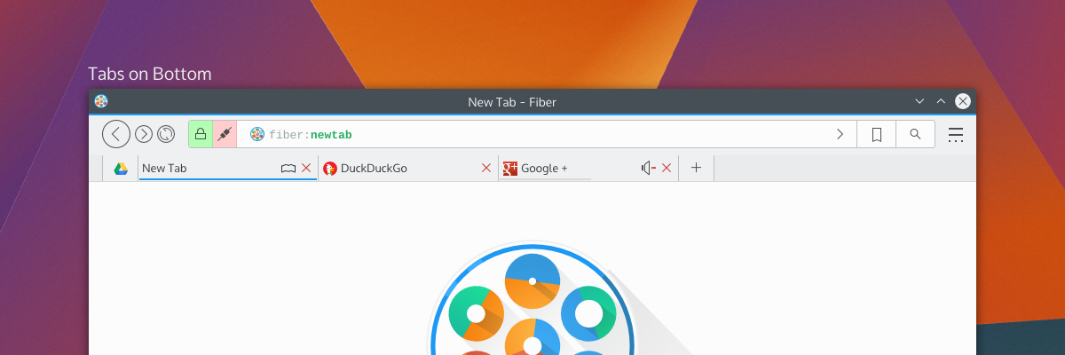
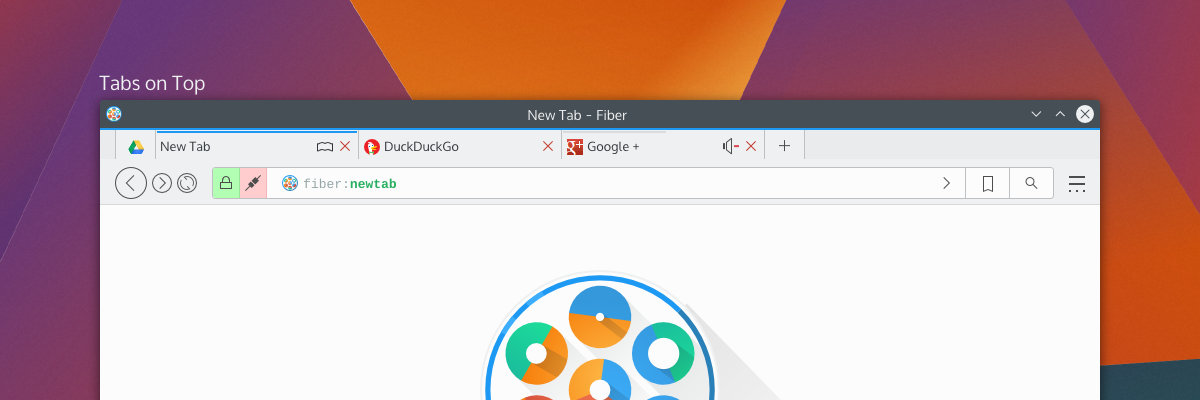
By default, Fiber will have either “Tabs on Side” or “Tabs on Bottom”; this hasn’t been decided yet, but there will also have a “Tabs on Top” option (which I have decided will not be default for a few reasons). Gone is the search box as it was in previous attempts – replaced with a proper address bar which I’m calling “Multitool” – and here’s more about it why I’m a little excited;
Multitool
Fiber is going to be an extensions-based browser. Almost everything will be an extension, from basic navigational elements (back, forward), to the bookmarks system – and all will either disable-able or replaceable. This means every button, every option, every utility will be configurable. I’ve studied how other browsers embed extensions in the address bar, and none of them really integrate with it in a meaningful and clearly defined way. Multitool is instead getting a well-defined interface for extensions which make use of the bar;
Extensions which have searchable or traversable content will be candidates for extending into the Multitool, which includes URL entry, search, history, bookmarks, downloads, and other things. Since these are extensions with a well-defined API you will be able to ruthlessly configure what you want or don’t want to show up, and only the URL entry will be set in stone. Multitool extensions will have 3 modes which you can pick from: background, button, and separate.
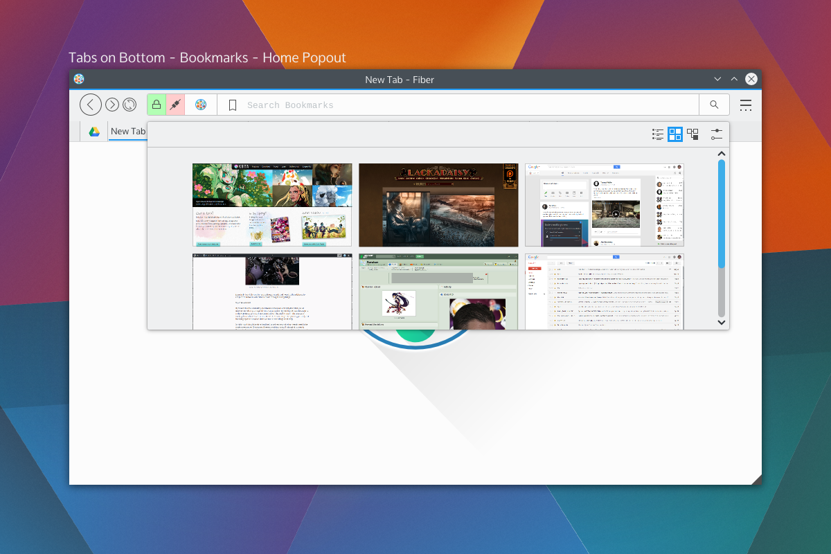
Background extensions will simply provide additional results when typing into the address bar. By default, this will be the behaviours of things like current tabs, history, and shortcut-enabled search. Button extensions in mutitool will provide a clickable option which will take over the Multitool when clicked, offering a focused text input and an optional QML-based “home popout”. Lastly, “separate” extensions will split the text input offering something similar to a separate text widget – only integrated into the address bar.
The modes and buttons will be easily configurable, and so you can choose to have extensions simply be active in the background, or you could turn on the buttons, or disable them entirely. Think of this as applying KRunner logic to a browser address bar, only with the additional ability to perform “focused searches”.
Shown on the right side of the Multitool are the two extensions with dedicated buttons; bookmarks and search, which will be the default rollout. When you click on those embedded buttons they will take over the address bar and you may begin your search. These tools will also be able to specify an optional QML file for their “home” popout. For example the Bookmarks home popout could be a speed-dial UI, History could be a time-machine-esque scrollthrough. Seen above is a speed dial popout. With Bookmarks and Search being in button mode by default, just about everything else that performs local searches will be in “background mode”, except keyword-based searches which will be enabled – but will require configuration. Generally, the address portion of Multitool will NOT out-of-box beam what you type to a 3rd party, but the search extension will. I have not selected search providers.
We also get a two-for-one deal for fast filtering, since the user is already aware they have clicked on a text entry. Once you pick a selection from a focused search or cancel, the bar will snap back into address mode. If you hit “enter” while doing a focused search, it will simply open a tab with the results of that search.
Aside from buttons, all the protocol and security information relevant to the page (the highlighted areas on the left) will also be extension-driven. Ideally, this will let you highly customise what warnings you get, and will also let extensions tie any content-altering behaviour into proper warnings. For example, the ad-blocker may broadcast the number of zapped ads. When clicked the extensions will us QML-driven popouts.
Finally, the address itself (and any focused extension searches) will have extension-driven syntax highlighting. Right now I’m thinking of using a monospace font so we can drive things like bold fonts without offsetting text.
Tabs
Tab placement was a big deal to people; some loved the single-row approach, others wanted a more traditional layout. The solution to the commotion was the fact that there isn’t a single solution. Tabs will have previews and simple information (as seen in the previous round of designs), so by default tabs will be on the bottom or side so the previews don’t obstruct unnecessary amounts of UI.
Fiber will have 3 tabbing options; Tabs on top, tabs on bottom, and tabs on side. When tabs are “on side” it will reduce the UI to one toolbar and place the tabs on the same row as the Multitool, and should also trigger a “compressed” layout for Multitool as well.
There will be the usual “app tab” support of pinning tabs, but not shown here will be tab-extensions. Tab extensions will behave like either app tabs or traditional tabs, and will be QML-powered pages from extensions. These special tabs will also be home-screen or new-tab options, and that is, largely, their purpose; but clever developers may find a use in having extension-based pages.
Tabs can also embed simple toggle-buttons, as usual, powered by extensions. Main candidates for these will be mute buttons or reader-mode buttons. There won’t be much to these buttons, but they will be content-sensitive and extensions will be required to provide the logic for when these buttons should be shown. For example, “reader mode” won’t be shown on pages without articles, and “mute” won’t be shown on pages without sound.
Current Progress
The current focus in Fiber is Profiles, Manifest files, and startup. Profiles will be the same as Firefox profiles, where you can have separate profiles with separate configurations. When in an activities-enabled environment, Fiber Profiles will attempt to keep in sync with the current activity – otherwise they will fall back to having users open a profile tool.
The manifest files are a big deal, since they define how extensions will interact with the browser. Fiber manifest files were origionally based on a slimmed down Chrome manifest with more “Qt-ish” syntax (like CamelCase); but with the more extensive extension plans and placement options there’s more going on with interaction points. There’s a decent manifest class, and it provides a reliable interface to read from, including things like providing missing defaults and offering some debugging info which will be used in Fibers extension development tools.I’m using DBus for Fiber to check a few things on startup; Fiber will be a “kind of” single-instance application, but individual profiles will be separate processes. DBus is being used to speak with running instances to figure out what it should do. The idea behind this setup is to keep instances on separate activities from spiking eachother, but to still allow the easier communication between windows of a single instance – this should help things like tab dragging between windows immensely. It also gives the benefit that you could run “unstable” extensions in a separate instance, which will be good for development purposes.I wish I could say development is going quickly, but right now my time is a bit crunched; either way things are going smoothly, and I’d rather be slow and steady than fast and sloppy.Development builds will be released in the future (still a long ways away) which I’ll be calling “Copper” builds. Copper builds will mostly be a rough and dirty way for me to test UI, and will not be stable or robust browsers. Mostly, it’ll be for the purpose of identifying annoying UI patterns and nipping them before they get written into extensions.
