For the past month I’ve been slightly more active than usual, and I’m excited for this release and some of the art I’ve managed to throw into the pipe;
Icons, Icons!
I would like to make a special mention that not all of these icons have been greenlit, and several of them are pending approval and may be dropped/require changes. Some were literally finished minutes ago while others have already been integrated into projects. \o/
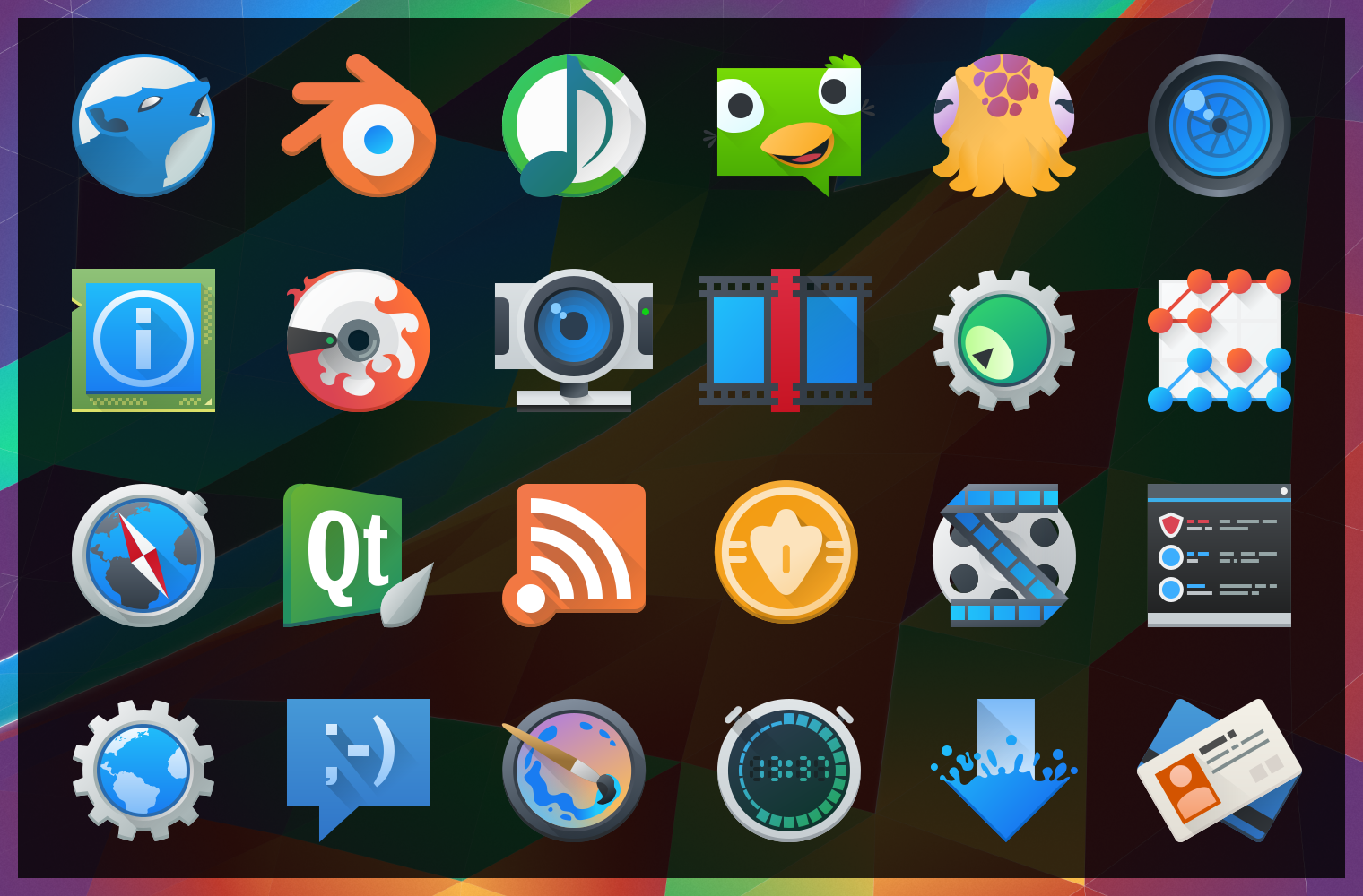 After “harmlessly” throwing in a couple monochrome icons from my personal projects, I found myself reading a few of the icon requests and one thing lead to another… Now I’ve pushed in somewhere around 25 new icons, mostly towards apps with the goal of filling in gaps of common applications. These new icons will hopefully bring a much more cohesive launcher menu, with more core and popular applications having Breezy icons.
Some of these may be shunted to an extended repo; 3rd parties get antsy when they see their logos get “breezified”, so “branded” icons need to occasionally be separated from the main repository to avoid troubles and takedown requests.
Lastly but not least; Uri and Andreas have been nothing short of awesome in helping me get these out, thanks guys!
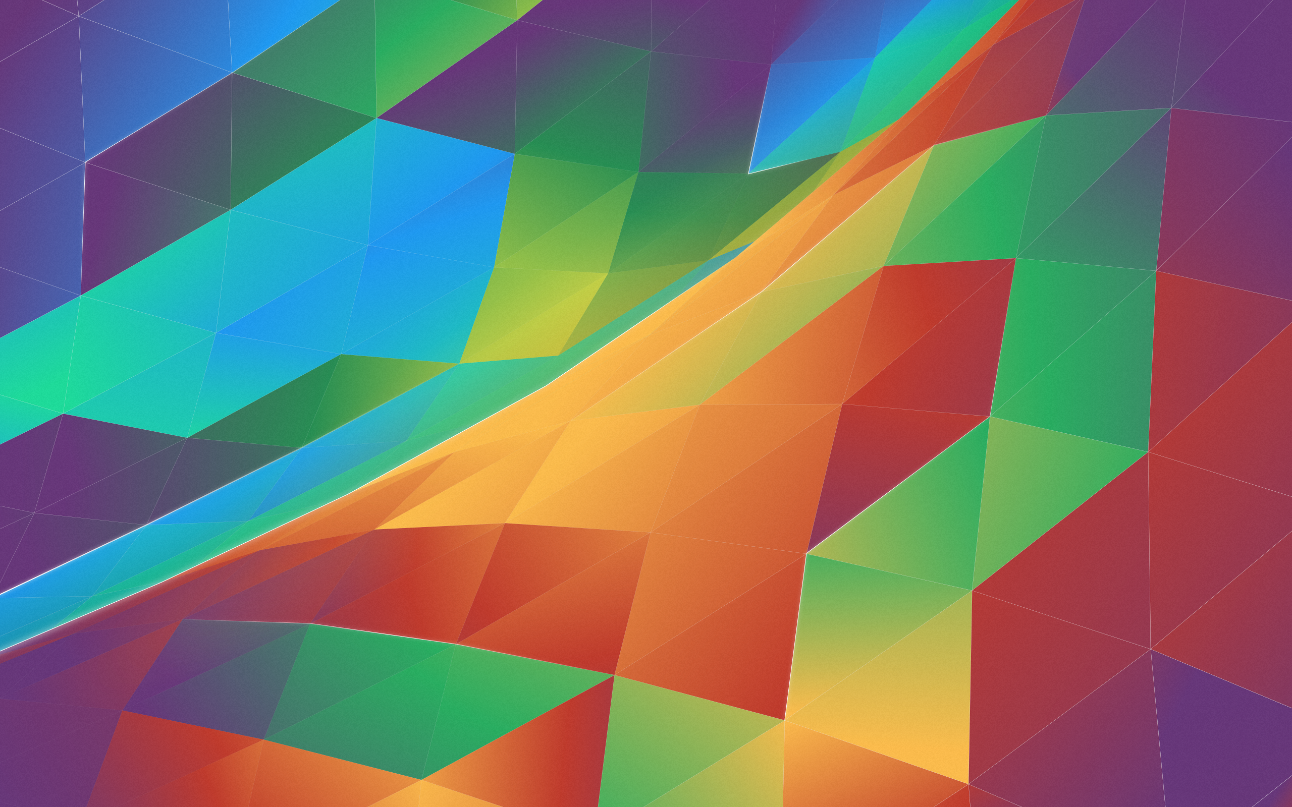
The tale of an annoying, terrible, awful wallpaper, and How I Made it.
I’d like to say that I’m less a man and more a force of nature – one able to sweep my hand and make art bloom at will… But this would be a lie, and occasionally getting art out there makes the only force I can muster feel like a fart in the wind. The new wallpaper for 5.4 just did not want to be made, and took days on and off trying to figure out what to do. I nearly just suggested we ship a backup wallpaper I had on the sidelines.
Eventually ideas got figured out, and after an unstructured failure (again, making me look at “the backup”) I started taking screenshots while using a more structured approach. I imagine I wanted all reading this to feel my pain. Either that or laugh. One of the two. Either way, the new wallpaper was one of the more involved processes used for a Plasma 5 wallpaper, and here are the steps for how it came together;
The new 5.4 wallpaper, “Horizon”, started off like this;

It’s how I’ve started every wallpaper, by simply drawing a triangle grid in Inkscape. This time around I also halved the height of successive rows near the top to give it a ‘curving away’ effect. I them exported this grid as a PNG with the intent to curve the grid.
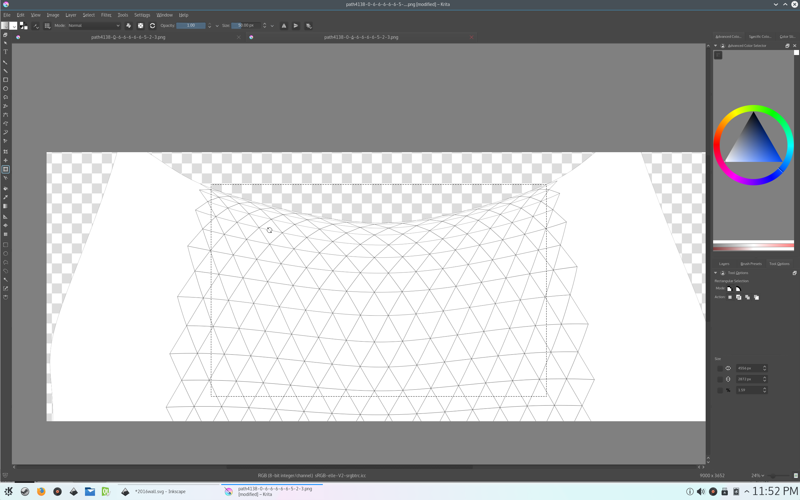
Originally, I tried to do this step in GIMP, and I need to say I was very disappointed. I don’t know why, but the GIMP cage transform tool is utter and terrible crap. Sorry guys but… Seriously? Anyway, I looked up how Krita could handle it, and again and again Krita impresses me; not only did Krita have amazing transform options, but they were all extremely fast. I swapped out to the Warp transform tool, and curved the grid twice; one bowing in and another bulging out, which I imported back into Inkscape.

Above you can see me tracing the new curved grid. I set up snapping so each triangle would snap perfectly into place. Each triangle had to be drawn individually because they are all slightly different due to the curve.
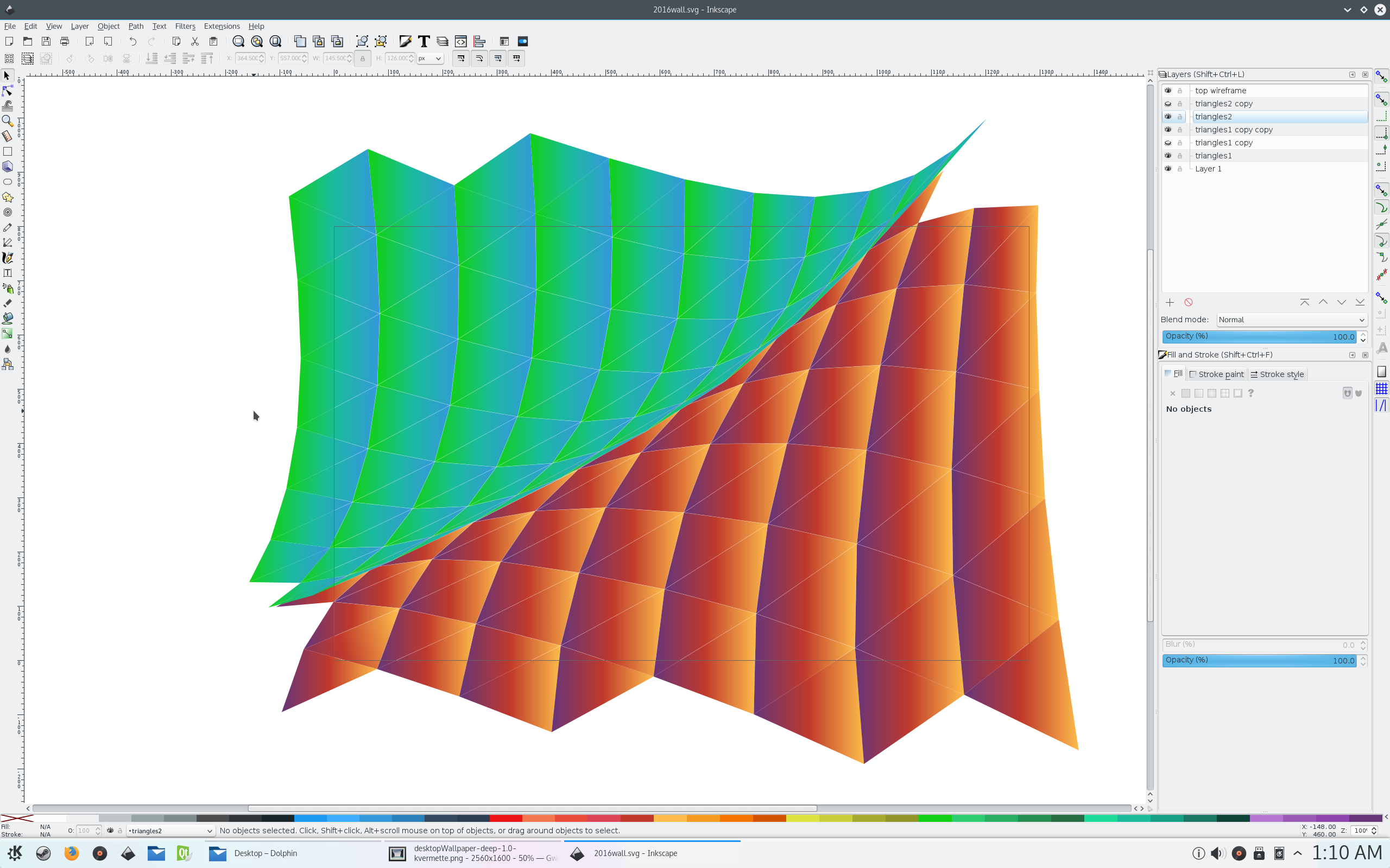
After tracing, I gave each half a base colour. At this point, I fiddled a with several colour combinations and patterns. Because I’m an idiot, this meant I adjusted each triangles gradient vector individually; though I did configure Inkscape to manipulate all gradients at once.
I took a break from endlessly tweaking colours, and I cropped the excess from around the canvas. Eventually I decided that each side would need two palettes, and how I would lay out the colours to get a nice effect.
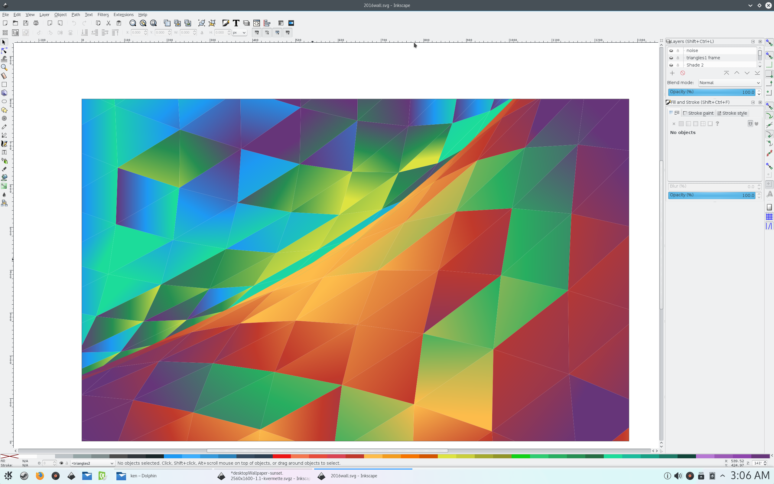
The 4 gradients that I would use would have a light and dark end. All the dark ends would terminate in the same purple so I could blend the gradients near the edges. I would also “twist” the gradients in a way that would break uniformity a bit without looking noisy. I’d like to say I got the ratios of all the stuff I’d done right the first time, but it took some tweaking until I was happy that the gradients were consistent with the “rules” I made. I also stuck with the Breeze colour palette again.
After that, it was just a matter of adding the usual highlights, and I also specifically added a hairline white trim to the triangles to emphasize the grid. I did another round of tweaking, and reached the final wallpaper, which can be downloaded by clicking the image below:
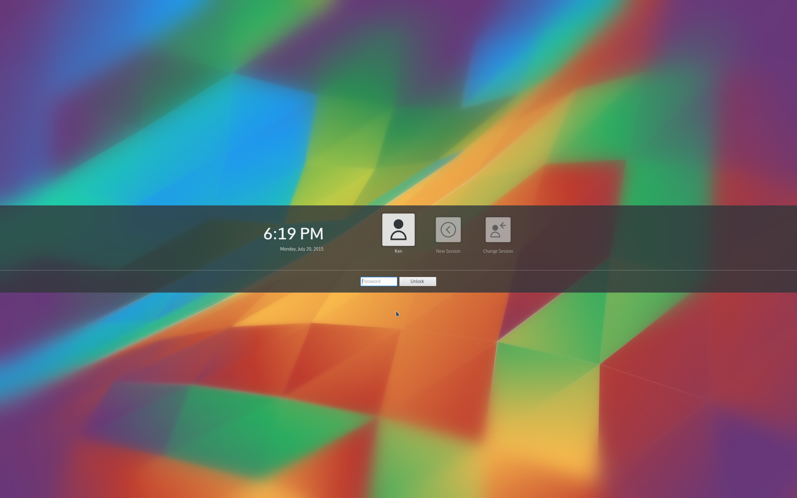
And here’s what the blurred version looks like for the lock screen. The wallpaper isn’t using blur in the strictest sense, and also uses noise spreading to give it an extremely subtle speckle effect;
… So after an annoying, terrible, awful run of bad wallpapers I now need to toot my own horn and say I’m pleased with this final result. I’m also satisfied with the break-away from “flat grids”.
The new wallpaper and icons will be available in 5.4. I’d also like to thank the VDG, everyone is doing great stuff. Additionally, if you are attending Akademy I recommend to the utmost that you attend the various VDG events; we’re interested in roping developers to help out, and any coders will be appreciated. Great UI/UX is more than pretty pictures, and we’d love for developers to contribute so we make the entire package together!