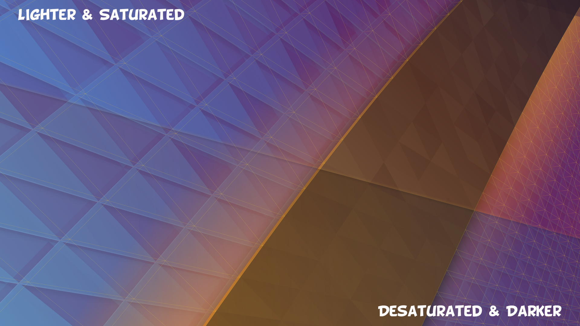
After posting the image of the 5.11 wallpaper feedback started coming in and one thing fairly consistently mentioned is how dark/muted it is. Of course, there were mixed opinions on whether it was good to be dark or if it was a little too far, but it was a clear observation, especially compared to the previous wallpapers.
So I took a few minutes to adjust the wallpaper. There were lots of people who liked having something more subtle, so I didn’t stray too far. I adjusted the blues to be more saturated, the browns are lighter towards the bottom to reduce banding, the orange is a bit brighter, and reds on the right were tweaked. I also reduced an “atmosphere” gradient. Lastly, I removed a noise filter used to combat banding.
Overall it’s not that much lighter, but it should be less muddy and washed out. If you didn’t have them side-by-side ideally you may not notice the changes, but hopefully it just feels a bit better.
Here’s the adjusted wallpaper:

Both versions are available on the KDE Store.