Category: Development

New Icons, Iconoclast Pipeline

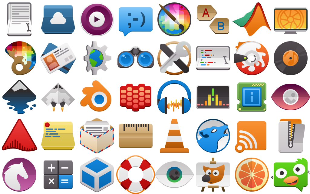
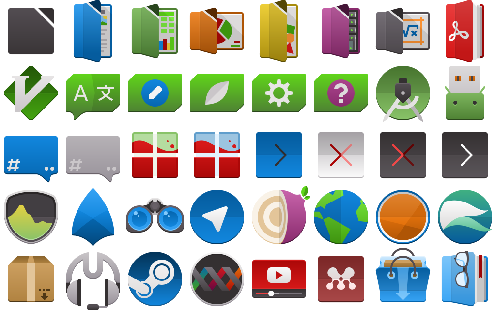
Over the month of November work has been started to refresh the full-colour icons in Breeze as an extension of the “Blue Ocean” initiative. With literally hundreds of hand-created vector icons in our roster we’ve had to develop new processes and are working on a more robust pipeline so this refresh can be done in a somewhat timely manner.

Preview of the new folders. Subject to change and refinement.

As was the method for Blue Ocean on the desktop widgets and design, the icons will be a gradual rollout over a few releases. We do have a strategy in place to ensure that this won’t be too jarring or inconsistent during the transition. The current plan is to update both all mimetypes and all places in time for the 5.24 release.

Like our current icons the new icons have adaptive capabilities. Beyond that some additional select icons such as the new desktop icon are also adaptive, and there are plans for other icons to also take advantage of this feature where it would not be obnoxious. Compared to existing icons the refreshed content will be softer, more detailed, and less flat. These icons are also prepared with future capabilities in mind, and as enhancements are made to KDE Frameworks these icons may expose new and interesting features.

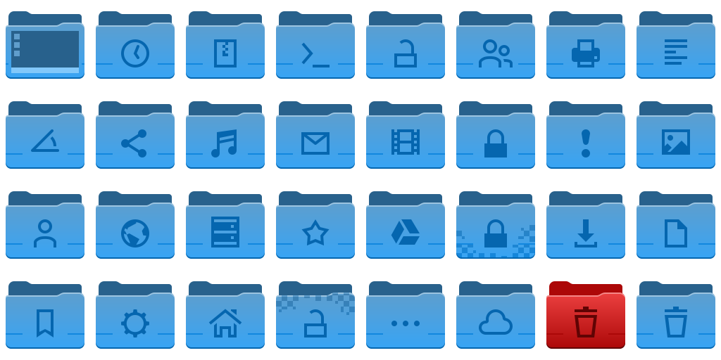
Finally, we’re expanding the number of sizes the icons come in, so they look ideal at more zoom levels in your file browser. Currently colour places icons are offered in 32, 48, 64, and 96 pixel sizes, and mimetypes are offered in 32 and 64 pixel sizes. Refreshed icons in both places and mimetypes will be offered in 32, 48, 64, 96, 128, and 256 pixel sizes with no missing graphics. We already have all folders in all of the above sizes, and in under a month while also writing our software we have over doubled the number of folder icons in Breeze. We’re estimating we will more than triple in the number of mimetype icons.

To get this work done we’ve built new tools for the express purpose of making mass iconography far easier for even individual artists, so I’m very pleased to state that a new icon and SVG pipeline is underway and despite being unfinished is producing results. This Python-written pipeline is capable of adding guides, rulers, and setting up grids for existing icons, standardizing existing icon colours, assembling entirely new icons from templates and components, and aggressively optimizing icons. With this authors will be able to have a “golden copy” of their icon sets where they can focus purely on design, letting the software take care of cleaning up the documents and assembling the individual pieces. The folders in the above image were assembled by the pipeline, with no hand-tuning.

In terms of optimization some extreme cases have seen unoptimized Oxygen icons drop 75% or their filesize. In less ideal situations a few simple hand-optimized test icons I produced run through the pipeline saw 10-20% reductions in filesize. The new optimizer is not built on any existing tools, and is an entirely new thing. At similar settings the new optimizer is on par or slightly ahead of Inkscape in most tests, but at the same time it’s also more specialized and the output cannot be edited when certain stages are enabled. It’s also targeted towards TinySVG and should not be expected to work on full-fat images (though, accommodations have been made). There is still work to be done too, and in the future more optimization steps are on the table to further reduce output size.

Not only is this pipeline beneficial to KDE artists, but history has proven even the roughest artistic tools we produce are regularly used outside of Plasma development. With this in mind we plan to release our new tooling separate from Breeze as its own package/download after polishing it to a mirror shine. Currently nicknamed “Iconoclast”, we are specifically setting out for this tooling to be useful and ready for the wider community beyond KDE.

Iconoclast will include our new pipeline, a manual, tips and advice, and another entirely new icon set named “Bones”, which is already in progress. The pipeline itself is strongly configurable with ini files, so KDE-isms can be removed and it can be adapted to work for icons sets that may have different flows through configuration. The Bones icon set will be a minimal base which can either be built on top of, or used as a reference, and these icons will released in the public domain. Different projects with different licenses can just take it and use it, and it’s uses generic technologies not tied to KDE. The pipeline itself will be GPL, and I don’t have a specific timeline for when the kit will be released but once it’s solidified I’ll make an announcement; though it’s likely to be after the new year.

Aether Icon Theme

What does everyones second-favourite Canadian developer do when he wakes up in the morning? First he makes coffee, usually by pouring coffee grounds and hot water directly into the sugar jar then drinking the resulting syrup. After that while he waits for the resulting diabetes and caffeine to kick in, he usually warms up for work by drawing a few icons to get into the productive mindset… This has been going on for a while.

So I’m pleased that this non-project has become complete enough that I believe I can share it around with the world a bit. Before I go on, I would like to express that this set is not an official project at this time. It may also randomly go totally unmaintained at any moment if the right people decide to strangle me.

Because I’ve been naming everything I get my hands on “Aether”, without further adieu I’m excited to present the Aether Icon Set;

aether-logo.svg

Everything needs a logo.

image8038

The Aether icon set takes cues from several existing icon specifications, along with heavy influence from Material icons. My hope is that icons from this set could present on Android and other platforms without seeming too out of place. As KDE applications make use of our mobile and convergent frameworks, it will in time become just as important for our artwork to be as portable as our applications.

The general design of the icons includes the use of folds, scores, and simple linear gradients inspired in equal parts by the concept of Kirigami and Material. Folds which visibly protrude from the icon may cast simple shadows. Icons generally aim for a middle-level of detail seeking clean and bold designs, and while there are keyline shapes it is encouraged to break from them for more dynamic silhouettes.

image7928

System settings and devices. Still a long way to go in this department.

The icons set is based on the ever steadfast Breeze icon set, and the intention is to retain the monochrome icons from Breeze while injecting a new set of full-colour icons to compliment them. Currently Aether requires breeze be installed on the system, as it will request Breeze icons in the manifest. It also lacks the coverage we enjoy in Breeze, so it’s also good to have it filling the gaps in Aether. While I do intend to use the Breeze monochrome icons, in some instances monochrome will eventually be overridden with colour icons for things like places and mimetypes for consistency purposes.

image7906

Folders in a variety of colours.

The Aether icon set currently contains over 150 new colour icons at 64px in scalable vector format. Of these, the vast majority use entirely original art, with a handful taking matching assets from Breeze and undergoing modification to fit the Aether aesthetic. The icons are designed so they can render quickly on the web with no loss in quality, as the modern web demands high-quality low-impact imagery in extreme DPI situations. I believe this is the most important aspect of design pulled from Breeze.

image8082

Applications, including Libreoffice and Qt development suites.

The Aether icon has a strict set of guidelines, along with a keyline template and an entirely new colour palette. The specification of the icon set allows the 64px icons to scale to 32px and remain pixel-perfect, with some icons scaling down to as low as 16px remaining completely readable.  This is not the long-term plan, and smaller sizes are already receiving partial coverage.

image7983

Folders are the most complete icons in Aether, with 16, 22, 32, and 64+ size icons available.

You can get the aether icon set via a scratch repository here:
https://cgit.kde.org/scratch/kvermette/aether-icons.git/

Even though I haven’t added the license to the repository yet, these are being placed under the Creative Commons Attribution-Share Alike 3.0 Unported license at http://creativecommons.org/licenses/by-sa/3.0/.

The scratch repo contains some working files and resources for those interested in contributing, but currently I have not written down the specifications. By reading the Google Material icon guidelines you will be roughly halfway there, but there are enough subtle differences to trip anyone up. In the scratch repo there is also a set of resource files with working master files, inkscape palettes, and extras.

If there is contributor interest let me know and I will write down the guidelines along with examples. Until then, I’ll accept contributions directly and simply adjust them as necessary if I’m able to fit them into Aether; this is still a very informal side project.


Does KDE.org look funny to you?

Our stalwart KDE homepage, which has been with us for several years, has, after serving us well, finally been retired.

The new KDE.org homepage, using the new theme “Aether”, is only the first step of a much longer journey to unify the disparate KDE websites. KDE.org and its surrounding network is made of many parts: forums, wikis, feed aggregates, custom solutions, etc; beyond the homepage each of these will need to be updated. It will be a long road, but the modernization is due.

This new design is still using direct and simple PHP, but the redesign effort will see us land this into a Drupal theme which will eventually be deployed for the wider KDE.org pages. We will still be using the other systems for our other non-static content, but Drupal will be used to replace any page using our current template engine “Capacity”.

I’d also like to give a special thanks to Harald Sitter for making this very quick and smooth transition possible.

If you spot any issues with the website, please report bugs to https://bugs.kde.org/describecomponents.cgi?product=www.kde.org, and I’ll watch the mailing list as well.

Wallpaper, Wallpapers, Website!

Starting off the Plasma Sprint today has been a good start with a little bit of real-world trolling, some quick sight-seeing, and of course, starting to get todos scratched off the list.

img_20170206_132239

Nobody noticed when this was stuck outside the window, and we are happy to report there’s a vast array of KDE software available for Windows. 😉

I’m excited to say it’s that time of the release cycle, meaning we show off a new wallpaper coming to Plasma 5.10!

1920x1080.png

The new wallpaper is named “Cascade”, English for many interesting things in technology, and French for Waterfall, or many waterfalls. Interestingly, this wallpaper has more layers than the 5.02 wallpaper had triangles.

If wanted, I can again show the process of how this wallpaper was put together, leave a comment and I’ll write it up.

Which brings me to my second todo which I finally got around to – wallpaper downloads! We’ve already had 9 wallpapers for the Plasma 5 series, and you can now visit https://store.kde.org/ to download each of them. For Nuno’s original “Next” wallpaper, I’ve provided a “remastered” version for 4k monitors named “Prev”. It’s not perfectly accurate, but for those who liked the original it is available;

plasma-5-0-1-prev-remastered.png.png

Additionally, there’s a new wallpaper named “History” for those who want to celebrate 10 iterations of Plasma 5 and the upcoming 11th iteration;

plasma-history.png

(Clicking on any of the images will take you to the relevant page on the KDE Store)

Lastly, much work as been done on the KDE website redesign. I’ll be blogging about it later, but here’s a screenshot showing the general design for the new homepage:

(sorry if the image is a bit fuzzy)

KDE_Community_Home_-_KDE.org_-_2017-02-04_08.27.43.png

The 2017 Plasma Sprint is sponsored by Meat Water.

A Link to the Tileset & Sprite Trivia

In my off time I’ve been closely examining the Legend of Zelda Link to the Past tilesets and sprites, and I’ve been learning a huge amount about how that game is assembled visually. it’s amazing how much they managed to do with the limited resources of the SNES.

For a game I’ve played religiously as a child, it’s interesting to see the imperfections which I completely glossed over even after several complete playthoroughs. There’s also some neat workarounds Nintendo did while preparing their graphics.

So here’s some “trivia” I found while closely examining the various maps and shots of the game;

  • Bricks lining the floors of diagonal walls are always rounded. This is not decorative, but a limit of their sprite-sheets 8×8 tile resolution. There are 5 unique 8×8 tiles used to create a diagonal wall, it would have required 6 tiles to add the 3 pixels needed to straighten the edge, and another 16×16 composite tile. Same, apparently, with the bottom of diagonal cliff edges. If they fixed this, several tight diagonal corridors would have been impossible.
  • In the overworld you will never find a flower that is NOT above a sprig of grass. You will always find flowers tiled with grass, or above and to the left of two sprigs. If you see three flowers, it’s just a combination of the other two patterns.
  • Live grass and dead grass never touch. I’m guessing because dead grass is a palette swap, so they would have had to include a tile-set for those edges. Instead, there’s always a dirt buffer or a cliff.
  • Bobbing flowers in the overworld have more frames of animation than any single enemy walk cycle. As a matter of fact, some enemies only appear to have one frame in their walk cycles – it’s just flipped to create the illusion of movement.
  • The animation used for guards falling off an edge contains more frames of animation than several enemies have for all their animations, total.
  • There is one tree in the game with a root placed on dirt/cliff edge. The tiles that make up that root are recoloured grass; because of that, one of the colours is slightly mismatched.
  • Cliffs are by far the most complex tiles in the game, but also tend to show the most seams between tiles. To say it must have been painstaking I think would be an understatement.
  • Most dungeons and houses share the same brick walls, only palette swapped with different tops. Instead, dungeons distinguish themselves with unique entrances, pillars, and decorations. There’s also a unique entrance for the monastery which was unused, possibly to avoid it being confused with dungeons.
  • Walls in houses and dungeons also don’t obey perspective, various tricks are used to maintain the illusion. The southmost walls are sometimes outright covered, and very seldomly will you see half-walls or “tall” objects touching the south walls.
  • Braziers, tall lampposts, half-walls, and various other doodads to not contain transparency keys. While not surprising on its own, it’s shocking to realise how many things don’t actually have “shapes” or “blend in” to their environments when closely examined, simply having grey backgrounds which most people must never notice. Those moving spike traps? Those are square, you just thought they were pointy.

Anyway, those were some fun facts.

Zelda: A Link to the Past is simply an amazing piece of work, and the tilesets are remarkably compressed for what they were able to create; PNG images containing the complete light world are larger than the entire game itself, not including the alternate dark world, insides of houses, or dungeons.