Some new CSS classes are coming to icons courtesy Janet Blackquill, and I’m excited to cover what exactly this will let icon artists do in 2022! This post is part tutorial and part news. For those looking for a quick TLDR; icons are going to get even better. I’m also going to clear up some inaccuracies in existing documentation (which I plan on updating at some point later)
CSS?
For those unfamiliar, vector icons in KDE can have a stylesheet which embeds several useful colours which update along with the system palette. If you want to make icons that adapt in some way you use the colours in these sheets. If you open an SVG icon from Breeze in a standard text editor you might come across something vaguely like this:
<style id="current-color-scheme" type="text/css">
    .ColorScheme-Text { color:#4d4d4d; }
    .ColorScheme-Background { color:#eff0f1; }
    .ColorScheme-Highlight { color:#3daee9; }
    .ColorScheme-ViewText { color:#31363b; }
    .ColorScheme-ViewBackground { color:#fcfcfc; }
    .ColorScheme-ViewHover { color:#93cee9; }
    .ColorScheme-ViewFocus{ color:#3daee9; }
    .ColorScheme-ButtonText { color:#31363b; }
    .ColorScheme-ButtonBackground { color:#eff0f1; }
    .ColorScheme-ButtonHover { color:#93cee9; }
    .ColorScheme-ButtonFocus{ color:#3daee9; }
</style>
Note that the <style> tag has an id of “current-color-scheme”. This is how we identify which <style> tag contains our adaptive colours.
When using Inkscape you can use the “Selectors and CSS” dialog available under the Object menu to see these special styles:
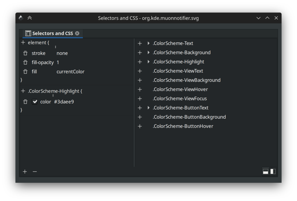
When you have a something selected you can set the fill or stroke to “currentColor” and use the “+” button to add a CSS class. Things that apply to the selected element are on the left, and a list of all classes found in the image are on the right. Here’s the important part: the classes in this list are a lie! First and foremost, some icons have extra CSS classes listed that don’t actually work when used as an icon, and of course, some new ones are missing. You can’t “preview” how an icon will look with Inkscape alone, so to see what actually works there’s applications like Cuttlefish or Ikona which can provide an accurate view of your work. In terms of quickly making sure you have the correct palette in an icon, I recommend using a text editor and replacing the style with the “id” of “current-color-scheme” with the style below:
<style id="current-color-scheme" type="text/css">
    .ColorScheme-Text         { color: #232629; }
    .ColorScheme-Background   { color: #eff0f1; }
    .ColorScheme-Highlight    { color: #7ec9f0; }
    .ColorScheme-PositiveText { color: #27ae60; }
    .ColorScheme-NeutralText  { color: #f67400; }
    .ColorScheme-NegativeText { color: #da4453; }
    .ColorScheme-ActiveText   { color: #3daee9; }
    .ColorScheme-Complement   { color: #ffffff; }
    .ColorScheme-Contrast     { color: #000000; }
</style>
You may notice several colours are very different. Let’s start with what’s missing; ColorScheme-ViewText, ColorScheme-ViewBackground, ColorScheme-ViewHover, ColorScheme-ViewFocus, ColorScheme-ButtonText, ColorScheme-ButtonBackground, and ColorScheme-ButtonHover are gone. I don’t know much about why these are used as often as they are, if they ever worked, or what, but they’re no longer active and when I was double checking to ensure I don’t feed anyone misinformation I found some bugs where they were meant to be used but… don’t work. So, for now, we’ll ignore what doesn’t actually exist.
In terms of what does exist, here’s a list of the available colours from the above style code and what you can expect behaviourally, along with my own observations:
- ColorScheme-Text; it’s the same colour as text on a standard window. This usually means it’s near-white or near-black, but expect some colour schemes to add some saturation, such as a red theme making text pink. The opposing colour to Text is Background. For modern use it’s a good contrast colour, and works really well for monochrome icons paired with text.
- ColorScheme-Background; Same as the background colour of a standard window. Background has fewer use-cases, and generally it’s recommended you use transparency instead of this.
- ColorScheme-Highlight; This was the first method of using the increasingly popular accent colour in icons, but colour schemes generally mix the accent colour with the background colour dulling the result to a degree. If you want the exact accent colour read on to ActiveText. Highlight is still great when you want to use the accent colour but you don’t want it to be overly strong.
- ColorScheme-PositiveText/ColorScheme-NeutralText/ColorScheme-NegativeText; Generally these are green, orange, and red respectively. Some schemes do change these a bit so if you want “guaranteed” colours such as green, these are not appropriate. Instead use them as their labels imply, as positive to negatively associated colours. These are used often in monochrome icons. If working on full-colour icons and you’re representing a common system component or generic things these can be used as well for light flavour, such as debris in a trash can, but it’s recommended use be kept to a minimum.
- ColorScheme-ActiveText; this is one of the 3 newly added colours to icons, and is the new recommended way of using accent colours in icons if you want the exact colour. Unlike Highlight, ActiveText is an unmodified accent colour directly set by the user. It can be just about anything from sky blue to hot pink to grey.
- ColorScheme-Complement and ColorScheme-Contrast; These are the other two new colours, and are a little bit special. Unlike every other colour set by the scheme, Complement and Contrast are guaranteed to be pure black or pure white. If the colour scheme is dark Compliment will be black and Contrast will be white, and if the scheme is light Compliment will be white and Contrast will be black. There are several use-cases for these, mainly for allowing icons to re-shade themselves for light/dark environments, or for providing outlines. Often icon artists relied on Text and Background for “shading”, but with schemes like Quartz or Afterglow you’d see situations where icons would be “stained” in unwanted ways. Now we have a much more reliable pair of values which won’t create muddy results.
How We’ll Use These New Classes
The new colours added a few possibilities. ColorScheme-ActiveText is pretty straightforward, giving us the user-defined accent. If you have an icon theme and are using accent colours via Highlight, ActiveText will get you the more vibrant and untarnished accent colour. Beyond that Compliment and Contrast are pulling a few duties in the upcoming icon refresh, so I’ll cover them in more detail.
First we’re using ColorScheme-Contrast for bottom shadows/highlights. In dark mode it gives icons a soft under-light, and light mode it’s a standard shadow. Previously we used Text for this, and it worked, but Contrast is just better for this now. Where it’s really nice is helping define the silhouette of the icon.
For folders we’re mixing in a very small amount of Contrast over top the accent colour for just a very tiny amount of “pop” without being obnoxious about it. This also helps guarantee a minimal amount of contrast between the accent colour and the background.
We’re using ColorScheme-Compliment for decals and overlays. We get nice dark-on-dark or light-on-light designs, but we don’t suffer from decals looking “muddy” anymore as we used the Background colour where we now use Compliment.

For comparison here’s the same folder using the new CSS under previously unfavourable circumstances with a red-on-red-on-red scheme, the folder on the left using previously available colours and the folder on the right using the three new colours. Before the new colours I was ready to chalk it up to “don’t use terrible themes” but now everyone can safely use the very worst colour schemes on the planet and still have usable and attractive icons.
Beyond the new colours, work is continuing on the refreshed icons. There’s been a great deal of feedback and many icons are being fine-tuned. The pipeline tools are evolving as well, having had a significant refactor which greatly improved the tool all-around.