Category: Open Source

How Bread is Helping Make Breeze Cursors Pixel Perfect

Some people accuse me of being a crazy person. Others are wrong. But occasionally the seeming madness of it all will bring about good things.

Last night was a sleepless night in all the good ways; I’m excited for the upcoming Plasma Sprint, and knowing I’ll be packing myself into a cigar tube and flinging myself across the North Atlantic Ocean is too much for me to sleep over. I had promised a commenter (too long ago) I would make green cursors, so I decided to make good on my word. After it took 5 minutes I needed more; and the wafting smell of my bread maker inspired me to make a Bread cursor theme. Once that was done, sufficiently delirious, I sent my weird bready message to the VDG. They appear to have ignored it – a wise decision. They’re busy people doing actual work.

bread

Today I opened up the cursors to see what I had done.  Nothing too terrible, and I decided it was worth polishing them up if just for the larfs. One of the touches was to add a half-pixel white outline between the crust and loaf for contrast.

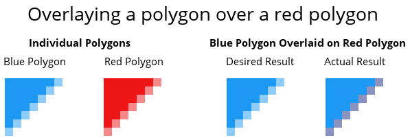
When I rendered the tweaked cursors, they started to look awful because of how SVG images layer and clamp nearby vectors. Simply put on a vector edge, even if there’s another identical edge above it, both edges will affect their neighbouring pixels as opposed to the upper vector shape ‘blocking’ the lower shape.

sample1

The “desired result” is the result a designer would expect, while the actual result is technically correct.

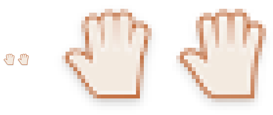
This had the effect of making the hand of my newly minted bread cursor (with the most edges) look “washed out” because the two lighter inner layers were covering the outline.

sample2

The solution for this problem is to ‘supersample’ the cursors in our build scripts. Supersampling is when you render the image at a much higher resolution, and scale it down to the desired resolution. Instead of going directly from Inkscape to a final image, we first export each cursor to a temporary file which is 4x standard resolution and 2x double resolution. We then scale down and copy that image to the final resolutions.

The end result is going to be the option for us to more easily use sub-pixel detailing in cursors without worrying about losing smoothness; any extra detail may not be noticeable on a day-to-day level – but it’s the polish Plasma users are beginning to expect. Additionally, high-resolution cursors will also benefit because the half-pixel details will become full pixel details, and on a high-quality screens you’ll have ultra-sharp graphics.

breadAnd that’s how bread is helping make Breeze cursors pixel perfect!

Now, super-pixel-perfection isn’t that noticeable so there’s not going to be a rush to update existing cursors; but if one day you quietly notice your cursor is a little bit sharper than it used to be – you can thank bread.

Download The Cursors:
(extract “compiled” cursors to your icons folder to install, or download the source to edit or remix them. Golgari is a green/black theme)

Bread Source
Bread Compiled
Breeze Golgari Source
Breeze Golgari Compiled

Plasma 5.2 – The Quintessential Breakdown

header

KDE is one of the oldest open-source desktop projects which can be found today, and over the years it has established a rich history of highs and lows. During some points it has been the undisputed ruler of the desktop world, while other times it had fallen behind or faced hard trials.

A memory everything but forgotten, just over 6 years ago KDE tore itself apart in spectacular fashion to assemble itself anew. Brave users who wandered through the rubble and wreckage saw developers rebuild the KDE before their eyes, witnessing the birth of ‘Plasma Desktop’ and it’s sister project ‘KDE Development Platform’. It was universally understood that this twisted gnarled creature of a computing experience was both hideous yet full of potential, and over 5 years of refining Plasma it had struggled, crawled, hobbled, walked, run, and eventually mature into a fine desktop.

Despite becoming an accepted way of computing there has always been one nagging persistent issue with it all; KDE is old and the legacy it inherited was a knotted mess of a foundation, with over a decade of old code accumulating to encumber nearly every aspect of the system. Software could not be written to use KDE Development Platform without pulling in so much baggage, and like a bundle of cords or strings there was no chance of pulling one from the mess without receiving the entire ball of twisted tangles; even a simple media player could bring in nearly all the legacy materials, even when used outside the Plasma desktop.

KDE developers knew what had to be done and set into motion years ago a complicated, time-consuming, and challenging goal: “we must untie the knots”. With a looming Qt5 transition on the horizon (the underlying toolkit used by KDE) developers saw their opportunity to untangle the ball as they ported to the next Qt.

But there were fears, warranted fears, that this process would again lay waste and pervert the now solid Plasma Desktop, people fearing they would be forced to decide between their beloved systems with an expiry date, or a new era of painful unfinished instability. The developers had a different plan in mind; a silent revolution planned to pass silently with little fanfare, as the underpinning foundations are churned into a sleek and modular framework which could be as loved as the desktop which used it.

“We must untie the knots.”

That day has already come and passed; dubbed “KDE Frameworks 5” for the technology, and “Plasma 5” for the environment/applications, these technologies have been in circulation as technical demonstrations and alternatives for some months now. A combination of nervous anticipation and memories of being burned by the 4.0 releases lead all but the bravest to venture early and discover nothing nearly as painful as the transition between KDE 3 and Plasma. With KDE Plasma 5.2 being formally announced as the default environment of Kubuntu 15.04 due only months away, Frameworks 5 and Plasma have been recognised as maturing usable products – which means it’s time to take a serious look at what to expect when you turn it on for the first time.

For the sake of simplicity I will be referring to KDE Plasma Desktop as “Plasma 5.2”, KDE Frameworks 5.6 as “Frameworks 5”; most regular people don’t need to know the exact version of the frameworks, and this review will be focused on the experience of the Plasma 5.2 desktop as it feels today. Some parts of the Plasma 5.2 experience are holdovers from Plasma 4, but I will cover them all the same should new users wonder if the hand-me-downs of the previous generation desktop gel with the new experience. I won’t be covering most technical issues in this breakdown; there are several that I had, however I’m using Beta software on an Alpha operating system – technical issues are to be expected which won’t impact final releases.

KDE Frameworks 5.3 & Plasma 5.1 – First Impressions

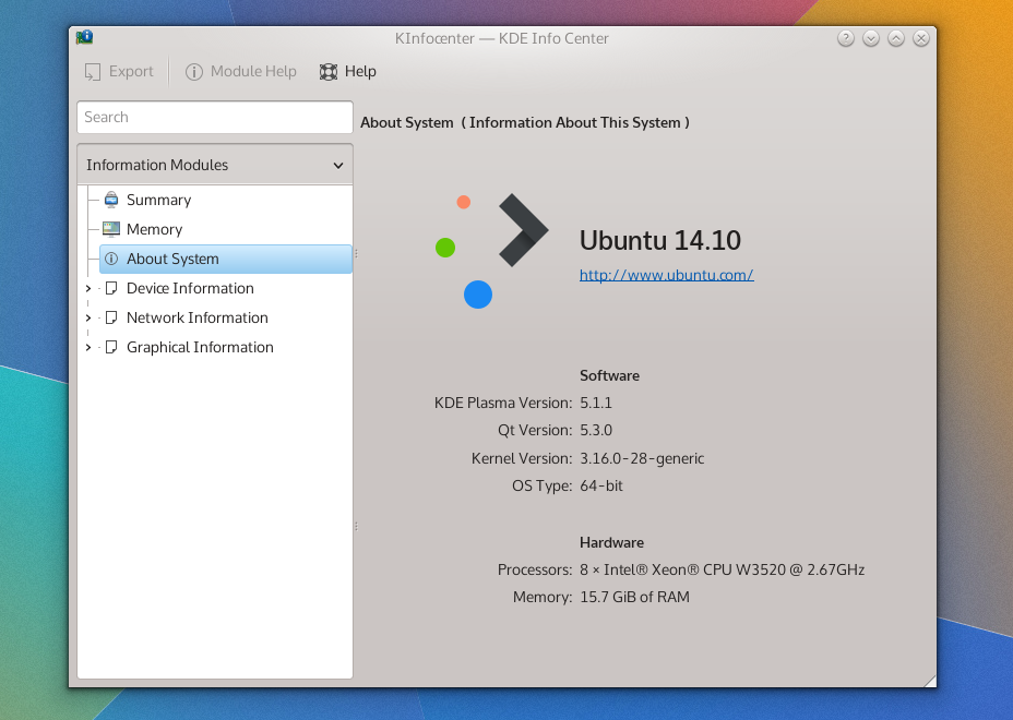
Today I took the plunge into the next-generation KDE desktop, performing a dirty upgrade from Kubuntu 14.04 to 14.10 before installing the plasma-5-desktop package; and this is my first impression of KF5.x and Plasma 5. This is also a bit of a primer, because when Plasma 5.2 enters the stage I’m interested to see the comparison and do a second write-up, using my experience in both 5.1 and 4.x as points-of-reference.

specs

The Old & New

Many KDE applications are in a transitional state and not migrated to KF5, so summarising the applications’ of KF5 as “uneventful” is apt because there are literally no events. I don’t know how a great deal of this is being handled, and it could just be from my method of installation, but aside from the system settings panel almost all the core applications are still running KDE Frameworks 4. Uneventful can be good, and I’d rather apps take their time porting to KDE 5 than sloppily rushing their ports. So, upgrading to the next-generation won’t gut your applications, and that’s a good thing to know an upgraded desktop won’t be paired with potentially unstable apps.

This makes me note how differently this iteration of the frameworks has been handled in contrast to Frameworks 4; there’s no mad science going on here folks – this major transition is being handled with caution and care.

Widget Shuffle

When it comes to the desktop itself, the reserved nature of the application updates speaks nothing of what you’ll get with the desktop widgets; a complete replacement of everything you’ve got. This sounds obvious, but at first blush while KDE looks similar to its forbearer with the white panel at the bottom, sporting the same widget selection and placement as its predecessor – that’s where the desktop similarities end, and it’s probably easier to name what’s stayed the same than everything that’s changed. This all makes sense, because swaths of the desktop *had* to be re-written, and the authors didn’t want a rocky transition this major release.The changes I did encounter aren’t flow-breaking and you won’t feel like a drunkard stumbling around unfamiliar territory, it’s still got KDE DNA and while you will have several “oh that’s different” moments: I’m glad to say they’re mostly good.The bad news first though; at least in Plasma 5.1 many of the widgets you may have used simply don’t exist yet. New and returning widgets are in the pipes, and with time they will surely return with the same level of polish found in the current crop of widgets, but with such a dramatic re-write it will take a few releases for all the widgets to catch up.

The good news is that the Plasma goodies which do make an appearance are universally improved. KDE has fully committed to QML as the language used for programming desktop components, and this decision has yielded a much more consistent desktop. It’s one of those things which is difficult to put your finger on, but it’s all just a little more cohesive.

snapshot1

There are a few notable new widgets and behaviours I’d like to specifically mention. The new search widget is shockingly fast, organised, and a hidden treasure. The notifications tray has been reworked; it’s easier, simple, consistent, and often integrates controls more smartly than before. The applications menu launcher, despite having no outright usability differences, also “feels” better.

Stability & Bugs

I’ll say this outright; KF5 and Plasma 5 are not nearly as mature as yesteryears KF4-based desktop. After installing the update and doing a complete reboot I’ve suffered several crashes, and Plasma had at one point managed to forget my colour and wallpaper settings. A second restart seems to have shored it up, and the desktop now seems to be stable; perhaps it had to overcome stage-fright? I’ve had several issues with the Plasma desktop, ranging from the desktop placing the ‘add widgets’ tray into the middle of the screen (seemingly “docked” onto a window), and the system settings application behaving like a petulant child.

With all that aside, for en early revision of a recently overhauled desktop environment, (after it calmed down) it’s become more stable, and it’s been running a full day without issue. With that being said, I’ll be looking at 5.2 before I take a more firm stance on stability and making recommendations based on that factor.

Performance & Animation

I have one of those huge Aluminium Mac Pros which I’ve upgraded it significantly during its’ lifetime, yet despite my heavyweight computing power and KDE never feeling ‘slow’, I must admit often times it didn’t necessarily feel ‘fast’ or ‘smooth’. With KF5 and Plasma 5 the desktop for the first time feels *smooth*, please understand I’m saying it feels buttery, slick, and silky in all the right ways.

This can be attributed to Qt 5, which has moved to a hardware-accelerated graphics-stack, and while KDE has taken advantage of hardware acceleration since KF4, it was not nearly as pervasive throughout the entire toolkit as it is in this most modern environment.

There also seems to be fewer visual glitches associated with the desktop; KF4 had some minor issues where it might blur a background or draw a shadow before whatever content was to be placed on the screen. KF5 and Plasma 5 have reduced these issues, but odd moments of ‘hiccups’ which reminded me of KDE 4 can be rung from the system if you launch an unloaded plasmoid from the panel. These visual hiccups are incredibly minor, but do detract from the incredible mirror-shine polish that I feel will become expected of the modern Plasma desktop.

This can be seen a split-second before the content catches up and fills in the popup.

This can be seen a split-second before the content catches up and fills in the popup.

Animations throughout the Plasma desktop are both more pervasive, consistent, and smooth. Everything feels animated, and it makes the desktop feel more alive. The animations and movements within widgets themselves look consistent, and are overall much more tied together. It feels less like desperate parts bolted onto a desktop, and more like a single whole dancing to the same tune.

Look ‘n’ Feel

Once again, a disclaimer; I’m a member of the group managing this aspect of KDE.

Out of the gate, Plasma 5 is both more and less visually polished than the Plasma 1 experience, it’s give-and-take. Generally, the “new look” (named “Breeze”) for KDE aims to be simpler, less cluttered, and more ‘designed’. The layout of just about everything has improved dramatically; this is in blatant disregard to your selected theme, being a core improvment on an applications’ and widgets’ level. Things don’t feel so tightly packed together, and it allows your eyes to rest more easily.

(as a side note, in my screenshots I’m using Oxygen again)

The new applications’ theme (as it stands in 5.1) can feel Spartan, with reduced chrome in the windows, more focus on spacing, and whiter default pallet. These are still clearly the early days for Breeze, and quite simply it hasn’t had the 6 years Oxygen has had to fine-tune its design and mature. That being said, it’s a very different style in it’s most core concept: Oxygen had head-first jumped into an extremely heavy and visually intense theme which gradually lightened itself up, while Breeze has started with an extremely minimal design.

The majority of toolbar icons no longer have colour, instead using a monochrome design, and it can sometimes take an extra few moments of searching to locate icons you’re looking for on the toolbar. This is offset by vivid content icons which readily call to your eyes, sporting near-pastel colours and thoughtfully laid out structures. Overall, the icons shift focus away from the UI and towards content, and you really don’t feel like the chrome of the windows is there.

The end result of all these changes is a much lighter feeling KDE. The UI gets out of your way more, and instead of attempting to woo you with distractions it’s clear the next generation desktop will have a reserved respectability in terms of costly design choices that will create a more elegant environment.

Settings & Configuration

Plasma 5.1 is configured to feel a great deal like the traditional KDE desktop, with the standard panel, mouse actions, and shortcuts, but things diverge a great deal in the system settings application which has been completely rearranged. Previously the grouping of the settings menus felt random as they were built on the leylines of technical details over user-oriented goals, while in Plasma 5.2 they are more sane to users, being grouped more by goal than underlying mechanics.

Desktop configuration (specifically managing widgets) has been incremented upon, with some changes feeling slightly arbitrary. The “add widgets” panel now slides in from the left and adding widgets now presents a “drop indicator” which illustrates where on an underlying grid your widget will be placed to help avid widget-users keep everything aligned. Widgets still have the slide-out drawer, which can often seem strange in how you interact with it – but it’s unchanged.

Several widgets on KDE which beg for configuration options open up bare settings dialogues, such as the search widget. While this is a minor nit-pick, it’s the type of issue where you know the first step is still going to be building the selection of widgets available, and you’ll need to wait to play under the hood of the high-quality widgets bundled with KDE.

Final Notes

KDE Frameworks 5 and Plasma 5.1 create a fine environment, but one that is still visibly in it’s early days – you could almost say it suffers from many small papercuts, avoiding the haemorrhaging issues that soured the initial KDE Frameworks 4 release. With a completely re-based desktop I don’t feel these little cracks will remain for long, as it seems the developers have a firm grasp of what needs to be done and exactly what they want to do. For a major point-release, there’s a real feeling that this software will reach rock-solid stability very quickly given the state of it as it stands.

Now, do I recommend Plasma 5.1 for general use? Compared to the current 4.x Plasma release?

If you were installing fresh I’d say go for Plasma 5, but if you were just considering an upgrade, I’d wait. Plasma 5.2 is coming in hot, and I believe it will be the beginning of this next-generation desktops’ serious push to bring people to this fine new desktop. Even if it doesn’t reach feature-parity with the previous desktop, I imagine 5.2 will be the ice-breaker for the interested public with 5.3 will more/less beginning the larger migration to the 5 series desktop.

DWD – a FAQ for questions around the Web

Don’t know what DWDs are? Click the link below to find out!

http://kver.wordpress.com/2014/10/25/presenting-dwd-a-candidate-for-kde-window-decorations/

It seems about the right time to post some common questions and misconceptions about DWDs I’ve seen around the web, so here’s a general FAQ about DWDs; If I missed any questions about DWD, please post them!
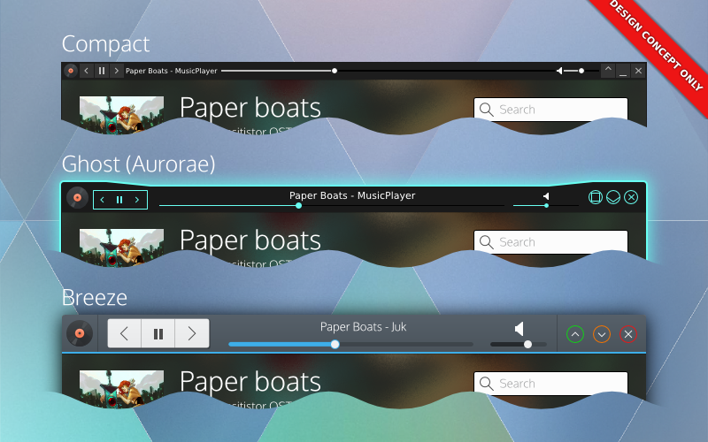
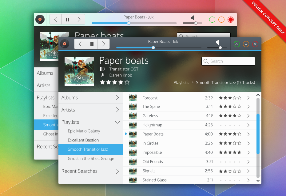
Window decorations would be responsible for widgets. Here's 3 potential window decorations using DWDs.

Window decorations would be responsible for widgets. Here’s 3 potential window decorations using DWDs. Note that the decoration dictates style – and users dictate the decorations. Complete control of your personal preference.

DWDs are going to make my windows inconsistent and ugly! Application widgets might clash with my window decoration!

DWDs are not CSDs, and all theming and drawing is handled by the window manager and decoration. In addition, applications only export the structure of their widgets, they do not pre-draw or draw the widgets themselves. Applications would have little or no say in how their decorations look, just like traditional SSDs.

That being said, we don’t want DWDs to be absolutly rigid, we are looking at ‘safe’ ways applications can do basic branding on themselves in a reasonable manner, which decorations could potentially integrate without excessive effort. The main thing we are looking at is allowing applications to offer a colour pallet which decorations could use to tweak their appearance, but DWD ultimately would put the power in your hands and options would also be provided to disable unwanted hints and effects for more consistency. A primary sentiment with DWDs is that the user would be completely in control of all aspects DWDs would provide.

Will I lose my current customizations, or ability to customise? Will I lose the ability to customise my windows in the future?

No! DWDs will actually give you more options – at least in KDE.

The only change to your existing configuration might be the switch from standard SSDs to DWDs when the option is initially added (or deemed stable). If you wanted your current setup to reign supreme, you could simply disable DWD-based widgets, and your desktop would be remain identical to how it is today.

I want features like controls on my phone, or controls in the panel, but I don’t like widgets in window decorations. Can I have one but not the other?

Yes. Since DWD is just a protocol, we could potentially build DWDs to be enabled/disabled on a per-service basis. You disable it in kwin, but keep device integration, or vice-versa.

How will I move the window if everything is interactive?

There are a few things we can do to address this issue.

The first is by looking at individual widgets and checking to see if they could conceivably be dragged. For example, buttons could easily be considered draggable surface. Progress bars are a draggable surface. About the only things that can’t really be dragged (which we would include in the specification) are tabs, text inputs, and sliders. Sliders take very little vertical room, they are less of an issue.

Next, we’ll recommend decorations insert generous area of padding in parts of the frame, which would provide grabbable area to drag from. Of course, if you have something against padding and would rather drag a window by holding alt – I’m sure an ultra-compact theme will accommodate you.

Lastly, we’ll also look at how widgets are configured, and potentially we could offer alternate behaviours for widgets. If users didn’t care about the order/arrangement of their tabs, we could easily have an option to just make tabs another draggable surface (and disable rearranging). Sliders could have an option to require users specifically use the knob. Text inputs could be set to require focus before a drag->select can occur. There are many options.

Overall, we want to assume that at least one or two apps will “abuse” DWDs, so I’d want to build ‘safety’ on the decoration level.

DWDs are complicated / CSDs would be simpler.

For applications developers DWD should be similar in complexity to CSD but will have extended options available and additional features, while omitting APIs for complex styling. DWDs will not impose default structures or layouts, or make assumptions about your layouts. Overall, DWD should be roughly equal to CSD for applications developers; they’ll likely just have a different API focus.

On a system/library level CSDs may be simple when you look at them in face-value; a simple library lets a program draw its own more functional header. But when you look at the grand scheme of things CSD libraries by nature don’t care to integrate with all environments, causing massive headaches and complexity to all other developers outside the targets of the CSD library; if the CSD library did attempt target target all environments, the CSD library itself would be *insanely* complex. Simply put you’ll never, ever, ever hear about a CSD library that supports KDE, Gnome, Windows, Mac, Unity, etc etc. DWD also forgoes the need for complex hacks and workarounds that desktop environments have had to kludge together; such as enabling corner-dragging in the toolkit because there’s no window manager support on frameless windows.

With DWD, environments can choose to support or not support DWDs, and provide incredible amounts of integration which CSDs simply cannot offer. Environment-specific integrations applications are doing (such as menubars) is primarily done through kludges and duct-tape, and even then they still don’t properly support every environment. Unity/Mac-style menubars are so broken in so many places it’s silly; support for the same applications and desktop environments vary from distro to distro. Gnome is moving towards eliminating them completely, with Gnome devs expressing that it’s one of their goals.

Lastly, the look and feel is also less susceptible to breakage; it’s been noted that GTK will often break themes, meaning theme developers constantly have to keep up with CSDs. With DWDs, the window manager doesn’t even know or care about the toolkit – it just follows the standardised instructions.

In other words once you step outside a face-value glance, DWD eliminates huge amounts of complexity – and more importantly breakage – through consistency. And support, while initially about as bad as CSD, actually has a chance of propagating across multiple desktop environments and toolkits reliably.

The buttons are too big! I hate this big button trend! (aka, I don’t like the look! It should look like this!)

I agree! DWD applications should absolutely fit and feel exactly how you want them to. If DWDs are implemented, it would be up to the window decorator and decoration to provide options like spacing, sizing, look and feel. So aside from the options decorations themselves might be able to provide, being able to completely change the decoration or decoration engine is an option. You could use minimal themes, fancy themes, ultra-compact themes or even embed the controls elsewhere and use a minimal wire-frame. DWDs would give you *more* control over the look of your applications than you’ve ever had before. So if you think one style is ugly, you aren’t ever stuck with it.

I don’t like DWD or CSD! Just keep SSD! Keep my titlebars clean!

Depending on the window manager using DWDs, buttons in titlebars could be disabled; resulting in traditional SSDs. The DWD specification is aiming to be completely backwards compatible, which means we also get a traditional SSD mode for free. That being said, DWD is still mostly conceptual at this point, so you’re still ‘safe’ from the evils of UI changes for a while.

Could my toolbar menus be placed in the window frame if DWDs aren’t supplied?

I personally would not fold this in to be a part of the DWD specification – but developers might decide otherwise. In my designs I had DWDs placing the application menubar into an overflow portion of the command menu; I should elaborate on that:

Ideally menubars in DWD command buttons would be an application-specific option and not part of the core DWD specification. Not all applications use menubars, and in some cases (such as productivity or professional applications) the application *needs* those menubars front-and-center – not behind a button. The DWD client library would likely just include a convenience function that would allow easy menubar embedding into the command menu’ putting it into the applications’ control.

In other words, I think this should be a Kwin-specific thing, and not a DWD-specific thing. The goal of DWD isn’t to ‘take over’ the window, merely to extend it.

Could DWDs fall back to CSDs?

Yes, they could! But no, KDE won’t!

One of the few things about KDEs’ implementation would be that we would not use CSDs as a fallback ourselves. DWDs could conceivably fall back to either CSD or SSD, but it would be an application/toolkit decision. KDE sentiments are falling back to SSD if DWD became a thing, and I personally agree with that choice. KDE/Qt technologies are designed to be used in a cross-platform cross-environment manner, and CSDs are probably the least portable thing you can integrate into a program for a number of reasons.

That being said, other environments/toolkits – if they decided to pick up DWDs for other potential benefits – could use or switch to CSD as their fallback.

Could other toolkits & programs be ported to DWD? Or is this just going to be KDE/Qt?

DWD, being a protocol, is highly portable. Native implementations in various toolkits should be possible; not just Qt and Gtk, but wxWidgets, Java, or others could implement it. In addition, toolkits would not need to worry about their environment in DWD, so a GTK application with DWD could fit right in with KDE, and vice-versa (if a Gtk environment hopped on board the DWD train). That being said, we don’t know who is interested in DWD outside of KDE, and even if they were it would likely be a while before it started propagating around.

Some applications which offer plugin support could implement DWD by using their API by hiding native widgets – Firefox being a prime example. There may be limitations to customization from implementation to implementation, but it is possible. Some applications (such as Google Chrome) are more questionable as to whether or not this approach would work, but it’s still better than nothing (its known chrome has ways of hiding the tab bar, but I personally don’t know enough about the chrome addon API to know if it’s possible in that context).

Gtk programs using CSD are a much tougher question to answer. I don’t know much about the Gtk-based “headerbar” CSD library, but if *any* solution were to bring DWD to Gtk it would be in that library. From what I’ve been told there are likely significant hurdles, and if DWDs were to be implemented it would be for feature-oriented reasons, meaning early cooperation or adoption is unlikely. Either way, DWD is being designed to be toolkit and environment agnostic, so there won’t be hard KDE/Qt-driven requirements in the implementation. Also, I need to stress that I’ve heard of no interest for DWDs from Gnome or Gtk developers – Gtk may ever use DWDs.

Will the DWD protocol use DBus?

DWD will likely be DBus-based. This likely means DWD features will be disabled on Windows unless a windows-specific utility library is written using QtWinExtras (for Qt applications); If such a library were to be implemented, it would offer a truly cross-platform way to use many currently windows-specific features, such as thumbnail toolbars, icon overlays, and Glass.

For external use (like networking or bluetooth) it depends entirely on how developers want to approach it, whether or not they would be in the core protocol, or use external plugins/services to extend the base functionality of the specification. I simply don’t know the optimal solutions or how developers might approach DWDs from a technical standapoint.

Could I have my decorations on the side or bottoms of my windows?

That would be up to the decorator, theme engine, and system; applications won’t get to know how their DWDs would actually be implemented, nor would they get get ‘final say’. The DWD protocol will provide applications with the chance to provide hints and metadata to how they believe they would optimally be displayed.

KDE developers are leaning towards consistency in the UI, so that consistency is being built in to an extent; There are ‘hints’ I’d like to see specified that the default KDE setup would not use, but we do need to consider the fact that other decoration engines or environments might want those hints. If a hint was of significant and immense value our applications would readily want to request, I will seek to have those hints included. Once a specification is made, it gets much harder to extend over time (and then get new feature adoption) so I feel it’s important to have obvious specifications included, even if we ourselves won’t use them in our default setup.

Things like position hints, colour hints, font hints, and other which could realistically be desired I think should be included in the spec.

Is DWD secure?

DWD will broadcast window controls, and this obviously means if DWD is done poorly, it could grant access to applications and cause all sorts of trouble.

For a very real example: Dolphin will open a web-browser if you type an HTTP address into it. Odds are a file manager with DWD will offer the location input. Someone hijacking your file managers’ DWD could allow them to open your web browser to a malicious web-page. If DWD is done improperly, scenarios like that become possible. Scary!

Already, my personal DWD specification is addressing issues like this. I won’t get into technical details, but DWD will be locked down by default, and flags will be used to express where, how, and who can access individual widgets; with denial outside non-root window decorations being the default access policy.

So, yes, DWD has security in mind, and will be well locked-down.

DWDs will allow *any* widget in the decoration / Applications will draw the widgets and DWD will just import them.

False. The widgets will be drawn by the consoles, so DWD has it’s own widget vocabulary, independent of the widgets offered by the applications’ toolkit to ensure consoles receive predictable input. We also don’t want to simply include everything + the kitchen sink, as having too many widgets means more complexity, more work for theme designers, and more work for implementations. DWD isn’t meant to be a “put your application in the header” library, it’s meant to compliment the main interface.

That being said, the widgets being drafted cover pretty much all reasonable use-cases and will aim have all the most common widgets, including buttons, buttongroups, breadcrumbs, sliders and other goodies. I don’t know what developers have in mind when they picture the widgets, but the final widget will be well thought out so designers aren’t overburdened creating DWD-ready decorations, and application devs still have the tools they need to build high-quality interfaces.

What will the first KDE release using DWDs look like?

The VDG has been keeping this under-wraps for some time, but we have designed a new, original, beautiful interface which KDE will default to when we switch to DWDs. We believe a lush photographic background will be key to adoption, and bold colours with subtle hints of depth will be the norm in the future.

nononono-dwd

Modern. Beautiful. Original.

Footnotes;

I’m going to be going holding off on DWD-related posts beyond this until I’m more firmly in touch with developers on the topic (which may be far off, we have busy devs!); I’m beginning to rub up against the boundaries which I can reliably talk about without referencing them first. This post was written simply to address C&Qs around the web (which I saw) and thought I’d address; as usual, this post is not guaranteed to be accurate, and when developers start aiming towards an implementation they could go in a complete different direction than what I’ve written here. So, salt people!

Presenting DWD, a Candidate for KDE Window Decorations

When the first CSD “what if” was made in the KDE community forums it became the catalyst that got me in touch with some of the fine developers who really do make KDE happen, from them and members of the VDG I was educated on a new method of decorating windows with clean yet powerful widgets, and I have the privilege of presenting the idea we have worked and iterated on for some weeks now today;

Foreword

Client-Side Decorations (CSD) and Server-Side Decorations (SSD) are two methods for displaying the frames around our windows; and as history gets written it would be noted that KDE would back SSD, and Gnome would embrace CSD.

As a primer for those uninformed about what these two things are; lets begin by saying the window manager is the “server” and the applications are “clients”. “Server side decorations”, make the display server or window manager responsible for drawing the frame including window controls and title of the window. “Client side decorations” make the application is responsible for drawing its own frame. While the difference is subtle, the impact is notable; It historically determined whether or not applications could draw buttons or other widgets in their own windows, or even forego window frames entirely; usually saving a great deal of space in the process. But once an application is responsible for drawing its own frame, all sorts of naughty things can happen, such as a crashed application becoming immovable or unclosable – without opening task managers or using cryptic hotkeys. If programs don’t do the highest quality job drawing their decorations, it causes problems.

Because of those points, SSDs are traditionally considered inflexible and wasteful of space, while CSDs are considered potentially unstable and unpredictable in certain cases, but very flexible in general. KDE developers like Martin Gräßlin, and many other KDE contributors have given this topic serious thought because there are serious pros and cons on either side, and made the decision that CSDs have too many downsides they want to avoid.

Introducing DWD; the next generation of SSD

The VDG has been tasked and trusted by very intelligent folks to conceptualise an evolution of SSDs; internally we’ve been calling it Dynamic Window Decorations or “DWD” for short, to avoid confusion. And it has us excited.

Before I continue, a disclaimer:

This is still deep, deep in the conceptual phase and we don’t know *if* it will be implemented, when it would be implemented, how it would be implemented, or when it would be adopted. There’s a large number of ifs, and we don’t have specifics. One thing we will say is that currently, this is the idea with the most developer interest;

Also, we are actively seeking community feedback on the DWD concept, use-cases which might be desired, and developer feedback. I’m sure we’d also want feedback from other projects interested in the DWD concept.

Lastly, there’s many examples in this post; many developers are probably finding out about this concept the same time as you – please don’t inundate them with questions;  we don’t know if this concept will even be implemented. KDE developers are extremely busy with many fantastic features, so please respect their inboxes.

Thank you.

So, what is DWD?

DWD can be boiled down to a core protocol where an application would broadcast a list of widget specifications, at which point other parts of the system (“DWD Consoles”) could take the specified widgets structure, generate the UI, and display native widgets where desired. Using this method, DWDs try to strike a balance between SSDs and CSDs, allowing application developers to be more flexible inside the window decoration while also addressing the need of a window manager to remain in control to avoid the downsides of CSDs.

Indeed, DWDs would be themeable like traditional decorations, fully supporting transparency effects.

Indeed, DWDs would be themeable like traditional decorations, fully supporting transparency effects.

It’s important to note that the application is not responsible for drawing the widgets, only specifying what widgets it wants drawn. An application might say “I have a button, this is its text, and when its clicked I want it to send a signal back to me”. The application would have no part in the rendering of the widget.

What could DWD do for you?

DWD is more than being able to embed some widgets into a window border – that’s the main benefit and design goal, but we quickly realised it can go a lot further since the window manager could also relay these requests to other parts of the system; enabling them to become “DWD Consoles” and display widgets outside the window entirely;

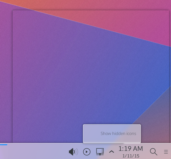
  • Plasma could display widgets directly on a panel, below window thumbnails, or even directly on the desktop itself, controlling windows without even opening them. Exporting windows controls to a plasma panel may allow some applications to run completely  chromeless.
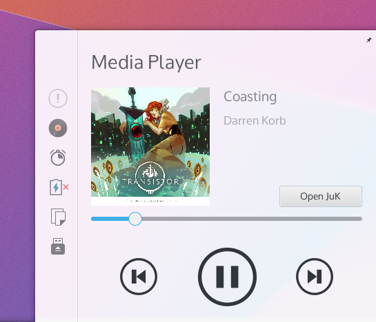
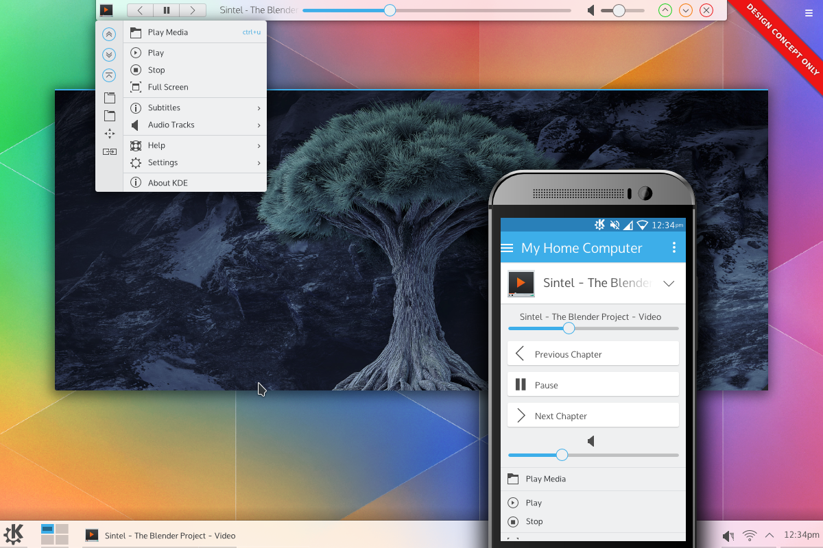
  • A media player might export its most prominent controls, and you could use them in the task-manager window preview without ever restoring the window. (thought in some scenarios it’s also possible with MPRIS)
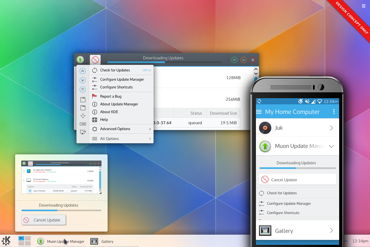
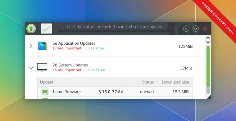
  • Tools like the amazing KDE Connect could receive requests for controls and embed them on your phone. You could conceivably open your phone – in another room – and tell Muon to do an update and watch the progress from your phone.
  • Finally, raw console. Not so much for usage as much as it would be used for testing the protocol in a bare-metal way.
DWDs could be exported to panels, window decorations, or potentially even phones.

DWDs could be exported to panels, window decorations, or potentially even phones.

What would DWD look like?

DWD in decorations would look remarkably like CSDs, but more consistent. Applications would not have the ability to say “I want my decos on the bottom”, or “I want my window frame to be pink and furry”, or “I want my window to be a trapezoid”. DWD applications could, however, provide a stripped-down version of the standard colour palette used by KDE which the DWD Receiver could optionally use, which the user could still optionally disable.

What is important to notice, however, is that as opposed to CSD, the window decorator remains in full control. If an applications asks the decorator to use a special color palette and the user doesn’t want that, the window decorator can decline the request and keep all applications visually consistent.

If you were the type of person who has a theme with their window controls on the bottom, you can rock bottom-window DWDs! Do you like your minimise button on the left, and your close button on the right? DWD can fit in the middle. A core goal is the acknowledgement that users know what’s best for themselves. You should be able to configure what you like, and have your preferences enforced by the system.

DWDs could export most - if not all - chrome in simple applications.

DWDs could export most – if not all – chrome in simple applications.

If a computer doesn’t have DWD – or you disable DWD, then DWD would simply fall back to drawing widgets inside the traditional application area as usual. So if you use Gnome, XFCE, Windows, or Ratpoison, DWD won’t break other environments. KDE apps would look and run almost exactly the same as they do now; when they open they would quickly negotiate with the DWD server to determine if they should hide some widgets from the content of the window and have the server render them in the DWD instead, always showing the widgets in the traditional content area if no DWD support was detected.

In addition, applications such as Mozilla Firefox could use plugins to export their tab data and hide native tabs – giving non-standard applications full DWD support. Since DWD would be standardised, any plugins of this manner would only need to be updated to support the application – and would work wherever DWDs are supported.

Distributions could potentially brand CSDs knowing they would not be violated by applications.

Distributions could potentially brand DWDs knowing they would not be violated by applications.

How might DWD work?

DWD is a protocol based on applications exporting the structure of a small set of widgets, along with a menu, and metadata such as colour schemes and technical info in a client<->server<->console relationship. This would be done in an environment independent manner, so DWD could function on any environment that wants to implement the protocol.

The specification would limit applications to exporting from a set of predefined widgets, and the control of how those widgets are used is entirely up to whatever is drawing those widgets. The protocol would be kept simple, clean, and goal-oriented, with less focus on specific widgets (“I want a slider”) and more focus on actions (“I want a range”). Applications could not invent new widgets, but new widgets and goals might be added to the specification later as the demand is noted.

Many services could accept DWD controls, and act as DWD consoles; the window manager could display CSD-like controls, Plasma could embed controls in a number of places, and KDE connect could receive content, too.  DWD would not be a replacement for protocols like MPRIS, but for many applications DWD would help broadcast a wider range of controls to outside sources than normally feasible.

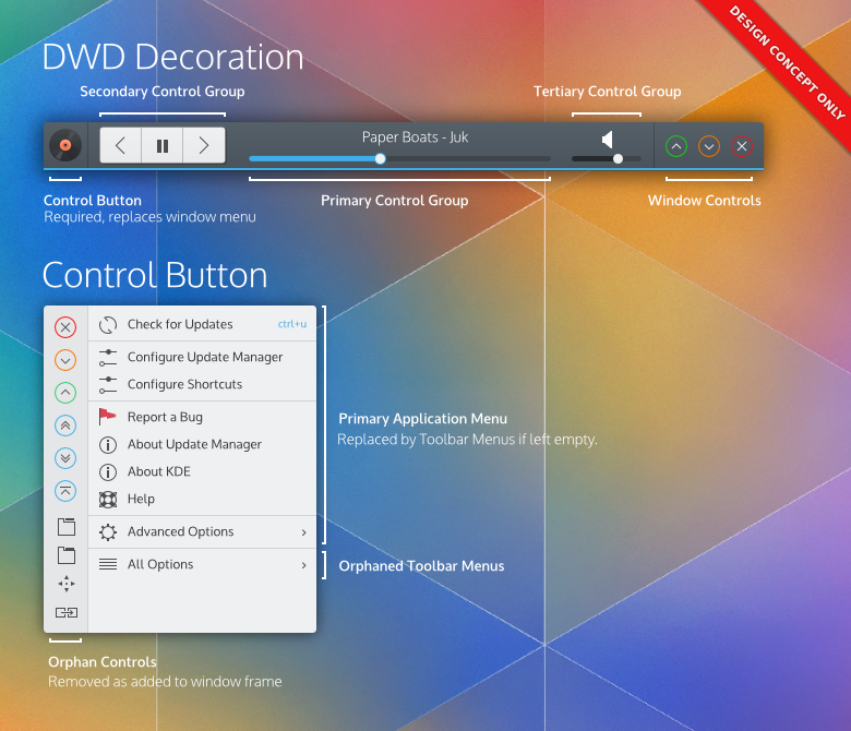
The two main componented of DWDs; the control menu, and the console client (here shown as a window decoration)

The two main componented of DWDs; the control menu, and the console client (here shown as a window decoration)

As the widgets are drawn by the ‘consoles’, the window manager can handle applications that are stuck as it does now, allowing the various consoles to much more gracefully disable them until the application becomes responsive or is forced closed; so none of the downsides of CSD crash-cases impact DWDs. The primary goal of DWD is for Dynamic Windows Decorations, and it should always be the first design goal, but DWD opens many other possibilities.

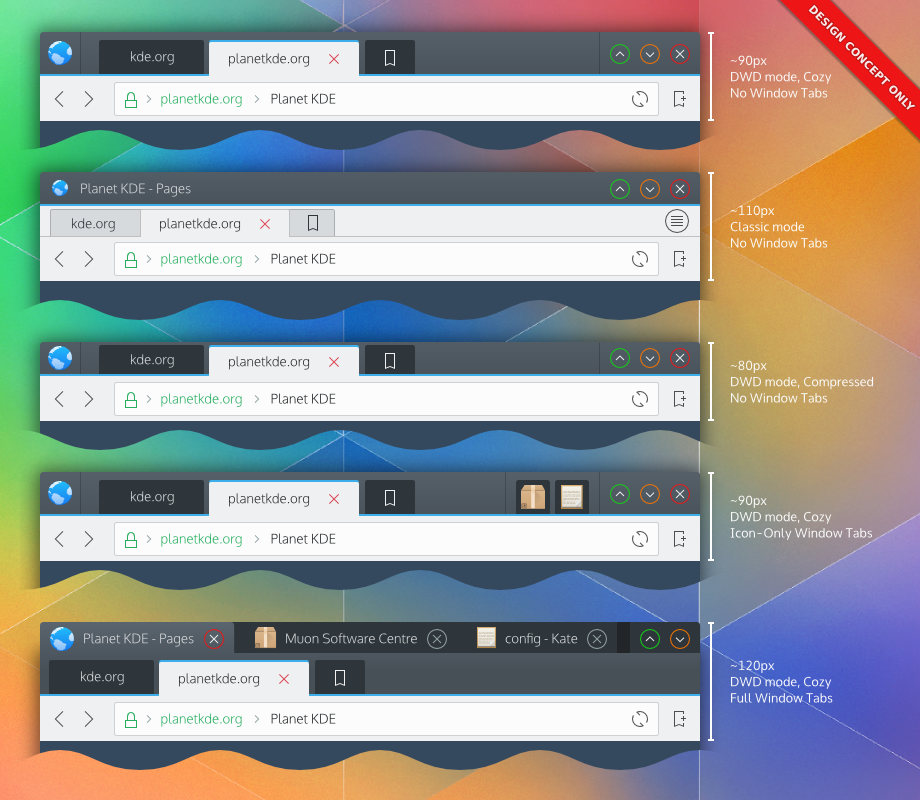
DWDs in various states and configurations. The second example illustrates DWDs in enviornments without DWD support.

DWDs in various states and configurations. The second example illustrates DWDs in environments without DWD support. Window decorations could easily offer different modes to better accommodate screens; Example 3 is a compact variant. Window decorations could also side-load or bottom-load decorations on the window – it’s up to the user.

Where can I learn more?

I’m sure there will be several developers reigning hellfire in on the various mistakes this post probably has – so the comments section will probably become a good place. But I’d recommend avoiding flooding developers with DWD questions; you will likely see DWD posts come out on aggregators or social circles, and until we have a firm grasp of how this technology might form – we request your patience. Smart people with more influence will likely help change these designs dramatically for the better if they go forward.

I will be posting more in-depth designs and work on individual components of this DWD concept, and refinement will happen as feedback rolls in. I, personally, will not post any more technical details on how DWD may work – I’m not qualified to go deeper on this subject, and again, smarter people will figure it out better than my conclusions; I’ll continue posting designs and concepts for DWD applications as a mini-series in the coming week, with more focus on individual DWD elements and application.

And again;

This is still deep, deep in the conceptual phase and we don’t know *if* it will be implemented, when it would be implemented, how it would be implemented, or when it would be adopted. There’s a large number of ifs, and we don’t have specifics. One thing we will say is that currently, this is the idea with the most developer interest.

Also, we are actively seeking community feedback on the DWD concept, use-cases which might be desired, and developer feedback. I’m sure we’d also want feedback from other projects interested in the DWD concept.

Lastly, there’s many examples in this post; many developers are probably finding out about this concept the same time as you – please don’t inundate them with questions, as, again, we don’t know if this concept will even be implemented. KDE developers are extremely busy with many fantastic features, so please respect their inboxes.

Thank you.

Last, but not least;

I’d like to give my sincerest gratitude to the KDE community for the support of my initial PlanetKDE posts, and especially to the excellent KDE VDG group whom I’ve had the privilege to work with. They absolutely define great community. I’m so excited to have gotten to bring the earliest VDG DWD concepts to the community, and the Visual Design Group was simply amazing in making it happen, so thank you!

What if… KDE Used Windows 10 Design Components?

A study of what-if scenarios which posit what KDE would look like if it took a different approach to certain aspects of design. Note that these posts are in no way “the direction KDE is going” and are simply a study done to reference designs and ideas we may never have investigated.

Forward

First, a brief overview of Windows 8;

Windows 8 was Microsofts’ first step towards creating a unified ‘experience’ between the range of products running Microsoft Windows. Before Windows 8, early tablets which ran Windows typically ran a traditional Windows desktop; because desktop Windows was designed for mice, it typically required a stylus, trackball, or other similar input; keyboard solutions were universally sub-par. Microsoft ideally wanted its mobile audience to use laptops and phones instead of tablets. Apple and Google later devoured the tablet/phone market with iOS and Android respectively, and touch-screen devices became the norm. With their advantage in touch input, these two systems grew into tablets. This left Microsoft in a bind; Windows mobile was not capable of delivering a capable experience, so instead of taking the route Android and iOS did (growing their OSs’ up) Microsoft decided to begin shrinking its more capable desktop OS down. Windows 8 was the first step in this process, and essentially laid a touch-centric layer on top of a traditional desktop OS. The end result was an OS with split personalities and it required desktop users to work around touch components, while mobile users more/less had a decent – but more limited – experience.

Windows 10 is Microsofts’ attempt to correct the design flaws of Windows 8; Mainly by allowing the interface to vary between form-factors, such as including a start menu and introducing a multi-desktop mode.

Consumption vs Work-Oriented Design

In terms of design, Windows 8+ has a much more consumption-oriented design, as opposed to a work-oriented design; and it has a large amount of data throughput even in the main menu. This is appealing to mass-market users who desire quick access to information, and the ability to quickly act on it. For example, the twitter live-tile not only shows the latest updates, but is a one-click access point to that data. We don’t have that efficiency; we can launch applications, or display plasmoids, but we don’t have an efficient solution that does both. On the other hand, users have complained that the live-tile interface can become chaotic, with literally dozens of tiles calling for attention.

Desktop Linux and KDE have traditionally kept towards work-oriented designs, and consumption efficiency is left in the hands of the applications. This is trouble for KDE, because we don’t bundle simple applications which other environments do; i.e weather, maps/directions, or a clock/timer/alarms app. We do keep these as desktop components, but instead of simply launching applications, KDE requires a user to use complex editing tools to add and configure those widgets. In addition, if we did bundle those applications plasma widgets still do not launch relevant applications; our weather plasmoid does not launch a weather app, our photo widget does not launch a gallery. This poses another problem because a user must also know how to create a dash with independent widgets and know how to invoke that dash if they do not wish to crowd their desktop with plasmoids.

One way this could be solved would be creating a class of “launcher widgets” which are read-only QML widgets the system would treat as icons. Additionally, we might create a new file-level protocol for a QML “icon widget” format which could enable dynamic icons for application launchers. For example, a weather app might have a QML-based icon which displays todays’ weather. Though this could cause serious performance ramifications if implemented poorly, and adds dramatic complexity to simple file-browsers.

It should be noted that you can launch plasmoids in KDE through KRunner, but this method is pretty much inaccessible for regular users. This feature is much more slanted towards development than actual real-world usage.

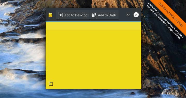
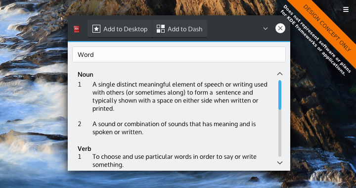
KDE should consider allowing widgets to flag themselves as being “launchable” – allowing them to be launched similarly to applications from a proper applications menu. Sometimes you need to make quick notes about something without the need to save files or open the “KDE Advanced Text Editor”. Maybe you just only need the dictionary once in a blue moon. Allowing these to launch as KDEs’ version of “modern apps” might be highly beneficial, and give access to KDEs well-designed plasmoids without the need to modify the desktop. Also, our container application which actually contains the widgets could offer buttons to do things like quickly add the app to the current desktop, panel, or dash. This could later be integrated into Martin Gräßlins’ server-side-decorations.

The notes plasmoids - launched as an application

The notes plasmoids – launched as an application

While a great deal of applications are being written in QML, launchable plasmoid applications for KDE might be a good option when use-cases are simple-enough to be desktop-ready, but still useful enough to work as ‘standalone apps’. This might also make plasmoid development more attractive to developers who work more in traditional applications. Things like maps, directions, notes, cloud-based services, contacts, and other simple utilities – especially those which piggyback off the system – would be especially viable if developed under this model. Not only would we have our own ‘metro apps’, but these ‘Plasma Apps’ would be incredibly flexible in their ability to integrate to the desktop.

The dictionary plasmoids - launched as an application

The dictionary plasmoids – launched as an application

Start Menus

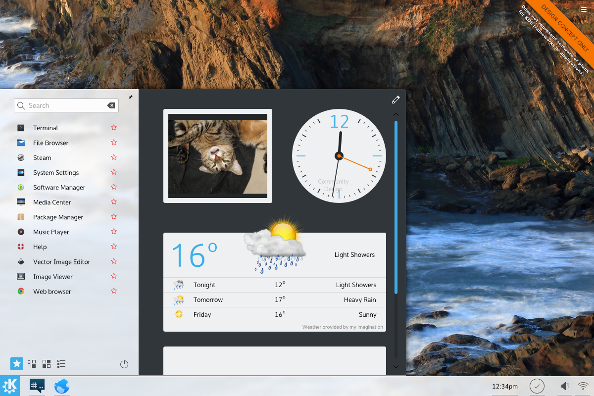
The Windows 10 Start menu has embedded live tiles. For plasmoids which aren’t big enough to be launched as applications, or not used consistently enough to be placed on the desktop or in the panel, Plasma could offer a launcher that has an embedded widget tray, or offer pop-up containments which could house collections of plasmoids.

Embedded widgets in a start-menu like launcher

Embedded widgets in a start-menu like launcher

Technical Challenges

For the most part, Plasma is already flexible enough to allow us to extend plasmoids into ‘Plasma Apps’. As a matter of fact, the plasmoid preview utility used by developers already gets us most of the way there. For the most part, there’s no real (obvious) technical hurdles.

One design aspect would be making a ‘native’ plasma theme for plasma running in an application mode.

Pros

  • Launching plasmoids as applications offers extreme occasional-use convenience.
  • Ensuring widgets can easily launch related full applications fits the “simple by default, powerful when needed” mantra.
  • Application developers might be more interested in plasmoid development when KDE users could launch it as a ‘real app’
  • It would help fill KDEs’ need for simple applications.

Cons

  • Users might not appreciate their program lists getting filled with plasmoids, especially if they can’t be hidden.
  • Plasmoids looking to be used as applications would need to account for more static contexts or alternate storage locations.
  • Everything listed here would add redundant applications to the system.
  • If plasmoids launched generic types of applications, we would need tonnes of default application types; default weather, default stock ticker, default dictionary, etc.
  • Applications lists would need to be overhauled to display plasma-apps.
  • Adding widgets to widgets (for the ‘start menu’) would need a clever editing UI, adding complexity.

Notes

Overall, the main issue KDE has is the disconnect between simple applications and simple plasmoids. KDE does have the functionality of other desktops in plasma, but it can feel more cumbersome to access it, especially if it’s in a situation where you may only need it on occasion. Plasmoids like the dictionary are the perfect example of this; I know no-one who refers to a dictionary often enough to constantly need one, but I can also say everybody likely needs one on occasion. For me, launching a browser and doing a Google search is faster than digging out the plasmoid. I don’t use the dash either, but even still do we want the KDE dash to be the junk-drawer of occasionally used widgets forever?

I found that adding live tiles was beneficial to the start menu, as it does become a simple notification area; I think it would be beneficial if we were capable of embedding widgets into launchers or secondary ‘container plasmoids’. I think KDE did do this at one point – can anyone let me know? I also think launching applications by directly clicking on plasmoids should be added; opening a full weather application would be great if we could package them together, and the same goes for stocks, maps, etc etc.

Chime in!

What are your thoughts on creating a more consumption-oriented design? What did I miss, any addendums? Let us know!

What if… Plasma Used Launchers from Other Systems & Enviornments? (Part 1)

A study of what-if scenarios which posit what KDE would look like if it took a different approach to certain aspects of design. Note that these posts are in no way “the direction KDE is going” and are simply a study done to reference designs and ideas we may never have investigated.

Forward

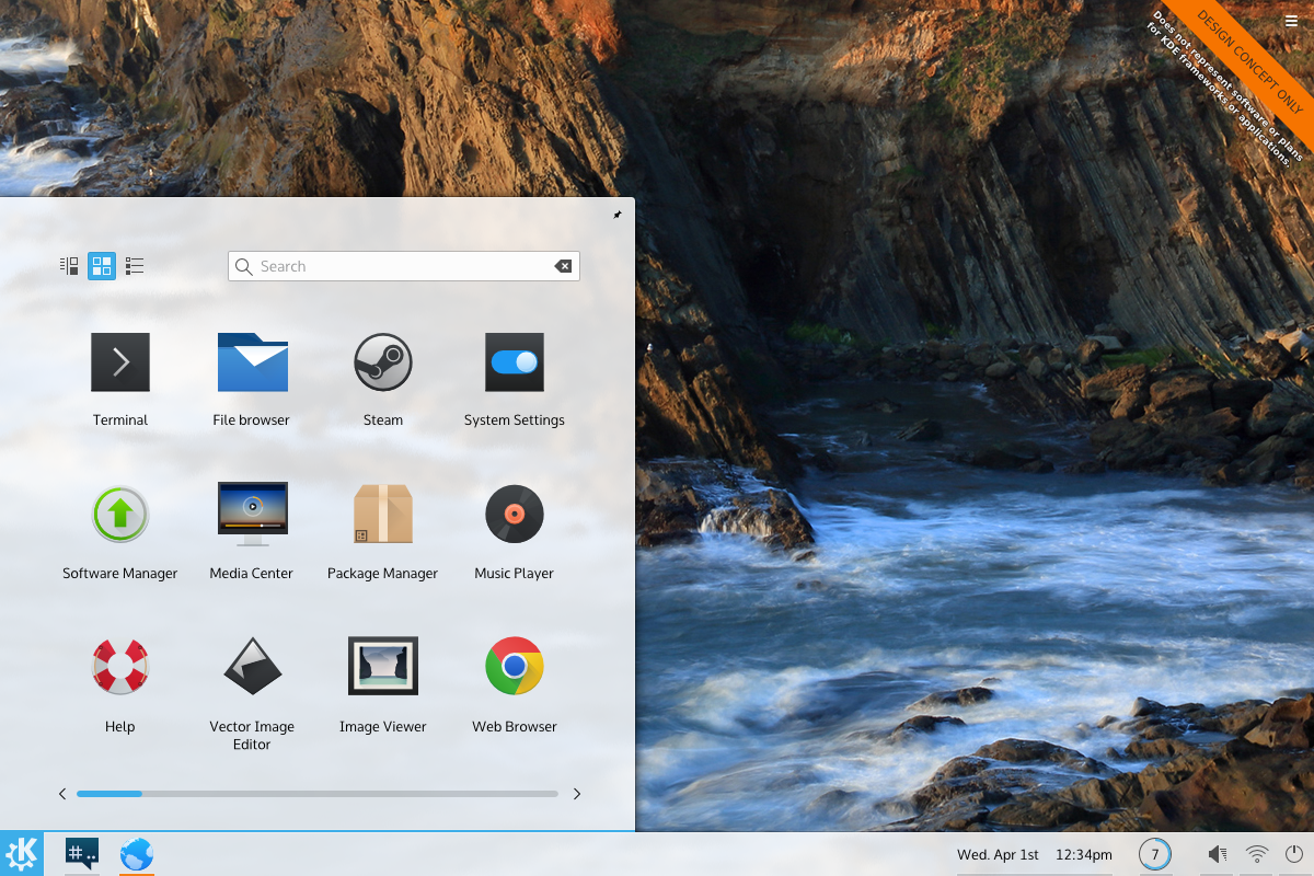
KDE and Plasma has several methods of launching programs; simple list menus, quick short-cuts, powerful multi-component menus, and task ‘pinning’… Command line. Plasmas’ default setup is to use two of these in tandem; ‘task pinning’ and multi-component menus.

Other environments tend to use the same methodology, but usually with far less configuration options. Windows, for example, often allows pinning applications as quick launchers, and a multi-component menu. Apples’ OSX takes a different approach, using a multi-component quick-launcher (the dock) and opening components via the file manager. Elementary OS takes a middle-road having a multi-component dock, and a simple launcher. Gnome uses a multi-component dashboard which serves as the ‘nerve centre’ for application launching and management.

For the sake of brevity (hahah! Like that’ll happen!), part one of this what-if will focus on Elementary OS; in addition to looking at launchers, the overall feel of the systems will also be briefly explored and discussed separately.

What if… Plasma Used Launchers from Other Systems & Environments Elementary OS?

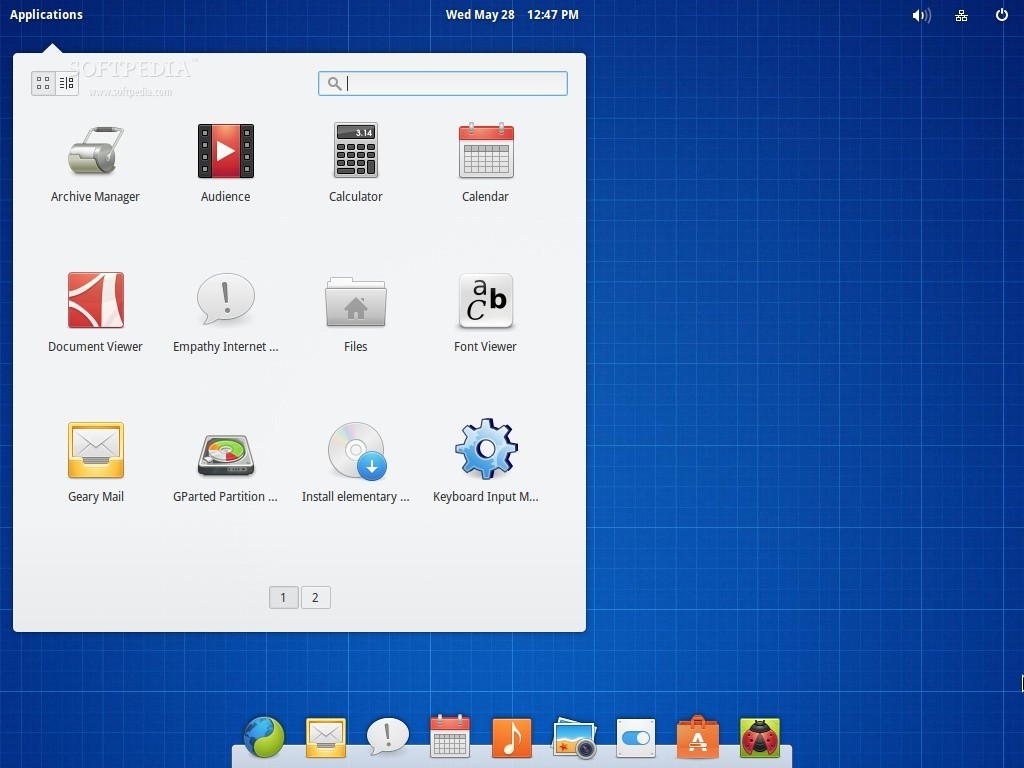
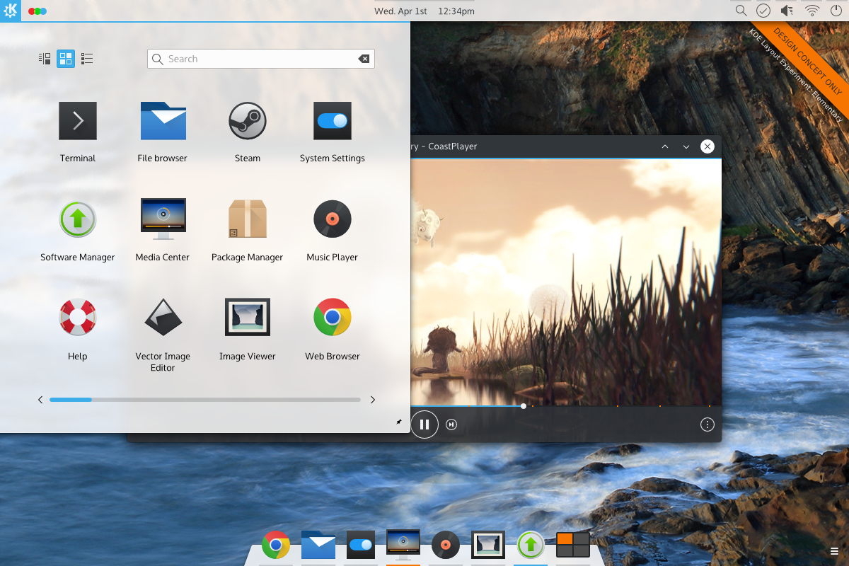
Elementary OS is a distribution of Linux which makes used of a highly customised desktop shell called “Pantheon”, which originally started as a set of modifications to the Gnome desktop. It consists of a panel at the top, and a dock at the bottom. While visually similar to Apples’ OSX, Elementary aims for a mono-tasking approach on all actions, and has a simpler approach to task/application launching and management.

by Softpedia

by Softpedia

I’m going to mention “Mono-Widgets“, “Compound Widgets” and “Multitasking Widgets” several times; this is because my analysis of KDE/Plasma and Elementary presented the need for some vocabulary.

  • When I refer to Mono-Widgets, I’m referring to a widget which performs only one operation. For example, the Elementary Launcher very strictly finds and launches applications. It does nothing else, and dismisses itself when the single task is complete.
  • Compound Widgets perform several functions, but when a user enters a compound widget they only do one thing, then the widget exits. They only ever use one part of the widget per invocation. KDE Launchers fall into this category, bundling power, application, search, recent documents, places, favourites, and other functions into one area; however you only ever do one at a time, and then the widget dismisses itself.
  • Multitasking Widgets are widgets where you’ll enter them, work on a task or two, and eventually dismiss them when you are finished. For example, the network widget will have you create, modify, update, select, and delete networks and basic network settings. Where this differs from Elementary is that Elementary will only list existing networks, opening a separate program to edit them.

Comparison to KDE/Plasma

EOS desktop components such as the Plank (the dock), and Slingshot (applications launcher) are extreme mono-tasking widgets, simplifying the work-flow substantially but also necessitating more individual widgets. A good example of this is the exclusion of power options in Slingshot, but the addition of a power widget on the far side of the panel. Ironically, KDE contains a much more comprehensive legion of widgets, many of which mono-task similarly to Elementary widgets – but instead Plasma defaults to compound widgets and multitask widgets.

Elementary supports minimal customization options out-of-box. Because they have chosen to avoid customization Elementary must approach their static configuration with much more discipline. Combined with their minimal approach, there’s a distinct feeling that every UI element added was harshly scrutinised before inclusion. Elementary almost never hides UI elements in their desktop environment; if a widget would not have space to include all the options necessary, it will instead attempt to include the options for most use-cases and provide access to a more comprehensive application. On the other side, Plasma widgets don’t tend to launch applications.

“An undiscovered feature really doesn’t exist to people who haven’t found it.”

“Simple by default, Powerful when needed”

The Plasma default layout tends to focus on displaying fewer compound widgets which rely on more robust configuration. Compound widgets come with all functionality enabled by default and tend to be “configured down” in a way that users must pick what they [i]don’t[/i] want; this is directly counter to “Simple by default”. Elementary on the other hand has exceptionally focused mono-tasking widgets, but no configuration options. In other words, Elementary meets the first half of the mantra (Simple by default), but the plasma desktop achieves neither (Powerful when needed)

KDE-style Plasma Panel, Elementary Launcher

KDE-style Plasma Panel, Elementary Launcher

Widgets in plasma which do focus on mono-tasking (such as the calendar) tend to have a higher focus on design, and are exceptionally intuitive. KDE developers could and should investigate the creation of more mono-tasking widgets for areas currently dominated by heavy-duty compound widgets. Developers could also re-investigate the default layout after mono-task widgets are complete to relegate much heavier widgets to configuration options. By packaging simple widgets into the default configuration and keeping heavier widgets as options KDE would further achieve the “Simple by default, powerful when needed” mantra.

The best example may be the Kickoff launcher which features favourites, applications, places, recently used files, account info, search, and other options. Some of these exist in other widgets, and the launcher could be forked into its remaining constituent parts; a launcher, a recent files widget, a computer widget, an account widget, etc. Plasma fails in intuitiveness when it packs this functionality into a widget and hides some components to keep the design clean such as hiding search in its launcher – where Elementary refuses to hide any feature. While this makes individual plasmoids powerful, it actually reduces the functionality because an undiscovered feature really doesn’t exist to people who haven’t found it.

Elementary styling takes over

Elementary styling takes over

Technical Challenges

Extra widgets would need to populate panels for a mono-widget design

Extra widgets would need to populate panels for a mono-widget design

If KDE were to attempt to lean towards an Elementary setup the largest hurdle would not be the addition of features or new monotasking widgets, but instead the streamlining of the desktop and its options into a functional, streamlined, and focused desktop without upsetting its user-base. This is less of a technical problem and more of an emotional one: KDE users tend to worry when applications become ‘dumbed down’ despite the fact that functionality remains. Granted, Marco Martin has done some fantastic work which eases operations like the swapping of widgets, so the road to quickly allow users to reconfigure to more complex setups has been paved.

Pros

  • Elementarys’ static structure requires far less cognative throughput on its users
  • Mono-widgets are lightweight, and visually more appealing. They have high discoverability.
  • Mono-widgets are simple to understand and intuitive. Search will want you to type something. Launching opens applications.
  • Configuration options which do exist are easier to understand, and will likely be better understood.
  • Elementarys’ highly disciplined approach packs similar functionality into a much smaller package

Cons

  • Mono-widgets are functionally a step back.
  • Each mono-widget requires a way to get to it, pushing complexity up the UI to areas like the panel.
  • Sometimes operations are complimentary or highly similar, and that is lost in mono-tasking. For example, a launcher search and a file search are highly complimentary.
  • Mono-tasking can result in a “good enough” experience where widgets get the job done, but sacrifice power and convienience.
  • Mono-tasking can make an otherwise capable tool feel oversimplified or underpowered.

Notes

Activities are an unknown hallmark of KDE

Activities are an unknown hallmark of KDE

In Plasma, default widgets should enforce a minimal configuration by default to present core functionality first, then allow users to “configure up”. For widgets added to the system via configuration tools, we should remain with the “configure down” approach to expose functionality when a user adds a (presumably) unknown widget. This is much more in-line with the “Simple by default, Powerful when needed”.

While Elementary is considered Linuxs’ most “elegant” desktop, KDE has more technology to quickly and easily iterate. KDE5/Plasma5  makes far better use of text and design elements, and actually feels more “designed” compared to Elementary in some areas; when you inspect an individual widget in Elementary they can be surprisingly utilitarian and uninsipred. The calendar is a prime example of where KDE has more visually appealing design. When Elementary Freya is released, I have no doubt that if KDE/Plasma developers hunkered-down and focused on design, we could “out-Elementary” Elementary by their next release.

KDE always needs a menu widget for usability reasons

KDE always needs a menu widget for usability reasons

On the inverse, KDE developers tend to lean towards “proper” system-level design, making them less willing to make technical exceptions for strictly design reasons, or at least slow KDE design down while better methods are engineered. This is not a bad thing. For example (as far as I know) KDE will not kludge in code to make docks adjust their colours based on wallpapers; but when similar functionality eventually does hit, it will be done in a way that is technologically superior, where plasma theme designers could easily tap well-designed APIs. Often, this comes down to the “glue” libraries used by KDE when adding APIs to QML.

An icon-sized desktop switcher is easily embedded as a plasmoid.

An icon-sized desktop switcher is easily embedded as a plasmoid.

Overall, technology-wise, KDE is capable of easily out-designing Elementary OS in a sustainable way; but where KDE has Technology Elementary has tenacious focus and dicipline we should learn from. They don’t try to please everybody, and perhaps KDE/Plasma shouldn’t try either. Focusing on a simpler default desktop enviornment and having power-users configure-in more powerful widgets where they want it may ultimately be a better model; power-users can be expected to “configure up”, but casual users won’t “configure down”.

Chime in!

What are your thoughts on Elementary OSs’ design merits? What did I miss, any addendums? Let us know!

What if… KDE Started using Client-Side Decorations?

A study of what-if scenarios which posit what KDE would look like if it took a different approach to certain aspects of design. Note that these posts are in no way “the direction KDE is going” and are simply a study done to reference designs and ideas we may never have investigated.

This is also an older what-if, and since it has been written, work on different approaches to design highly dynamic decorations has advanced. This post is here more/less for posterity. More info will come later on other methods.

Forward

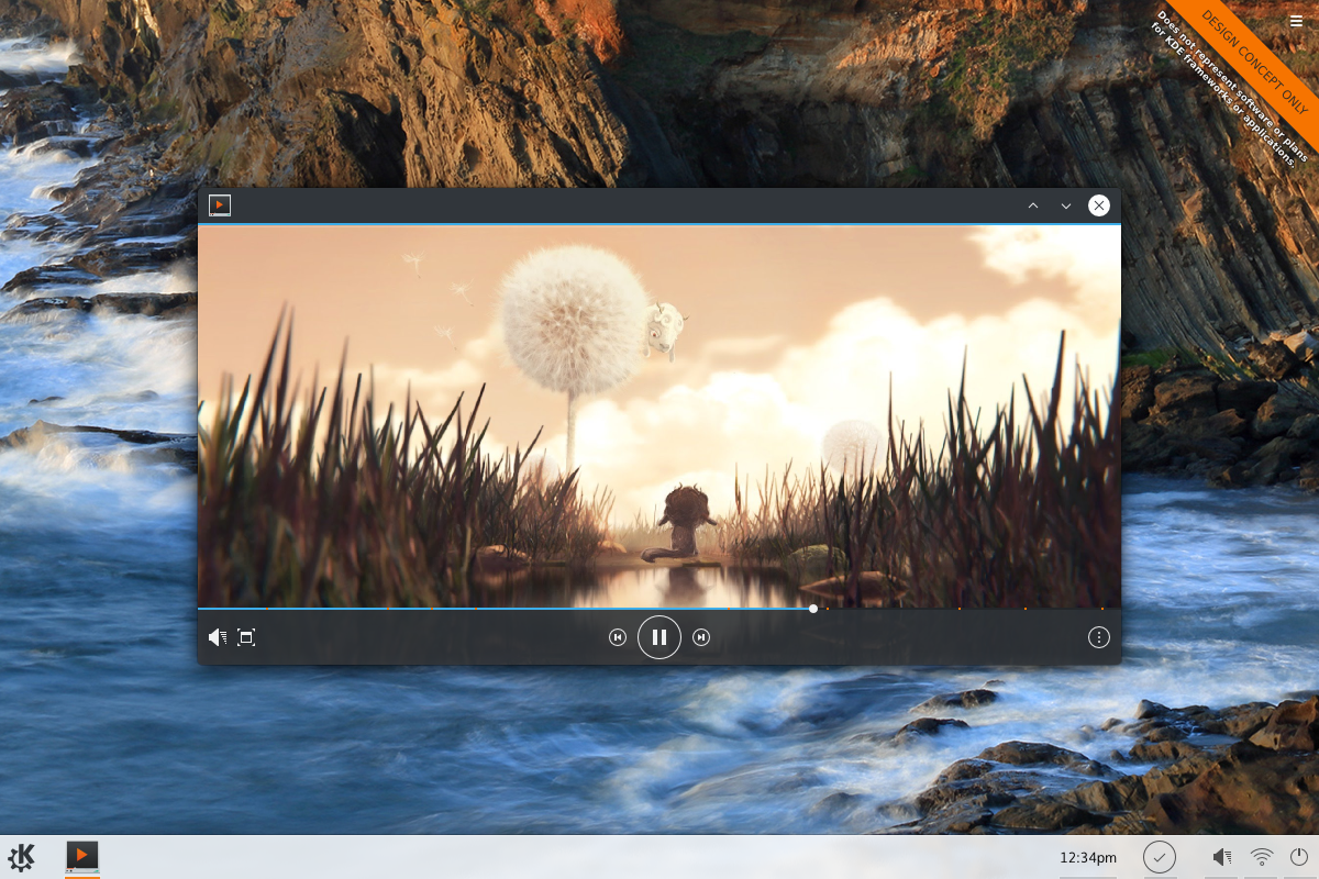
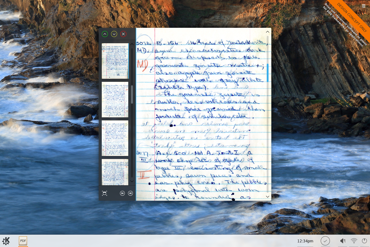
“Client-Side Decorations” (or “CSDs” for short) are a method of decorating windows where the application is responsible for the window frame. Commonly, Linux and Linux desktop environments have favoured “Server Side” decorations (SSDs for short), where it was up to the window manager to draw the window frames. In this “What if” scenario we’ll explore two hypothetical applications; a media player and a PDF viewer, programs which might benefit from CSD technology. Before the CSD-enabled mockup, here’s what the media player application might look li ke using KDEs’ current SSD method:
csd-movie-nodeco

And here’s what it might look like using CSD:

csd-movie

In the CSD design, the various window buttons are moved down into the control bar of the media player. This saves vertical space, meaning an un-maximised video will always be slightly larger. In addition, the buttons can follow a separate theme from the main window; in this case a less distracting button is used. Additionally, the application could partially fade buttons in the bottom bar, or, if the bar was laid over the video the entire bar could be faded out (when the mouse leaves) for maximum display – though this is not in the mockup.

csd-pdfreader

In this PDF reader, the CSD is on the left, and uses the thumbnail column as the decoration. As PDFs generally tend to be a series of portrait sheets, vertical space is at a premium.

Technical Challenges

The main technical challenges faced by KDE developers is ensuring application consistency will continue to work under various form-factors. When Kwin (the KDE window manager) controls window borders, it can quickly and gracefully adapt to multiple form-factors. For example, in Plasma active space is at such a premium KDE can hide window decorations and embed them into the workspace itself.

The other technical challenge is protocol and cross-enviornment consistency. It’s known that CSD-enabled applications can look extremly awkward when window borders are wrapped around an application not designed to use them. In addition, protocols for drawing CSDs on Linux are a mish-mash at best, and CSD code tends to be far less portable to other desktop environments. Compounding that, KDE has additional features (such as window tabbing) which are inherently incompatible with the feature.

If KDE were to use CSDs, it would likely be preferable for all applications to support CSDs as a secondary ‘upgrade’ and default to using SSDs until the window manager explicitly enables the CSD; meaning KDE apps with CSDs would need alternate layout code. KDE might also need to reserve the ability to revoke CSDs from an application or flag them to keep CSDs disabled; for example, it might only allow Wayland-composited environments to use CSDs, as Wayland has protocols for CSD-specific problems (such as application hangups). It might revoke the CSD layout if a user disabled it, or if an application is moved into a window-tab.

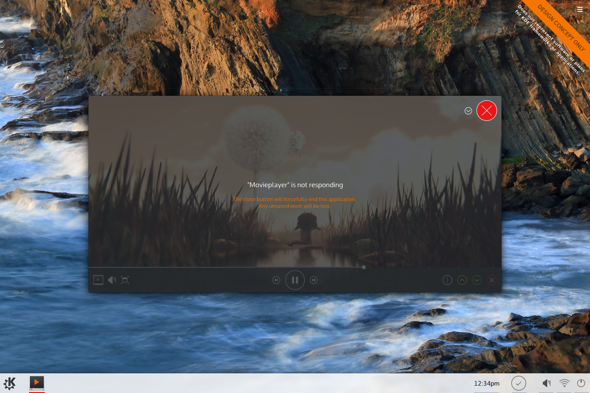
Application crashes are another significant issue; If applications are made responsible for their own close buttons you enter a situation where the close button on a crashing program will fail to function. There are several technical aspects to this which can defer the impact, but in a worst-case scenario the GUI of an application will become an non-responsive picture. Wayland has solutions to detect this, while Xorg is a hot mess; if Wayland/KDE used CSDs, a window manager overlay might need to be created in the event of a crash to retake the minimal window-level control of applications.

csd-movie-crash

Pros

  • Applications would waste less space on screen; for small laptops this is a significant advantage.
  • The decoration can be placed on any side. Applications like a movie player could hide decorations completely.
  • Applications with a full-screen mode may just use the same chrome in full-screen, maintaining placement of close/minimise/maximise buttons.
  • A strong CSD protocol/library could ensure reliability[/list]

Cons

  • Outside of the extra code overhead, applications could more easily break in the future as technology changes.
  • Depending on the implementation, applications could be larger.
  • Kwin would need more code to recover, mark, or kill crashed CSD applications.
  • Consistency is lost; Windows might place buttons on the top, bottom, left, or right. Users would need to adjust to applications individually.
  • Poorly chosen widgets can interfere with window dragging, space meant for dragging windows might be lost.
  • Depending on implementation, polling mechanisms might falsely label applications as non-responsive.

Other Points

  • Applications can crash many ways, causing whole-system breaks. SSDs can’t police the whole system; Bad applications shouldn’t be the example.
  • Using an “SSD until otherwise permitted” model can still allow users who dislike CSDs to enforce SSDs.
  • KDE applications are beginning to ship with multiple layouts for convergence purposes; CSD layouts might piggyback on this.

csd-samp-1csd-samp-2csd-samp-3csd-samp-4

Notes

On a personal level, I love applications which properly use CSDs. They’re more screen-efficent and applications can look much more professional. I also believe that CSDs will be inevitable, and that a strong KDE CSD library which enforces smart use of CSDs would be better now than applications inventing their own solutions later; especially when other environments are starting to make good use of it.  After looking at Gnomes solution, I do think CSDs as-an-upgrade would be ideal, as applications can behave “normally” until they get the go-ahead to be shiny. This will help KDE apps fit into environments like Windows, OSX, or Gnome without issues. Also, users might want to forcefully disable CSDs desktop-wide for consistency purposes, and having CSDs as-an-upgrade would assist in this.

I also think that CSDs should also be required to adhere to Kwin specifications will first and foremost; while it’s nice applications might ‘brand’ themselves using colours or unique styling, I believe allowing Kwin to dictate the style would be a usability win. In addition, KDE 5 is incredibly friendly to dark themes (or is increasingly getting better at it), and allowing CSDs to colour themselves would take away from user options. On the other hand, since windows would not necessarily display titles, colouring becomes an important identifier.

I also like the idea that a full-screen application could just continue recycling the same piece of chrome; often applications use entirely different UIs in full-screen mode, which reduces usability – especially when hot-keys are required to exit fullscreen.

Technology-wise, I’ve read impressive articles on Wayland in regards to how they’ve thought through many CSD specific problems – such as application crashes rendering windows unmovable. No matter how its sliced though, CSDs should be approached carefully and thoughtfully if they were to be implemented as a part of KDE in the future.

In terms of the “simple by default, powerful when needed” mantra, CSD decorations follow the pros and cons listed above; mainly by making more efficient use of screen-space and giving applications a more simple, less intimidating demeanour. On the other hand, it decreases the intuitivity of applications by potentially moving window controls, or causing issues in event of a hangup. I think CSD driven designs tend to be more simple and reserved (at least as Gnome has done it). Disabling the CSD desktop-wide for features like window tabbing is where “powerful when needed” kicks in; especially since its an uncommon and difficult to discover feature.

One Last Note;

This is actually a fairly old what-if, and since it has been published work on different approaches to design has advanced. This post is here more/less for posterity.

Chime in!

What are your thoughts on CSD; what did I miss, any addendums? Let us know!