Streaming this Saturday

This Saturday (Feb 19th) from 12:00pm to ~4:00pm EST I’ll be livestreaming preliminary work on the Plasma 5.25 wallpaper, as well as a brainstorming session for possible directions the Plasma 6 wallpapers could go. Iconography might also be a thing.

Abstract KDE NeuralBlender Example

The Plasma 5.25 wallpaper work is mainly going to be sketching in Krita, and there may be 2 or 3 sketches that come out from that process. After that will be exploring ideas I’ll be proposing for Plasma 6, including KDE-prompted neurally generated images being used to find new and interesting design concepts.

Lots of Video News!

I’ve been incredibly happy with the very early success and interest with the videos produced the past couple weeks… Both of them. While I think the attention received may have been oddly disproportionate to the quality of the content, I feel I can do far better and will be stepping up my video game!

First, I’m going to be breaking up my current YouTube account into 3 distinct channels outside of my personal videos; “Kver Create!”, “Kver Play!” and “Kver Workshop!”. I’m furiously trying to get everything ready, but here’s what everyone can expect:

Kver Create!

Will focus on work, and will be mostly livestreams. This is where I’ll be doing things like wallpapers, icons, other art, development, and even personal projects. It’s also where I’ll publish excerpts of the previously recorded livestreams when there’s interesting segments. In the future it might be neat to feature other artists and developers as well. Expect regular KDE content here.

Kver Play!

May or may not have a future, but if my first livestreams taught me anything it’s that I’m not yet comfortable with the mic, so what’s a better teacher than a more casual and fun environment while I rehabilitate my voicebox? This will probably have the most livestreams out-of-gate, but I imagine it will slow down in favour of other channels as time goes on.

Kver Workshop!

This is by far the channel I’m most excited for. It’s also going to be the last to see published videos, as I want to put the most branding, thought, and production effort into it before content start rolling out. Workshop! will cover a variety of topics, such as digital art, development, and even just using the various desktops in Linux.

For every topic there will be two types of videos: The first is short sweet to-the-point tutorials showing you how to use a tool or accomplish a goal in a program. That might include showing you the snapping tools in Inkscape, the animation docker in Krita, or the web inspector in your browser. The second type of videos will be “Advanced Workshops”, and I’m giddy over what I have planned! When a workshop is scheduled a series of tutorials will be produced in advance, the workshop will list those videos in the lead-up, then the workshop itself will put that knowledge into practice. Workshops will always be livestreamed so participants can ask questions, interact, and learn how to push their software to the limits. Once the format is fully ironed out I really want to bring in other experts, but that’s down the road.

An example of what sort of thing you might expect to learn in a workshop is how to draw semi-realistic hardware such as the laptop featured on the kde.org homepage – with leading tutorials covering things like the perspective tool and keeping vector art web-friendly. Another example of a workshop might be how to make KDE Plasma icons to standard, and down the road I’m even thinking of getting in touch with Gnome/Elementary/etc folks to see if they want workshops run to make assets in their standards.

What’s coming up?

I’m still working on making everything reasonably presentable, so the first videos will be rolling out a bit later towards the end of this upcoming week, but once it’s all up-and-running I’ll aim for an initial schedule of 4 livestreams/week, and once the Workshop! fiddlybits are sorted out we’ll trade in a livestream or two for more tutorial content. Here’s the schedule for next week:

  • Thursday January 20th at 12:00PM EST on the Create! channel: a two-to-four-hour livestream where I work on various icons in Inkscape and Python. I’ll be starting with application icons, and follow the chat if they want me to work on mimetypes and the Iconoclast pipeline. The main stream will be two hours, and I’ll do another two in an “aftershow” after a short break.
  • Thursday January 20th at 5:00PM EST on the Play! channel: is going to be a fun livestream where I game on Linux! While for me the goal is to be less awkward and more open on mic, I’m sure everybody tuning in will enjoy the fact that I – a total wuss – will be playing a scary game. I do not do well with scary games. Fine with movies. Very poorly with games. The name of the game is Outlast. I hear it is a pleasant walk in the asylum park.
  • Friday January 21st at 12:00PM EST on the Create! channel: will be livestreaming work on an in-development game built using Godot and entirely FLOSS applications. The livestream itself will be mostly work in Krita. This is very much a personal passion project, and for those interested I’ll be talking about the lore of the game and the overall intended design.
  • Friday January 21st at 5:00PM EST on the Play! channel: another scary game livestream. Probably a continuation of Outlast assuming it’s appropriately torturous fun, but I’ll take requests if people want me to mix it up.

I’m going to be re-evaluating the streams on a week-by-week basis. Mostly right now I’m just trying to get used to the mic while I work on overlays and such. There’s nothing slated for Workshop! yet, again, because I want everyone who wants to learn and participate to get a truly gold-standard experience. The kind of thing that you might pay a premium for – but for free. Part of this is planning and building out interactive overlays that will be specific to that channel, I want the interactive component to be nothing like anything else available today.

Once I finish up the basics for the channels, I’ll post the links in an update. Expect them in a few days!

Plasma 5.24 Wallpaper: “Wavy McWallpaperface”

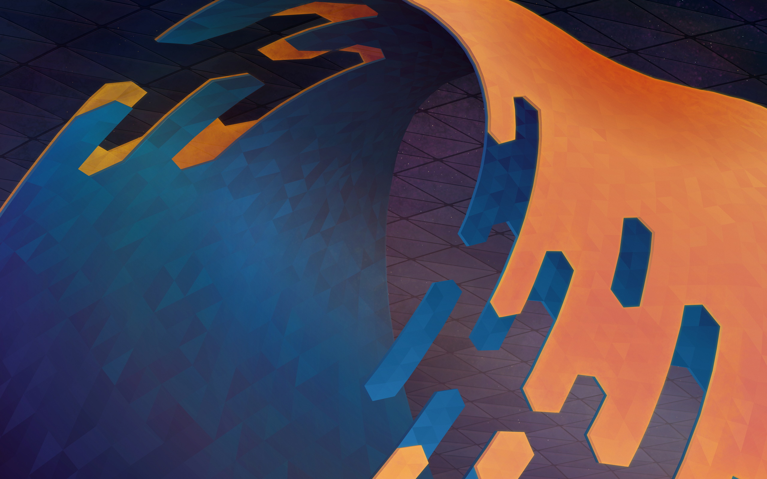
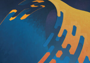
After two tremendously fun livestreams the Plasma 5.24 wallpaper is all wrapped up. With this particular image we had a lot of fun using new techniques to create this wallpaper, and the entire process was a fun adventure. To download the wallpaper it’s available on OpenDesktop and GetHowNewStuff if you’re a Plasma user.

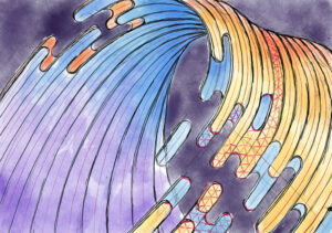
The wallpaper was first sketched in the Krita painting application. Up until this point wallpapers I authored used a fairly inflexible technique of creating a polygon grid and manipulating it, but this new shape would require new techniques.

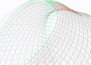
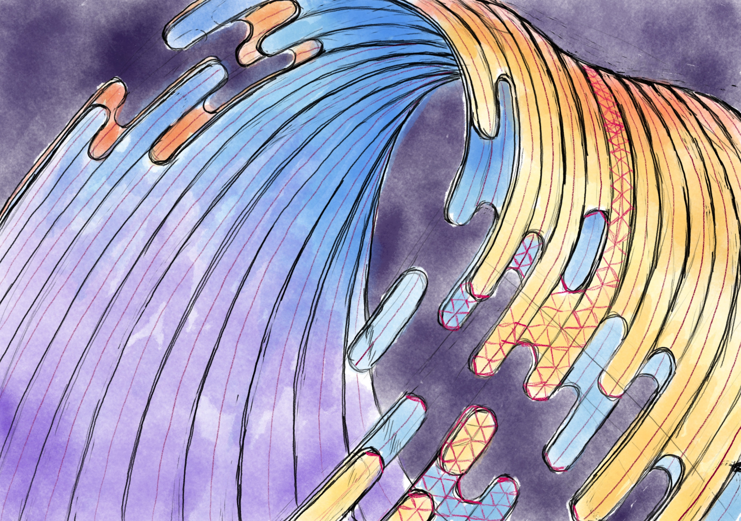
In Inkscape a wireframe was drawn using the line tool. This was done by drawing curved lines roughly matched over the sketch, applying successive wireframes one over another until we could rely on the snapping tools in Inkscape to place polygons.

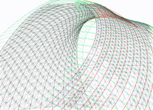
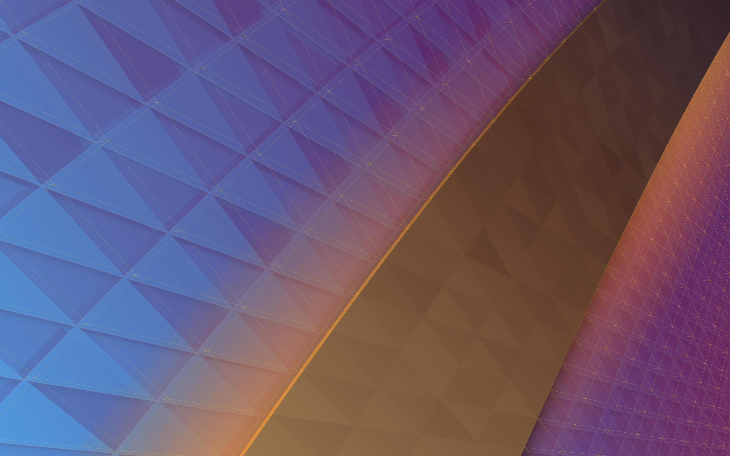
This ultimately resulted in 2,221 hand-drawn polygons, layered in a way similar to reptile scales so gaps would not show through once fills were applied. People often question if these are done in Blender, but Inkscape is actually the software of the day with this being done entirely in 2D.

Fills were applied as linear gradients to the grouped polygons. At this point edges were also drawn in and I was getting ready to use the “Jitter Gradients” plugin I developed some years ago for the purpose of differentiating the individual polygons, but alas it wasn’t compatible with modern Inkscape! AAAAGH!

While I was busy having a panic attack live on-air Niccolò Veggero swept in and graciously updated the script to be compatible while I worked in other areas. What a lifesaver! With the Jitter Gradients plugin fixed up work began hopping between Krita and Inkscape, colours starting roughly landing, and we quickly approached the end of the wallpaper work.

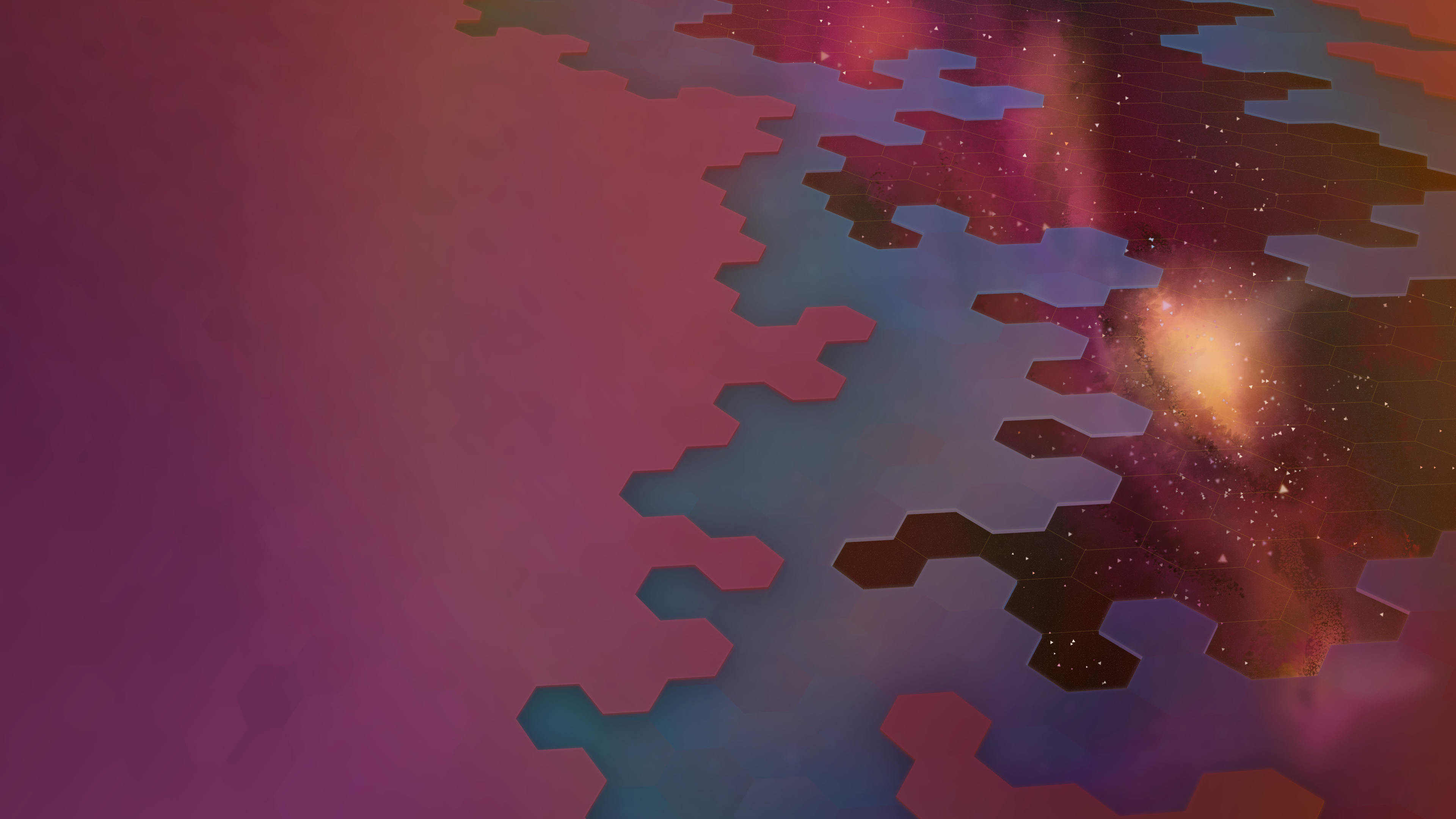
Layers layers layers ahoy! This was the state of the wallpaper at the end of the second livestream. While almost everything was in place, in practise it’s never a bad idea to walk away for a few hours to come back later with clear eyes.

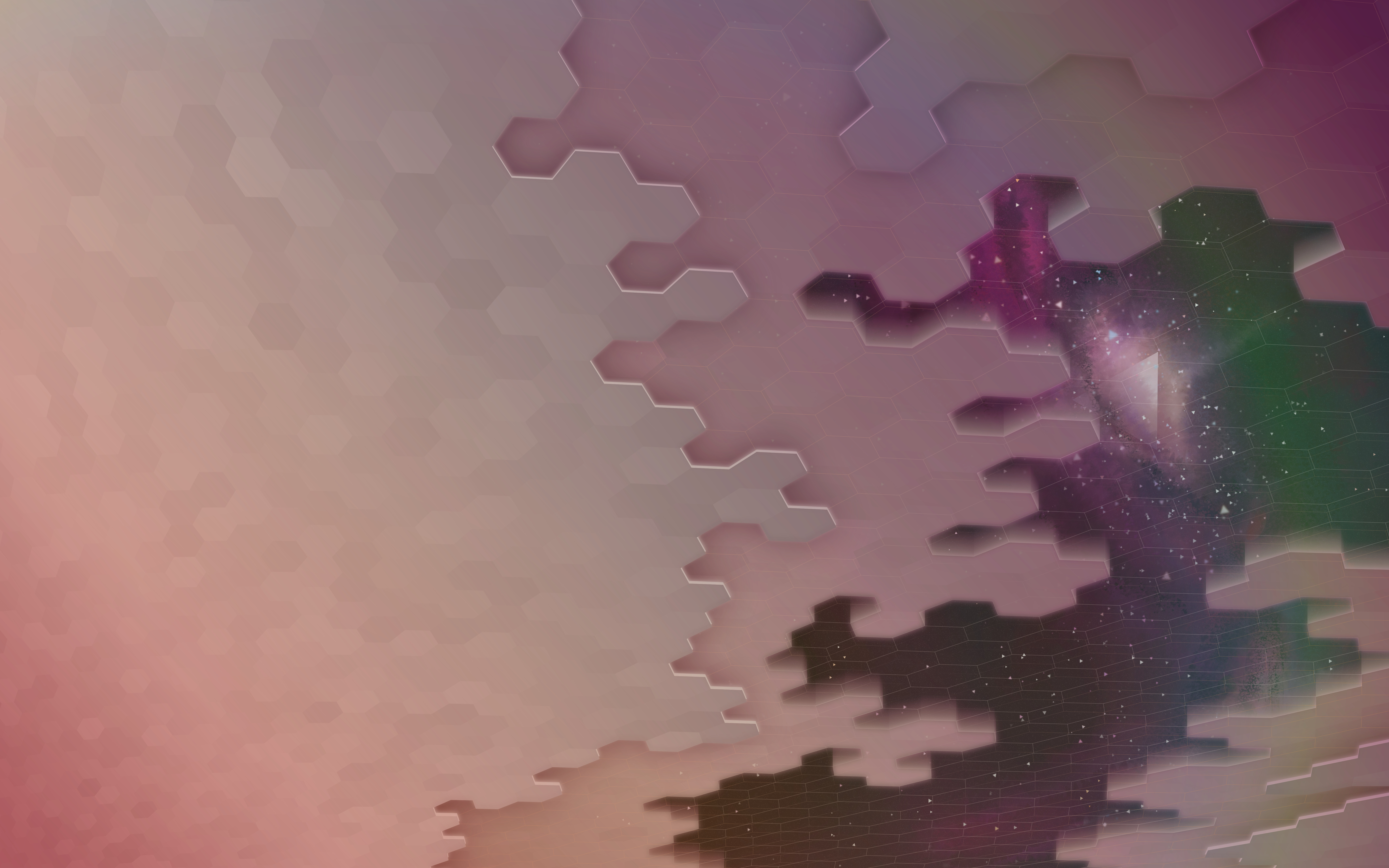
After coming back to the image several adjustments were made. A lot of the work I had done in Krita during the livestream was replaced, mostly because I realized I didn’t do the work in 8K, which we offer now. There was also a few steps in GIMP such as noise and some minor light-curve editing.

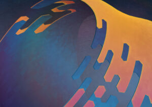
And so ended the work on the Plasma 5.24 wallpaper! After taking it up with the chat on the livestream it was quickly decided to be named “Wavy McWallpaperface”. The last steps are pretty standard; we run it through our cropping and sizing script which produces the highest quality versions for a variety of resolutions. If you noticed that the base image is slightly taller than “standard” it’s because it was, to accommodate cropping so it’s not just removing content for taller aspect ratios. The cropping script was also adjusted slightly for this wallpaper so it wouldn’t crop the top, which is the more interesting bit.

If you’re a crazy person and you wish to watch the wallpaper being created you can watch the process as it was streamed on Youtube:
Part 1: Wireframe & Polygon Creation
Part 2: Everything Else

To download the wallpaper once again it’s available on OpenDesktop at various resolutions, including the mobile version!

Wallpaper Livestream (Part 2, Sunday January 9th)

Update: The Livestream is moved to Monday January 10th, sorry for the inconvenience it may cause.

After a very successful livestream at the beginning of the week (with a heartfelt thank-you to everyone who popped in) it’s time to hunker down for one more afternoon to finish what we started! This Sunday (January 9th) I’ll once again be hosting a stream, where we’ll finish the wallpaper together. All the tedious manual work is well behind us, so this round should be mostly finery and polish in addition to the background, which is all fun and creative stuff. Click here for the Youtube link to the upcoming stream if you want to set a reminder for yourself. The livestream will run at least 2 hours, but if we’re all having fun I’ll run it for an additional 2 after a brief intermission.

For everyone who didn’t have a chance to attend, in the last livestream we started with the above sketch done in Krita and experimented with a new method on-the-fly where we leaned into Inkscapes snapping features to create a 3D mesh by hand, with the plan to use the built-in “Restacking” tool to enable hand-drawn polygons with “perfect” edges. While the mesh method was a rousing success and testing the restack feature gave ideal results, near the end of the stream it was realized that watching me draw triangles for several hours was not a hip idea, so I decided to take the remainder of the more tedious work offline.

Which was a good thing, because I had to throw away hours worth of hand-drawn polygons. I was not a happy camper. There was a damper in the pamper. It was a stylistic cramper. Simply put I literally zigged when I should have zagged and half the polygons were misaligned because of it.

Not to worry though, because I had the chance to experiment a bit more with less certain ideas and while I’m still playing a bit, I’m even happier with the redone results. Almost like I had roughly 5 hours of practice…

In terms of livestreaming itself it went off without a hitch on a technical level, but the overall quality was pretty awful. I’m sorry for that, I didn’t realize how bad it was. I’ve been making improvements so the quality of future streams will be far better. Earnestly I wasn’t sure if I’d be doing it again so I didn’t put an overwhelming amount of effort into the initial setup. I fully expected to have large swaths of time without anyone watching, but while the quality of the feed was borderline unwatchable I saw far more activity than I anticipated, and the chat was more than excellent in making me want to continue doing streams. You all rock!

There’s still testing and adjustments to be made but it’ll definitely have much higher video quality this upcoming stream, hopefully have better audio quality, and there’s a 50/50 chance I’ll broadcast in (up to) 4K (if the latency is acceptable). I didn’t have hardware encoding set up, I think it’ll be waaaaay nicer for me not to be encoding 4K to 1080p video on my CPU while using a CPU-intensive drawing application. It’s almost like my video card is meant for video. Additionally, and while I make no guarantees, I’ll also be attempting to hook up screen mirroring with my Android drawing tablet so I can use both it and my desktop computer to complete the wallpaper using all the tools at my disposal on-air. While the mixing of vector and traditional art was debated in an older wallpaper, I’ll have you – yes, you! – to give live feedback.

Once again I want to thank everyone who made it (or wanted to make it) to the previous stream. It was a delightful experience and I hope to see you this Sunday!

Art Livestream (Mon Jan 3rd, 2022)

Hullo! On Monday January 3rd 5:00pm GMT (12:00pm EST) I’m going to try livestreaming work on a potential Plasma wallpaper, possibly some icon work, and other potential tangential work. I’ll also be answering questions, giving advice and tips for software like Krita and Inkscape, and if there’s time I may also show some terrible unreleased design work from the bowels of my storage drive. The stream will be of indeterminate length; at least a couple hours but it might run long.

The stream will be on Youtube for sure, please comment requesting another video service (click here) if Youtube/Google skeeves interested people out (assuming I can get them to work); here’s the Youtube link for those who may want to set a reminder.

Better Adaptive Icons for 2022!

Some new CSS classes are coming to icons courtesy Janet Blackquill, and I’m excited to cover what exactly this will let icon artists do in 2022! This post is part tutorial and part news. For those looking for a quick TLDR; icons are going to get even better. I’m also going to clear up some inaccuracies in existing documentation (which I plan on updating at some point later)

CSS?

For those unfamiliar, vector icons in KDE can have a stylesheet which embeds several useful colours which update along with the system palette. If you want to make icons that adapt in some way you use the colours in these sheets. If you open an SVG icon from Breeze in a standard text editor you might come across something vaguely like this:

<style id="current-color-scheme" type="text/css">
    .ColorScheme-Text { color:#4d4d4d; }
    .ColorScheme-Background { color:#eff0f1; }
    .ColorScheme-Highlight { color:#3daee9; }
    .ColorScheme-ViewText { color:#31363b; }
    .ColorScheme-ViewBackground { color:#fcfcfc; }
    .ColorScheme-ViewHover { color:#93cee9; }
    .ColorScheme-ViewFocus{ color:#3daee9; }
    .ColorScheme-ButtonText { color:#31363b; }
    .ColorScheme-ButtonBackground { color:#eff0f1; }
    .ColorScheme-ButtonHover { color:#93cee9; }
    .ColorScheme-ButtonFocus{ color:#3daee9; }
</style>

Note that the <style> tag has an id of “current-color-scheme”. This is how we identify which <style> tag contains our adaptive colours.

When using Inkscape you can use the “Selectors and CSS” dialog available under the Object menu to see these special styles:

When you have a something selected you can set the fill or stroke to “currentColor” and use the “+” button to add a CSS class. Things that apply to the selected element are on the left, and a list of all classes found in the image are on the right. Here’s the important part: the classes in this list are a lie! First and foremost, some icons have extra CSS classes listed that don’t actually work when used as an icon, and of course, some new ones are missing. You can’t “preview” how an icon will look with Inkscape alone, so to see what actually works there’s applications like Cuttlefish or Ikona which can provide an accurate view of your work. In terms of quickly making sure you have the correct palette in an icon, I recommend using a text editor and replacing the style with the “id” of “current-color-scheme” with the style below:

<style id="current-color-scheme" type="text/css">
    .ColorScheme-Text         { color: #232629; }
    .ColorScheme-Background   { color: #eff0f1; }
    .ColorScheme-Highlight    { color: #7ec9f0; }
    .ColorScheme-PositiveText { color: #27ae60; }
    .ColorScheme-NeutralText  { color: #f67400; }
    .ColorScheme-NegativeText { color: #da4453; }
    .ColorScheme-ActiveText   { color: #3daee9; }
    .ColorScheme-Complement   { color: #ffffff; }
    .ColorScheme-Contrast     { color: #000000; }
</style>

You may notice several colours are very different. Let’s start with what’s missing; ColorScheme-ViewText, ColorScheme-ViewBackground, ColorScheme-ViewHover, ColorScheme-ViewFocus, ColorScheme-ButtonText, ColorScheme-ButtonBackground, and ColorScheme-ButtonHover are gone. I don’t know much about why these are used as often as they are, if they ever worked, or what, but they’re no longer active and when I was double checking to ensure I don’t feed anyone misinformation I found some bugs where they were meant to be used but… don’t work. So, for now, we’ll ignore what doesn’t actually exist.

In terms of what does exist, here’s a list of the available colours from the above style code and what you can expect behaviourally, along with my own observations:

  • ColorScheme-Text; it’s the same colour as text on a standard window. This usually means it’s near-white or near-black, but expect some colour schemes to add some saturation, such as a red theme making text pink. The opposing colour to Text is Background. For modern use it’s a good contrast colour, and works really well for monochrome icons paired with text.
  • ColorScheme-Background; Same as the background colour of a standard window. Background has fewer use-cases, and generally it’s recommended you use transparency instead of this.
  • ColorScheme-Highlight; This was the first method of using the increasingly popular accent colour in icons, but colour schemes generally mix the accent colour with the background colour dulling the result to a degree. If you want the exact accent colour read on to ActiveText. Highlight is still great when you want to use the accent colour but you don’t want it to be overly strong.
  • ColorScheme-PositiveText/ColorScheme-NeutralText/ColorScheme-NegativeText; Generally these are green, orange, and red respectively. Some schemes do change these a bit so if you want “guaranteed” colours such as green, these are not appropriate. Instead use them as their labels imply, as positive to negatively associated colours. These are used often in monochrome icons. If working on full-colour icons and you’re representing a common system component or generic things these can be used as well for light flavour, such as debris in a trash can, but it’s recommended use be kept to a minimum.
  • ColorScheme-ActiveText; this is one of the 3 newly added colours to icons, and is the new recommended way of using accent colours in icons if you want the exact colour. Unlike Highlight, ActiveText is an unmodified accent colour directly set by the user. It can be just about anything from sky blue to hot pink to grey.
  • ColorScheme-Complement and ColorScheme-Contrast; These are the other two new colours, and are a little bit special. Unlike every other colour set by the scheme, Complement and Contrast are guaranteed to be pure black or pure white. If the colour scheme is dark Compliment will be black and Contrast will be white, and if the scheme is light Compliment will be white and Contrast will be black. There are several use-cases for these, mainly for allowing icons to re-shade themselves for light/dark environments, or for providing outlines. Often icon artists relied on Text and Background for “shading”, but with schemes like Quartz or Afterglow you’d see situations where icons would be “stained” in unwanted ways. Now we have a much more reliable pair of values which won’t create muddy results.

How We’ll Use These New Classes

The new colours added a few possibilities. ColorScheme-ActiveText is pretty straightforward, giving us the user-defined accent. If you have an icon theme and are using accent colours via Highlight, ActiveText will get you the more vibrant and untarnished accent colour. Beyond that Compliment and Contrast are pulling a few duties in the upcoming icon refresh, so I’ll cover them in more detail.

First we’re using ColorScheme-Contrast for bottom shadows/highlights. In dark mode it gives icons a soft under-light, and light mode it’s a standard shadow. Previously we used Text for this, and it worked, but Contrast is just better for this now. Where it’s really nice is helping define the silhouette of the icon.

For folders we’re mixing in a very small amount of Contrast over top the accent colour for just a very tiny amount of “pop” without being obnoxious about it. This also helps guarantee a minimal amount of contrast between the accent colour and the background.

We’re using ColorScheme-Compliment for decals and overlays. We get nice dark-on-dark or light-on-light designs, but we don’t suffer from decals looking “muddy” anymore as we used the Background colour where we now use Compliment.

For comparison here’s the same folder using the new CSS under previously unfavourable circumstances with a red-on-red-on-red scheme, the folder on the left using previously available colours and the folder on the right using the three new colours. Before the new colours I was ready to chalk it up to “don’t use terrible themes” but now everyone can safely use the very worst colour schemes on the planet and still have usable and attractive icons.

Beyond the new colours, work is continuing on the refreshed icons. There’s been a great deal of feedback and many icons are being fine-tuned. The pipeline tools are evolving as well, having had a significant refactor which greatly improved the tool all-around.

New Icons, Iconoclast Pipeline

Over the month of November work has been started to refresh the full-colour icons in Breeze as an extension of the “Blue Ocean” initiative. With literally hundreds of hand-created vector icons in our roster we’ve had to develop new processes and are working on a more robust pipeline so this refresh can be done in a somewhat timely manner.

Preview of the new folders. Subject to change and refinement.

As was the method for Blue Ocean on the desktop widgets and design, the icons will be a gradual rollout over a few releases. We do have a strategy in place to ensure that this won’t be too jarring or inconsistent during the transition. The current plan is to update both all mimetypes and all places in time for the 5.24 release.

Like our current icons the new icons have adaptive capabilities. Beyond that some additional select icons such as the new desktop icon are also adaptive, and there are plans for other icons to also take advantage of this feature where it would not be obnoxious. Compared to existing icons the refreshed content will be softer, more detailed, and less flat. These icons are also prepared with future capabilities in mind, and as enhancements are made to KDE Frameworks these icons may expose new and interesting features.

Finally, we’re expanding the number of sizes the icons come in, so they look ideal at more zoom levels in your file browser. Currently colour places icons are offered in 32, 48, 64, and 96 pixel sizes, and mimetypes are offered in 32 and 64 pixel sizes. Refreshed icons in both places and mimetypes will be offered in 32, 48, 64, 96, 128, and 256 pixel sizes with no missing graphics. We already have all folders in all of the above sizes, and in under a month while also writing our software we have over doubled the number of folder icons in Breeze. We’re estimating we will more than triple in the number of mimetype icons.

To get this work done we’ve built new tools for the express purpose of making mass iconography far easier for even individual artists, so I’m very pleased to state that a new icon and SVG pipeline is underway and despite being unfinished is producing results. This Python-written pipeline is capable of adding guides, rulers, and setting up grids for existing icons, standardizing existing icon colours, assembling entirely new icons from templates and components, and aggressively optimizing icons. With this authors will be able to have a “golden copy” of their icon sets where they can focus purely on design, letting the software take care of cleaning up the documents and assembling the individual pieces. The folders in the above image were assembled by the pipeline, with no hand-tuning.

In terms of optimization some extreme cases have seen unoptimized Oxygen icons drop 75% or their filesize. In less ideal situations a few simple hand-optimized test icons I produced run through the pipeline saw 10-20% reductions in filesize. The new optimizer is not built on any existing tools, and is an entirely new thing. At similar settings the new optimizer is on par or slightly ahead of Inkscape in most tests, but at the same time it’s also more specialized and the output cannot be edited when certain stages are enabled. It’s also targeted towards TinySVG and should not be expected to work on full-fat images (though, accommodations have been made). There is still work to be done too, and in the future more optimization steps are on the table to further reduce output size.

Not only is this pipeline beneficial to KDE artists, but history has proven even the roughest artistic tools we produce are regularly used outside of Plasma development. With this in mind we plan to release our new tooling separate from Breeze as its own package/download after polishing it to a mirror shine. Currently nicknamed “Iconoclast”, we are specifically setting out for this tooling to be useful and ready for the wider community beyond KDE.

Iconoclast will include our new pipeline, a manual, tips and advice, and another entirely new icon set named “Bones”, which is already in progress. The pipeline itself is strongly configurable with ini files, so KDE-isms can be removed and it can be adapted to work for icons sets that may have different flows through configuration. The Bones icon set will be a minimal base which can either be built on top of, or used as a reference, and these icons will released in the public domain. Different projects with different licenses can just take it and use it, and it’s uses generic technologies not tied to KDE. The pipeline itself will be GPL, and I don’t have a specific timeline for when the kit will be released but once it’s solidified I’ll make an announcement; though it’s likely to be after the new year.

FizzBuzz Overanalyzed

Fizzbuzz is a common coding competency challenge that tests your ability to work with basic math and logic. The challenge is to write a block of code that accomplishes these goals:

  • Iterate over an incrementing integer. 0, 1, 2, 3… We’ll call this $i. We’ll call the current iteration $n.
  • Write “fizz” when the $n is a multiple of 3.
  • Write “buzz” when the $n is a multiple of 5.
  • Write “fizzbuzz” when both the previous conditions are met.
  • Write the value of $n if none of the above conditions are met.

Commonly the challenge might stipulate that your code should be written as a function. In this case a “fizzbuzz” function will accept one integer $n and return or print the result.

For the FizzBuzz challenge this is what I would consider a fairly typical response (as written in PHP) which we’ll call “Solution 1”:

function fizzBuzz ($n)
{
	if($n % 3 == 0 && $n % 5 == 0) {
		return 'fizzbuzz';
	} 
	else if($n % 5 == 0) {
		return 'buzz';
	} 
	else if($n % 3 == 0) {
		return 'fizz';
	} 
	else {
		return $n;
	}
}

for ($i = 1; $i < 50; $i ++) {
	echo fizzBuzz($i)."\n";
}

The output of this FizzBuzz will look something like this:

1
2
fizz
4
buzz
fizz
7
8
fizz
buzz
11
fizz
13
14
fizzbuzz
16
17
fizz
...

The Gotchas

There’s two main ‘gotchas’ that solution 1 misses. This first is an outright error; the very first check in FizzBuzz should be for the number 0. While the sample codes on this page don’t make use of 0, it’s good to anticipate it depending on who you’re presenting a FizzBuzz to.

if($n == 0) {
	return 0;
} 

The reason for this is because the modulus operator used in FizzBuzz responses returns remainders. If a modulus operation returns 0, it’s a clean division, making it a multiple. Except for 0. 0 will always return a remainder of 0 but isn’t actually considered a multiple of integral numbers. It always surprises me know many FizzBuzz solutions neglect 0.

The second common ‘gotcha’ is known as the “15” condition. Often we see something like this:

if($n % 3 == 0 && $n % 5 == 0) {
	return 'fizzbuzz';
} 

There’s nothing wrong with this response, but it can alternatively be written as…

if($n % 15 == 0) {
	return 'fizzbuzz';
} 

The basic premise is that instead of using two checks (for 3 and 5) in the “fizzbuzz” condition, you can instead use one check for 15. Between any multiple of 3 and 5 the lowest common denominator is 15, and using that to avoid a check potentially saves hundreds of calculations if running the fizzbuzz check thousands of times.

Ultimately, there’s no wrong response to the 15 check, but I would ask any author why they used one method over the other. If they used the two-check method my preferred answer would lean towards readability or “self documentation”. Yes, it’s less efficient, but glancing at the code you more readily have an idea of what the author might be trying to do. If they used the one-check method I’d be fishing for either an answer in outright efficiency or general mathematics. If someone performed the 15 check and didn’t have an answer I’d be a bit more concerned that it’s not their logic and they just read about using 15 somewhere.

Given all this, a more thoughtful FizzBuzz response might look something like this, which we’ll call “Solution 2”;

function fizzBuzz ($n)
{
	if($n == 0) {
		return 0;
	}
	else if($n % 15 == 0) {
		return 'fizzbuzz';
	} 
	else if($n % 5 == 0) {
		return 'buzz';
	} 
	else if($n % 3 == 0) {
		return 'fizz';
	} 
	else {
		return $n;
	}
}

for ($i = 1; $i < 50; $i ++) {
	echo fizzBuzz($i)."\n";
}

Going Ternary

There is, also, further evolution of a good answer which compresses the code down by several lines, and also gives additional performance perks which we’ll call “Solution 3”;

function fizzBuzz ($n)
{
	if($n == 0) {
		return 0;
	}
	else if ($n % 3 == 0) {
		return $n % 5 ? 'fizzbuzz' : 'fizz';
	}
	else {
		return $n % 5 == 0 ? 'buzz' : $n;
	}
}

for ($i = 1; $i < 50; $i ++) {
	echo fizzBuzz($i)."\n";
}

In this more compact variant we not only look at the reduced line count, but also use more efficient codepaths. In this solution we use ternary expressions inside our return statements. Ternary expressions are essentially a more condensed if condition. The above code could be written as nested if statements, but many developers avoid nesting more than a few levels deep as it makes code progressively more difficult to navigate.

On the efficiency front this solution better accounts for modulus (%) not being an efficient operator to use, as far as operators go. Leaving aside the 0 condition the two solutions have what are called “best case” and “worst case” costs to run the function. Below shows these cases, along with the average number of % checks performed after 1000 iterations.

Best “%” CaseWorst “%” CaseAverage “%” CaseAverage Execution Time
Solution 1243.734973837.016
Solution 2132.734688097.077
Solution 32223843310.965
Number of “%” Calls per solution. Average Execution Time is against 10000 iterations with 1000 samples, compared using hrTime.

At first blush the best case scenario is better with solution 2, but solution 2’s best case only applied to one of every 15 iterations. You could shuffle the conditions so the second most efficient path applies to one third of the checks… but in general you’re just pushing a flat logic tree if you do that, when a couple of branches in logic paths will serve you better.

I don’t think anybody in their right mind would expect people to know the performance metrics of FizzBuzz. It’s not exactly real-world code, but if a developer is writing a solution to the FizzBuzz challenge beyond a competency level, I’d be very interested in seeing them push a little bit beyond the basics.

While we don’t want to try micro-optimizing this fairly trivial piece of code, it is always worth seeing when someone tends to write in more efficient manners, or at least, can. If nothing else, it’s always good to see someone push their code just a little bit harder beyond what’s strictly necessary.

Or maybe I’m just overanalyzing it.

Bash Updater

If you’re like me, you probably see the value in keeping your code in GIT repositories. If you’re like me and you also have websites running you probably pull your staged code right from git. It might not be an enterprise-grade solution, but it’s easy, we know where things are, and it’s a fairly natural workflow.

There is an issue though created by my desire for absolute laziness; it can be annoying to cd all the way into a folder, run the pull requests, and possibly do it again if I’ve exited from my ssh session but I had one more push to pull.

Of course, the natural solution is to alias a command that does everything. But it doesn’t feel particularly flexible, and I don’t like having an archive of commands which may or may not be functional. Another solution is to have something like GitHub run webhooks and such to trigger updates as you make them. While this sounds pretty hand and super simple, for me personally, I like to know exactly when my code will go live.

My solution is the below script in tandem with a dead-simple config file, which lets me get the granularity I like without the need for endless aliased commands.

#!/bin/bash

# Updates various git repositories registered in ~/git-update-locations.ini.
# Format is as follows:
# [MyProject]
# firstRepo=/path/to/first/repo
# secondRepo=/path/to/second/repo
# allRepos=/path/to/repos/*
#
# git-update.sh MyProject firstRepo
# git-update.sh MyProject allRepos
#
# If the value of a path ends with "*" it will look at all directories in that
# location, if they have a git repo, it will run the pull.
#
# For example:
# 
# [mywordpresssite.com]
# theme=/var/www/mywordpresssite.com/public_html/wp-content/themes/my-git-theme
# plugins=/var/www/mywordpresssite.com/public_html/wp-content/plugins/*
#
# git-update.sh mywordpresssite.com theme
# -> will update the theme from git.
#
# git-update.sh mywordpresssite.com plugins
# -> will update all plugins found connected to git.

if [ ! -f "$HOME/git-update-locations.ini" ]; then
	"$HOME/git-update-locations.ini not found"
	exit
fi

if [[ -z $1 ]] ; then
	echo "You must specify a registered site"
	exit
fi

if [[ -z $2 ]] ; then
	echo "You must specify a section to update"
	exit
fi

SECTION=${1//[_- ]/.}
TARGET=${2//[._ -]/"-"}
CONFIG="$HOME/git-update-locations.ini"
FOLDER=$(sed -nr "/^\[$SECTION\]/ { :l /^$TARGET[ ]*=/ { s/.*=[ ]*//; p; q;}; n; b l;}" "$CONFIG")

if [ "$FOLDER" = "" ]; then
	echo "Target $SECTION $TARGET not found."
	exit
fi

if [[ "$FOLDER" =~ '*'$ ]] ; then 
	echo "Scanning for git repositories"
	for REPO in "${FOLDER::-1}"*; do
		[ -d "$REPO" ] || continue
		cd "$REPO"
		status="$(git rev-parse --is-inside-work-tree 2>/dev/null)"
		[ "$status" = "true" ] || continue
		echo "Updating $REPO"
		git status -s
		git pull --verbose
	done
else
	echo "Updating $FOLDER"
	cd "$FOLDER"
	git status -s
	git pull --verbose
fi

Of course, I’ve aliased this script to git-update.

alias git-update="/path/to/git-updater/git-update.sh"

Below is a portion of my own ini file, with the values used for updating this site and even the updater itself;

[kver.ca]
plugins=/var/www/kver.ca/public_html/wp-content/plugins/*
themes=/var/www/kver.ca/public_html/wp-content/themes/*
kv-design=/var/www/kver.ca/public_html/wp-content/themes/kv-design/

[utils]
updater=/opt/git-updater/

These days when updating my personal websites I just push to git, ssh into the server and have fairly quick access running my updates like so;

# Update my theme
git-update kver.ca theme

#Update all plugins connected to git
git-update kver.ca plugins

#Update the updater
git-update utils updater

Getting Glyphy With It

The newest addition is the Glyph library used on this site. It features hundreds of original icons in a convenient font-based format.

Work on the glyphs is ongoing, and I expect there to be some upheaval in the near future as the generator is upgraded. If you don’t mind that though or just want to peruse, check em’ out!