KDE Frameworks 5.3 & Plasma 5.1 – First Impressions

Today I took the plunge into the next-generation KDE desktop, performing a dirty upgrade from Kubuntu 14.04 to 14.10 before installing the plasma-5-desktop package; and this is my first impression of KF5.x and Plasma 5. This is also a bit of a primer, because when Plasma 5.2 enters the stage I’m interested to see the comparison and do a second write-up, using my experience in both 5.1 and 4.x as points-of-reference.

specs

The Old & New

Many KDE applications are in a transitional state and not migrated to KF5, so summarising the applications’ of KF5 as “uneventful” is apt because there are literally no events. I don’t know how a great deal of this is being handled, and it could just be from my method of installation, but aside from the system settings panel almost all the core applications are still running KDE Frameworks 4. Uneventful can be good, and I’d rather apps take their time porting to KDE 5 than sloppily rushing their ports. So, upgrading to the next-generation won’t gut your applications, and that’s a good thing to know an upgraded desktop won’t be paired with potentially unstable apps.

This makes me note how differently this iteration of the frameworks has been handled in contrast to Frameworks 4; there’s no mad science going on here folks – this major transition is being handled with caution and care.

Widget Shuffle

When it comes to the desktop itself, the reserved nature of the application updates speaks nothing of what you’ll get with the desktop widgets; a complete replacement of everything you’ve got. This sounds obvious, but at first blush while KDE looks similar to its forbearer with the white panel at the bottom, sporting the same widget selection and placement as its predecessor – that’s where the desktop similarities end, and it’s probably easier to name what’s stayed the same than everything that’s changed. This all makes sense, because swaths of the desktop *had* to be re-written, and the authors didn’t want a rocky transition this major release.The changes I did encounter aren’t flow-breaking and you won’t feel like a drunkard stumbling around unfamiliar territory, it’s still got KDE DNA and while you will have several “oh that’s different” moments: I’m glad to say they’re mostly good.The bad news first though; at least in Plasma 5.1 many of the widgets you may have used simply don’t exist yet. New and returning widgets are in the pipes, and with time they will surely return with the same level of polish found in the current crop of widgets, but with such a dramatic re-write it will take a few releases for all the widgets to catch up.

The good news is that the Plasma goodies which do make an appearance are universally improved. KDE has fully committed to QML as the language used for programming desktop components, and this decision has yielded a much more consistent desktop. It’s one of those things which is difficult to put your finger on, but it’s all just a little more cohesive.

snapshot1

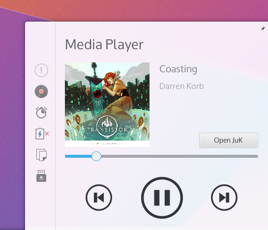
There are a few notable new widgets and behaviours I’d like to specifically mention. The new search widget is shockingly fast, organised, and a hidden treasure. The notifications tray has been reworked; it’s easier, simple, consistent, and often integrates controls more smartly than before. The applications menu launcher, despite having no outright usability differences, also “feels” better.

Stability & Bugs

I’ll say this outright; KF5 and Plasma 5 are not nearly as mature as yesteryears KF4-based desktop. After installing the update and doing a complete reboot I’ve suffered several crashes, and Plasma had at one point managed to forget my colour and wallpaper settings. A second restart seems to have shored it up, and the desktop now seems to be stable; perhaps it had to overcome stage-fright? I’ve had several issues with the Plasma desktop, ranging from the desktop placing the ‘add widgets’ tray into the middle of the screen (seemingly “docked” onto a window), and the system settings application behaving like a petulant child.

With all that aside, for en early revision of a recently overhauled desktop environment, (after it calmed down) it’s become more stable, and it’s been running a full day without issue. With that being said, I’ll be looking at 5.2 before I take a more firm stance on stability and making recommendations based on that factor.

Performance & Animation

I have one of those huge Aluminium Mac Pros which I’ve upgraded it significantly during its’ lifetime, yet despite my heavyweight computing power and KDE never feeling ‘slow’, I must admit often times it didn’t necessarily feel ‘fast’ or ‘smooth’. With KF5 and Plasma 5 the desktop for the first time feels *smooth*, please understand I’m saying it feels buttery, slick, and silky in all the right ways.

This can be attributed to Qt 5, which has moved to a hardware-accelerated graphics-stack, and while KDE has taken advantage of hardware acceleration since KF4, it was not nearly as pervasive throughout the entire toolkit as it is in this most modern environment.

There also seems to be fewer visual glitches associated with the desktop; KF4 had some minor issues where it might blur a background or draw a shadow before whatever content was to be placed on the screen. KF5 and Plasma 5 have reduced these issues, but odd moments of ‘hiccups’ which reminded me of KDE 4 can be rung from the system if you launch an unloaded plasmoid from the panel. These visual hiccups are incredibly minor, but do detract from the incredible mirror-shine polish that I feel will become expected of the modern Plasma desktop.

This can be seen a split-second before the content catches up and fills in the popup.

This can be seen a split-second before the content catches up and fills in the popup.

Animations throughout the Plasma desktop are both more pervasive, consistent, and smooth. Everything feels animated, and it makes the desktop feel more alive. The animations and movements within widgets themselves look consistent, and are overall much more tied together. It feels less like desperate parts bolted onto a desktop, and more like a single whole dancing to the same tune.

Look ‘n’ Feel

Once again, a disclaimer; I’m a member of the group managing this aspect of KDE.

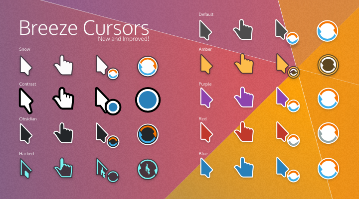
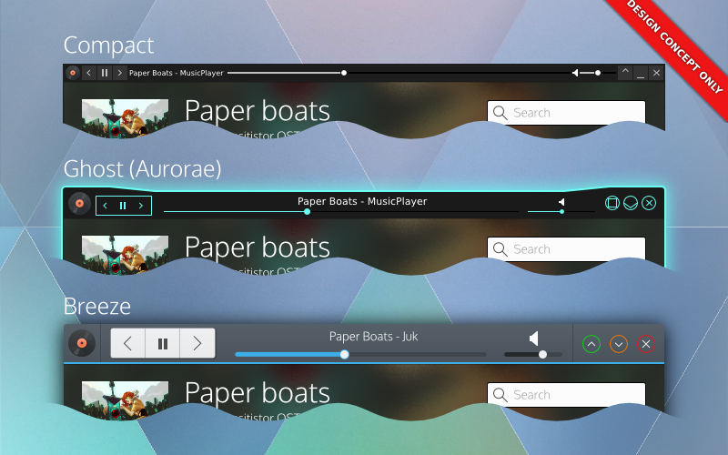
Out of the gate, Plasma 5 is both more and less visually polished than the Plasma 1 experience, it’s give-and-take. Generally, the “new look” (named “Breeze”) for KDE aims to be simpler, less cluttered, and more ‘designed’. The layout of just about everything has improved dramatically; this is in blatant disregard to your selected theme, being a core improvment on an applications’ and widgets’ level. Things don’t feel so tightly packed together, and it allows your eyes to rest more easily.

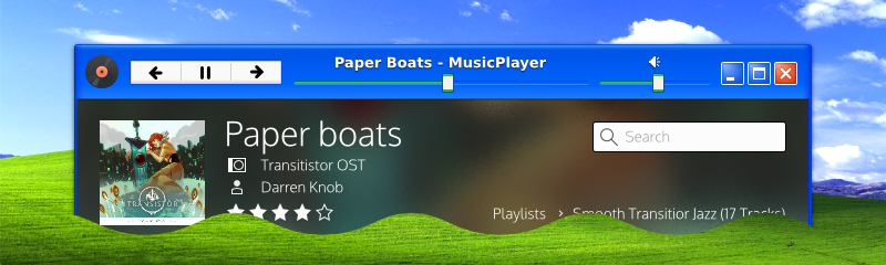
(as a side note, in my screenshots I’m using Oxygen again)

The new applications’ theme (as it stands in 5.1) can feel Spartan, with reduced chrome in the windows, more focus on spacing, and whiter default pallet. These are still clearly the early days for Breeze, and quite simply it hasn’t had the 6 years Oxygen has had to fine-tune its design and mature. That being said, it’s a very different style in it’s most core concept: Oxygen had head-first jumped into an extremely heavy and visually intense theme which gradually lightened itself up, while Breeze has started with an extremely minimal design.

The majority of toolbar icons no longer have colour, instead using a monochrome design, and it can sometimes take an extra few moments of searching to locate icons you’re looking for on the toolbar. This is offset by vivid content icons which readily call to your eyes, sporting near-pastel colours and thoughtfully laid out structures. Overall, the icons shift focus away from the UI and towards content, and you really don’t feel like the chrome of the windows is there.

The end result of all these changes is a much lighter feeling KDE. The UI gets out of your way more, and instead of attempting to woo you with distractions it’s clear the next generation desktop will have a reserved respectability in terms of costly design choices that will create a more elegant environment.

Settings & Configuration

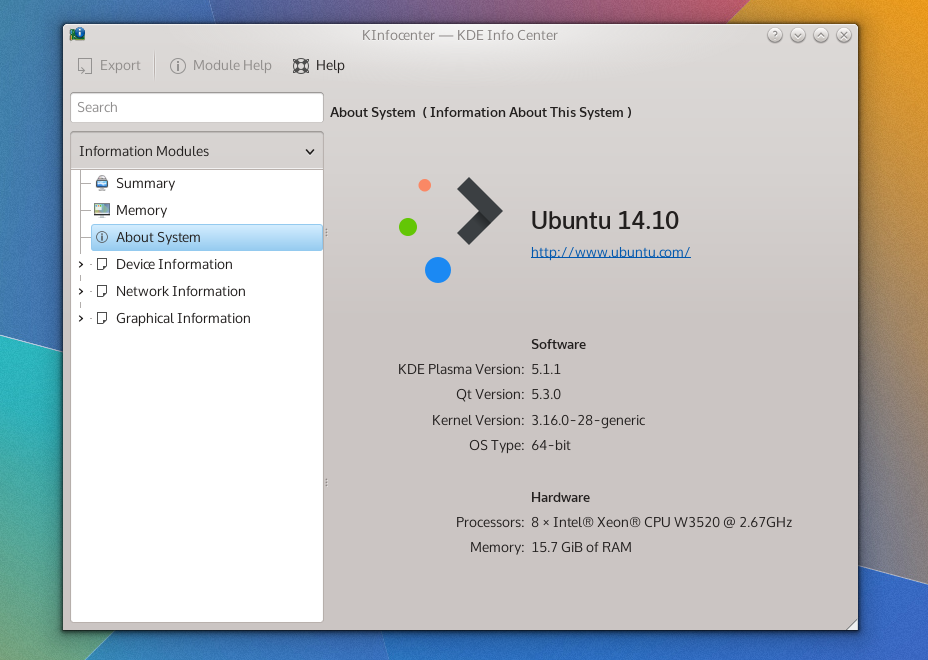
Plasma 5.1 is configured to feel a great deal like the traditional KDE desktop, with the standard panel, mouse actions, and shortcuts, but things diverge a great deal in the system settings application which has been completely rearranged. Previously the grouping of the settings menus felt random as they were built on the leylines of technical details over user-oriented goals, while in Plasma 5.2 they are more sane to users, being grouped more by goal than underlying mechanics.

Desktop configuration (specifically managing widgets) has been incremented upon, with some changes feeling slightly arbitrary. The “add widgets” panel now slides in from the left and adding widgets now presents a “drop indicator” which illustrates where on an underlying grid your widget will be placed to help avid widget-users keep everything aligned. Widgets still have the slide-out drawer, which can often seem strange in how you interact with it – but it’s unchanged.

Several widgets on KDE which beg for configuration options open up bare settings dialogues, such as the search widget. While this is a minor nit-pick, it’s the type of issue where you know the first step is still going to be building the selection of widgets available, and you’ll need to wait to play under the hood of the high-quality widgets bundled with KDE.

Final Notes

KDE Frameworks 5 and Plasma 5.1 create a fine environment, but one that is still visibly in it’s early days – you could almost say it suffers from many small papercuts, avoiding the haemorrhaging issues that soured the initial KDE Frameworks 4 release. With a completely re-based desktop I don’t feel these little cracks will remain for long, as it seems the developers have a firm grasp of what needs to be done and exactly what they want to do. For a major point-release, there’s a real feeling that this software will reach rock-solid stability very quickly given the state of it as it stands.

Now, do I recommend Plasma 5.1 for general use? Compared to the current 4.x Plasma release?

If you were installing fresh I’d say go for Plasma 5, but if you were just considering an upgrade, I’d wait. Plasma 5.2 is coming in hot, and I believe it will be the beginning of this next-generation desktops’ serious push to bring people to this fine new desktop. Even if it doesn’t reach feature-parity with the previous desktop, I imagine 5.2 will be the ice-breaker for the interested public with 5.3 will more/less beginning the larger migration to the 5 series desktop.

Curses! … I mean, Cursors!

cursors

In the upcoming release of Plasma we’ve done some work on the humble cursor; we’ve added a few missing states, and there will also be a brand new “snow” version, along with minor tweaks to the existing Breeze cursors. But me being lazy and the merge window having closed, there are a great many more cursors which haven’t made it into this release, so I’m putting them here for everyone to use and redistribute.

All of the cursors I’m posting will have 2 versions; the source and the compiled versions. Download the source if you’d like to edit, remaster, or improve the icons – build instructions are included, and our build script has been significantly improved and should be pretty easy. If you just want to use the cursors download the compiled version and simply extract them right into your icons folder (usually found in /usr/share/icons/) and enable them in your control panel.

Standard

Not much has changed, but if slightly softened shadows and diagonal cell-sizing cursors are important (or you just don’t have the default cursors) then here they are;

Breeze (Source)
Breeze (Compiled)

Contrast Cursors:

Probably the most important cursor set I regret not getting into this merge quickly enough is a new contrast style; so if you or someone you know is a visually impaired user, I’d like to offer this new cursor set. I can’t claim to be visually impaired myself, so if there is a user who is visually impaired I would like feedback on this particular cursor set and its usability. It also comes with an extra-large size as well.

Breeze Contrast (Source)
Breeze Contrast (Compiled)

Hacked

Hax0r3d! Some people love it, other people hate it; here’s a colour-matched cursor to accompany the “Ghost” “hacker” style.

Breeze Hacked (Source)
Breeze Hacked (Compiled)

Obsidian

Is the dark default cursor not dark enough?

Breeze Obsidian (Source)
Breeze Obsidian (Compiled)

Snow

This was a widely requested style; white Breeze cursors! These cursors will be in the upcoming plasma release, so if you’re upgrading, you can skip installing them.

Breeze Snow (Source)
Breeze Snow (Compiled)

Other Colours

Amber, purple, blue, and red… ‘Nuff said.

Breeze Amber (Source)
Breeze Amber (Compiled)

Breeze Purple (Source)
Breeze Purple (Compiled)

Breeze Blue (Source)
Breeze Blue (Compiled)

Breeze Red (Source)
Breeze Red (Compiled)

Glad I Took the Time

Hello Planet; This post isn’t about KDE specifically, but about taking time off to avoid burnout, and the importance of understanding when work has gone too far. If you’re a developer, please remember that rest is important, it’s an important part of developing great stuff. If you’re a user… You might get something out of this if you’re a workaholic.

In about an hour a few short minutes, I’ll be stepping out into the ice-covered Canadian landscape to once again wander towards the off-blue cubicle I call home for 8 hours a day. It’s a bit different than usual, because it’s the first day back from the first real vacation I’ve had in a number of years.

I’m a workaholic, and slowly I’ve also been burning out. I work when I’m in the office, I’ll work when I’m on break, I’ll work at home – and thanks to the all-glorious superphone – I’ve even found ways to work on the bus. May the dark lord Satan help me the day I get a tablet, because I know that too will let me do even more work. I’ve caught myself several times doing work at the office – and then waking up when I reach into the IT closet to be pulled in by wires vibrating “YOOOUUUU HAVENNNNT ZIP-TIEEED USSSS, THAT LIGHT ISN’T BLINKING HOW IT SHOULD, GRRAAAAHHH” – waking up to know I’ve been working in my dreams again. About the only times I’m not working in some way are during the odd card nights, and even those make me apprehensive. So, in the days leading up to my vacation, of course, I had planned some “light work”, “relaxing work”. I’d make one website, do a bunch of art, and get a jump-start on my January workload, among other things… Nothing major I told myself.

Then something weird happened. I had always planned to take the first day of my time off, off. I was sick, sick to my stomach that day because I wasn’t working – I had so much to do and I had promised myself not to do it for one of my sixteen days. The next day, all the work was still there – waiting – and while doing other things it dawned on me that I was actually a little burnt out, the smoke coming from my ears was pervasive enough to cloud my apartment and smog out the glowing silicon device waiting in the corner. I hadn’t realised just how mentally drained I was becoming – like an undead walking from keyboard to keyboard – typing arcane commands with so little passion.

A trend began and soon I realised I had taken some full days off, and family visits claimed even more. On the first Saturday of my vacation I once again opened Kate and started punching in lines of code. That day I had been something I hadn’t been in a very long time: rested. It dawned on me while writing code that maybe this vacation time was not the time for clocking-in, but for checking out. I fought my brain, I fought every impulse firing through my neurons, and I pushed my keyboard away from me. I was never so turned on by being shut down. I felt irresponsible sleeping fully, dastardly for sitting on messages calling on me to my computer, and vile for letting all that work fester and rot. My dreams involved endless pits of encroaching cords and demonic follies of co-workers demanding I resume my pursuits.

But the world still turned. Even without me dragging myself to the helm navigating choppy seas in the dark, everything kept spinning. I’m not a big “personal revelation” guy, but I had forgotten the importance of time off, that burnout is a grindstone which churns away at you, and one that’s easily preventable. All the work I had to do is still there – and some of it I did – but almost all of it waited without too much disturbance. There’s no need to damage oneself over a deadline, or a merge window, or a last-minute request. Sure, once in a blue moon it’s good to let stress focus you – but it’s not a state you should constantly keep yourself in.

I was irresponsible in how I left my work. I went fairly dark, and left no explanation to those who have been waiting patiently. This I could have handled better. But the more important fiddlybit I’d like to express from this post is one thing; Most of the people likely to read this are as – or far more – passionate about technology than I am, and today we almost all have technology at the holster allowing us to constantly be on. A single ‘ding’ in our pockets can call for hours of our time any time; it can hurt, it can be painful, it will make you sick… But take a few moments and really think about the last day you were really truly off, and if you can’t recall it, remember you have all week to examine your weekend – and really, really ask yourself if turning off your phone and shutting your workstation will really result in catastrophe. Will missing a merge window end the world?

So, tl;dr:

Burnout is a slow grind dulling the knife; allot yourself some real time off. After two weeks I already feel refreshed from years of constant stress and work. One day every weekend to yourself won’t kill your projects and undertakings, and you’ll be all the sharper for it.

I would also like to point out; the KDE VDG is awesome. I essentially disappeared for two weeks (in a very irresponsible way), but when things had to be done they got done. I wasn’t elegant in how I dropped the ball, and I should have said ahead of time when I decided to rest – but they handled it (Kudos, Uri!); trust your peers to handle things if you need to take some time for yourself.

Oculus Rift – First Impressions

dk2-hero

Today my mom got her dirty mitts on on Oculus Rift (Dev Kit 2); and being the techie of the family, along with the distinction of being the one who essentially sold her on it, was the made responsible for getting it set up and running.

Out of the Box

The very first thing we commented on was how surprisingly light the unit was; given its square almost bulky appearance, the unit looked as if it could have been 100 grams heftier. Even holding it, looking inside, you felt as if it should been as heavy as a pair of premium binoculars. Because of this, it almost felt… Cheap. The plastic was good quality, but even the small gears on the inside (used to adjust the distance of the lenses) were from the same plastic – and I felt a little like stressing it could cause it to snap; this never happened though. I’m not sure what the lenses were make of, but I suspect they are plastic as well – especially given the reports that they easily scratch.

The box came with an array of cables and cords, some are apparently optional; when I set it up I missed a cord that clearly looked like a 3.5mm audio jack, and after placing it to the side I later found out it was a low-latency sync cable for the camera – which I had believed worked through USB. The software gave no warning that the cable was not connected, and we simply didn’t have spacial tracking because of it, and for the first time in a decade I resorted to the manual.

For a normal non-technie person, I would easily classify the setup as a small nightmare; there were plugs in very unintuitive places, and it seems as if there’s no good way to do the wiring. On the PC, the Rift will consume 2 USB ports, and an HDMI port. The camera connects to the PC and a box in the middle of the headset cords.

Getting Started

The first ‘game’ we got running was the configuration environment; it’s a simple office desk on a blueprint-like plane, and you could look around and lean in. It was very simple yet elegant way to both demonstrate and calibrate the multitude of sensors and options on the system. You’d assume with gyroscopes, lenses and motion sensors calibration would be a nightmare, but out-of-the-box it worked just fine, you didn’t even really need to calibrate it.

For the majority of rift software outside the configuration tool, packages are simple downloaded archives which are unzipped and run directly. Some are ‘properly’ installed. Playing “real” games requires patching ‘drivers’ which get applied directly to games, though in the short time I had I couldn’t get any of the patches to work. I imagine this is simply a bi-product of being a development kit, and that it will be trivial for apps to ship full Oculus support without extra hassle.

With some games, you launch the executable, with others you launch a specific “dev kit 2” launcher. The support for various features is spotty, but that’s expected for early software; some games supported spacial positioning while others were oddly fuzzy. The haphazard support is apparently a result of the second dev kit having such different features, and games had simply not caught up. For the consumer version there’s a similar feature jump which concerns me slightly, will features be fragmented for the consumer version? Will it be as noticeable?

Our First Experiences

The first game we got running was one I had specifically selected to ease us into the peripheral – the “Tuscan Villa”, a simple house you can explore on the coast. Despite being a lightweight game in terms of mental intensity both my mother and I had almost immediately became motion sick when we took our first steps; The moment you start moving your brain almost has an abhorrent response to your senses conflicting messages; your body says your stationary, your eyes say you’re moving. It only takes half a minute to adjust though, and once you get past it you start to notice the real sense of agency the Oculus gives you.

There were butterflies fluttering about the villa and despite being a grand total of 4 polygons I found myself following one around the yard, until hitting a balcony overlooking the water. This is a completely different kind of depth than a movie in 3D; in 3D movies you feel like actors are in front of the screen, but in the Oculus you feel like that water really does go on forever, it’s nearly cathartic.

The next experience we tried was the “Lava Coaster”; this was the game we discovered that we missed a cable used for spacial positioning. Once we got past the initial minor hiccup this much more intense simulation made us seriously queasy. We made the mistake of giving this to my stepfather (before something easier like the villa) and he immediately had to take it off. As we played successive demos we found ourselves actively become resistant to nauseating effects.

Not for Sharing

The Oculus has two sets of lenses which are interchanged, and two adjustment knobs used to achieve focus on the unit. I was a ‘Type B’ lens while my mom was a ‘Type A’ lens; unscrewing them to swap out can feel a bit tight, and the torque required to do it makes me just slightly uncomfortable – mostly owing to that plastic lightness. Overall, because of the constant adjustments we were making we ultimately had to find a middle-ground because it’s so much to fiddle with each time we swapped the rift between us. There doesn’t seem to be an ideal solution for quickly adjusting the device, and I’d be tempted to say they could make the entire lens face-plate removable so only the electronics and screen would remain; so you just make “your” perfect faceplate and snap it in… Otherwise there’s just no good way to share between multiple people because of the time-sucking vampire that is tweaking the rift. You ultimately have to settle for “good enough” focus to share it around a couple people.

In terms of fit, the rift seats very low on your face; I found it completely covered my nose. There’s also air-holes in the rift to avoid fogging, but light can get in and I had an odd lens-flare for a couple games. The weight was, again, lighter than expected; I’ve heard other people say it needs a counter-weight but it’s really not necessary, I think it’s just a case of taking regular breaks – the device was light enough to be quite comfortable.

The Experience

The “screen door” effect is apparent when you put on the device; I’m still unsure if my expectations were too high, but it was noticeable. Right now the Oculus uses a mobile phone screen, but I imagine when the formfactor comes into its’ own, screens formatted to sit inches from your eyes will eliminate the issue. The effect is more prominent on brighter games, and horror games with darker visuals will seem far less obfuscated.

Having the rift on does nothing to help you locate your hands, and we found ourselves fumbling all over the keyboard. I’ll be attempting to hack a wii remote onto her computer my next visit. At one point the rift went out of sync, and she was ‘rotated’ 90 degrees from her keyboard causing WASD to behave like DSAW; it didn’t help that she was freefalling at the time, frantically trying to get in control of the keyboard while plummeting into her fear of heights.

I did notice occasional jankiness in head movement vs the screen keeping ‘in sync’, though I can’t say for sure if it was the computer, the camera being blocked, gyroscopes, or something else. But it was only in some games, which suggests in my be an issue on their part. Other games appeared to be slightly out-of-focus.

Though not a fault of the unit, I would highly recommend rocking some Q-Tips if you expect to share the device; when you change lenses a single hair or piece of dirt on the screen becomes immediately obvious, and a Q-Tip is a surefire way of fetching those specs without fingering the screen. If you keep the lenses close toy our eyes, expect to use the supplied cleaning cloth to regularly wipe down the lenses.

Final Thoughts

The Oculus Rift is a fine piece of technology so far; I was both impressed and cooled by its performance in several areas. The set-up is a nightmare, but once it’s up-and-running things got easier fairly quickly. I do see where it has a ways to go, especially in the screen-door-effect area, but without a doubt it’s the most immersive thing I’ve ever used. I didn’t gush too much over it’s mostly silky-smooth feeling, and it really does add incredible agency, even for games with the most simple of graphics. For the second prototype in a brand new category of device it’s nothing less than an achievement.

If you want to touch the future today in lieu of waiting another year, you’ll need to be willing to get your hands dirty – but once you experience the Rift you’ll just kind of sit back in awe at both the impressive immersion of the contemporary device, but also at the possibilities and potential of virtual reality. There’s a little difficulty in admitting to yourself that this sci-fi thing is here today.

DWD – a FAQ for questions around the Web

Don’t know what DWDs are? Click the link below to find out!

http://kver.wordpress.com/2014/10/25/presenting-dwd-a-candidate-for-kde-window-decorations/

It seems about the right time to post some common questions and misconceptions about DWDs I’ve seen around the web, so here’s a general FAQ about DWDs; If I missed any questions about DWD, please post them!

Window decorations would be responsible for widgets. Here's 3 potential window decorations using DWDs.

Window decorations would be responsible for widgets. Here’s 3 potential window decorations using DWDs. Note that the decoration dictates style – and users dictate the decorations. Complete control of your personal preference.

DWDs are going to make my windows inconsistent and ugly! Application widgets might clash with my window decoration!

DWDs are not CSDs, and all theming and drawing is handled by the window manager and decoration. In addition, applications only export the structure of their widgets, they do not pre-draw or draw the widgets themselves. Applications would have little or no say in how their decorations look, just like traditional SSDs.

That being said, we don’t want DWDs to be absolutly rigid, we are looking at ‘safe’ ways applications can do basic branding on themselves in a reasonable manner, which decorations could potentially integrate without excessive effort. The main thing we are looking at is allowing applications to offer a colour pallet which decorations could use to tweak their appearance, but DWD ultimately would put the power in your hands and options would also be provided to disable unwanted hints and effects for more consistency. A primary sentiment with DWDs is that the user would be completely in control of all aspects DWDs would provide.

Will I lose my current customizations, or ability to customise? Will I lose the ability to customise my windows in the future?

No! DWDs will actually give you more options – at least in KDE.

The only change to your existing configuration might be the switch from standard SSDs to DWDs when the option is initially added (or deemed stable). If you wanted your current setup to reign supreme, you could simply disable DWD-based widgets, and your desktop would be remain identical to how it is today.

I want features like controls on my phone, or controls in the panel, but I don’t like widgets in window decorations. Can I have one but not the other?

Yes. Since DWD is just a protocol, we could potentially build DWDs to be enabled/disabled on a per-service basis. You disable it in kwin, but keep device integration, or vice-versa.

How will I move the window if everything is interactive?

There are a few things we can do to address this issue.

The first is by looking at individual widgets and checking to see if they could conceivably be dragged. For example, buttons could easily be considered draggable surface. Progress bars are a draggable surface. About the only things that can’t really be dragged (which we would include in the specification) are tabs, text inputs, and sliders. Sliders take very little vertical room, they are less of an issue.

Next, we’ll recommend decorations insert generous area of padding in parts of the frame, which would provide grabbable area to drag from. Of course, if you have something against padding and would rather drag a window by holding alt – I’m sure an ultra-compact theme will accommodate you.

Lastly, we’ll also look at how widgets are configured, and potentially we could offer alternate behaviours for widgets. If users didn’t care about the order/arrangement of their tabs, we could easily have an option to just make tabs another draggable surface (and disable rearranging). Sliders could have an option to require users specifically use the knob. Text inputs could be set to require focus before a drag->select can occur. There are many options.

Overall, we want to assume that at least one or two apps will “abuse” DWDs, so I’d want to build ‘safety’ on the decoration level.

DWDs are complicated / CSDs would be simpler.

For applications developers DWD should be similar in complexity to CSD but will have extended options available and additional features, while omitting APIs for complex styling. DWDs will not impose default structures or layouts, or make assumptions about your layouts. Overall, DWD should be roughly equal to CSD for applications developers; they’ll likely just have a different API focus.

On a system/library level CSDs may be simple when you look at them in face-value; a simple library lets a program draw its own more functional header. But when you look at the grand scheme of things CSD libraries by nature don’t care to integrate with all environments, causing massive headaches and complexity to all other developers outside the targets of the CSD library; if the CSD library did attempt target target all environments, the CSD library itself would be *insanely* complex. Simply put you’ll never, ever, ever hear about a CSD library that supports KDE, Gnome, Windows, Mac, Unity, etc etc. DWD also forgoes the need for complex hacks and workarounds that desktop environments have had to kludge together; such as enabling corner-dragging in the toolkit because there’s no window manager support on frameless windows.

With DWD, environments can choose to support or not support DWDs, and provide incredible amounts of integration which CSDs simply cannot offer. Environment-specific integrations applications are doing (such as menubars) is primarily done through kludges and duct-tape, and even then they still don’t properly support every environment. Unity/Mac-style menubars are so broken in so many places it’s silly; support for the same applications and desktop environments vary from distro to distro. Gnome is moving towards eliminating them completely, with Gnome devs expressing that it’s one of their goals.

Lastly, the look and feel is also less susceptible to breakage; it’s been noted that GTK will often break themes, meaning theme developers constantly have to keep up with CSDs. With DWDs, the window manager doesn’t even know or care about the toolkit – it just follows the standardised instructions.

In other words once you step outside a face-value glance, DWD eliminates huge amounts of complexity – and more importantly breakage – through consistency. And support, while initially about as bad as CSD, actually has a chance of propagating across multiple desktop environments and toolkits reliably.

The buttons are too big! I hate this big button trend! (aka, I don’t like the look! It should look like this!)

I agree! DWD applications should absolutely fit and feel exactly how you want them to. If DWDs are implemented, it would be up to the window decorator and decoration to provide options like spacing, sizing, look and feel. So aside from the options decorations themselves might be able to provide, being able to completely change the decoration or decoration engine is an option. You could use minimal themes, fancy themes, ultra-compact themes or even embed the controls elsewhere and use a minimal wire-frame. DWDs would give you *more* control over the look of your applications than you’ve ever had before. So if you think one style is ugly, you aren’t ever stuck with it.

I don’t like DWD or CSD! Just keep SSD! Keep my titlebars clean!

Depending on the window manager using DWDs, buttons in titlebars could be disabled; resulting in traditional SSDs. The DWD specification is aiming to be completely backwards compatible, which means we also get a traditional SSD mode for free. That being said, DWD is still mostly conceptual at this point, so you’re still ‘safe’ from the evils of UI changes for a while.

Could my toolbar menus be placed in the window frame if DWDs aren’t supplied?

I personally would not fold this in to be a part of the DWD specification – but developers might decide otherwise. In my designs I had DWDs placing the application menubar into an overflow portion of the command menu; I should elaborate on that:

Ideally menubars in DWD command buttons would be an application-specific option and not part of the core DWD specification. Not all applications use menubars, and in some cases (such as productivity or professional applications) the application *needs* those menubars front-and-center – not behind a button. The DWD client library would likely just include a convenience function that would allow easy menubar embedding into the command menu’ putting it into the applications’ control.

In other words, I think this should be a Kwin-specific thing, and not a DWD-specific thing. The goal of DWD isn’t to ‘take over’ the window, merely to extend it.

Could DWDs fall back to CSDs?

Yes, they could! But no, KDE won’t!

One of the few things about KDEs’ implementation would be that we would not use CSDs as a fallback ourselves. DWDs could conceivably fall back to either CSD or SSD, but it would be an application/toolkit decision. KDE sentiments are falling back to SSD if DWD became a thing, and I personally agree with that choice. KDE/Qt technologies are designed to be used in a cross-platform cross-environment manner, and CSDs are probably the least portable thing you can integrate into a program for a number of reasons.

That being said, other environments/toolkits – if they decided to pick up DWDs for other potential benefits – could use or switch to CSD as their fallback.

Could other toolkits & programs be ported to DWD? Or is this just going to be KDE/Qt?

DWD, being a protocol, is highly portable. Native implementations in various toolkits should be possible; not just Qt and Gtk, but wxWidgets, Java, or others could implement it. In addition, toolkits would not need to worry about their environment in DWD, so a GTK application with DWD could fit right in with KDE, and vice-versa (if a Gtk environment hopped on board the DWD train). That being said, we don’t know who is interested in DWD outside of KDE, and even if they were it would likely be a while before it started propagating around.

Some applications which offer plugin support could implement DWD by using their API by hiding native widgets – Firefox being a prime example. There may be limitations to customization from implementation to implementation, but it is possible. Some applications (such as Google Chrome) are more questionable as to whether or not this approach would work, but it’s still better than nothing (its known chrome has ways of hiding the tab bar, but I personally don’t know enough about the chrome addon API to know if it’s possible in that context).

Gtk programs using CSD are a much tougher question to answer. I don’t know much about the Gtk-based “headerbar” CSD library, but if *any* solution were to bring DWD to Gtk it would be in that library. From what I’ve been told there are likely significant hurdles, and if DWDs were to be implemented it would be for feature-oriented reasons, meaning early cooperation or adoption is unlikely. Either way, DWD is being designed to be toolkit and environment agnostic, so there won’t be hard KDE/Qt-driven requirements in the implementation. Also, I need to stress that I’ve heard of no interest for DWDs from Gnome or Gtk developers – Gtk may ever use DWDs.

Will the DWD protocol use DBus?

DWD will likely be DBus-based. This likely means DWD features will be disabled on Windows unless a windows-specific utility library is written using QtWinExtras (for Qt applications); If such a library were to be implemented, it would offer a truly cross-platform way to use many currently windows-specific features, such as thumbnail toolbars, icon overlays, and Glass.

For external use (like networking or bluetooth) it depends entirely on how developers want to approach it, whether or not they would be in the core protocol, or use external plugins/services to extend the base functionality of the specification. I simply don’t know the optimal solutions or how developers might approach DWDs from a technical standapoint.

Could I have my decorations on the side or bottoms of my windows?

That would be up to the decorator, theme engine, and system; applications won’t get to know how their DWDs would actually be implemented, nor would they get get ‘final say’. The DWD protocol will provide applications with the chance to provide hints and metadata to how they believe they would optimally be displayed.

KDE developers are leaning towards consistency in the UI, so that consistency is being built in to an extent; There are ‘hints’ I’d like to see specified that the default KDE setup would not use, but we do need to consider the fact that other decoration engines or environments might want those hints. If a hint was of significant and immense value our applications would readily want to request, I will seek to have those hints included. Once a specification is made, it gets much harder to extend over time (and then get new feature adoption) so I feel it’s important to have obvious specifications included, even if we ourselves won’t use them in our default setup.

Things like position hints, colour hints, font hints, and other which could realistically be desired I think should be included in the spec.

Is DWD secure?

DWD will broadcast window controls, and this obviously means if DWD is done poorly, it could grant access to applications and cause all sorts of trouble.

For a very real example: Dolphin will open a web-browser if you type an HTTP address into it. Odds are a file manager with DWD will offer the location input. Someone hijacking your file managers’ DWD could allow them to open your web browser to a malicious web-page. If DWD is done improperly, scenarios like that become possible. Scary!

Already, my personal DWD specification is addressing issues like this. I won’t get into technical details, but DWD will be locked down by default, and flags will be used to express where, how, and who can access individual widgets; with denial outside non-root window decorations being the default access policy.

So, yes, DWD has security in mind, and will be well locked-down.

DWDs will allow *any* widget in the decoration / Applications will draw the widgets and DWD will just import them.

False. The widgets will be drawn by the consoles, so DWD has it’s own widget vocabulary, independent of the widgets offered by the applications’ toolkit to ensure consoles receive predictable input. We also don’t want to simply include everything + the kitchen sink, as having too many widgets means more complexity, more work for theme designers, and more work for implementations. DWD isn’t meant to be a “put your application in the header” library, it’s meant to compliment the main interface.

That being said, the widgets being drafted cover pretty much all reasonable use-cases and will aim have all the most common widgets, including buttons, buttongroups, breadcrumbs, sliders and other goodies. I don’t know what developers have in mind when they picture the widgets, but the final widget will be well thought out so designers aren’t overburdened creating DWD-ready decorations, and application devs still have the tools they need to build high-quality interfaces.

What will the first KDE release using DWDs look like?

The VDG has been keeping this under-wraps for some time, but we have designed a new, original, beautiful interface which KDE will default to when we switch to DWDs. We believe a lush photographic background will be key to adoption, and bold colours with subtle hints of depth will be the norm in the future.

nononono-dwd

Modern. Beautiful. Original.

Footnotes;

I’m going to be going holding off on DWD-related posts beyond this until I’m more firmly in touch with developers on the topic (which may be far off, we have busy devs!); I’m beginning to rub up against the boundaries which I can reliably talk about without referencing them first. This post was written simply to address C&Qs around the web (which I saw) and thought I’d address; as usual, this post is not guaranteed to be accurate, and when developers start aiming towards an implementation they could go in a complete different direction than what I’ve written here. So, salt people!