New artwork coming in 5.4 & the tale of a troublesome wallpaper

For the past month I’ve been slightly more active than usual, and I’m excited for this release and some of the art I’ve managed to throw into the pipe;

Icons, Icons!

I would like to make a special mention that not all of these icons have been greenlit, and several of them are pending approval and may be dropped/require changes. Some were literally finished minutes ago while others have already been integrated into projects. \o/

image10430After “harmlessly” throwing in a couple monochrome icons from my personal projects, I found myself reading a few of the icon requests and one thing lead to another… Now I’ve pushed in somewhere around 25 new icons, mostly towards apps with the goal of filling in gaps of common applications. These new icons will hopefully bring a much more cohesive launcher menu, with more core and popular applications having Breezy icons.

Some of these may be shunted to an extended repo; 3rd parties get antsy when they see their logos get “breezified”, so “branded” icons need to occasionally be separated from the main repository to avoid troubles and takedown requests.

Lastly but not least; Uri and Andreas have been nothing short of awesome in helping me get these out, thanks guys!

The tale of an annoying, terrible, awful wallpaper, and How I Made it.

I’d like to say that I’m less a man and more a force of nature – one able to sweep my hand and make art bloom at will… But this would be a lie, and occasionally getting art out there makes the only force I can muster feel like a fart in the wind. The new wallpaper for 5.4 just did not want to be made, and took days on and off trying to figure out what to do. I nearly just suggested we ship a backup wallpaper I had on the sidelines.

Eventually ideas got figured out, and after an unstructured failure (again, making me look at “the backup”) I started taking screenshots while using a more structured approach. I imagine I wanted all reading this to feel my pain. Either that or laugh. One of the two. Either way, the new wallpaper was one of the more involved processes used for a Plasma 5 wallpaper, and here are the steps for how it came together;

(more…)

Google Deep Dream ruins food forever.

Google Deep Dream is an interesting piece of AI software which looks for patterns in pictures, much like humans may look for patterns in clouds. Deep Dream has been trained to find a few things, like eyes, animals, arches, pagodas, and the most fascinating part is that Deep Dream can also spit out what it “saw”. Then Google opened Deep Dream to the public and people started loading tonnes of images into the system, and when you combine food with Deep Dream it turns into the stuff of nightmares.

RUN NOW OR FOREVER RUIN FOOD FOREVER! Here’s pictures of food turned to ghoulish nightmare-fuel courtesy of Deep Dream;

Nope. NOPE. Great start. Never eating takeout again. At least nothing bad can happen to the humble doughnut.

Duncan Nicoll, thank you. Via Ibitimes

Duncan Nicoll, thank you. Via Ibitimes

GREAT. FANTASTIC. I didn’t like doughnuts anyway. ARE THOSE LEGS?

Ibitimes also had this. Spaghetti & nightmares.

Ibitimes also had this. Spaghetti & nightmares.

I loved pasta. I did once. Then, this. Now never again.

Asian soup via Reddit. Dammit Reddit.

Asian soup via Reddit. Dammit Reddit.

Asian soup creeped me out anyway. BUT IT DOESN’T HELP WHEN THE SOUP LOOKS AT YOU WITH MANY, MANY PUPPY DOG EYES.

Via Vr-Lab

Via Vr-Lab

Hey, look, what a diverse menu of terror!

I’m never, ever eating Asian again. Why does so much of it look fishy?

Thanks, again, VR-Lab.

Thanks, again, VR-Lab.

I, too, would be in the foetal position if my soup was a WRITHING MASS.

VR-Lab.... Shtap. Please.

VR-Lab…. Shtap. Please.

NO. NOT PIZZA TOO. I’M OUT.

Fiber UI Experiments – Conclusion?

It’s been one heckuva road, but I think the dust is starting to settle on the UI design for Fiber, a new web browser which I’m developing for KDE. After some back-and fourth from previous revisions, there are some exciting new ideas in this iteration! Please note that this post is about design experiments – the development status of the browser is still very low-level and won’t reach the UI stage for some time. These experiments are being done now so I can better understand the structure of the browser as I program around a heavily extension-based UI, so when I do solidify the APIs it we have a rock-solid foundation.

Just as an aside before I get started; just about any time I mention “QML”, there is the possible chance that whatever is being driven could also alternatively use HTML. I’m looking into this, but make no guarantees.

As a recap to previous experiments, one of the biggest things that became very clear from feedback was that the address bar isn’t going away and I’m not going to hide it. I was a sad panda, but there are important things the address bar provides which I just couldn’t work around. Luckily, I found some ways to improve upon the existing address bar ideology via aggressive use of extensions, and slightly different usage compared to how contemporary browsers embed extensions into the input field – so lets take a look at the current designs;

tabsOnSide tabsOnBottom
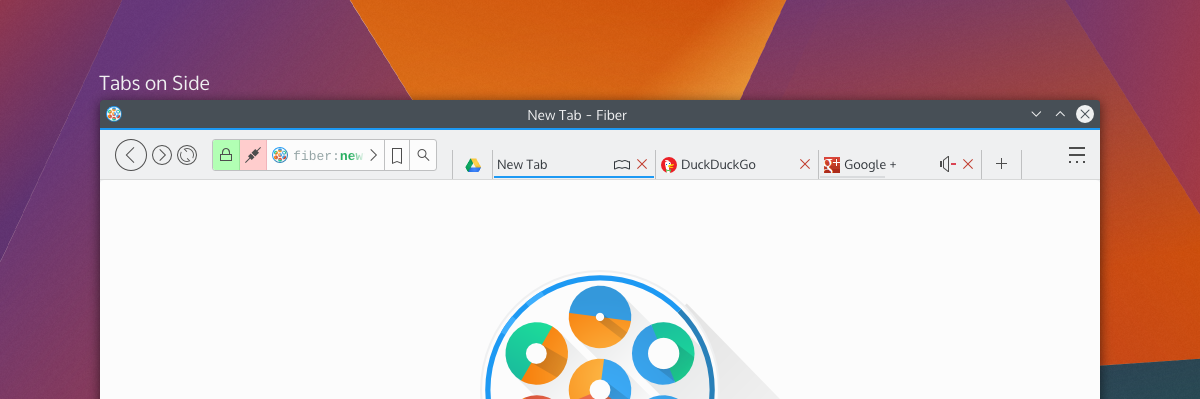
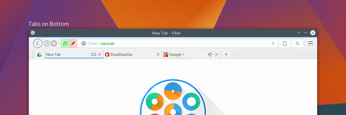
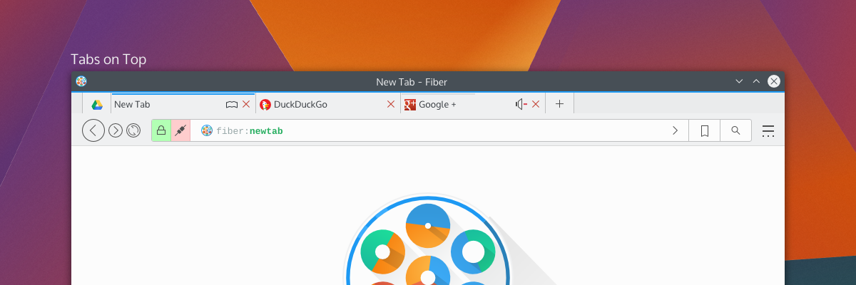
By default, Fiber will have either “Tabs on Side” or “Tabs on Bottom”; this hasn’t been decided yet, but there will also have a “Tabs on Top” option (which I have decided will not be default for a few reasons). Gone is the search box as it was in previous attempts – replaced with a proper address bar which I’m calling “Multitool” – and here’s more about it why I’m a little excited;

Multitool

Fiber is going to be an extensions-based browser. Almost everything will be an extension, from basic navigational elements (back, forward), to the bookmarks system – and all will either disable-able or replaceable. This means every button, every option, every utility will be configurable. I’ve studied how other browsers embed extensions in the address bar, and none of them really integrate with it in a meaningful and clearly defined way. Multitool is instead getting a well-defined interface for extensions which make use of the bar;

Extensions which have searchable or traversable content will be candidates for extending into the Multitool, which includes URL entry, search, history, bookmarks, downloads, and other things. Since these are extensions with a well-defined API you will be able to ruthlessly configure what you want or don’t want to show up, and only the URL entry will be set in stone. Multitool extensions will have 3 modes which you can pick from: background, button, and separate.

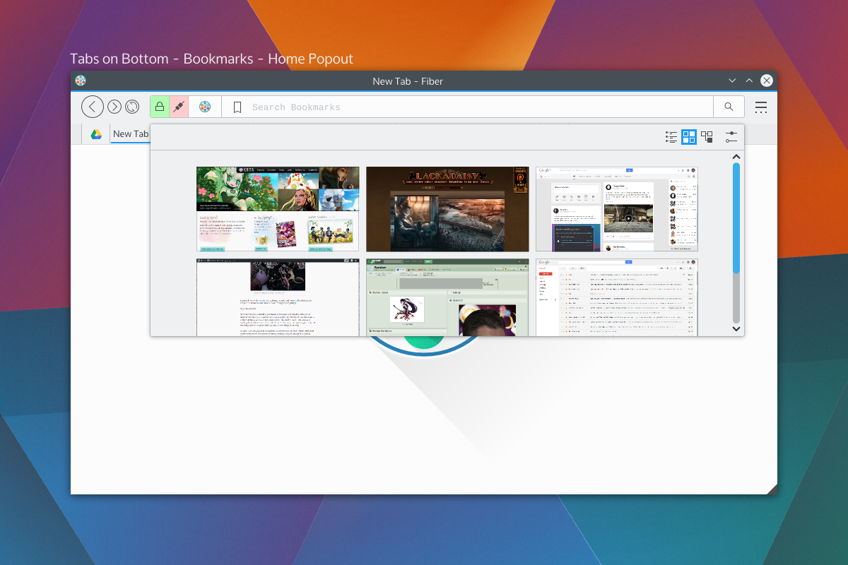
Background extensions will simply provide additional results when typing into the address bar. By default, this will be the behaviours of things like current tabs, history, and shortcut-enabled search. Button extensions in mutitool will provide a clickable option which will take over the Multitool when clicked, offering a focused text input and an optional QML-based “home popout”. Lastly, “separateextensions will split the text input offering something similar to a separate text widget – only integrated into the address bar.

The modes and buttons will be easily configurable, and so you can choose to have extensions simply be active in the background, or you could turn on the buttons, or disable them entirely. Think of this as applying KRunner logic to a browser address bar, only with the additional ability to perform “focused searches”.bookmarkshome

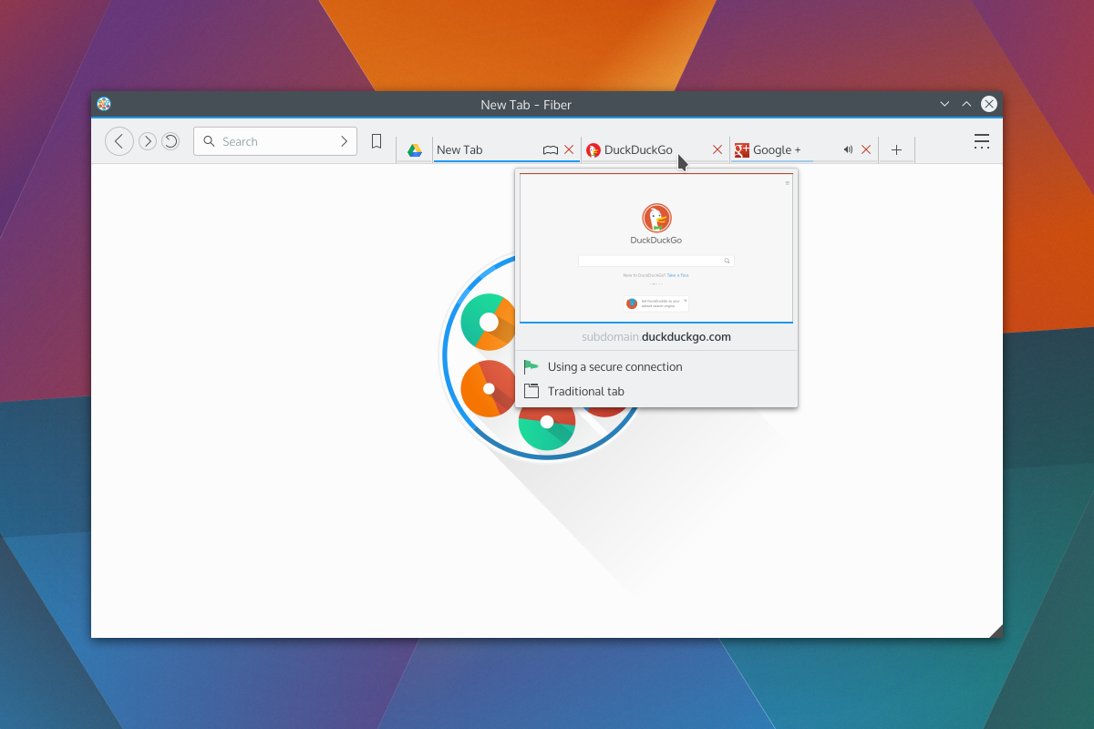
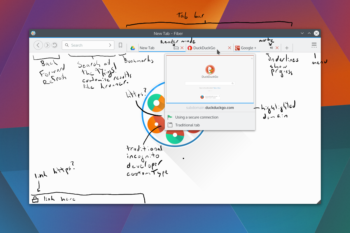
Shown on the right side of the Multitool are the two extensions with dedicated buttons; bookmarks and search, which will be the default rollout. When you click on those embedded buttons they will take over the address bar and you may begin your search. These tools will also be able to specify an optional QML file for their “home” popout. For example the Bookmarks home popout could be a speed-dial UI, History could be a time-machine-esque scrollthrough. Seen above is a speed dial popout. With Bookmarks and Search being in button mode by default, just about everything else that performs local searches will be in “background mode”, except keyword-based searches which will be enabled – but will require configuration. Generally, the address portion of Multitool will NOT out-of-box beam what you type to a 3rd party, but the search extension will. I have not selected search providers.

We also get a two-for-one deal for fast filtering, since the user is already aware they have clicked on a text entry. Once you pick a selection from a focused search or cancel, the bar will snap back into address mode. If you hit “enter” while doing a focused search, it will simply open a tab with the results of that search.

Aside from buttons, all the protocol and security information relevant to the page (the highlighted areas on the left) will also be extension-driven. Ideally, this will let you highly customise what warnings you get, and will also let extensions tie any content-altering behaviour into proper warnings. For example, the ad-blocker may broadcast the number of zapped ads. When clicked the extensions will us QML-driven popouts.

Finally, the address itself (and any focused extension searches) will have extension-driven syntax highlighting. Right now I’m thinking of using a monospace font so we can drive things like bold fonts without offsetting text.

Tabs

Tab placement was a big deal to people; some loved the single-row approach, others wanted a more traditional layout. The solution to the commotion was the fact that there isn’t a single solution. Tabs will have previews and simple information (as seen in the previous round of designs), so by default tabs will be on the bottom or side so the previews don’t obstruct unnecessary amounts of UI.

tabsontop

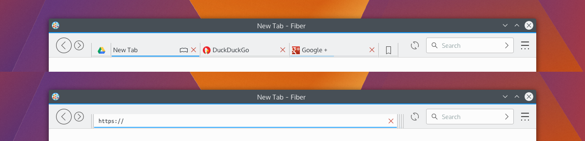
Fiber will have 3 tabbing options; Tabs on top, tabs on bottom, and tabs on side. When tabs are “on side” it will reduce the UI to one toolbar and place the tabs on the same row as the Multitool, and should also trigger a “compressed” layout for Multitool as well.

There will be the usual “app tab” support of pinning tabs, but not shown here will be tab-extensions. Tab extensions will behave like either app tabs or traditional tabs, and will be QML-powered pages from extensions. These special tabs will also be home-screen or new-tab options, and that is, largely, their purpose; but clever developers may find a use in having extension-based pages.

Tabs can also embed simple toggle-buttons, as usual, powered by extensions. Main candidates for these will be mute buttons or reader-mode buttons. There won’t be much to these buttons, but they will be content-sensitive and extensions will be required to provide the logic for when these buttons should be shown. For example, “reader mode” won’t be shown on pages without articles, and “mute” won’t be shown on pages without sound.

Current Progress

The current focus in Fiber is Profiles, Manifest files, and startup. Profiles will be the same as Firefox profiles, where you can have separate profiles with separate configurations. When in an activities-enabled environment, Fiber Profiles will attempt to keep in sync with the current activity – otherwise they will fall back to having users open a profile tool.

The manifest files are a big deal, since they define how extensions will interact with the browser. Fiber manifest files were origionally based on a slimmed down Chrome manifest with more “Qt-ish” syntax (like CamelCase); but with the more extensive extension plans and placement options there’s more going on with interaction points. There’s a decent manifest class, and it provides a reliable interface to read from, including things like providing missing defaults and offering some debugging info which will be used in Fibers extension development tools.I’m using DBus for Fiber to check a few things on startup; Fiber will be a “kind of” single-instance application, but individual profiles will be separate processes. DBus is being used to speak with running instances to figure out what it should do. The idea behind this setup is to keep instances on separate activities from spiking eachother, but to still allow the easier communication between windows of a single instance – this should help things like tab dragging between windows immensely. It also gives the benefit that you could run “unstable” extensions in a separate instance, which will be good for development purposes.I wish I could say development is going quickly, but right now my time is a bit crunched; either way things are going smoothly, and I’d rather be slow and steady than fast and sloppy.Development builds will be released in the future (still a long ways away) which I’ll be calling “Copper” builds. Copper builds will mostly be a rough and dirty way for me to test UI, and will not be stable or robust browsers. Mostly, it’ll be for the purpose of identifying annoying UI patterns and nipping them before they get written into extensions.

Fiber UI Experiments

This week has been the lowest-level backbone things for the Fiber Browser. Mostly I’ve been designing the manifest class, which accepts a JSON file and produces a nice reliable API to interpret. Most of this browser will run on extensions, so the Manifest is one of the most important parts of this browser. It’s largely based on Chrome manifest files, however it differs in naming conventions (e.g. camelCase) and structural areas, the largest being “services” support. Services include things like “history” and  “bookmarks”. Services will have clearly defined APIs, and extensions using those services don’t need to know what extension is offering the service.

Earlier I put up a G+ post of one of my UI experiments for Fiber. I had created the following design based on the idea that the address bar is becoming obsolete, and needed feedback on my thought process. The idea is that the address bar is hidden inside the tabs, and when a tab is double-clicked it would expand to reveal the address behind the tab.

fiber-modesAside from some KDE integration, the original (nearly chrome-identical) design added nothing to the browser space.  I didn’t want to make a browser that was the same, but I don’t like changing things just for the sake of being unique.

uniqueforkMy G+ post was a fleshed-out version of my favourite pencil wireframe. The first thing I looked at was the wasted space in browsers; the current “space race” has lead to one generally accepted design with tabs on top and content controls on a second row. Sometimes a bookmarks bar. Lots of smart engineers at Google, Mozilla, Apple, Microsoft, and Opera have looked at UI controls in browsers, it’s not an accident that this is the current “best design”. The current browser layout offers immediate access to important controls, with the two expanding elements (tabs and address) being on two rows. but the address bar didn’t to anything the search bar couldn’t, aside from address a very specific URL.

So, after my design and some more thinking I took a look at browsers again, and I found only IE broke from the trend by putting everything on one row with approximately half the toolbar going to the address bar, and other half going to the tabs. The benefit was saving vertical space, but with the downside of limiting how many tabs a window could multi-task easily.

internet-explorer-11This was very close to my design with the sole exception being that the core functionality of the line input is an address bar – where mine was search. I was actually a little shocked at the back/forward buttons too, because mine looked similar. Granted, I was actually aping an older Firefox design, but that’s beside the point. 😛

So I took a more thorough look at more factors, and settled on my current design goal (pending YOUR feedback!); please note that the new tab page is a placeholder.

fiber-full-12The first thing going on is moving the search bar in a position to the IE address bar. After careful consideration, I realised the search bar was going to be much more heavily used, so it needed better placement closer to users’ muscle memory. Additionally, since websites tend to place navigational elements on the top or left, it made sense to have the search be nearer to where the mouse might be. The search bar will also search your bookmarks and history, so it should find regularly accessed URLs efficiently. Depending on the extension rollout, the capabilities of the search bar should be adjustable.

Bookmarks have been moved from a tab to a menu button. I don’t know what I was thinking putting bookmarks as a tab. Too bad I don’t do drugs, or I’d have an excuse. I also put in the ‘new tab’ button.

Next is the preview. There’s the thumbnail, the loading status bar, the highlighted domain, https status, and tab type.

fiber-full-12-markedNot seen would be the transient URL bar. The bar would be colour-coded, and extensions could augment it to add icons or snippets of text. For example, it would be neat to have a phishing extension warn users before they even click a dangerous link, display if the link will run a popup, etc.

One thing mentioned in the original G+ post was phishing and the address bar; with no address bar, how can you spot phishing? Simply put, I don’t want to rely on the address bar to warn users about phishing. I just think it’s a bad idea which shouldn’t be relied upon, as I don’t believe most users understand how URLs are composed – and while it may be simple to many of us, addresses have many moving parts. Additionally if a website looks convincing enough, users may not feel the need to double check the address bar.
Far, far later in development, possible a version or two after release, I plan to add safety extensions. I’m interested in the Google Safe Browsing API.
Otherwise, the only thing not shown in the new screenshots is the address bar which, like the first designs, would expand by double-clicking a tab. I may also look at putting in a toggleable button for the same purpose, as some persons have difficulty double-clicking, or may want faster access.Any C&C would be deeply appreciated, this is an evolving design and I’d like to have it well thought-out before I begin programming that aspect of the browser.

Be just as suspicious of your news providers as you are about your software providers

As a human who occasionally gets a giggle out of some news articles, I riff on Phoronix sometimes for the ‘sensationalist’ journalism on my G+ feed. While the news site can occasionally get excited for mundane developments, one important detail is that Phoronix doesn’t intentionally misrepresent issues. I may riff on Phoronix, but I genuinely trust their news as the baseline for reliable information, and if Larabel notices an inconsistency he’s quick to update his articles.

I can’t say the same for Rick Falkvinge and his “Privacy News Online” website.

I got linked to an article from OSNews and was absolutely disgusted by the amount of distortion in the article, which goes beyond sensationalism and straight into damaging and slanderous territory. I may titter at Phoronix once in a blue moon, but “PNO” actively made me sick.

So, what’s the article about?

Google provides a service binary for its “O.K. Google” voice search functionality, this package is downloaded by Chrome as a post-installation package. Open-source Chromium builds download the module the same manner. The function of the voice search module is to listen for a key phrase and transmit voice snippets to Google for interpretation, ultimately so the user may use a reliable voice-search mechanism. Despite being downloaded voice search is not activated by default.

The Pirate Party founder behind the article took offence that an open-source Chromium browser will download the binary blob which provides the service, and I imagine mouth-still-frothing decided the only way to solve this problem was to slam the Googley browsers through a litany of litigation-worthy libel.

Paraphrased, or rewritten? Rewritten.

The most egregious part of the article is a portion which “obviously paraphrases” a Google rep, and it offends me as a thinking person. The paraphrased content makes Google out like a villain ready to tie people to train tracks, wilfully rewriting the statements from a bug report to make it as draconian as possible.

The paraphrased content is a copy->paste away from landing in the article as-is, and when you read the original texts it’s all quite reasonable – my paraphrasing of it goes;

There’s a binary voice-search module which will be downloaded, but it’s not enabled by default, and you can specifically tell Chromium not to download it. We think voice is pretty important, so we give it to you by default and treat it as part of the core browser, but you need to enable it yourself for privacy reasons.

But the “paraphrased” cartoon-villain version of the same text from “Privacy News Online” would make the NSA blush. Below is snippets copied-and-pasted from the article, cropped for brevity. Though I added exclamation marks because I feel it’s more appropriate punctuation for the ridiculousness;

Yes! We’re downloading and installing a wiretapping black-box to your computer! We did take advantage of our position as trusted upstream to stealth-insert code into open-source software that installed this black box onto millions of computers! Yes, Chromium is bypassing the entire source code auditing process by downloading a pre-built black box onto people’s computers. But that’s not something we care about, really! Yes, we deliberately hid this listening module from the users! We don’t want to show all modules that we install ourselves!
MUAHAHAHA!

(I also added the “Muahahaha”, sorry. It’s too ridiculous)

We must defend ourselves against features!

The article goes on to say that, because companies force these terrible optional binary features on us, that we need to start getting all kinds of tin-foil-hat crazy with our electronics.

Fun fact: I used to work in a call-centre troubleshooting mobile phones. My favourite call ever was from an individual who wrapped is battery in tin-foil so “the government couldn’t listen”

His first point is that people will “downplay the alarm”; Oh, you bet. He questions how it knows ‘OK Google” was spoken, implying that everything you say is always transmitted. There’s two problems with this point; he skipped the part where you need to enable it, and simple math dictates that even the great Google can’t beam millions of simultaneous voice-streams to their servers perpetually.

His next point is that it is a big deal for the same reasons as point #1; that Google is slurping up physically impossible amounts of bandwidth listening to millions of people across the world. He adds that maybe there’s keywords embedded in the software which Google is listening for, so every time you mention artichoke, broccoli, cauliflower, or dates Google will secretly log your love of vegetables or hot singles looking for a night out. One of the two.

Then he questions why it’s “opt-out”. Protip: when something isn’t enabled by default, it’s opt-in. But I get it! He wants all binary things in Chromium to be opt-in, not wanting binary components near his open-source sauce; but that’s a build issue, and if someone is building Chromium it puts that person in an entirely different league than someone who just wants their browser to work.

Lastly, he says the inverse of the previous argument which I just said; he states it’s opt-in except for having the binary component, but then implies “we don’t really know that for sure! It could still be running! Google could be downloading different spyware!”. This argument annoys me because that’s not how computers work; you can have the most malicious executable on your hard-drive, but it’s inert until you run it. I could have “babyeater.o” sitting on my computer right now, but until I choose to run it, it’s nothing. His entire argument here hinges on the idea that “Google put a binary service onto my computer, and they could secretly run it on my computer!”; but they aren’t. Google isn’t stupid. If they tried that Google would stand to lose billions of dollars in an international class-action lawsuit. If they say it’s “opt-in” it’s going to be opt-in, and just because it isn’t obvious doesn’t mean it’s hidden. Chrome and Chromium have a multitude of features, and for obvious reasons Google isn’t going to add a 12-part setup wizard to Chromium so every user can make decisions about highly technical aspects of a web-browser.

Finally, the cherry on the top is the article advocating all computer peripherals should have physical on/off switches. But! Companies are EVIL! DANGEROUS! WILLING TO DO THINGS WHICH WOULD GET THEM SUED! What if these evil companies put out webcams and microphones which simply had dummy on/off switches? Clearly, hardware manufacturers are above snooping. At his level of paranoia, there’s a much easier solution than making the hardware industry include physical switches for everything: unplug the damn devices. I mean, it’s common knowledge that many computer systems are vulnerable to remote tapping – and they don’t even turn on the “recording” LED on webcams. If you’re going to be paranoid, at least be paranoid *all the way*.

Should you don the tinfoil headgear?

I advocate crazy people. Crazy people let us know we’re all still sane, and sometimes crazy people find out crazy things or point out issues which should have been crazy obvious. People like Richard Stallman who are clearly insane are necessary, because they pull the whole baseline in a focused direction. They’ll more readily call out things which are on the verge of becoming dangerous. I enjoy people who are constructively crazy. Richard Stallman brought us wonderful ideal open-source licences, putting his brand of crazy in the “awesome” end of the spectrum.

But then you get people like Rick Falkvinge. Rick is being crazy too, but he’s not being constructive. I don’t like Rick. His article could have been incredibly informative; he could have taught us how Chromium works, what it’s doing, why it’s doing it, and how to make an informed choice.

Freedom is fake if your choices are based on lies. Choices aren’t real when you’re not informed. Decisions aren’t your own when someone scares you into them. It’s manipulation.

When I read article like “Google Chrome Listening In To Your Room Shows The Importance Of Privacy Defense In Depth” I get angry because of how it portrays the issue; it’s doing a disservice to his readers because they will not have an informed choice. The article is manipulating its users into thinking voice search is an evil scheme by a faceless behemoth.

I like Google – but while I’m cautious about my Google intake – they still provide high quality services and set a reasonable expectation about how they use my data. What if a handicapped user read his article? Or a friend of a handicapped person? What if that person who could have benefited from voice search thought it was malicious spyware, instead of knowing what it was really all about? I may never use voice search, but I think it’s a very reasonable inclusion provided in a way that minimises hoops for interested users.

In the end, I guess this all goes to say that we also need to look into our news sources; Rick Falkvinge doesn’t seem to be making any effort to provide valuable information, instead preferring to force klaxxon onto readers based on pre-conceived notions. So when you open up an article, keep in mind that authors can be biased just as much as software can be dangerous.

Now that you’ve finished my article on it, please, ponder what I’ve said and question what biases I have. Do some research on the topic – Google it. Come to a clear understanding, and make a real choice.