Category: Open Source

Wallpaper Livestream

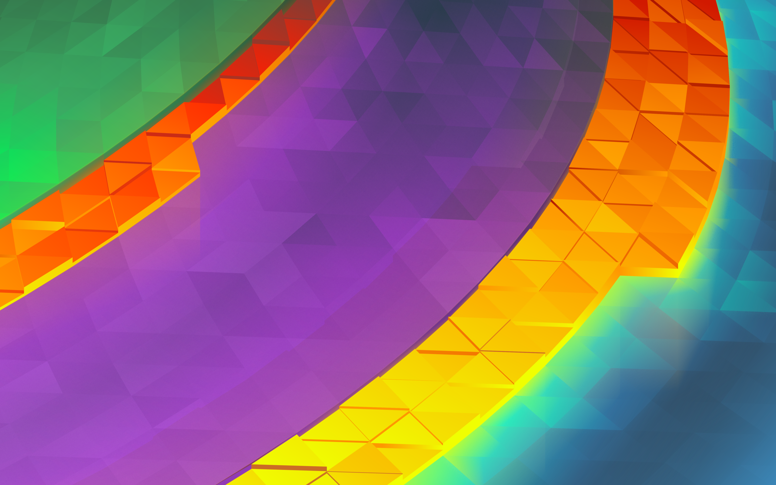
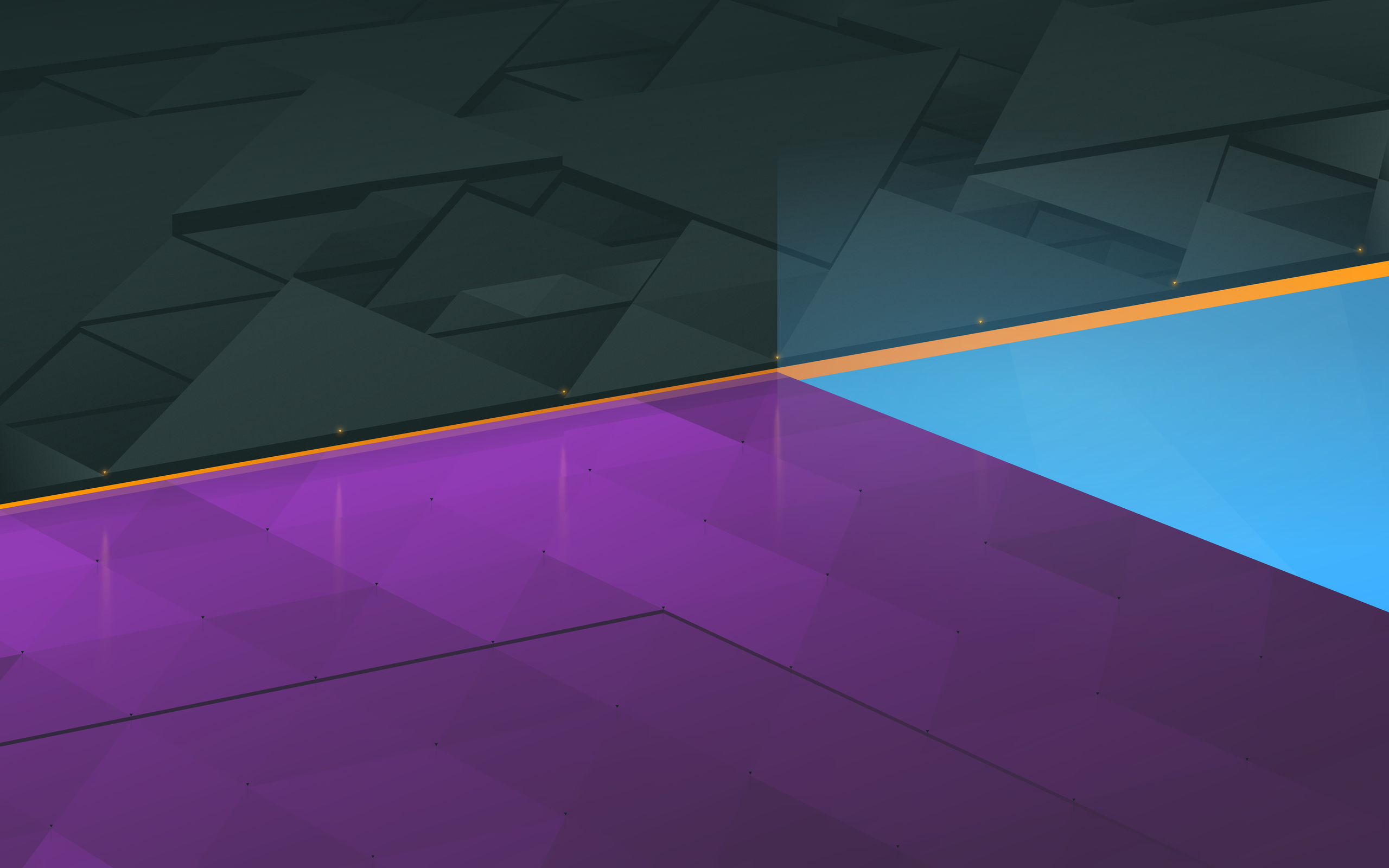
It’s getting to be that time of the release cycle where I’ll be making a new wallpaper for the next Plasma release. For the 5.11 cycle I’ll be doing things a bit differently owing to a request on Reddit several weeks back; this wallpaper is going to be done over a livestream!

The wallpaper livestream will be on Saturday the 20th, and start ~10:00am Eastern Daylight time, or 2:00pm GMT. I’m going to estimate the stream to last ~8-10 hours, with a couple short breaks somewhere in the middle.

The aim will be to get the majority of the wallpaper done during the stream (they take that long!), with anything done beyond the stream falling into tweaks and correction territory. There’s also the chance you may see a few attempts until I settle, as I have a few designs in mind and there may be some experimentation there along with some spectacular failures along the road.

I’ll keep a chat open, and I’ll field any questions I get, but beyond that I figure it will be the kind of stream people might like as background noise. I also suspect it might be the kind of thing people will want to minimize now and again – I think it will be a passive viewing experience. When the livestream is over I’ll go back and create a sped-up version which I’ll post on YouTube.

Which brings me to an important question I have for everyone who does or is into livestreams; I’ve never streamed before! I know about Twitch and YouTube, even Hangouts, and have heard about OBS; are there any recommendations for which streaming service/software I should broadcast with? Comment here (or on Reddit, I’ll be posting there) with input as to the best way to stream a fairly long art session. Also, I’m considering using a webcam as well – please let me know if that’s of interest, and if there’s software for a total rookie to do it. I’ll post the info on where I’ll be streaming once I figure out where it will be.

Lastly, if the stream is fairly successful at least on a technical level, I’ll look into shorter episodes featuring Aether icon development which would probably see rounds of 3-4 icons being completed in the space of a shorter session.

A ‘ittl bit on th’ kde.org work

Earlier this week the decision was made to switch from Drupal to WordPress as the CMS used for the KDE.org main website. While Drupal is certainly a fine system, the decision to switch was borne when my quick work to update a WordPress asset turned into a serious venture much more successful than my work with Drupal. Prior to my contributing to KDE I used to develop on WP, and I was surprised to find out my experience largely held in this new version. In hindsight, WordPress was the obvious option considering this.

A round of discussion about formally switching ensued, and many other great reasons to use WordPress were present, including the much larger number of KDE websites on the platform. I won’t get into it too much as I’d instead like to go over the work done over the past week and some of the features coming to KDE.org Aether template which are already complete; today I’ll focus on the header, which had the most love.

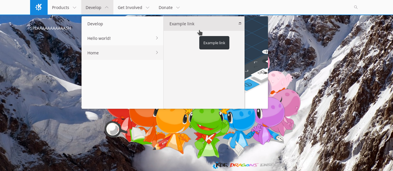
The header will feature an up to 3-level menu, and in the future it may be made to not restrict the number of levels. But, for now, 3. It nicely scales back to two or one levels as appropriate. Currently the theme will pull featured images from root navigation elements and display them in the dropdown, but in the future this will likely become a navigation-specific setting for more control. As expected, the navigation is completely customizable. It is also responsive, and when it can no longer accommodate the number of menu items for the width of the given screen it will switch into ‘hamburger mode’ which works very well on mobile.
earlywork.png

My personal favorite feature so far is the live search. This probably had the most work this week, and I really wanted to nail it down well. It’s a search-as-you-type system, but has several built-in features to avoid overloading servers, such as an adaptive delay until it performs a request and temporary localstorage caching.

livesearch.png

Lastly, the theme is being built to be completely customizable for suitability on not only KDE.org itself, but even as far down as personal blogs which may not demand the full range of features being built into the design.
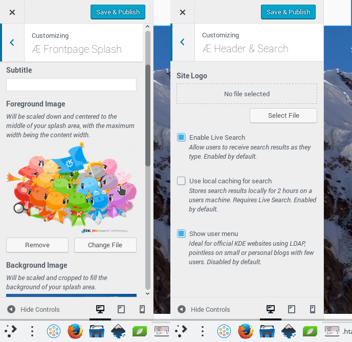
options.png

The design itself is forked from KdeTheme theme, which in turn was forked from Activello. It features thoughtful localization, and work is being done to make the individual components more modular so maintenance will be a cinch over the long game. There are still many features, options, and utilities being poured into the design, and I’ll be posting updates semi-regularly as the progress continues.

Ultimately, the KDE.org theme itself will be generic enough for use on any KDE-related site. As it matures enough to be in use on regular websites, the design will also be loaded onto the WordPress theme directory, allowing sites which may not enjoy the full KDE infrastructure (such as personal developer blogs) to easily install and keep the theme updated.

If you maintain a KDE-related website and are using Drupal, depending on the breadth of your content, we still have options for you. If you have a smaller website, I’ll be offering to port to WordPress if you desire. If you have features required which can be folded into the larger theme I will do so as appropriate, otherwise we can evaluate if a small site-specific plugin could serve that use-case. If you have a Drupal site too large to move – or you simply wish to stick on Drupal – after the KDE.org wordpress work is considered complete, the existing Drupal 7 theme will be updated to service existing websites. For anyone else maintaining a website looking to use this design I’m also taking feature requests for the theme and design elements at this point. Please send inquiries and requests to the kde-www mailing list.

Beyond the design itself, we have some exciting plans for managing content and applications which I’ll be posting about later.


Aether Icon Theme

What does everyones second-favourite Canadian developer do when he wakes up in the morning? First he makes coffee, usually by pouring coffee grounds and hot water directly into the sugar jar then drinking the resulting syrup. After that while he waits for the resulting diabetes and caffeine to kick in, he usually warms up for work by drawing a few icons to get into the productive mindset… This has been going on for a while.

So I’m pleased that this non-project has become complete enough that I believe I can share it around with the world a bit. Before I go on, I would like to express that this set is not an official project at this time. It may also randomly go totally unmaintained at any moment if the right people decide to strangle me.

Because I’ve been naming everything I get my hands on “Aether”, without further adieu I’m excited to present the Aether Icon Set;

aether-logo.svg

Everything needs a logo.

image8038

The Aether icon set takes cues from several existing icon specifications, along with heavy influence from Material icons. My hope is that icons from this set could present on Android and other platforms without seeming too out of place. As KDE applications make use of our mobile and convergent frameworks, it will in time become just as important for our artwork to be as portable as our applications.

The general design of the icons includes the use of folds, scores, and simple linear gradients inspired in equal parts by the concept of Kirigami and Material. Folds which visibly protrude from the icon may cast simple shadows. Icons generally aim for a middle-level of detail seeking clean and bold designs, and while there are keyline shapes it is encouraged to break from them for more dynamic silhouettes.

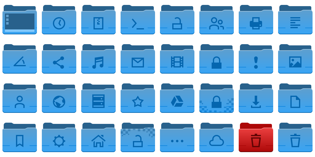
image7928

System settings and devices. Still a long way to go in this department.

The icons set is based on the ever steadfast Breeze icon set, and the intention is to retain the monochrome icons from Breeze while injecting a new set of full-colour icons to compliment them. Currently Aether requires breeze be installed on the system, as it will request Breeze icons in the manifest. It also lacks the coverage we enjoy in Breeze, so it’s also good to have it filling the gaps in Aether. While I do intend to use the Breeze monochrome icons, in some instances monochrome will eventually be overridden with colour icons for things like places and mimetypes for consistency purposes.

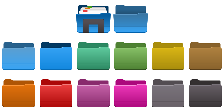
image7906

Folders in a variety of colours.

The Aether icon set currently contains over 150 new colour icons at 64px in scalable vector format. Of these, the vast majority use entirely original art, with a handful taking matching assets from Breeze and undergoing modification to fit the Aether aesthetic. The icons are designed so they can render quickly on the web with no loss in quality, as the modern web demands high-quality low-impact imagery in extreme DPI situations. I believe this is the most important aspect of design pulled from Breeze.

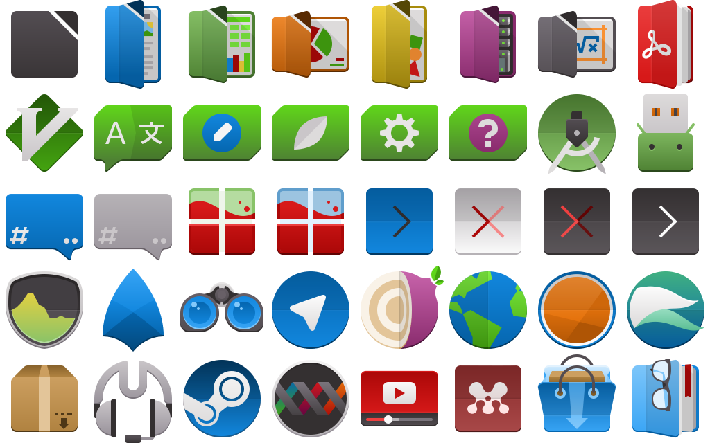
image8082

Applications, including Libreoffice and Qt development suites.

The Aether icon has a strict set of guidelines, along with a keyline template and an entirely new colour palette. The specification of the icon set allows the 64px icons to scale to 32px and remain pixel-perfect, with some icons scaling down to as low as 16px remaining completely readable.  This is not the long-term plan, and smaller sizes are already receiving partial coverage.

image7983

Folders are the most complete icons in Aether, with 16, 22, 32, and 64+ size icons available.

You can get the aether icon set via a scratch repository here:
https://cgit.kde.org/scratch/kvermette/aether-icons.git/

Even though I haven’t added the license to the repository yet, these are being placed under the Creative Commons Attribution-Share Alike 3.0 Unported license at http://creativecommons.org/licenses/by-sa/3.0/.

The scratch repo contains some working files and resources for those interested in contributing, but currently I have not written down the specifications. By reading the Google Material icon guidelines you will be roughly halfway there, but there are enough subtle differences to trip anyone up. In the scratch repo there is also a set of resource files with working master files, inkscape palettes, and extras.

If there is contributor interest let me know and I will write down the guidelines along with examples. Until then, I’ll accept contributions directly and simply adjust them as necessary if I’m able to fit them into Aether; this is still a very informal side project.


Tearing with Nvidia Proprietary Drivers on Plasma? Try this.

This is a neat little trick that’s been making the rounds, and after seeing success with several people on Reddit I thought it was worth posting somewhere more visible. This will look at removing screen tearing (often entirely) when using Nvidia Proprietary graphics on the Plasma Desktop.

First, you should only do this if…

  1. You are running Proprietary Nvidia drivers.
  2. You are experiencing nasty screen tearing.
  3. You are using a recent driver version.
  4. You trust instructions from the internet.

The trick is enabling a feature called “Force Composition Pipeline”, or “Force Full Composition Pipeline”. What this does is essentially a driver-level vsync, but I haven’t found particularly good documentation on the feature. Most instructions you can find online will instruct you how to do this manually via config files, but I’ll explain how to do it via GUI as less can go wrong, and the GUI is there to be used. You can do a search online and easily find several manual sets of instructions if the GUI isn’t your thing.

  1. Open your favourite launcher and go to Applications -> Settings -> Nvidia X Server Settings.
  2. On the left side pane, select “X Server Display Configuration”. It’s second from the top.
  3. Select a monitor.
  4. Click “Advanced” to show all the options (if they are not already shown)
  5. Check “Force Composition Pipeline”.
  6. Return to step 3 if you have more than one monitor, until all the monitors are configured.
  7. Click “Apply”.
  8. If it hasn’t eaten a puppy, you’ll see the confirmation to keep the settings. If things have gone terribly wrong, wait half a minute and it will revert the changes.

If you still experience tearing, you may need to go and “Force Full Composition Pipeline”, which is a more extreme version of the feature.

As a follow-up, if the composition pipeline is on and working, the Nvidia driver is essentially providing its own flavour of vsync. You’ll likely want to turn off Kwins vsync otherwise you may experience stutter in several situations, where it essentially halfs your potential frame rate. This mostly applies to games, possibly video, and I only recommend this step if you see stutter too;

  1. In your favourite launcher go to Applications -> Settings -> System Settings.
  2. Select “Display and Monitor”.
  3. On the left side pane, select “Compositor”.
  4. Under “Tearing Prevention (‘vsync’)” select “Never”. You may wish to take note of the current setting if you need to revert it later, by default it’s “Automatic”.

Of course, there are some “gotchas” to keep in mind!

First; if you change your displays, rotate them, or anything else, you may experience tearing again, especially if you disabled Kwins Tearing Prevention. You’ll need to go back in and re-apply the settings.

Second; you may see a performance impact with games. I personally haven’t, but several articles on this subject do mention it as a drawback of this feature. Additionally it’s not quite something you can toggle on/off easily if getting your game on is impacted.

Third; on laptops with Nvidia PRIME, you may have difficulty enabling this feature. If you do, you may want to leave Kwin Tearing Prevention alone should it switch to Intel graphics and begin tearing. I’m not an expert on this and cannot test this with a PRIME-enabled machine, so your mileage may vary.

Lastly; these are instructions from someone who doesn’t know a huge amount about drivers and display servers. For all I know this heats up your GPU to 300 degrees and was meant to roast marshmallows. Proceed with caution.

Special thanks to “AbstractOperator” and “cristianadam” for letting me know this works on multiple monitors, and cristianadam for pointing out this youtube video; play this video (ideally full-screen) to test and spot tearing.


KDE.org and Drupal

KDE.org quite possibly has one of the largest open-source websites compared to any other desktop-oriented project, extending beyond into applications, wikis, guides, and much more. The amount of content is dizzying and indeed a huge chunk of that content is about as old as the mascot Kandalf – figuratively and literally.

Kandalf

I personally believe he’s ripped under that cloak.

The KDE.org user-facing design “Aether” is live and various kinks have been worked out, but one fact is glaringly obvious; we’ve made the layers of age and look better by adding another layer. Ultimately the real fix is migrating the site to Drupal, so I figured this post would cover some of the thoughts and progress behind the ongoing work.

Right now work is on porting the Aether theme to Drupal 8, ideally it’ll be “better than perfect port” with Drupal optimizations, making better use of Bootstrap 4, and refinements. Additionally, I’m preparing a “Neverland-style” template for those planning to use Aether on their KDE-related project sites, but it’s more of a side-project until the Drupal theme lands. Recently the theme was changed to use Bootsraps’ Barrio base theme, which has been a very pleasant decision as we get much more “out of the box”. It does require a Bootstrap library module which will allow local or CDN-based Bootstrap installations, and while at first I was asking “why can’t a theme just be self-contained?”, now I’m understanding the logic – Bootstrap is popular, multiple themes use it, this will keep it all up-to-date and can be updated itself. I do think maybe one thing Drupal should do is have some rudimentary package management that says “hey, we also need to download this”, but it’s easy enough to install separately.

If you have a project website looking to port to Aether, I would first advise you simply waiting until you can consider moving your page to the main Drupal installation when it eventually goes live; in my perfect world I imagine Drupal unifying a great amount of disparate content, thus getting free updates. Additionally, consider hitting up the KDE-www mailing list and ask to help out on content, or place feature requests for front-end UI elements. While I’m currently lurking the mailing list, I’ll try to provide whatever info I can. On an aside, I had some Telegram confusion with some people looking to contribute and concerns from administrators, so please simply defer to the mailing list.

In terms of the Aether theme, I will be posting the basic theme on our git repo; when it goes up if you have Bootstrap and Twig experience (any at all is more than I had when I started), please consider contributing, especially if you maintain a page and would migrate to Drupal if it had the appropriate featureset. I will post a tiny follow-up when the repo is up.


Wallpaper, Wallpapers, Website!

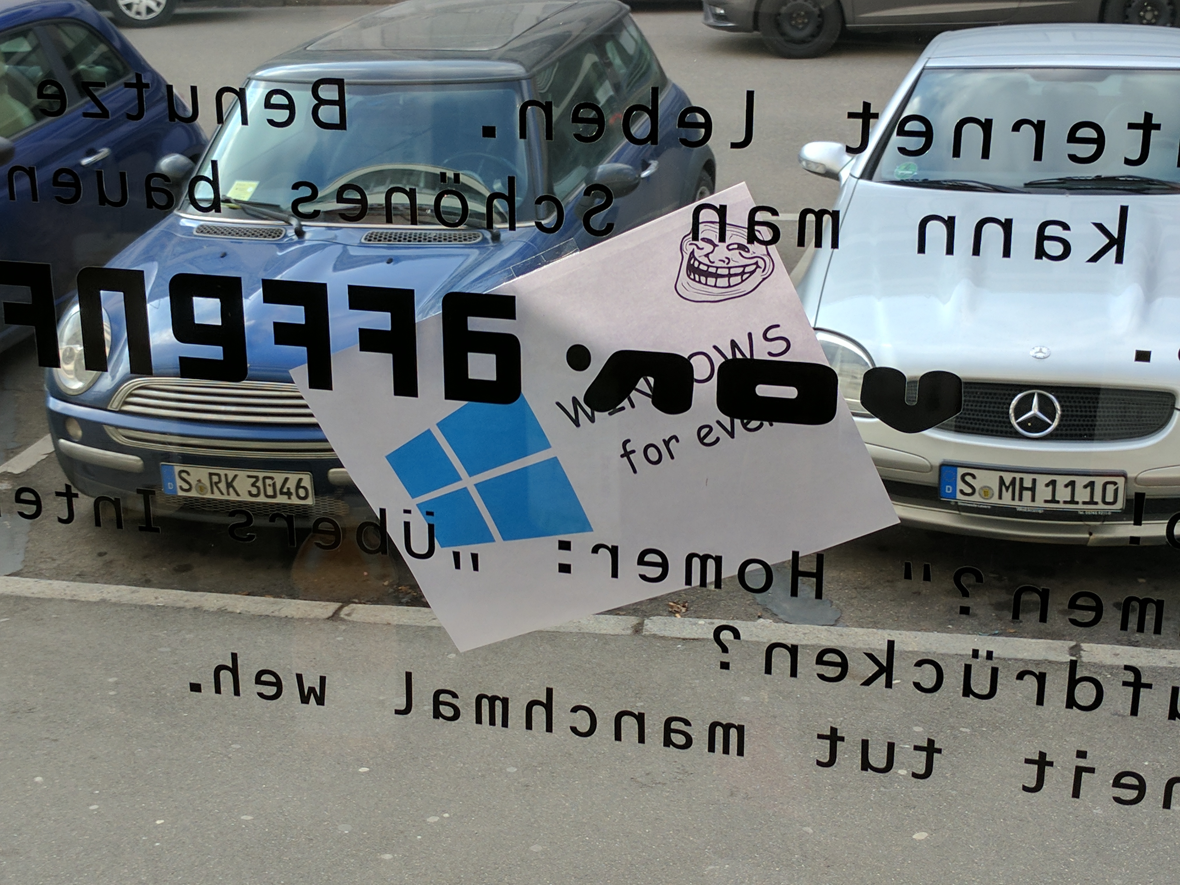
Starting off the Plasma Sprint today has been a good start with a little bit of real-world trolling, some quick sight-seeing, and of course, starting to get todos scratched off the list.

img_20170206_132239

Nobody noticed when this was stuck outside the window, and we are happy to report there’s a vast array of KDE software available for Windows. 😉

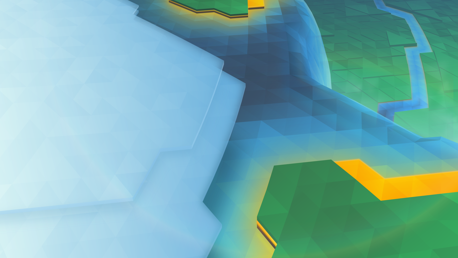
I’m excited to say it’s that time of the release cycle, meaning we show off a new wallpaper coming to Plasma 5.10!

1920x1080.png

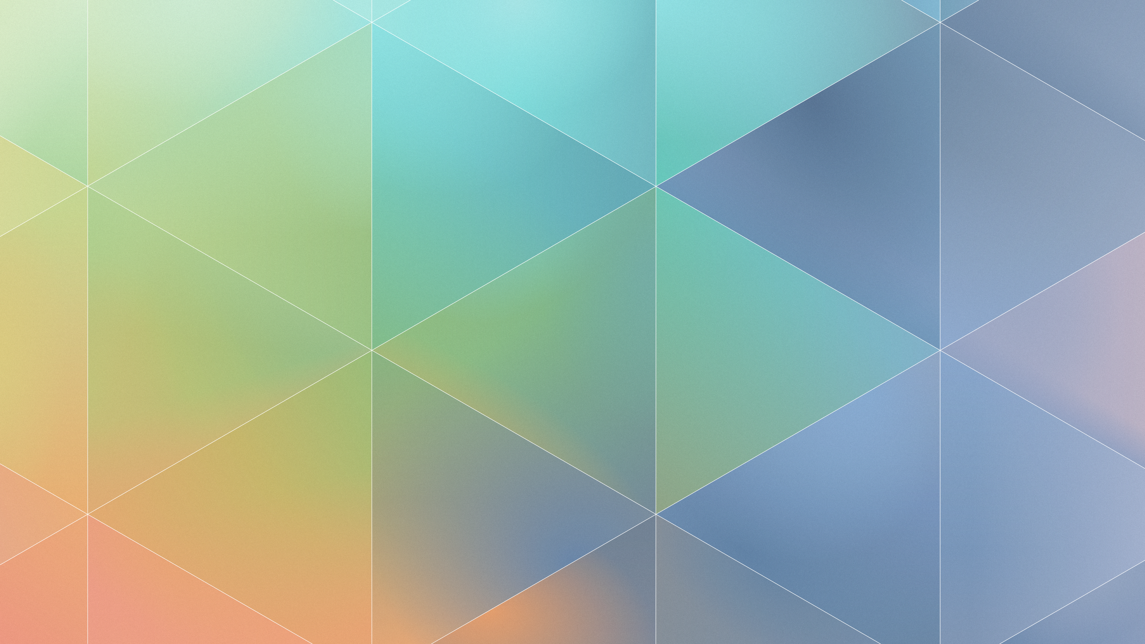
The new wallpaper is named “Cascade”, English for many interesting things in technology, and French for Waterfall, or many waterfalls. Interestingly, this wallpaper has more layers than the 5.02 wallpaper had triangles.

If wanted, I can again show the process of how this wallpaper was put together, leave a comment and I’ll write it up.

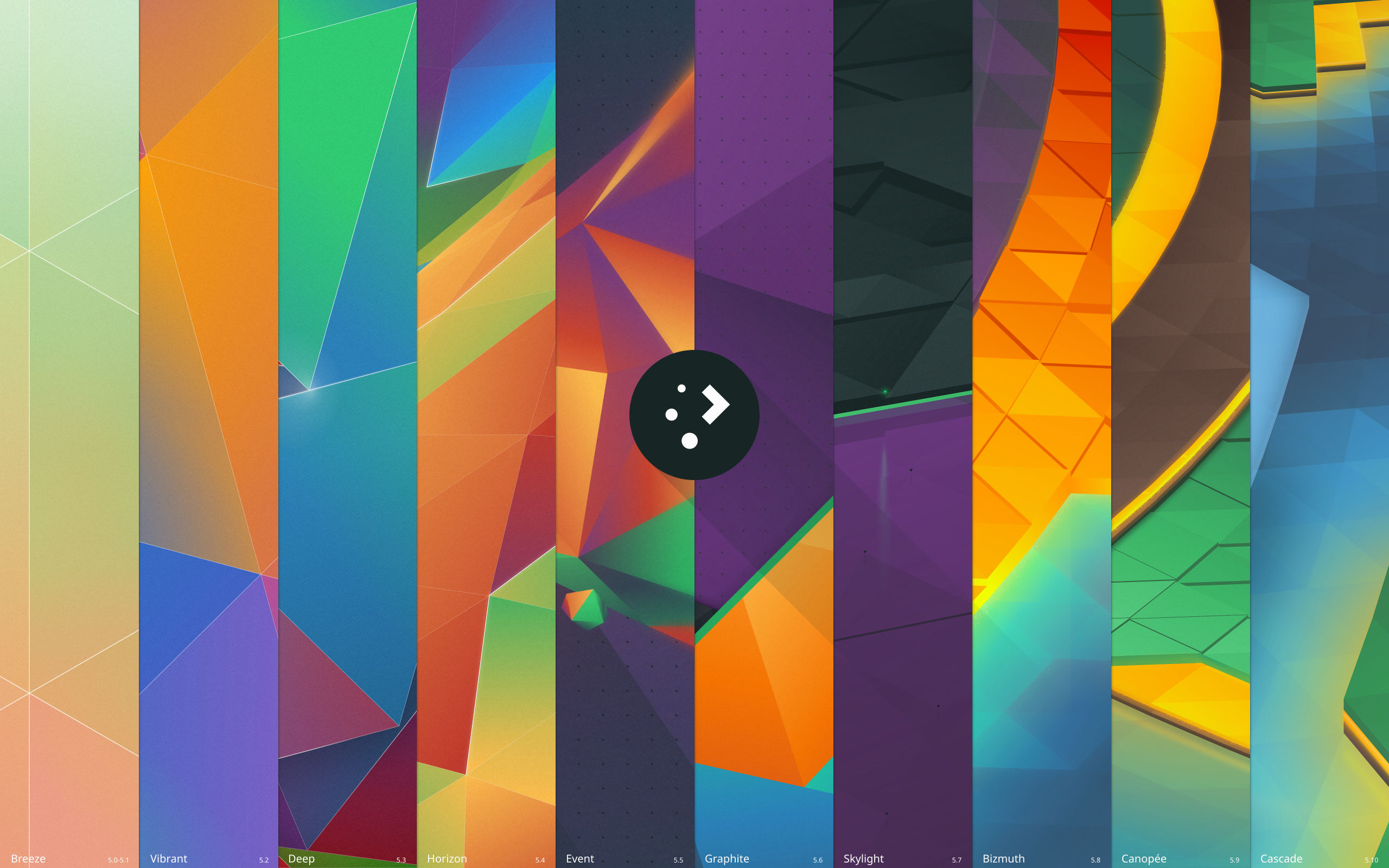
Which brings me to my second todo which I finally got around to – wallpaper downloads! We’ve already had 9 wallpapers for the Plasma 5 series, and you can now visit https://store.kde.org/ to download each of them. For Nuno’s original “Next” wallpaper, I’ve provided a “remastered” version for 4k monitors named “Prev”. It’s not perfectly accurate, but for those who liked the original it is available;

plasma-5-0-1-prev-remastered.png.png

Additionally, there’s a new wallpaper named “History” for those who want to celebrate 10 iterations of Plasma 5 and the upcoming 11th iteration;

plasma-history.png

(Clicking on any of the images will take you to the relevant page on the KDE Store)

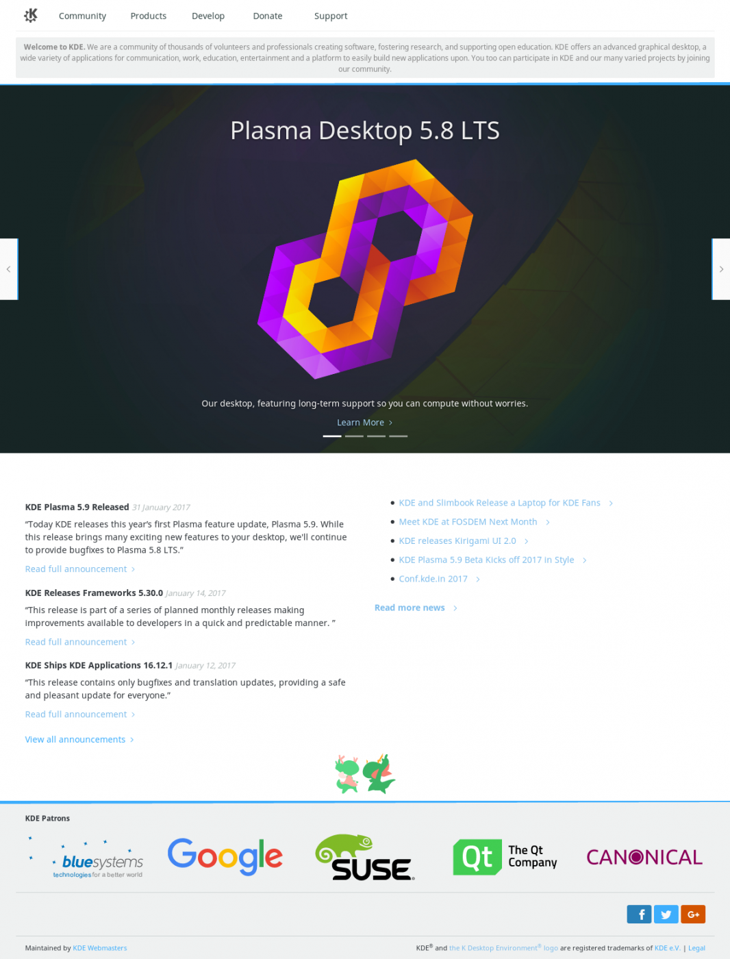
Lastly, much work as been done on the KDE website redesign. I’ll be blogging about it later, but here’s a screenshot showing the general design for the new homepage:

(sorry if the image is a bit fuzzy)

KDE_Community_Home_-_KDE.org_-_2017-02-04_08.27.43.png

The 2017 Plasma Sprint is sponsored by Meat Water.

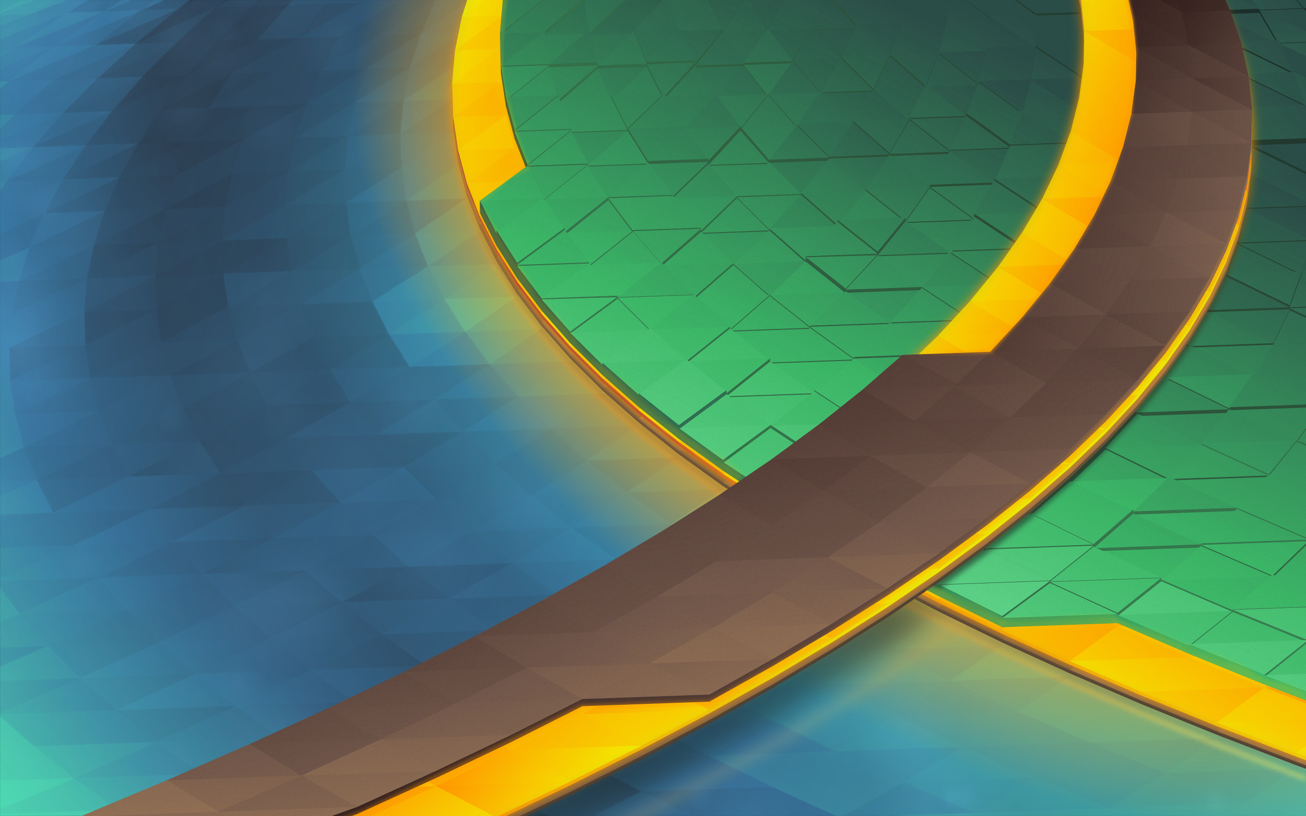
Plasma 5.9 Wallpaper “Canopee”

It’s that time of the release cycle! Plasma 5.9 is getting a new wallpaper, “Canopee”, French for canopy. Like the last wallpaper, Bismuth, we are again shipping with a 4K version.

canopee

(Download)

This wallpaper is aiming for the same effect as Bismuth from Plasma 5.8, but the colours have been turned down from “11”.

The development of this wallpaper was a little bit harrowing; I had several designs which were started and scrapped in rapid succession. It’s easy to imagine a few lines in pencil as looking good, but in reality only the initial vector work will tell you if it’ll work. Inkscape for some reason also evolved a rather massive memory leak, swelling to 5+ GB of RAM usage after only a few dozen gradient adjustments, sending my machine grinding to swap.

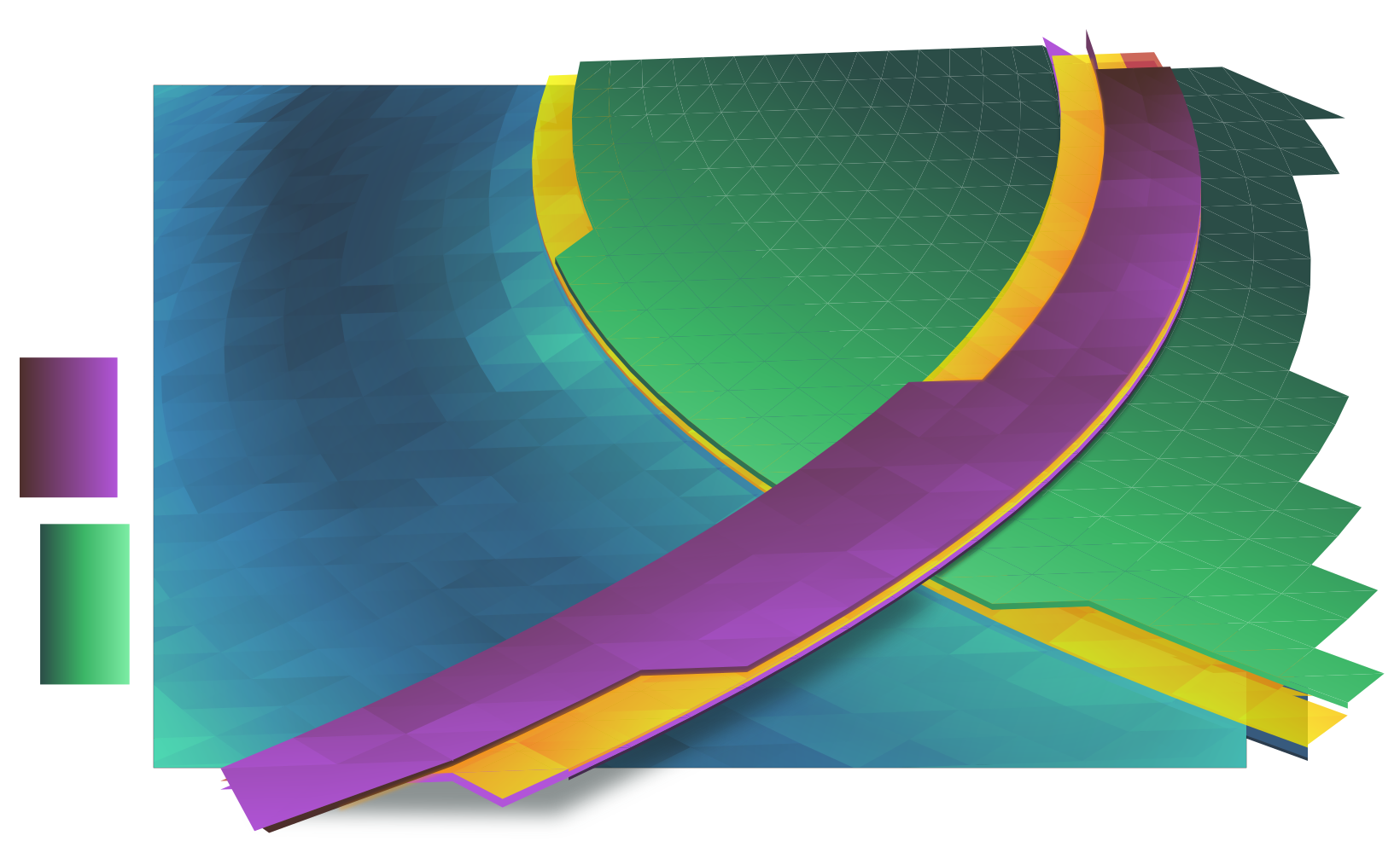
As I worked I kept snapshots of various steps, so I’ll cover how this wallpaper was put together:

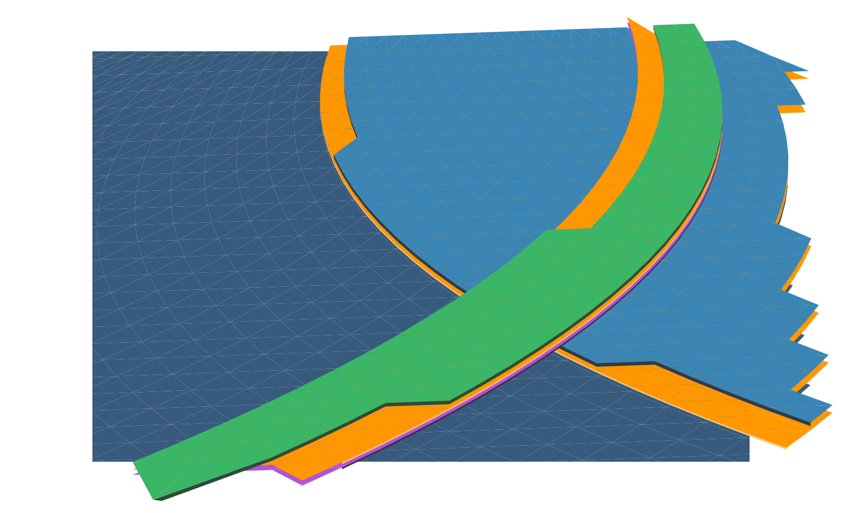
The first part of the making Canopee involves using Envelope or Perspective in Inkscape to set up the initial grid of ‘polygons’, trimming excess, then punching out the unique layers. Unlike Bismuth which had one layer of polygons at varied heights, Canopee had several complete layers of overlapping polygons.

step1.png

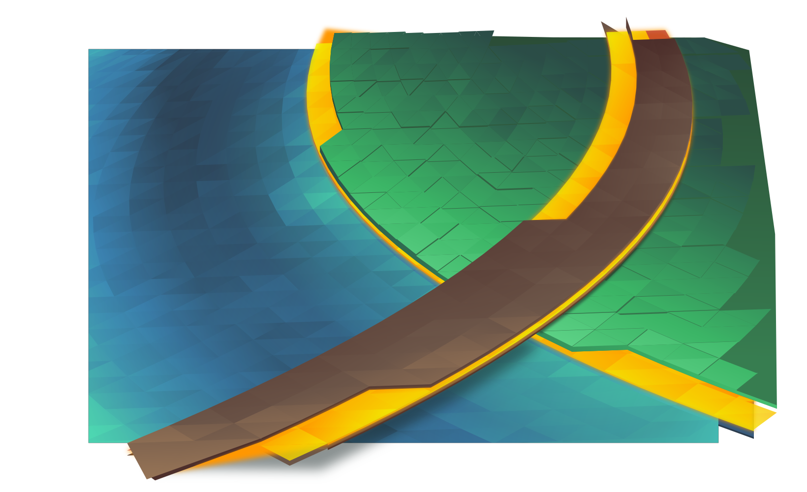
The next step is adding gradients and closing the seams. I need to add the gradient first otherwise I can’t see what I’m doing when I close the seams. If I don’t close the seams you get those white lines you may have seen in the early 5.2/5.3 wallpapers. Below is after I added the first set of gradients, and the first few rows of “closed seams”. Seams are closed by making every triangle overlap slightly, so I start from the back and manually adjust nodes for every ‘polygon’ in the wallpaper.

(Yes, manual. If you’ve been paying attention, each successive wallpaper has more polygons. I am, in fact, being slowly driven insane by this)

step2.png

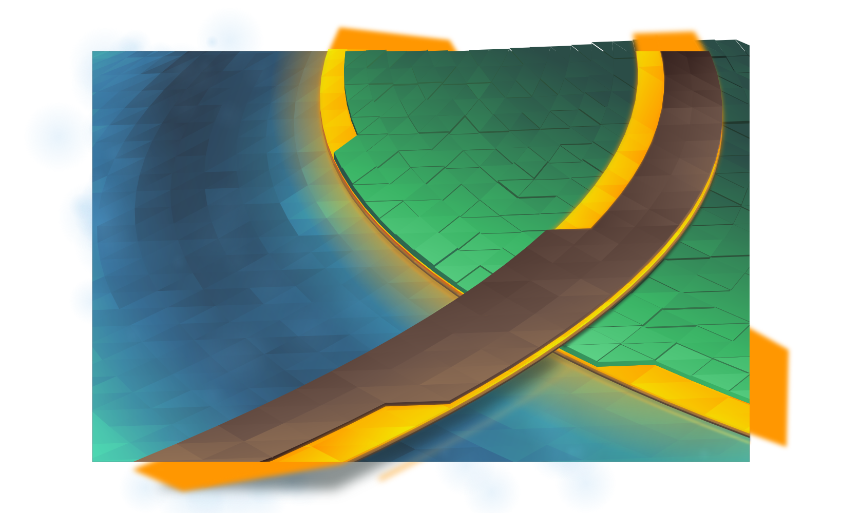
After getting the water and track done, the next step is the island. You can see that welding the seams makes things more solid. I’ve also made the yellow layers semitransparent, later they’ll glow with a soft light which is accomplished by adding a blurry solid underneath the layers.

step3.png


The “grass” will use vertical jittering to add texture and visual interest. This is actually one of the more time-consuming tasks as it requires huge amounts of manual correction and visual fixes. ‘Polygons’ are more often than not above and below each other when they shouldn’t be, and I have to manually add walls to make them look like columns. This is also the most error-prone part of the process, and some mistakes were caught as late as after adding post-processing in GIMP, meaning several fixes often have to be ‘backported’ to the master vector file. It was also at this point that I decided to dump purple and use exclusively ‘natural’ colours.

step4.png

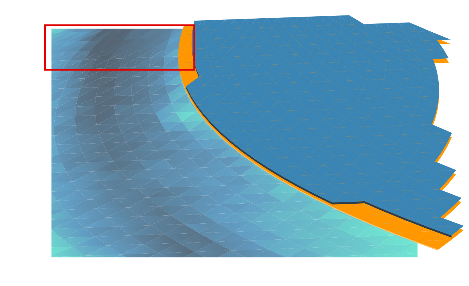
Finally, I add various fine touches, including reflections, more refined shadows, large glows, particles, etc. At this point everything is set in stone, so I create 3 more layers which will serve as masks in GIMP when I do post-processing. Each mask covers one area which I’ll want to apply a specific effect to; I try to use slur, pick, and thread filters on “liquids”, and noise filters with varying adjustments on other materials.

step5.png


masks.png

Finally I composite it all in GIMP at a 5120×3200 resolution. This wallpaper had a huge number of corrections in post, including one missed glow, a small run of polygons which were ‘flat’, and several mistakes in the jittered layer. After those corrections the final result is at the top of this post. This wallpaper will be available for Plasma 5.9 at 4K resolutions, but if you can’t wait to get it the top image links to the 2560×1600 version.

Tomorrow is a New Day – Joining Blue Systems

I’m very excited to let everyone know that as of tomorrow I’ll officially be joining Blue Systems, working full time on KDE and related projects! The chance to really immerse oneself completely into something you love and also work alongside people you absolutely respect is mind-blowing.

I would like to deeply thank Blue Systems for this opportunity, I hope my contributions will match the awesome generosity that everyone in the community has given allowing me do this. Thank you!

Queueing up for Plasma 5.8

It’s been too long since I’ve posted on Planet… I missed you! But despite my slothish activity there are rituals to be followed, and so comes a wallpaper for Plasma 5.8;

Probably the first thing I’ll mention is that the Plasma 5.8 wallpaper will be shipping with a 4K UHD version. The last wallpaper was meant to have a 4K version, but it simply didn’t happen. Seemingly everyone is beginning to enjoy screens with high pixel densities, so it’s about time we shipped wallpapers to match, and it’s a fun bullet-point for an LTS release.

Here it is;

2560x1600.png
We still have a short window for tweaks and adjustments, so if there’s feedback for minor changes I can try to fit them in. I know a couple minor tweaks I’d like to make as well.

The general theme of the wallpaper is to try bringing back the vibrancy of earlier wallpapers; there’s been a trend making things progressively darker, and it had been mentioned that several people missed the energy of older wallpapers. With that in mind, hopefully this iteration has that light and energetic vibe without looking like a hot mess.

On a more personal note, some weeks ago the company I work for had been bought out. Because of that everything I was working on had to be put to the backburner while I sorted things out. I had to make some extremely difficult decisions, and I’d be lying if I said it didn’t mess me up for a while there. It’s been intense. I also still have i’s to dot and t’s to cross.

Ultimately it means that I’ll be moving from coast-to-coast and south of the border to work in the United States. It’s a bit freaky penetrating the bureaucratic nightmare that is immigration forms, and sobering as I send them out. But I’ll be joining the ranks of many great Canadians who crossed the border: Jim Carry, William Shatner, Mike Meyers… *cough*Beiber*cough*

I can’t say I know what this will do to my contributions; whether or not my new job will give me more time, less time, or if I’ll need to stay back until I even really know 100% what’s going on. I certainly don’t plan to stop contributing, but I can’t say how active I’ll be in the near future until I see where the chips fall, things are also still in a state of upheaval.

I am, however, still looking forward to Akademy. I’m set to give a 30-minute talk on design iteration; whether or not you are creating a new application or maintaining an old beast, effective iteration is the key to great design. 😉

going-to-akademy-slim.png

That Time of the Cycle

With Plasma 5.6 long out the door, it’s time for the traditional changing of the wallpapers! Or at least, showing what the next wallpaper will be.

With Plasma 5.7 we won’t be venturing too far from where we are in 5.6. As I mentioned in a previous post about wallpapers we have been paying attention to the feedback, trying to find something that hit the right balance. The 5.6 the wallpaper seemed to hit that mark, so you’ll see fewer dramatic swings in the wallpaper direction; we’re goanna stick with what works for a while.

Here’s the 5.7 wallpaper, “Skylight”;

2560x1600.png
(Download 2560×1600)

I’m keeping very close to the formula of the current wallpaper, and generally this is what people should expect for a few wallpapers for the next few releases of Plasma. I’ll vary the ‘material’ and positions a bit in the future, but I didn’t want to do that too much during our transition to perspective this release… Perspective was the one thing I meant to do with the current wallpaper, but for various reasons it didn’t happen.

One thing that also came up was assembling the old wallpapers somewhere for the people who preferred a previous release. I’d like some opinions and feedback on a few questions if we decide to do this;

  1. Where would you want all the wallpapers stored? A ‘legacy wallpapers’ package, the current additional wallpapers package, OpenDesktop?
  2. Would you want me to “George Lucas” some of the wallpapers, and tweak/improve the lower-quality ones for re-release? Or should we just drop some of the really early ones?

So, what do you think we should do with the older wallpapers? Comment below, let us know!