Category: UX

Better Adaptive Icons for 2022!

Some new CSS classes are coming to icons courtesy Janet Blackquill, and I’m excited to cover what exactly this will let icon artists do in 2022! This post is part tutorial and part news. For those looking for a quick TLDR; icons are going to get even better. I’m also going to clear up some inaccuracies in existing documentation (which I plan on updating at some point later)

CSS?

For those unfamiliar, vector icons in KDE can have a stylesheet which embeds several useful colours which update along with the system palette. If you want to make icons that adapt in some way you use the colours in these sheets. If you open an SVG icon from Breeze in a standard text editor you might come across something vaguely like this:

<style id="current-color-scheme" type="text/css">
    .ColorScheme-Text { color:#4d4d4d; }
    .ColorScheme-Background { color:#eff0f1; }
    .ColorScheme-Highlight { color:#3daee9; }
    .ColorScheme-ViewText { color:#31363b; }
    .ColorScheme-ViewBackground { color:#fcfcfc; }
    .ColorScheme-ViewHover { color:#93cee9; }
    .ColorScheme-ViewFocus{ color:#3daee9; }
    .ColorScheme-ButtonText { color:#31363b; }
    .ColorScheme-ButtonBackground { color:#eff0f1; }
    .ColorScheme-ButtonHover { color:#93cee9; }
    .ColorScheme-ButtonFocus{ color:#3daee9; }
</style>

Note that the <style> tag has an id of “current-color-scheme”. This is how we identify which <style> tag contains our adaptive colours.

When using Inkscape you can use the “Selectors and CSS” dialog available under the Object menu to see these special styles:
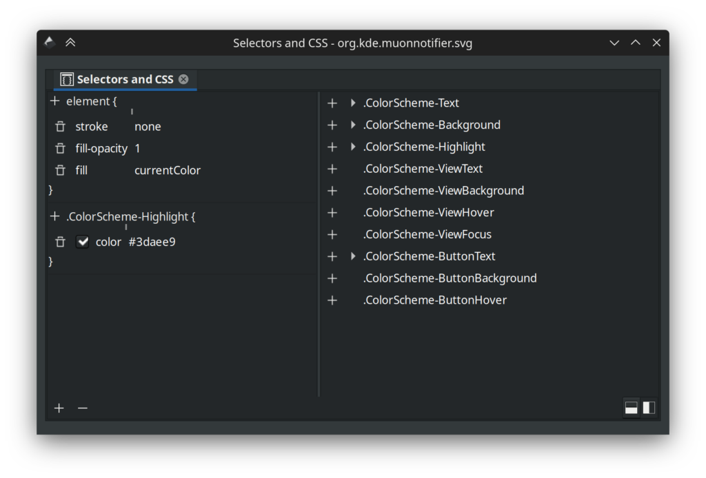
When you have a something selected you can set the fill or stroke to “currentColor” and use the “+” button to add a CSS class. Things that apply to the selected element are on the left, and a list of all classes found in the image are on the right. Here’s the important part: the classes in this list are a lie! First and foremost, some icons have extra CSS classes listed that don’t actually work when used as an icon, and of course, some new ones are missing. You can’t “preview” how an icon will look with Inkscape alone, so to see what actually works there’s applications like Cuttlefish or Ikona which can provide an accurate view of your work. In terms of quickly making sure you have the correct palette in an icon, I recommend using a text editor and replacing the style with the “id” of “current-color-scheme” with the style below:

<style id="current-color-scheme" type="text/css">
    .ColorScheme-Text         { color: #232629; }
    .ColorScheme-Background   { color: #eff0f1; }
    .ColorScheme-Highlight    { color: #7ec9f0; }
    .ColorScheme-PositiveText { color: #27ae60; }
    .ColorScheme-NeutralText  { color: #f67400; }
    .ColorScheme-NegativeText { color: #da4453; }
    .ColorScheme-ActiveText   { color: #3daee9; }
    .ColorScheme-Complement   { color: #ffffff; }
    .ColorScheme-Contrast     { color: #000000; }
</style>

You may notice several colours are very different. Let’s start with what’s missing; ColorScheme-ViewText, ColorScheme-ViewBackground, ColorScheme-ViewHover, ColorScheme-ViewFocus, ColorScheme-ButtonText, ColorScheme-ButtonBackground, and ColorScheme-ButtonHover are gone. I don’t know much about why these are used as often as they are, if they ever worked, or what, but they’re no longer active and when I was double checking to ensure I don’t feed anyone misinformation I found some bugs where they were meant to be used but… don’t work. So, for now, we’ll ignore what doesn’t actually exist.

In terms of what does exist, here’s a list of the available colours from the above style code and what you can expect behaviourally, along with my own observations:

  • ColorScheme-Text; it’s the same colour as text on a standard window. This usually means it’s near-white or near-black, but expect some colour schemes to add some saturation, such as a red theme making text pink. The opposing colour to Text is Background. For modern use it’s a good contrast colour, and works really well for monochrome icons paired with text.
  • ColorScheme-Background; Same as the background colour of a standard window. Background has fewer use-cases, and generally it’s recommended you use transparency instead of this.
  • ColorScheme-Highlight; This was the first method of using the increasingly popular accent colour in icons, but colour schemes generally mix the accent colour with the background colour dulling the result to a degree. If you want the exact accent colour read on to ActiveText. Highlight is still great when you want to use the accent colour but you don’t want it to be overly strong.
  • ColorScheme-PositiveText/ColorScheme-NeutralText/ColorScheme-NegativeText; Generally these are green, orange, and red respectively. Some schemes do change these a bit so if you want “guaranteed” colours such as green, these are not appropriate. Instead use them as their labels imply, as positive to negatively associated colours. These are used often in monochrome icons. If working on full-colour icons and you’re representing a common system component or generic things these can be used as well for light flavour, such as debris in a trash can, but it’s recommended use be kept to a minimum.
  • ColorScheme-ActiveText; this is one of the 3 newly added colours to icons, and is the new recommended way of using accent colours in icons if you want the exact colour. Unlike Highlight, ActiveText is an unmodified accent colour directly set by the user. It can be just about anything from sky blue to hot pink to grey.
  • ColorScheme-Complement and ColorScheme-Contrast; These are the other two new colours, and are a little bit special. Unlike every other colour set by the scheme, Complement and Contrast are guaranteed to be pure black or pure white. If the colour scheme is dark Compliment will be black and Contrast will be white, and if the scheme is light Compliment will be white and Contrast will be black. There are several use-cases for these, mainly for allowing icons to re-shade themselves for light/dark environments, or for providing outlines. Often icon artists relied on Text and Background for “shading”, but with schemes like Quartz or Afterglow you’d see situations where icons would be “stained” in unwanted ways. Now we have a much more reliable pair of values which won’t create muddy results.

How We’ll Use These New Classes

The new colours added a few possibilities. ColorScheme-ActiveText is pretty straightforward, giving us the user-defined accent. If you have an icon theme and are using accent colours via Highlight, ActiveText will get you the more vibrant and untarnished accent colour. Beyond that Compliment and Contrast are pulling a few duties in the upcoming icon refresh, so I’ll cover them in more detail.

First we’re using ColorScheme-Contrast for bottom shadows/highlights. In dark mode it gives icons a soft under-light, and light mode it’s a standard shadow. Previously we used Text for this, and it worked, but Contrast is just better for this now. Where it’s really nice is helping define the silhouette of the icon.

For folders we’re mixing in a very small amount of Contrast over top the accent colour for just a very tiny amount of “pop” without being obnoxious about it. This also helps guarantee a minimal amount of contrast between the accent colour and the background.

We’re using ColorScheme-Compliment for decals and overlays. We get nice dark-on-dark or light-on-light designs, but we don’t suffer from decals looking “muddy” anymore as we used the Background colour where we now use Compliment.
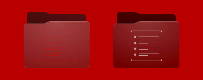
For comparison here’s the same folder using the new CSS under previously unfavourable circumstances with a red-on-red-on-red scheme, the folder on the left using previously available colours and the folder on the right using the three new colours. Before the new colours I was ready to chalk it up to “don’t use terrible themes” but now everyone can safely use the very worst colour schemes on the planet and still have usable and attractive icons.

Beyond the new colours, work is continuing on the refreshed icons. There’s been a great deal of feedback and many icons are being fine-tuned. The pipeline tools are evolving as well, having had a significant refactor which greatly improved the tool all-around.
DWD: Protocol U-Turn

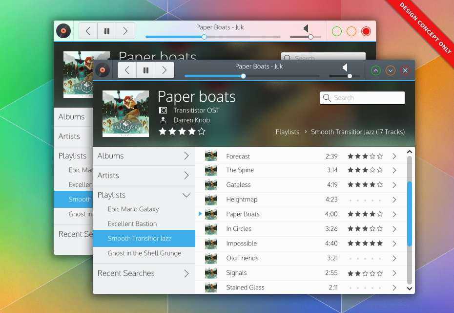
Since Martin posted his Wayland progress I’ve noticed an uptick in questions about CSD, so I figure now is a good time to upload this post I’ve had sitting around, as for the past month I’ve been closely examining the concept of “Dynamic Window Decorations”, or “DWDs” and how to better implement them.

When Last We Saw Our Heroes

For those who need a primer or reminder, DWD is the sister of “Client Side Decorations”, or “CSD”s. Both CSD and DWD are methods for placing widgets in the frame area of windows to save vertical space, look cleaner, and either make applications feel unique or more integrated.

media

Indeed, DWDs would be themeable like traditional decorations, fully supporting transparency effects.

CSD charges the application with drawing the whole window including the frame, instructing the window manager to discard the provided frame. This is the method used on Windows, OSX, and GTK. DWD is aiming for the opposite approach; the window manager continues to draw the window frame, but the application can request certain widgets to replace the window title. Martin Gräßlin plans to keep as much as possible on the server-side as there are many important advantages including customisation, stability, trust, and integration.

DWD “1.0” Was Getting Complicated

One thing CSD will always have over DWD is customisation; when an application has free reign over the whole window it can literally do anything; it can make windows round if it wants to, it can invent crazy widgets and put em’ in the title area, and more. DWD isn’t suited to this, and while designing the first iteration of the protocol I tried to bang a square peg into the round hole by providing those many possibilities.

In my infinite wisdom I re-invented X, with a sprawling protocol that covered dozens of edge-cases which would likely never be used. Even with that, people still complained about the fact that many customisations would still impossible. People also didn’t like the KDE crew being the stewards of this protocol, as different environments want to do different things.

DWD, as originally envisioned, had to change – it was just too complicated and inflexible. Listening to the feedback it was clear the protocol had to be simple, flexible, and tractable. A large requirement was also making it able to grow outside of KDE with or without our ‘approval’.

DWDs New Approach

DWD, as I have drafted it, has been boiled down to a discovery service whose sole purpose is getting apps and window managers to figure out compatible protocols, and specify some standard UI controls which will use those protocols.

Here’s the quick overview on the current core “DWD Protocol”, again, as of my current draft (which could totally be rejected):

  • DWD will be organised into “extensions”. Extensions are just blueprints listing required D-Bus specifications, widgets/controls, and options.
  • Applications and the Window Manager handshake for compatible extensions.
  • Applications tell the Window Manager what controls from those extensions it should display, and how it wants them laid out.
  • Applications hide their native controls.
  • DWD is done and gets out of the way at this point. Control is handed to specifications like MPRIS2, and Window Managers (or Plasma) control the app through those protocols using the requested controls.

That’s it, DWD “2.0” in a nutshell.

KDE will need to create some reference extensions (plus some D-Bus specs) and hopefully everyone will be happy enough to standardise on the basics. From there any environment can create specialised extensions for DWD, we can work with extensions we like, and maybe standardise on the really useful ones (much like libinput has been folded into many environments). If someone makes an awesome extension that handles admin access requests, we could use it. If we make an extension that handles progress charts, someone else could adopt it. I’d like us to develop two reference extensions: a basic toolbar extension, and an MPRIS2 extension.

Advantages over “1.0”

Security is the biggest upside to offloading work on other protocols. DWD doesn’t care how the standards are implemented, so they can be as secure (or insecure) as they choose to be. Security issues or weaknesses in the protocol itself will be mitigated, as the protocol is much smaller. Patches for applications or changes to functional protocols can be made without breaking DWD.

Integration is also another bonus. Parts of the desktop can integrate the protocols extensions use, without DWD needing to explicitly support it. The best example is MPRIS2, which already exists and has amazing support everywhere. The idea behind DWD is that we create more MPRIS-type extensions as we need them.

Finally, core DWD is out of the hotpath for data passing. Window Managers don’t need to be “like X” and conform to complex drawing and customisation tasks. Hopefully as a de-stresser to Martin, this method of offering DWD will be much more easily implemented in a plugin architecture which can be gradually expanded upon. We won’t need to have the full protocol out-of gate, and environments can start with the bare basics and evolve as useful extensions are finalised. I don’t know how he might want to do it, but DWD extension plugins could be potentially be maintained entirely outside of Kwin (or other Window managers) if we play our cards right.

The Downsides

Nothing is perfect, so of course there are downsides;

Customisation.

The big elephant in the room. Going over more standard protocols (and not bloating the new specification) means applications will have no say over how content is styled in the window. I considered this for a while and ultimately decided that it’s O.K.

21cd7e7b6bc1893c23a2e2faad0e9239

We could still offer a few more standardised ways of doing common things we do today, such as passing a colour palette to sync with the window, but outside of the handshake I’ll push for an extension-over-integration policy.


The application doesn’t need to know how things are done, only that they’re getting done. The WM knows more about the environment it’s in than the application; functionality is what matters. The volume button on a computer might be shown as a slider, but on a touch-device it may be a larger button with a popout slider. Maybe a phone will simply use the hardware controls. It’s up to whatever is managing the control.

For people already seething with rage ready to point at me and say “Linux is about choice! Applications should choose what their UIs look like!” I will point out; applications can chose not to use DWD. They can choose to implement a CSD-based application. But lets be real here: when we find a need for speciality widgets, if they are really something useful, their host toolkits/environments can always add the extension.

Generally though, if an application is doing something really unique it’s probably doing it’s own thing anyway – like Chrome/Chromium – or breaking the local HIGs. If you absolutely need to save that 18px while also showing a one-of-a-kind rainbow-powered rocket-widget which must be in the frame… CSD is the price of needing to be that special.

Fragmentation.

With anyone able to create extensions, there’s a change we might have a situation where two environments create two similar offerings. For this, I believe it’s a chance for everyone to experiment, and then work together to standardise. The one thing this means is that applications created for another environment might take longer to get CSD-like functionality, though they should present their interfaces in their traditional application UI.

I think this is still better than CSD, as often a broken CSD is unusable vs a DWD which will simply not conserve space.

DWD

So, in the end, this is the direction DWD has gone. Keep it simple, let anyone decide how it should be used, and piggyback off of proven protocols.

MPRIS2 shows what a purpose-driven protocol can do, and already has lots of examples of “remote control” interfaces. Outside of MPRIS2 we would create missing D-Bus specifications which would hopefully make the wider applications library accessible in a similar manner. Specifications for things like progress management, search, sharing, and many others could be created which will benefit applications, and allow deeper desktop integration for everybody.

For those who saw the previous designs in my original DWD blog post, not much has actually changed visually. Everything I posted is still possible, but now we have a much more practical way to do it which I am much more confident we could reliably implement and share.

Spooky Scary Post-Halloween Monster Post

With Halloween settling down and children retreating back to their lairs so they can bathe in their sugary loot, it’s time to post an update, and not just any type of post – but a Spooky Scary Post-Halloween Monster Post!

Wallpapers

Before I get to show-and-tell I wanted to make a quick digression to something we noticed a few months ago after the 5.4 wallpaper was released…

There has always been some pretty harsh criticism against the wallpapers I’ve produced, some of this comes down to being bolder and more vibrant in our designs, and some of it some of it comes down to the fact that my early work was genuinely bad. We listen to comments wherever they come from (even if we don’t specifically reply), be it a forum on a news site, Reddit, or imageboards. Until Plasma 5.3 though the criticism lacked constructiveness and was mostly just mud-slinging. The Plasma 5.4 wallpaper though must have crossed a threshold at some point, because the entire VDG very specifically noticed an uptick in constructive criticism, and a it had a heavy influence on the 5.5 wallpaper.

What this all comes down to and what I really want to say is this; do be critical of our work! But be critical in a constructive way, so we can build on your comments. Calling a wallpaper “dogshit” doesn’t give us much to work with, but pointing out the Dutch Angle of the last wallpaper as being too extreme – that we can work with and improve the next wallpaper. Since we had the feedback, I’ll go over the two main points we’ve heard.

#1: The Brightness / Saturation.
More often worded as “the author must have eaten his crayons before puking on the screen” this was a result of how I initially imitated the 5.1 wallpaper with the Breeze palette, and absolutely failed; so much in fact that I think it may have affected the perceived colours of later wallpapers.

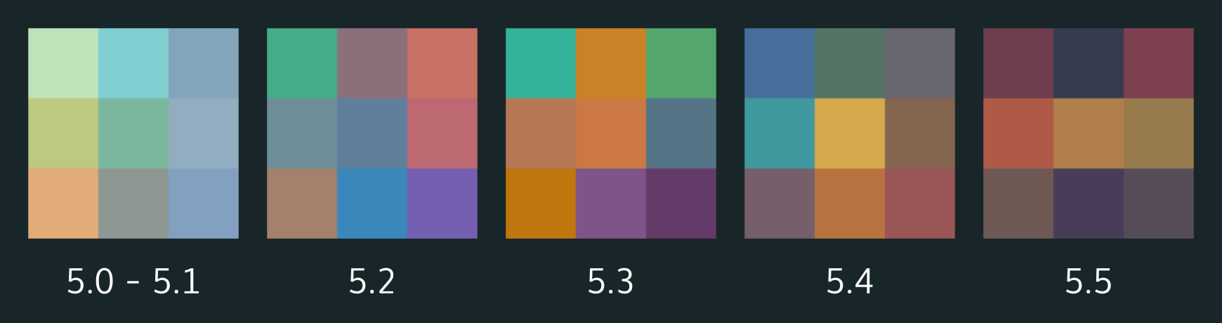
While some people certainly enjoyed the lighter wallpapers the main comment was that the over-saturated wallpapers were too much. Interestingly, wallpapers on Plasma 5 have been trending towards darker tones, below being some swatches I quickly composed of our wallpaper history:

swatchesWhen I started making the wallpapers at 5.2 I had decided to stick with the official Breeze colour palette, which is geared towards icons. This meant that working at the same luminosity Nuno used for the 5.1 wallpaper would oversaturate mine, which is what happened. It’s worth noting that the 5.2 wallpaper was made purely for personal use, and it was only by a fluke that we used it in production. With 5.4 I think we approached the tipping-point of appropriate brightness/saturation, and I think we’re closer to the ‘right’ amount now considering out palette.

#2: The Dutch Angle / Drug Induced Wallpaper
This is a simple fix: stop using intense angles. But! If everything is made flat it becomes visually uninteresting. As a matter of fact none of the KDE wallpapers have been perfectly level, except Nunos original wallpaper which had clear vertical orientation. I think this was just because 5.4 was so extreme, and also because there were no other mounting points a user could visually register.

With the ‘acid trip’ feel of the last wallpaper, I think it was (again) the dutch angle throwing users off a bit along with the fisheye lens of the horizon line. I do worry that such a perception may impact the professionalism of the desktop, so for future wallpapers I may attempt to better avoid this moreso – though this wallpaper does maintain a more organic shape, which I expect may get dinged on that score.

So, what’s in the pipe for 5.5?

I’m very excited to announce we will be shipping 3 wallpapers this upcoming release. The two below continue the evolution seen in previous wallpapers. They are “Event Night” and “Event Day”. Event Night will be the 5.5 default.

desktopWallpaper-event-1.0-kvermettedesktopWallpaper-event-light-1.0-kvermette
Lionel Chauvins’ “Pastel Hills” will also be available, which harkens back to Nunos original design using a lighter pastel palette. I also have the feeling this is the first wallpaper we have distributed made with Blender. I highly recommend checking out his new KDE-look account if you like the smooth jazz that is his wallpaper, hopefully he uploads his other works. 😉

2560x1600

5.5 Wallpaper Contest
Finally, Andreas is continuing his wallpaper contest; the deadline is in roughly 9 days, so if you have a beautiful image you want to submit please jump in and submit your wallpaper!

KDE.org

KDE.org is undergoing a redesign which should one day present a more unified and consistent interface across the myriad of systems we currently use.

The most obvious issues with the current site are twofold; there’s no consistent navigation, and no two systems look alike. Because we have so many systems which are largely incompatible and/or on completely different hardware, we’re taking a unique approach to the new design so we can begin to unify the disparate designs.

We’re building the user-facing elements as a modular set of pieces which can be arbitrarily inserted onto any website, regardless of the technology or hardware they use, as long as they support even the most primitive skinning. These modular pieces are self-contained, and should be fairly easy to insert into existing systems until larger changes can be made.

I’ll have screenshots later (maybe a video) once I finish up a few more modules for feedback. Unfortunately I’ve had exceptionally busy weekends (when I get most of my work done) and haven’t been able to make the progress I had hoped for. I’ll post more on that later.

Fiber Browser

Because I have been swamped with smaller projects I’m temporarily going to put Fiber on hold to nail other things down, as I want to give more time to immediate smaller impacting projects across KDE as a whole, rather than constantly scrambling around several half-finished todos.

The original plan was to have a version which would be “presentable” at Sprints so I could garner interest, but that will be dropped. One thing that has become clear is that other developers will want to work on it regardless of me ‘promoting’ it, so I’m comfortable in the thought that I could assemble a small team later on. Also, the main KDE devs are busy enough anyway.

Next, after (very careful) consideration I may temporarily drop CEF and pick up WebEngine when I seriously resume the project. Fiber is a one-man band, and to say CEF integration has been nothing short of a pain would be an understatement. I feel like the most important aspect of Fiber will be a rich, deep API and modular design – but with so much focus on getting CEF functional it simply sucks the life out of the entire project. Instead, I may shift to a CEF port as a “Fiber 2.0” feature (hopefully when other devs may maintain the APIs), which should help as by then Servo will be more mature and I can test it as the primary renderer.

Unofficially I may still chip away at it – but for now I’m more comfortable saying it’s on pause while I focus on my todo list. I will resume work on it once I’ve bumped off a few smaller things, and hopefully It’ll speed up development a bit by switching to WebEngine for the 1.0 release along with having fewer balls to juggle.

Polish Effort

Before I say anything else, hats off to Hugo for his work. I’m not going to lie: I threw him to the wolves on this one (unintentionally!), and he’s solo’d the real work going into Breeze polish. So, hats off to Hugo for being blazingly awesome!

On the design notes, one thing that became apparent somewhat quickly was the fact that the design I presented began to heavily diverge from the current Breeze design, so much as to be considered a different design entirely. I’m still debating how to handle this, as this is one area where I wanted to free up time so I could more properly contribute.

In terms of stuff getting done, we’ll have some pleasing adjustments to several visual elements such as menus and pixel-tweaks. We’ve also identified several issues such as misalignments in applications, dark-theme colour woes, and inconsistent spacing; I don’t believe we have fixes in for everything, but I’m confident in my ability at throwing Hugo to the wolves. ;P

DWD

There’s not much to report here, but a couple people have been wondering about this. For those not in the know, DWD will be a protocol-driven solution for widgets in the titlebar, similar to the CSD approach that is the Gnome headerbar.

Mainly I’ve been working on the specification, and it’s been pointed out that DWD as a technology will never be suited for insanely weird and creative widgets. To mitigate this I had written some crazy crap about all the special and unique ways a widgets might be customised, and I realised it was pointless to try matching the “creative potential” of CSDs with endless options. I did a thought experiment and swung the other direction;

What if instead of offering primitive widgets with crazy tweaks DWD focused on higher-level but rigid purpose-driven widgets? You don’t request a slider with a volume icon, you request a volume widget and feed it a few channels. Instead of a lineedit you’d just put up a search box… And this approach shaped up surprisingly well.

The general mindset is the idea that CSD eschews system integration in exchange for more radical customisation. DWD on the other hand is about integration though standards – and the initial spec didn’t play to that strength. The main downside to this new spec is the fact that we do sacrifice more creativity in the headerbar, but I looked at it, and in most screenshots of Gnome CSD widgets seem remarkably standardised as well. I’ll be doing a post later which gets into details and pretty pictures but this seems to be the direction to move towards.

That’s all, folks!

sluggerfly

Random Sluggerfly!

New artwork coming in 5.4 & the tale of a troublesome wallpaper

For the past month I’ve been slightly more active than usual, and I’m excited for this release and some of the art I’ve managed to throw into the pipe;

Icons, Icons!

I would like to make a special mention that not all of these icons have been greenlit, and several of them are pending approval and may be dropped/require changes. Some were literally finished minutes ago while others have already been integrated into projects. \o/

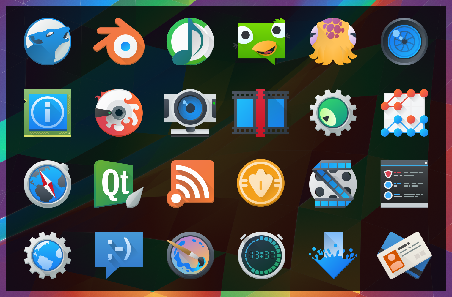
image10430After “harmlessly” throwing in a couple monochrome icons from my personal projects, I found myself reading a few of the icon requests and one thing lead to another… Now I’ve pushed in somewhere around 25 new icons, mostly towards apps with the goal of filling in gaps of common applications. These new icons will hopefully bring a much more cohesive launcher menu, with more core and popular applications having Breezy icons.

Some of these may be shunted to an extended repo; 3rd parties get antsy when they see their logos get “breezified”, so “branded” icons need to occasionally be separated from the main repository to avoid troubles and takedown requests.

Lastly but not least; Uri and Andreas have been nothing short of awesome in helping me get these out, thanks guys!

The tale of an annoying, terrible, awful wallpaper, and How I Made it.

I’d like to say that I’m less a man and more a force of nature – one able to sweep my hand and make art bloom at will… But this would be a lie, and occasionally getting art out there makes the only force I can muster feel like a fart in the wind. The new wallpaper for 5.4 just did not want to be made, and took days on and off trying to figure out what to do. I nearly just suggested we ship a backup wallpaper I had on the sidelines.

Eventually ideas got figured out, and after an unstructured failure (again, making me look at “the backup”) I started taking screenshots while using a more structured approach. I imagine I wanted all reading this to feel my pain. Either that or laugh. One of the two. Either way, the new wallpaper was one of the more involved processes used for a Plasma 5 wallpaper, and here are the steps for how it came together;

(more…)

Plasma Sprint 2015

Just over 2 weeks ago I stepped off a plane, putting my heels onto Canadian soil after spending a week participating in the Plasma 2015 Sprint. The entire experience was exhausting in the best of ways, and after landing home my throughput was thoroughly trounced for some time as I settled back into normalcy. But lets rewind to the beginning;

The day of my arrival in Barcelona it would be a far cry to say I was nervous – in the moments before pressing the buzzer I was in a downright terror! These people will realise I’m an idiot! Ship me back to Canada on the next canoe! Needless to say only minutes in to the sprint not only were my worst fears completely unfounded – but I met a group as welcoming as they were brilliant.

Finally, I think I have the perspective to share my experience. I won’t try to recap the entire event, I will mainly focus on VDG work.

But first! The People of KDE

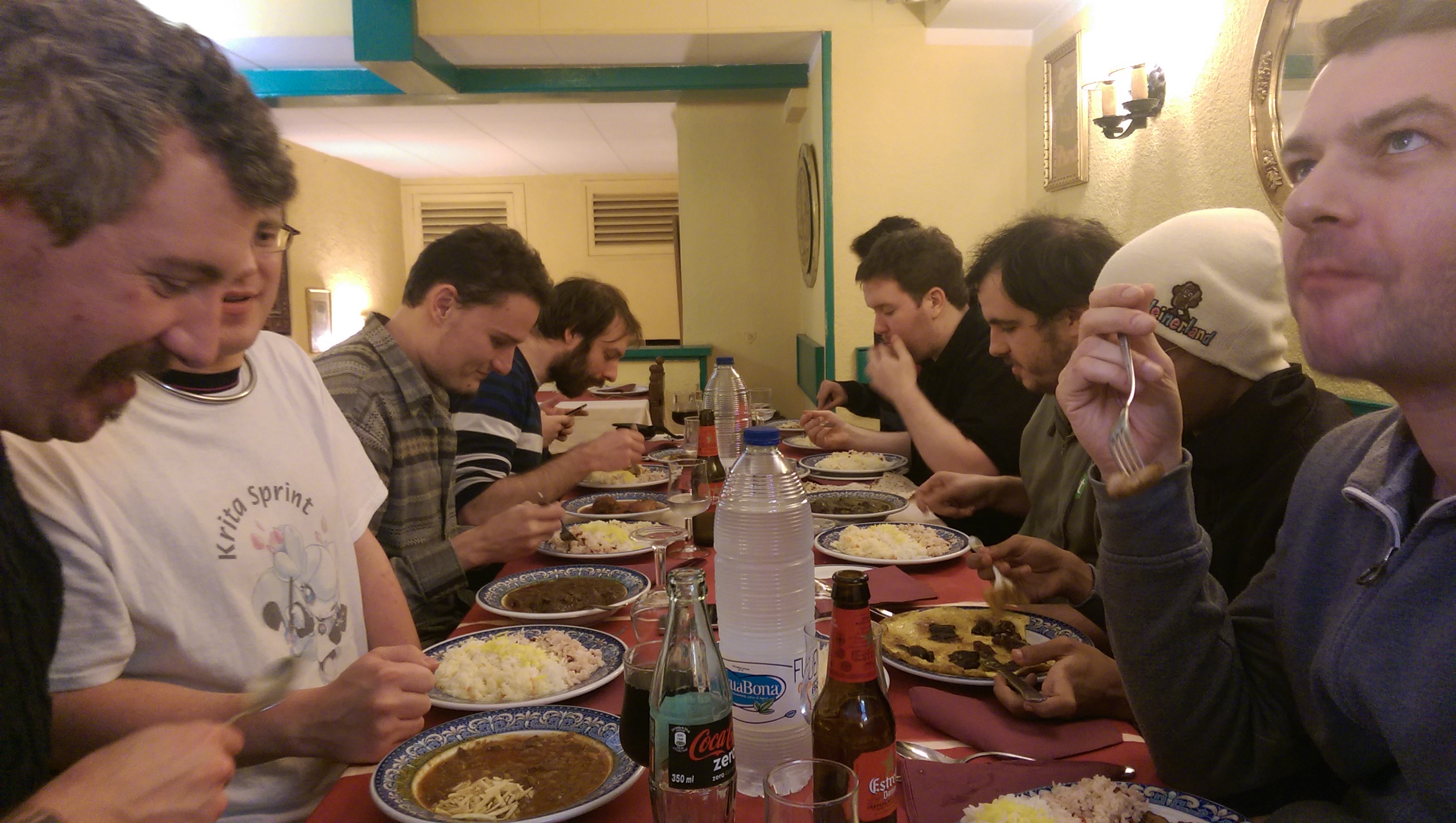
I met about a dozen dedicated and hard-working developers in the Blue Systems office during the sprint, and it needs to be said just how great these people are – each and every one passionate about their respective fields and projects. I’d really just like to give a shout-out to everyone I met in the Sprint. They’re the kind of people who make you smarter by proximity, and they welcome you to do it. For anyone invited to a Sprint I highly recommend jumping on the chance; you will be enriched for doing it.

IMAG0387_BURST001

Drawing Konquis

After arriving mid-day Jens Reuterberg headed the idea to begin creating and stockpiling promotional graphics. Essentially we wanted vector artwork which could be used easily for things like release announcements, large print materials, web pages, etc. Jens dove head-first into logotypes, and I splintered off into doing up a pair of vector Katie and Konqui graphics during my half-day; Konqui being a direct trace, and Katie being new. You can view the original graphics by the talented Tyson Tan here.

g4358

Download KatieDownload Konqui

VDG <3 Developers

There was a great deal discussed during a pair of review and planning sessions in the first two official Sprint days. One of the biggest things (for Jens and I) was helping the VDG and developers interoperate better; for those who don’t know, the VDG communicates very differently than mainline developers.

Devs tend to focus on bug reports, mailing lists, reviewboards, and IRC. Members of the VDG tend to use Forums, Hangouts, and to a limited extent IRC. Immediately there’s very little overlap, which means at this point developers have to go to the forums to wield the VDG.

The problem lies in how forums operate; where the VDG design processes benefits from the relative chaos, it’s not good for developers looking for the ‘final word’ of the design discussion. It’s further impacted by forum conversations which don’t have definitive conclusions, or discussions which can get muddled down. When developers go to the forums they need a solid final product to build around – but on multiple occasions they end with a half dozen different designs and no clear answer on what they should do.

It was a short discussion during the Sprint, but Jens and I both immediately agreed that this is an area where the VDG must step up and refine our process.

The current idea will be sticking with the forums threads as the main creative area, but changing the way they spin down. Once we feel a design discussion has gestated, the VDG aims to have a member pull the ‘final’ design from the conversation, at which point they’ll put together a coherent deliverable developers can understand and act on, on a channel they are comfortable with.

There are still details we are ferreting out before we more formally put this into motion, but the essential aim is to move the VDG into a position where we can reliably ship usable deliverable design, on a channel developers can comfortably handle.

Breeze Applications

This only came up briefly during the Sprint as well, but is something which has been brewing for a while now – so it might be worth mentioning ‘for realsies’, essentially since I don’t think anyone pointed out that this is a ‘thing’;

KDE and Plasma have a bit of a history with names, and for many core applications we’ve been wanting a more consistent scheme for it all. At the same time, with every major tookit release (i.e. Qt4 -> Qt5) many applications need to be ported or re-written. Finally, on these major releases, visual/workflow trends have usually shifted meaning the experience of applications will also shift.

So, all this stuff going on, we figure it’s time to put a bow on it and turn this cavalcade of factors into one cohesive event, so we’ve come up with the concept of Breeze Applications.

The idea is that, coinciding with frameworks, trend, and design changes we will name a subset of the bundled applications after the current design. So for Plasma 5 we will have ‘Breeze’, for some future plasma version many moons from now we may have ‘Gust’ or ‘Wind’ applications.

What does this mean? The biggest thing is that we intend to use these ‘Breeze’ applications as standards bearers, which we hope to see other applications follow. It’s much the same way Google treats ‘Holo’ and ‘Material’, along with their base applications: This is the design, these are the examples. Ideally we intend to focus on only a few applications, which developers will be able to dissect and say ‘oh, this is the plan’. In addition, as new technologies and techniques land, we hope Breeze applications will be the frontrunners in adopting cutting-edge KDE/Plasma technologies.

Does this mean every Plasma or KF5 app will be named “Breeze X”? No. We only plan on Breeze-ifying the more simple core applications which can be easily maintained, kept up to date, and streamlined enough that the code could easily be used for reference material.

Fun fact: The bathrooms in Frankford are powered by Ubuntu!

Fun fact: The bathrooms in Frankford are powered by Ubuntu!

Dynamic Window Decorations

Before I even get started on this, I must give props to David Edmonston. The man is a trooper, and I feel almost as if I tortured the poor gentleman throughout the sprint.

During the sprint I presented some of my DWD plans; technical details were discussed, implementation questions were raised, and concerns were were round-tabled. The discussion was extremely positive and productive, and real issues were ferreted out.

IMAG0392_BURST007

One of the larger questions was ‘what IPC protocol should be used?’; I personally was educated about the Wayland protocol, and that it could be used even on ‘non-wayland’ systems – since it is just a protocol and not an installed library. Ultimately, the developers present agreed that D-Bus was the way to go, the general consensus being that the protocol is known and familiar, mature, battle-tested, and isn’t going to shift or break.

I also gave my personal thoughts on how applications might access/implement DWDs, and while there’s still considerable room for discussion, it seems to be on the right track. I was cautioned by developers and I feel the need to point out: even when the DWD protocol does pick up steam it will still be years before it’s available in any meaningful way.

During the development portion of the Sprint I managed to rope David into doing some DWD work on a proof-of-concept level. Through his efforts we now have a much better idea of what obstacles we will face integrating widgets into server-side decorations, such as ensuring the draw code runs correctly/efficiently. He heroically managed to get window decorations to draw usable sliders, so we do know window decorations are capable of drawing server-side widgets.

Sadly, the proof did nearly cost David his sanity. It probably didn’t help that I was giggling like an imbecile. Sorry about that, David. I hope the tea made up for it. :/

UI Feedback

Throughout the Sprint Jens and I were able to lend our services in helping to design and streamline interfaces. Towards he end of the Sprint we also did a walkthrough of the Plasma desktop and several components to identify surface-level bugs and weak areas.

This included an extensive review of the system settings utility and its KCMS.

I also managed to chip in some light advice with a new power-manager tool, and an upcoming redesign of the Baloo settings manager with Vishesh Handa.

And a Great Deal more!

As I mentioned at the start of the post, and can only mention again; There were a lot of really great people at the Sprint – and all of them had their own projects, goals, plans, and feedback. It was really impressive to meet people who had such a deep understanding of KDE Frameworks and Plasma, able to talk about extremely complex technologies in detail over a coffee.

I, personally, learned a great deal from everyone. From being unable to compile a package to now comfortably hacking, simply rubbing shoulders with the outstanding individuals was absolutely my privilege.

There’s a great deal not in this post, but I imagine other posts will fill in the rest… So on a closing note I will say again; if you are ever invited to a Sprint, don’t hesitate to say yes – it’s an amazing experience which is beyond worth it!

I drank this. I still don't know what it was.

I drank this. I still don’t know what it was.