KDE.org Redesign

KDE Frameworks, Plasma desktop, and our community have a rich history of nearly twenty years in creating great open-source software, making us a truly historic organisation of passionate developers; and along with that history some of our online infrastructure has begun to show its age. The KDE.org website and its various sections are the front door to the KDE ecosystem, it is how people new to KDE will judge us and it’s where our developers, translators, artists, and community members know their hard work will be presented to the world.

Recently there’s been a minor movement in the KDE community hive-mind stirring about our web network, and it’s increasing need for a significant update. Some of this has been separate, some in groups, some know about the others but not vice-versa. There was a BOF at Akademy which also focused on a new website and goals.

We’ve opened up a new community forum with the dedicated task of modernising our legacy infrastructure to create a unified effort. Everyone wanting to participate will have the goal of revitalising the KDE.org website for our 20th anniversary, giving us a strong infrastructure to celebrate a stronger foundation for the next 20 years of KDE, community, and open-source.

The WWW team, Promo Team, and VDG have all expressed desire to build a better KDE.org, and we’d all like to see the wider KDE community to contribute! You don’t need to be a web developer or server administrator to chip in; even if it’s a few minutes of feedback or a single idea, we would like to see you participate! We plan to build this website on a foundation of respect and openness – everybody and all constructive input will be welcomed.

There’s no specific goal to have the whole network completed; there’s a huge number of assets and each one is unique, but I believe it’s reasonable to have many of our most prominent pages and sections converted in time for our 20th anniversary – October of next year, roughly. Beyond that, we’ll work section-by-section page-by-page to ensure KDE.org is as amazing as it can be.

Click here to go to the forum

New artwork coming in 5.4 & the tale of a troublesome wallpaper

For the past month I’ve been slightly more active than usual, and I’m excited for this release and some of the art I’ve managed to throw into the pipe;

Icons, Icons!

I would like to make a special mention that not all of these icons have been greenlit, and several of them are pending approval and may be dropped/require changes. Some were literally finished minutes ago while others have already been integrated into projects. \o/

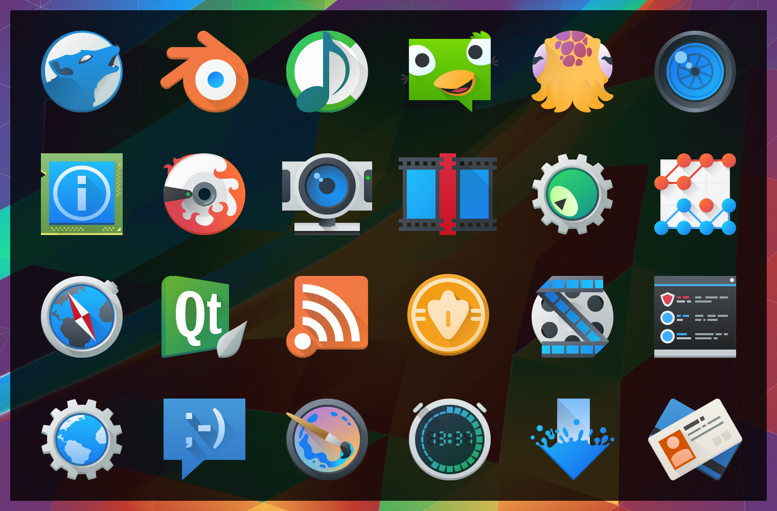
image10430After “harmlessly” throwing in a couple monochrome icons from my personal projects, I found myself reading a few of the icon requests and one thing lead to another… Now I’ve pushed in somewhere around 25 new icons, mostly towards apps with the goal of filling in gaps of common applications. These new icons will hopefully bring a much more cohesive launcher menu, with more core and popular applications having Breezy icons.

Some of these may be shunted to an extended repo; 3rd parties get antsy when they see their logos get “breezified”, so “branded” icons need to occasionally be separated from the main repository to avoid troubles and takedown requests.

Lastly but not least; Uri and Andreas have been nothing short of awesome in helping me get these out, thanks guys!

The tale of an annoying, terrible, awful wallpaper, and How I Made it.

I’d like to say that I’m less a man and more a force of nature – one able to sweep my hand and make art bloom at will… But this would be a lie, and occasionally getting art out there makes the only force I can muster feel like a fart in the wind. The new wallpaper for 5.4 just did not want to be made, and took days on and off trying to figure out what to do. I nearly just suggested we ship a backup wallpaper I had on the sidelines.

Eventually ideas got figured out, and after an unstructured failure (again, making me look at “the backup”) I started taking screenshots while using a more structured approach. I imagine I wanted all reading this to feel my pain. Either that or laugh. One of the two. Either way, the new wallpaper was one of the more involved processes used for a Plasma 5 wallpaper, and here are the steps for how it came together;

(more…)

Google Deep Dream ruins food forever.

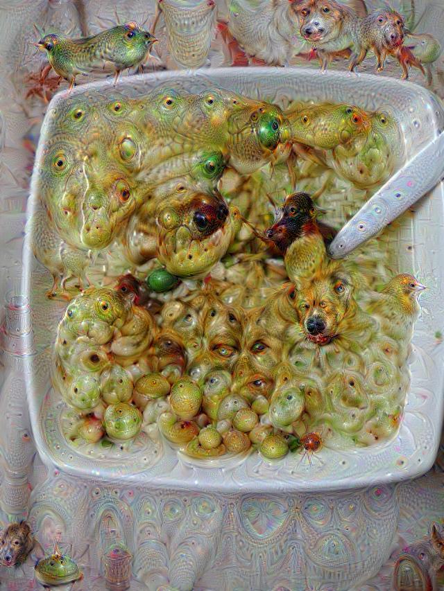
Google Deep Dream is an interesting piece of AI software which looks for patterns in pictures, much like humans may look for patterns in clouds. Deep Dream has been trained to find a few things, like eyes, animals, arches, pagodas, and the most fascinating part is that Deep Dream can also spit out what it “saw”. Then Google opened Deep Dream to the public and people started loading tonnes of images into the system, and when you combine food with Deep Dream it turns into the stuff of nightmares.

RUN NOW OR FOREVER RUIN FOOD FOREVER! Here’s pictures of food turned to ghoulish nightmare-fuel courtesy of Deep Dream;

Nope. NOPE. Great start. Never eating takeout again. At least nothing bad can happen to the humble doughnut.

Duncan Nicoll, thank you. Via Ibitimes

Duncan Nicoll, thank you. Via Ibitimes

GREAT. FANTASTIC. I didn’t like doughnuts anyway. ARE THOSE LEGS?

Ibitimes also had this. Spaghetti & nightmares.

Ibitimes also had this. Spaghetti & nightmares.

I loved pasta. I did once. Then, this. Now never again.

Asian soup via Reddit. Dammit Reddit.

Asian soup via Reddit. Dammit Reddit.

Asian soup creeped me out anyway. BUT IT DOESN’T HELP WHEN THE SOUP LOOKS AT YOU WITH MANY, MANY PUPPY DOG EYES.

Via Vr-Lab

Via Vr-Lab

Hey, look, what a diverse menu of terror!

I’m never, ever eating Asian again. Why does so much of it look fishy?

Thanks, again, VR-Lab.

Thanks, again, VR-Lab.

I, too, would be in the foetal position if my soup was a WRITHING MASS.

VR-Lab.... Shtap. Please.

VR-Lab…. Shtap. Please.

NO. NOT PIZZA TOO. I’M OUT.

Fiber UI Experiments – Conclusion?

It’s been one heckuva road, but I think the dust is starting to settle on the UI design for Fiber, a new web browser which I’m developing for KDE. After some back-and fourth from previous revisions, there are some exciting new ideas in this iteration! Please note that this post is about design experiments – the development status of the browser is still very low-level and won’t reach the UI stage for some time. These experiments are being done now so I can better understand the structure of the browser as I program around a heavily extension-based UI, so when I do solidify the APIs it we have a rock-solid foundation.

Just as an aside before I get started; just about any time I mention “QML”, there is the possible chance that whatever is being driven could also alternatively use HTML. I’m looking into this, but make no guarantees.

As a recap to previous experiments, one of the biggest things that became very clear from feedback was that the address bar isn’t going away and I’m not going to hide it. I was a sad panda, but there are important things the address bar provides which I just couldn’t work around. Luckily, I found some ways to improve upon the existing address bar ideology via aggressive use of extensions, and slightly different usage compared to how contemporary browsers embed extensions into the input field – so lets take a look at the current designs;

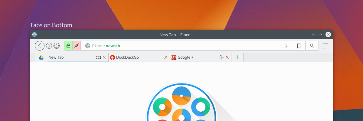
tabsOnSide tabsOnBottom
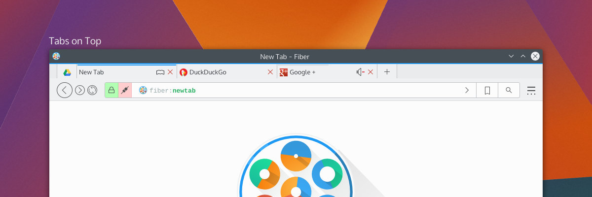
By default, Fiber will have either “Tabs on Side” or “Tabs on Bottom”; this hasn’t been decided yet, but there will also have a “Tabs on Top” option (which I have decided will not be default for a few reasons). Gone is the search box as it was in previous attempts – replaced with a proper address bar which I’m calling “Multitool” – and here’s more about it why I’m a little excited;

Multitool

Fiber is going to be an extensions-based browser. Almost everything will be an extension, from basic navigational elements (back, forward), to the bookmarks system – and all will either disable-able or replaceable. This means every button, every option, every utility will be configurable. I’ve studied how other browsers embed extensions in the address bar, and none of them really integrate with it in a meaningful and clearly defined way. Multitool is instead getting a well-defined interface for extensions which make use of the bar;

Extensions which have searchable or traversable content will be candidates for extending into the Multitool, which includes URL entry, search, history, bookmarks, downloads, and other things. Since these are extensions with a well-defined API you will be able to ruthlessly configure what you want or don’t want to show up, and only the URL entry will be set in stone. Multitool extensions will have 3 modes which you can pick from: background, button, and separate.

Background extensions will simply provide additional results when typing into the address bar. By default, this will be the behaviours of things like current tabs, history, and shortcut-enabled search. Button extensions in mutitool will provide a clickable option which will take over the Multitool when clicked, offering a focused text input and an optional QML-based “home popout”. Lastly, “separateextensions will split the text input offering something similar to a separate text widget – only integrated into the address bar.

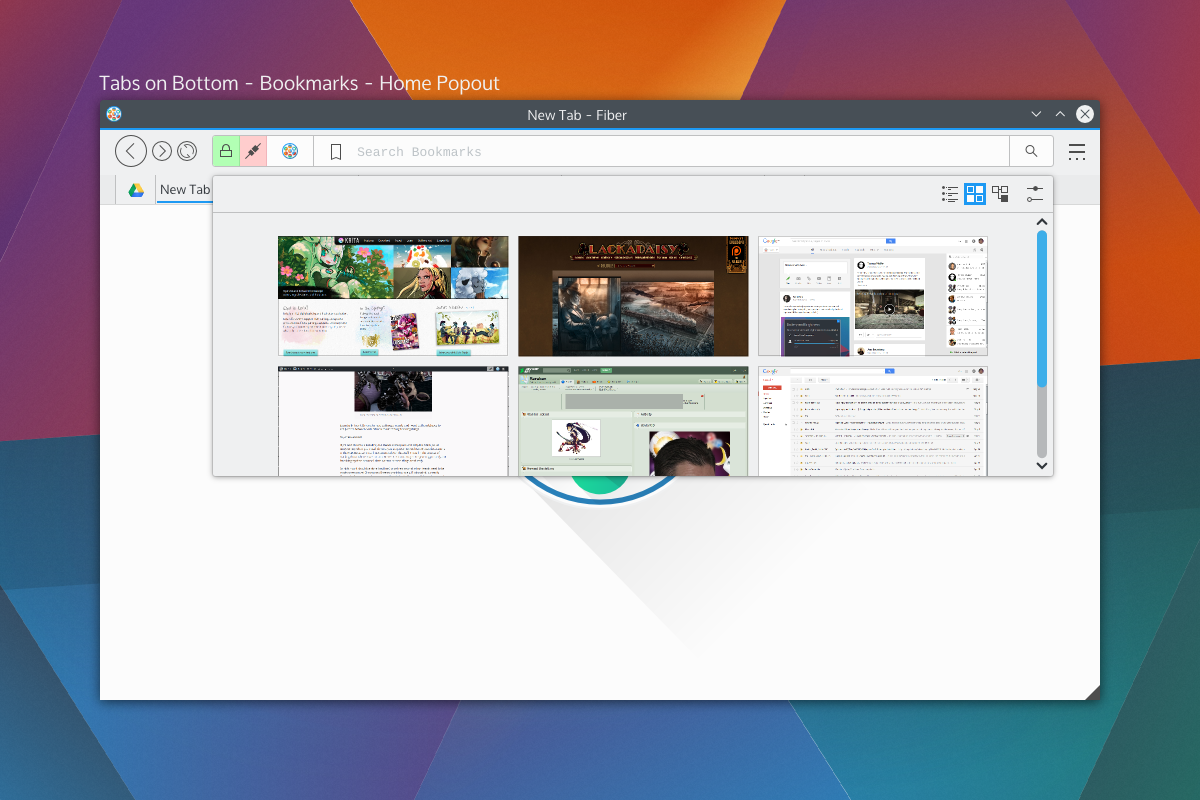
The modes and buttons will be easily configurable, and so you can choose to have extensions simply be active in the background, or you could turn on the buttons, or disable them entirely. Think of this as applying KRunner logic to a browser address bar, only with the additional ability to perform “focused searches”.bookmarkshome

Shown on the right side of the Multitool are the two extensions with dedicated buttons; bookmarks and search, which will be the default rollout. When you click on those embedded buttons they will take over the address bar and you may begin your search. These tools will also be able to specify an optional QML file for their “home” popout. For example the Bookmarks home popout could be a speed-dial UI, History could be a time-machine-esque scrollthrough. Seen above is a speed dial popout. With Bookmarks and Search being in button mode by default, just about everything else that performs local searches will be in “background mode”, except keyword-based searches which will be enabled – but will require configuration. Generally, the address portion of Multitool will NOT out-of-box beam what you type to a 3rd party, but the search extension will. I have not selected search providers.

We also get a two-for-one deal for fast filtering, since the user is already aware they have clicked on a text entry. Once you pick a selection from a focused search or cancel, the bar will snap back into address mode. If you hit “enter” while doing a focused search, it will simply open a tab with the results of that search.

Aside from buttons, all the protocol and security information relevant to the page (the highlighted areas on the left) will also be extension-driven. Ideally, this will let you highly customise what warnings you get, and will also let extensions tie any content-altering behaviour into proper warnings. For example, the ad-blocker may broadcast the number of zapped ads. When clicked the extensions will us QML-driven popouts.

Finally, the address itself (and any focused extension searches) will have extension-driven syntax highlighting. Right now I’m thinking of using a monospace font so we can drive things like bold fonts without offsetting text.

Tabs

Tab placement was a big deal to people; some loved the single-row approach, others wanted a more traditional layout. The solution to the commotion was the fact that there isn’t a single solution. Tabs will have previews and simple information (as seen in the previous round of designs), so by default tabs will be on the bottom or side so the previews don’t obstruct unnecessary amounts of UI.

tabsontop

Fiber will have 3 tabbing options; Tabs on top, tabs on bottom, and tabs on side. When tabs are “on side” it will reduce the UI to one toolbar and place the tabs on the same row as the Multitool, and should also trigger a “compressed” layout for Multitool as well.

There will be the usual “app tab” support of pinning tabs, but not shown here will be tab-extensions. Tab extensions will behave like either app tabs or traditional tabs, and will be QML-powered pages from extensions. These special tabs will also be home-screen or new-tab options, and that is, largely, their purpose; but clever developers may find a use in having extension-based pages.

Tabs can also embed simple toggle-buttons, as usual, powered by extensions. Main candidates for these will be mute buttons or reader-mode buttons. There won’t be much to these buttons, but they will be content-sensitive and extensions will be required to provide the logic for when these buttons should be shown. For example, “reader mode” won’t be shown on pages without articles, and “mute” won’t be shown on pages without sound.

Current Progress

The current focus in Fiber is Profiles, Manifest files, and startup. Profiles will be the same as Firefox profiles, where you can have separate profiles with separate configurations. When in an activities-enabled environment, Fiber Profiles will attempt to keep in sync with the current activity – otherwise they will fall back to having users open a profile tool.

The manifest files are a big deal, since they define how extensions will interact with the browser. Fiber manifest files were origionally based on a slimmed down Chrome manifest with more “Qt-ish” syntax (like CamelCase); but with the more extensive extension plans and placement options there’s more going on with interaction points. There’s a decent manifest class, and it provides a reliable interface to read from, including things like providing missing defaults and offering some debugging info which will be used in Fibers extension development tools.I’m using DBus for Fiber to check a few things on startup; Fiber will be a “kind of” single-instance application, but individual profiles will be separate processes. DBus is being used to speak with running instances to figure out what it should do. The idea behind this setup is to keep instances on separate activities from spiking eachother, but to still allow the easier communication between windows of a single instance – this should help things like tab dragging between windows immensely. It also gives the benefit that you could run “unstable” extensions in a separate instance, which will be good for development purposes.I wish I could say development is going quickly, but right now my time is a bit crunched; either way things are going smoothly, and I’d rather be slow and steady than fast and sloppy.Development builds will be released in the future (still a long ways away) which I’ll be calling “Copper” builds. Copper builds will mostly be a rough and dirty way for me to test UI, and will not be stable or robust browsers. Mostly, it’ll be for the purpose of identifying annoying UI patterns and nipping them before they get written into extensions.

Fiber UI Experiments

This week has been the lowest-level backbone things for the Fiber Browser. Mostly I’ve been designing the manifest class, which accepts a JSON file and produces a nice reliable API to interpret. Most of this browser will run on extensions, so the Manifest is one of the most important parts of this browser. It’s largely based on Chrome manifest files, however it differs in naming conventions (e.g. camelCase) and structural areas, the largest being “services” support. Services include things like “history” and  “bookmarks”. Services will have clearly defined APIs, and extensions using those services don’t need to know what extension is offering the service.

Earlier I put up a G+ post of one of my UI experiments for Fiber. I had created the following design based on the idea that the address bar is becoming obsolete, and needed feedback on my thought process. The idea is that the address bar is hidden inside the tabs, and when a tab is double-clicked it would expand to reveal the address behind the tab.

fiber-modesAside from some KDE integration, the original (nearly chrome-identical) design added nothing to the browser space.  I didn’t want to make a browser that was the same, but I don’t like changing things just for the sake of being unique.

uniqueforkMy G+ post was a fleshed-out version of my favourite pencil wireframe. The first thing I looked at was the wasted space in browsers; the current “space race” has lead to one generally accepted design with tabs on top and content controls on a second row. Sometimes a bookmarks bar. Lots of smart engineers at Google, Mozilla, Apple, Microsoft, and Opera have looked at UI controls in browsers, it’s not an accident that this is the current “best design”. The current browser layout offers immediate access to important controls, with the two expanding elements (tabs and address) being on two rows. but the address bar didn’t to anything the search bar couldn’t, aside from address a very specific URL.

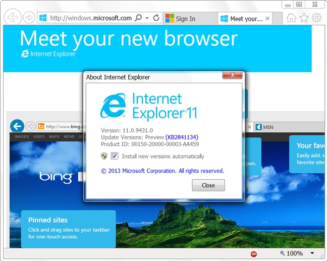
So, after my design and some more thinking I took a look at browsers again, and I found only IE broke from the trend by putting everything on one row with approximately half the toolbar going to the address bar, and other half going to the tabs. The benefit was saving vertical space, but with the downside of limiting how many tabs a window could multi-task easily.

internet-explorer-11This was very close to my design with the sole exception being that the core functionality of the line input is an address bar – where mine was search. I was actually a little shocked at the back/forward buttons too, because mine looked similar. Granted, I was actually aping an older Firefox design, but that’s beside the point. 😛

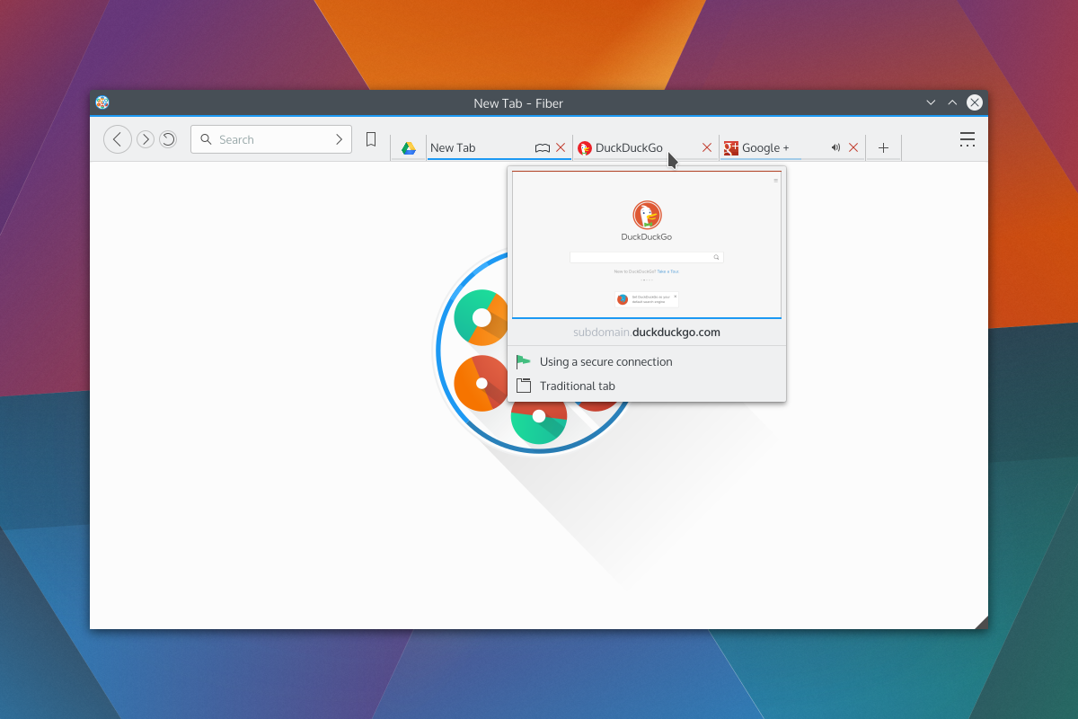
So I took a more thorough look at more factors, and settled on my current design goal (pending YOUR feedback!); please note that the new tab page is a placeholder.

fiber-full-12The first thing going on is moving the search bar in a position to the IE address bar. After careful consideration, I realised the search bar was going to be much more heavily used, so it needed better placement closer to users’ muscle memory. Additionally, since websites tend to place navigational elements on the top or left, it made sense to have the search be nearer to where the mouse might be. The search bar will also search your bookmarks and history, so it should find regularly accessed URLs efficiently. Depending on the extension rollout, the capabilities of the search bar should be adjustable.

Bookmarks have been moved from a tab to a menu button. I don’t know what I was thinking putting bookmarks as a tab. Too bad I don’t do drugs, or I’d have an excuse. I also put in the ‘new tab’ button.

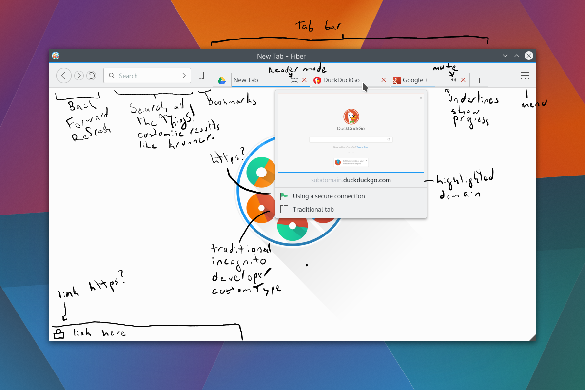
Next is the preview. There’s the thumbnail, the loading status bar, the highlighted domain, https status, and tab type.

fiber-full-12-markedNot seen would be the transient URL bar. The bar would be colour-coded, and extensions could augment it to add icons or snippets of text. For example, it would be neat to have a phishing extension warn users before they even click a dangerous link, display if the link will run a popup, etc.

One thing mentioned in the original G+ post was phishing and the address bar; with no address bar, how can you spot phishing? Simply put, I don’t want to rely on the address bar to warn users about phishing. I just think it’s a bad idea which shouldn’t be relied upon, as I don’t believe most users understand how URLs are composed – and while it may be simple to many of us, addresses have many moving parts. Additionally if a website looks convincing enough, users may not feel the need to double check the address bar.
Far, far later in development, possible a version or two after release, I plan to add safety extensions. I’m interested in the Google Safe Browsing API.
Otherwise, the only thing not shown in the new screenshots is the address bar which, like the first designs, would expand by double-clicking a tab. I may also look at putting in a toggleable button for the same purpose, as some persons have difficulty double-clicking, or may want faster access.Any C&C would be deeply appreciated, this is an evolving design and I’d like to have it well thought-out before I begin programming that aspect of the browser.

Be just as suspicious of your news providers as you are about your software providers

As a human who occasionally gets a giggle out of some news articles, I riff on Phoronix sometimes for the ‘sensationalist’ journalism on my G+ feed. While the news site can occasionally get excited for mundane developments, one important detail is that Phoronix doesn’t intentionally misrepresent issues. I may riff on Phoronix, but I genuinely trust their news as the baseline for reliable information, and if Larabel notices an inconsistency he’s quick to update his articles.

I can’t say the same for Rick Falkvinge and his “Privacy News Online” website.

I got linked to an article from OSNews and was absolutely disgusted by the amount of distortion in the article, which goes beyond sensationalism and straight into damaging and slanderous territory. I may titter at Phoronix once in a blue moon, but “PNO” actively made me sick.

So, what’s the article about?

Google provides a service binary for its “O.K. Google” voice search functionality, this package is downloaded by Chrome as a post-installation package. Open-source Chromium builds download the module the same manner. The function of the voice search module is to listen for a key phrase and transmit voice snippets to Google for interpretation, ultimately so the user may use a reliable voice-search mechanism. Despite being downloaded voice search is not activated by default.

The Pirate Party founder behind the article took offence that an open-source Chromium browser will download the binary blob which provides the service, and I imagine mouth-still-frothing decided the only way to solve this problem was to slam the Googley browsers through a litany of litigation-worthy libel.

Paraphrased, or rewritten? Rewritten.

The most egregious part of the article is a portion which “obviously paraphrases” a Google rep, and it offends me as a thinking person. The paraphrased content makes Google out like a villain ready to tie people to train tracks, wilfully rewriting the statements from a bug report to make it as draconian as possible.

The paraphrased content is a copy->paste away from landing in the article as-is, and when you read the original texts it’s all quite reasonable – my paraphrasing of it goes;

There’s a binary voice-search module which will be downloaded, but it’s not enabled by default, and you can specifically tell Chromium not to download it. We think voice is pretty important, so we give it to you by default and treat it as part of the core browser, but you need to enable it yourself for privacy reasons.

But the “paraphrased” cartoon-villain version of the same text from “Privacy News Online” would make the NSA blush. Below is snippets copied-and-pasted from the article, cropped for brevity. Though I added exclamation marks because I feel it’s more appropriate punctuation for the ridiculousness;

Yes! We’re downloading and installing a wiretapping black-box to your computer! We did take advantage of our position as trusted upstream to stealth-insert code into open-source software that installed this black box onto millions of computers! Yes, Chromium is bypassing the entire source code auditing process by downloading a pre-built black box onto people’s computers. But that’s not something we care about, really! Yes, we deliberately hid this listening module from the users! We don’t want to show all modules that we install ourselves!
MUAHAHAHA!

(I also added the “Muahahaha”, sorry. It’s too ridiculous)

We must defend ourselves against features!

The article goes on to say that, because companies force these terrible optional binary features on us, that we need to start getting all kinds of tin-foil-hat crazy with our electronics.

Fun fact: I used to work in a call-centre troubleshooting mobile phones. My favourite call ever was from an individual who wrapped is battery in tin-foil so “the government couldn’t listen”

His first point is that people will “downplay the alarm”; Oh, you bet. He questions how it knows ‘OK Google” was spoken, implying that everything you say is always transmitted. There’s two problems with this point; he skipped the part where you need to enable it, and simple math dictates that even the great Google can’t beam millions of simultaneous voice-streams to their servers perpetually.

His next point is that it is a big deal for the same reasons as point #1; that Google is slurping up physically impossible amounts of bandwidth listening to millions of people across the world. He adds that maybe there’s keywords embedded in the software which Google is listening for, so every time you mention artichoke, broccoli, cauliflower, or dates Google will secretly log your love of vegetables or hot singles looking for a night out. One of the two.

Then he questions why it’s “opt-out”. Protip: when something isn’t enabled by default, it’s opt-in. But I get it! He wants all binary things in Chromium to be opt-in, not wanting binary components near his open-source sauce; but that’s a build issue, and if someone is building Chromium it puts that person in an entirely different league than someone who just wants their browser to work.

Lastly, he says the inverse of the previous argument which I just said; he states it’s opt-in except for having the binary component, but then implies “we don’t really know that for sure! It could still be running! Google could be downloading different spyware!”. This argument annoys me because that’s not how computers work; you can have the most malicious executable on your hard-drive, but it’s inert until you run it. I could have “babyeater.o” sitting on my computer right now, but until I choose to run it, it’s nothing. His entire argument here hinges on the idea that “Google put a binary service onto my computer, and they could secretly run it on my computer!”; but they aren’t. Google isn’t stupid. If they tried that Google would stand to lose billions of dollars in an international class-action lawsuit. If they say it’s “opt-in” it’s going to be opt-in, and just because it isn’t obvious doesn’t mean it’s hidden. Chrome and Chromium have a multitude of features, and for obvious reasons Google isn’t going to add a 12-part setup wizard to Chromium so every user can make decisions about highly technical aspects of a web-browser.

Finally, the cherry on the top is the article advocating all computer peripherals should have physical on/off switches. But! Companies are EVIL! DANGEROUS! WILLING TO DO THINGS WHICH WOULD GET THEM SUED! What if these evil companies put out webcams and microphones which simply had dummy on/off switches? Clearly, hardware manufacturers are above snooping. At his level of paranoia, there’s a much easier solution than making the hardware industry include physical switches for everything: unplug the damn devices. I mean, it’s common knowledge that many computer systems are vulnerable to remote tapping – and they don’t even turn on the “recording” LED on webcams. If you’re going to be paranoid, at least be paranoid *all the way*.

Should you don the tinfoil headgear?

I advocate crazy people. Crazy people let us know we’re all still sane, and sometimes crazy people find out crazy things or point out issues which should have been crazy obvious. People like Richard Stallman who are clearly insane are necessary, because they pull the whole baseline in a focused direction. They’ll more readily call out things which are on the verge of becoming dangerous. I enjoy people who are constructively crazy. Richard Stallman brought us wonderful ideal open-source licences, putting his brand of crazy in the “awesome” end of the spectrum.

But then you get people like Rick Falkvinge. Rick is being crazy too, but he’s not being constructive. I don’t like Rick. His article could have been incredibly informative; he could have taught us how Chromium works, what it’s doing, why it’s doing it, and how to make an informed choice.

Freedom is fake if your choices are based on lies. Choices aren’t real when you’re not informed. Decisions aren’t your own when someone scares you into them. It’s manipulation.

When I read article like “Google Chrome Listening In To Your Room Shows The Importance Of Privacy Defense In Depth” I get angry because of how it portrays the issue; it’s doing a disservice to his readers because they will not have an informed choice. The article is manipulating its users into thinking voice search is an evil scheme by a faceless behemoth.

I like Google – but while I’m cautious about my Google intake – they still provide high quality services and set a reasonable expectation about how they use my data. What if a handicapped user read his article? Or a friend of a handicapped person? What if that person who could have benefited from voice search thought it was malicious spyware, instead of knowing what it was really all about? I may never use voice search, but I think it’s a very reasonable inclusion provided in a way that minimises hoops for interested users.

In the end, I guess this all goes to say that we also need to look into our news sources; Rick Falkvinge doesn’t seem to be making any effort to provide valuable information, instead preferring to force klaxxon onto readers based on pre-conceived notions. So when you open up an article, keep in mind that authors can be biased just as much as software can be dangerous.

Now that you’ve finished my article on it, please, ponder what I’ve said and question what biases I have. Do some research on the topic – Google it. Come to a clear understanding, and make a real choice.

Fiber is DEAD! Long live Fiber!

So, over on G+ I had it pointed out to me that my multi-process work was… Pointless. It really kinda killed Fiber as it was. Apparently WebEngine covered the bases I was running at. While it was super-sad to see my work circle down the toilet bowl (along with my ‘hacker cred’!) it was also a bit of a relief; not only do I get it for free, but it would have been done better and more robustly than I could have.

The main thing it changed was the fact that anything I would do from that point forward could either be pulled or applied to existing browsers, raising the question; should I fork, contribute, or still start from scratch? I knew I had 3 goals;

  • Deep KDE technology integration.
  • Present a polished, stable, modern experience.
  • Be simple by default, powerful when needed.

And a few ‘key’ features;

  • Be Multi-process CLEAR!
  • Extensions over hardcoded features
  • Custom per-tab profiles

I looked to see what was around, and there are 4 browsers which I could work with;

Qupzilla

Qupzilla isn’t KDE-specific, and I their thing is cross-platform. I very specifically want to target a KDE-oriented browser. Additionally it’s still on Qt4, I want a Frameworks 5 oriented browser. Apparently they’re on Qt5!

Even with the Qt5 version, I’d still be taking an uncomfortable number of liberties with their goals. Also, the plan seems to be a QML-based browser – Qupzilla is out.

Rekonq

Rekonq is currently ~the~ KDE browser, it has the fullest KDE integration, and is established.

The major downside is the fact that Rekonq is an inactive project; it has been stagnant for over a year. Additionally, despite being a browser based on KDE tech, Firefox has supplanted it as the default browser on even the most vanilla distributions.

I’ve been looking at the code and there are some worrying mistakes; I won’t pick it apart, but I spotted a few things that concerned me. Additionally, like QupZilla, it’s still on Qt4 and needs to be ported to Frameworks 5.

Generally, I feel Rekonq has a large amount of baggage; it needs to be ported to Qt5, it has some outstanding issues, and it seems the developers have lost interest… Rekonq is out.

QT Demo Browser

QT Demo Browser is what Rekonq was based off long ago. Since it’s just a demo, basing off it would be a new project; but it is Qt5, and the most ‘vanilla’ of the bunch.

Qt Demo is, well, a demonstration. It has valuable up-to-date code, and is somewhat no-frills. But, because it’s just a demo it also lacks many subtle features that make modern browsing pleasant. It’s also built like a traditional application, so it has a structure that looks more like IE6 than a modern browser.

Qt Nano Browser

Qt Nano Browser is a QML-based browser. It has the absolute fewest features, and is no-nonsense in its quest to simply present a QML-based tabbed browser.

The downside is, the thing really is a skeleton, and there’s a huge amount of basic functionality missing. Compared to the other browser, the question is whether or not I want to strip something down, or build something up.

The Plan

The plan is to start a new browser from scratch (or, re-start), as I was going to previously. I’m currently in a debate between traditional widgets or a QML driven UI.

I should go QtQuick, as it has some clear advantages and is another differentiating factor vs contemporary widget-based browsers. If I do so, I’ll instead base of QtNanoBrowser or at least refer to the nano browser. About the only reason I’m debating QML is because we had an agreement to disagree, but I should really just accept it and drink the juice.

So, as it was (my little multi-process experiment) is dead! But the time and effort that will be saved will go into creating something richer, different, and modern.

An Update… With Fiber!

Updates! Where I reveal things that are obvious, some which are lesser-known, and hopefully one that takes somebody by surprise… But before I need to answer why I’m not posting this on PlanetKDE, it’s because it’s non-news IMHO, or at least, I don’t think it needs to be news. 😛

At the moment, I have 4 KDE-related projects on the go.

The first is my mockup assembly line and/or blog posts. I haven’t had any requests for mockups, and this is a blog post. CLEAR.

I (think) the next version of Plasma will have a new wallpaper by another VDG member, but I’ll double-check how that’s going. We still have the sunset wallpaper in the wings, and I can make a new wallpaper if I need to pick up any slack.

Right now the Chroma Window Decoration is on hold for a few reasons. Mainly I’m lazy, and I don’t have a good setup to test without messing up my build setup. For the time being I’m pretty happy with the current Breeze windeco, and all I’m bringing to the party is some slightly fancy buttons. That being said, I’m still excited to bring it, but it’s moved down a few pegs in the importance scale over the past few weeks.

If someone wants to take over the current todo (KCM integration) and make the decoration functional for the wider world, I can totally update the repo with my latest butcherings.

Next is the KDE.org websites. about which I’ve been quiet, very quiet. For those not in the loop (pretty much everyone outside of a few devs and the VDG) I’m cooking up what will hopefully be a successor to the current KDE.org sites.

Progress has been slow though. Mostly because I’m a web developer by day and it would destroy my brain if I developed websites around the clock. For the most part, KDE.org related stuff has been limited to Sunday projects because of this. Within the next week I’ll be finished with web development at my work and switching into IT mode for a bit, so I should have the drive to produce a demonstration site “soon”.

There is a (hidden) KDE forum with exactly 1 post in it, and soon I’ll request it be opened up, hopefully around the same time I get the demo site together. It will be for the effort of modernising the KDE websites.

Which brings me to my fourth project;

Fiber Browser

Not sure how comfortable I am coming out with this project as early as it is – so my dear lovelies – please keep this on the “down low” (as your “peeps” might say).

Lately I haven’t been 100% happy with browsers for Linux, and I decided to start a new KDE Frameworks 5 based browser from the ground-up; I’ve taken to calling it Fiber. It’s been in planning for some time now, and I’ve landed enough code to build my confidence in the feasibility of this as a thing.

Between the KDE website refresh and Fiber, these two projects will likely account for the majority of my mid-term KDE-related contributions.

What is it?

fiber

Fiber Icon

Fiber is a Qt5-based browser using the new Qt WebEngine based on Blink. Currently, Fiber is only prototype-quality code, an icon/logo, and a slew of specifications I’ve been planning for a while now.

Like Google Chrome and Chromium, Fiber is a multi-process browser. Specifically, Fiber manages multiprocess browsing by using QProcess, QWidget based window containers, and DBus.

From a main window, Fiber will launch “WebEngineWindow” processes via QProcess. After a short handshake between QProcess and the WebEngineWindow for the purpose of initial embedding, Fiber switches to DBus as its IPC to talk between the processes.

Fiber should be display-server agnostic and fully capable of running on Wayland; it does not use Q11XEmbedContainer. Fiber should be portable between platforms, though for Windows I believe extra work is required for DBus. That being said, my development/testing will be limited to my current distro, and I’m probably going to be too lazy to package it most of the time.

In may day browsers had interfaces! We had Mosiac! I don't get this "miminalism" jive!

In may day browsers had interfaces! We had Mosiac! I don’t get this “miminalism” jive!

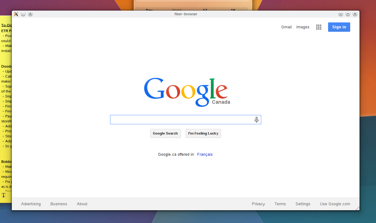
Currently there’s no formal UI; Fiber at this point will start itself, start its first child at “about:blank”, embed the process, and over DBus send a request to hit google.com. Closing the main window neatly quits out the WebEngineWindow process, and manually crashing the WebEngineWindow process leaves the main UI unscathed – process isolation, baby! I only need a clever “He’s dead, Jim!” graphic.

Currently the browser is using Vanilla Qt, but once the underpinnings are grounded I’ll be using KDE Frameworks features. I don’t know if I’ll be using QML, but if I do it will likely be in the context of extensions and special pages. The main UI is being traditionally programmed for now.

Why not fork/contribute to existing browsers?

One of the main goals for Fiber is to be a fully multi-process affair, and will be the justification for its existence. Currently none of the Qt-based browsers I am aware of are multi-process, and I’m not keen to layer such a significant transition onto projects not designed around it, either in a fork or as contributions.

Additionally, I’ll be sounding klaxxon on release warning people about the fact that the first releases will probably be an unstable security hole held together with duct-tape; I don’t want to inflict that onto an established project.

What are the goals?

There are 3 major goals for Fiber (presented in order):

  • Deep KDE technology integration.
  • Present a polished, stable, modern experience.
  • Be simple by default, powerful when needed.

Integration with Frameworks/Plasma will be a key feature, my hope is to have Fiber promote banner features Frameworks and Plasma provides. Additionally, I will attempt to have Fiber follow ‘KDE’ trends. While Fiber will have a ‘KDE first’ attitude, if functionality and polish for wider environments can be maintained – it will be.

A major goal for this browser to have the same level of polish that the “big 4” browsers have. Between adding a feature or improving the existing functionality I will always vote to improve what we’ve got, though I’m not out to make a ‘lightweight’ browser. Essentially it will do what it does well, and it won’t compromise to do what it does. I plan to place an emphasis on visual polish, but every effort will be made to ensure things like the rendering engine will not be left behind.

The VDG has the mantra “simple by default, powerful when needed”. The plan for Fiber is to offer as much functionality as it can in the form of extensions, and roll-out simple, stable and interchangeable components offering basic functionality, but allowing power-users to push those aspects further and harder. Additionally, Fiber will use the concept of “tab profiles” as a method for managing features on a per-tab level. E.g. ‘private’ tabs would simply be a profile configured to privacy. I plan to include a developer profile. Eventually I’d be interested in users being able to specifically launch Tor/Proxy tabs – but that’s far down the road. This means that we can have advanced developer features able to roll-out en-masse when requested, but keep them out of the way for casual users unless called upon.

What Licence?

not sure! Since everything is being written from scratch, I have liberties here. The likely answer will be GPLv2, and I figure if I start borrowing code that decision will be made for me.

Making Sense of the Kubuntu Council Leadership Spat

By now the news has spread quite quickly; the Ubuntu Community Council (or “CC” for short) had attempted to boot Jonathan Riddell as a community leader, asking him to “take an extended break” from the Kubuntu Council (“KC” for short) citing personality conflicts and breaches of the Ubuntu code of conduct.

So, what just happened? On the various news sites and through some broken telephones there’s several misconceptions about what happened. Being an outsider the whole issue is rather complicated, I know nothing of the structure around Canonical, Ubuntu, and these councils and how all this relates to Kubuntu.

This isn’t going to be a post about the he-said-she-said arguments, but is more of an outsiders explanation into how all this fits together and what it really means.

I’d like to mention I’ve received corrections in the comments, and would like to give a thank-you to the commenters for their feedback.

What is the Community Council? How does it work?

The Community Council is the highest governing body representing the Ubuntu umbrella of projects, including its derivatives. The CC is a democratic organisation with 7 seats available for elected representatives and a 8th tie-breaking seat being reserved by Mark Shuttleworth. The group uses a well defined electoral process which receives votes and nominations from the Ubuntu membership and community at large.

The group manages non-technical communication and governance of the Ubuntu project and derivatives. An important part of this event is the mandate that the council operates transparently to the wider community, the idea being that they would also serve as a bridge between the commercial arm of Canonical and the open-source community at large.

What is the Kubuntu Council?

Just like a larger governing body, the Community Council has delegated sub-councils to represent larger projects within the community. The Kubuntu Council is one such branch managing the KDE-oriented Kubuntu project. Like the CC, the Kubuntu Council is composed of members elected by the community.

When the system works the idea is that the Kubuntu Council will take care of project-level matters independently, and the Kubuntu Council lead will attend meetings to trade information and matters upstream with the Community Council.

So… Does Canonical Own Kubuntu?

I will note here that Canonical is not one of the active parties in this dispute – this section is only meant to clarify misconceptions I’ve seen online, and to help explain the next sections.

Canonical owns the trademark for Kubuntu – so as a ‘brand’ they own Kubuntu. Beyond that Canonical does not directly fund Kubuntu, instead they offer infrastructure in the form of repositories and servers, where Kubuntu is allowed to piggyback off the Canonical/Ubuntu project network and work more closely with upstream resources.

But Canonical does not employ the Kubuntu staff; previously they did employ staff but Blue Systems stepped in when Canonical cut funding. Blue Systems has since become a much larger part of what drives Kubuntu than Canonical. Both of these together have made Kubuntu (as a project) much more than a solely Canonical venture.

In over-simplified terms Canonical owns the franchise and Blue Systems runs the hottest ‘non-headquarters’ location.

Who is Jonathan Riddell?

Jonathan is an ex-Canonical employee who was scooped up by Blue Systems after Canonical cut funding.

Part of Canonical cutting Kubuntu funding was terminating Jonathan as an employee of Canonical. He essentially retained his position in all community aspects of Ubuntu, just without the paycheque: he is a Kubuntu Council member, has access to the Canonical infrastructure, and helps manage the Kubuntu project.

Blue systems picked him up and he is able to work full-time in an almost identical capacity that he did as a Canonical employee.

What was the Ruckus?

Mainly, there’s some conflicts between Riddell and members of the core Community Council. Riddell had repeatedly pushed several issues which the council was unable to fulfil, leading to frustration on both sides. In the end both sides showed the stress they were under, at which point the Community Council privately decided they would oust Jonathan from the Kubuntu Council.

The KC replied arguing that the decision was not made transparently, questioned how much power the Community Council should have over the community-elected Kubuntu Council roster, and was incensed by the CC not retracting the decision before a transparent conversation. The Kubuntu Council didn’t want to negotiate “with a gun to [their] heads”.

Who Ultimately Gives the Orders?

The Kubuntu Council is bound by their constitution to obey “legitimate orders” from the Community Council; if the CC makes a decision in line with the Code of Conduct and its own constitution the Kubuntu Council must obey that request. But no provisions have been made for when the two groups disagree over a decision. The Community Council may be forced to cut off Jonathan or supporters from Ubuntu support infrastructure, such as Canonical repositories and funding, and the group has already stated that he is keeping his upload rights and ability to request funding. However given the hostilities, revoking those privileges might be a hardball solution, and one that the Kubuntu Council may not have control over.

The reason Kubuntu believes it can reject an authoritative attempt is threefold; it had never happened before so there was no ‘precedent’, there was no warning for Jonathan to correct the ‘behavioural issues’, and the largest reason is because the Kubuntu Council does not feel the decision was legitimate.

The entire issue hinges on the legitimacy of the order; Kubuntu Council only has to obey legitimate orders, and questions whether a decision made behind closed-doors when the mandate is transparency be considered legitimate.

In short: yes the Community Council can remove people from its sub-councils, but it might have terrible fallout if done improperly. They can’t really tell the Kubuntu crew what to do if Kubuntu doesn’t find the orders legitimate. But if push comes to shove it is possible for the Community Council and Canonical to revoke infrastructure access if a resolution cannot be found.

What Happens Now?

Right now the Community Council is exerting control over projects using their infrastructure much like a company would manage employees; if someone isn’t in line they can be moved, removed, or suspended without public debate.

The problem with this strategy is the fact that communities don’t like being dictated to, and in attempting to do so rubbed the community the wrong way. The Community Council literally gave an order and the Kubuntu Council said “no”. So what happens now?

By removing Jonathan from his position in the Kubuntu community, it also affects his value for Blue Systems. If he were removed, it brings into question what Blue Systems and the community would do in response; Riddell is a Blue Systems employee and carries significant community favour from KDE users.

The first thing that can happen is… Nothing. Birds will sing, grass will grow, and the KC will make the CC grit their teeth a bit. Maybe Jonathan will be removed after a more transparent meeting, maybe not. If the KC doesn’t remove Jonathan, then it may force Canonical into an awkward situation where it must back the council and start cutting off infrastructure.

Second, if this is resolved, Mark and the Community Council may revise its community strategy and put in safeguards for these situations and possibly enforce a more formal structure over the ad-hoc sub-community model. This would need to apply to all communities as singling out specific projects would simply inflame the situation, in the future preventing other projects from entering a similar situation.

Third, instead of a split the Kubuntu crew might attempt to separate their internal governance a bit; possibly designating a separate group to work with the Community Council while the main leadership remains as-is. Ubuntu can work with their partners effectively without disturbing the leadership, but this solution complicates communication and doesn’t fix several underlying issues.

The next thing that may happen could be the start of a more gradual separation; Kubuntu as a project may slowly take on more infrastructure, growing apart and leaving the nest – maybe with Canonicals blessing and the transfer of the Kubuntu trademark. Who knows.

Lastly both sides could calmly file into a room before sizing up chairs to throw at each other; terrible words being said about peoples mothers before forking Kubuntu into ‘Librebuntu’. This would hurt as the Kubuntu and KDE developers already have poor relations with Canonical, meaning a fork would likely lead to a mass exodus from Kubuntu to the new project (much like the LibreOffice fork). While the freedom of not having Canonical or the Community Council dictate policy would be refreshing, the loss of infrastructure would be a certain setback.

In the End… ?

In the end, I think we all simply hope that projects, companies, communities, and benevolent dictators can all work together in relative harmony. The situation isn’t ideal, but a major part of building strong communities is occasionally finding out something doesn’t work – and fixing it; hopefully to the benefit of everyone involved.

Right now both sides are holding strong in a ‘grey zone’ with their actions – the CC seems to be meting out harsh decisions without clear policy, and the KC is refusing to listen until the CC backpedals on its position.

That’s my breakdown of the politics; I hope it helped and provided insight into this whole messy affair. I hope to gets all sorted out in the long run. If I have anything wrong, please do let me know in the comments and I’ll make the relevant corrections.