Earlier this week the decision was made to switch from Drupal to WordPress as the CMS used for the KDE.org main website. While Drupal is certainly a fine system, the decision to switch was borne when my quick work to update a WordPress asset turned into a serious venture much more successful than my work with Drupal. Prior to my contributing to KDE I used to develop on WP, and I was surprised to find out my experience largely held in this new version. In hindsight, WordPress was the obvious option considering this.
A round of discussion about formally switching ensued, and many other great reasons to use WordPress were present, including the much larger number of KDE websites on the platform. I won’t get into it too much as I’d instead like to go over the work done over the past week and some of the features coming to KDE.org Aether template which are already complete; today I’ll focus on the header, which had the most love.
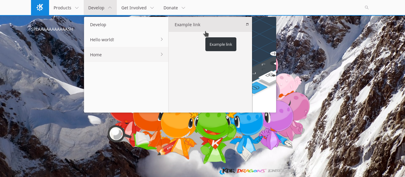
The header will feature an up to 3-level menu, and in the future it may be made to not restrict the number of levels. But, for now, 3. It nicely scales back to two or one levels as appropriate. Currently the theme will pull featured images from root navigation elements and display them in the dropdown, but in the future this will likely become a navigation-specific setting for more control. As expected, the navigation is completely customizable. It is also responsive, and when it can no longer accommodate the number of menu items for the width of the given screen it will switch into ‘hamburger mode’ which works very well on mobile.
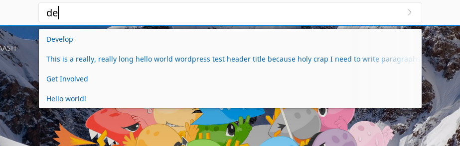
My personal favorite feature so far is the live search. This probably had the most work this week, and I really wanted to nail it down well. It’s a search-as-you-type system, but has several built-in features to avoid overloading servers, such as an adaptive delay until it performs a request and temporary localstorage caching.
Lastly, the theme is being built to be completely customizable for suitability on not only KDE.org itself, but even as far down as personal blogs which may not demand the full range of features being built into the design.
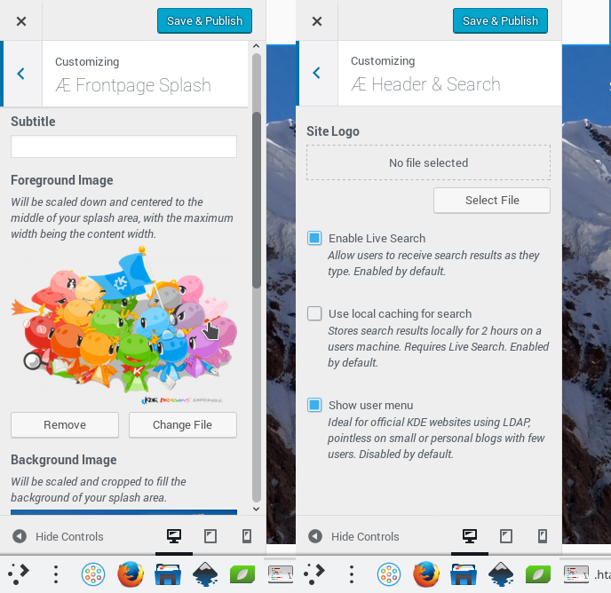
The design itself is forked from KdeTheme theme, which in turn was forked from Activello. It features thoughtful localization, and work is being done to make the individual components more modular so maintenance will be a cinch over the long game. There are still many features, options, and utilities being poured into the design, and I’ll be posting updates semi-regularly as the progress continues.
Ultimately, the KDE.org theme itself will be generic enough for use on any KDE-related site. As it matures enough to be in use on regular websites, the design will also be loaded onto the WordPress theme directory, allowing sites which may not enjoy the full KDE infrastructure (such as personal developer blogs) to easily install and keep the theme updated.
If you maintain a KDE-related website and are using Drupal, depending on the breadth of your content, we still have options for you. If you have a smaller website, I’ll be offering to port to WordPress if you desire. If you have features required which can be folded into the larger theme I will do so as appropriate, otherwise we can evaluate if a small site-specific plugin could serve that use-case. If you have a Drupal site too large to move – or you simply wish to stick on Drupal – after the KDE.org wordpress work is considered complete, the existing Drupal 7 theme will be updated to service existing websites. For anyone else maintaining a website looking to use this design I’m also taking feature requests for the theme and design elements at this point. Please send inquiries and requests to the kde-www mailing list.
Beyond the design itself, we have some exciting plans for managing content and applications which I’ll be posting about later.