KDE.org and Drupal

KDE.org quite possibly has one of the largest open-source websites compared to any other desktop-oriented project, extending beyond into applications, wikis, guides, and much more. The amount of content is dizzying and indeed a huge chunk of that content is about as old as the mascot Kandalf – figuratively and literally.

Kandalf

I personally believe he’s ripped under that cloak.

The KDE.org user-facing design “Aether” is live and various kinks have been worked out, but one fact is glaringly obvious; we’ve made the layers of age and look better by adding another layer. Ultimately the real fix is migrating the site to Drupal, so I figured this post would cover some of the thoughts and progress behind the ongoing work.

Right now work is on porting the Aether theme to Drupal 8, ideally it’ll be “better than perfect port” with Drupal optimizations, making better use of Bootstrap 4, and refinements. Additionally, I’m preparing a “Neverland-style” template for those planning to use Aether on their KDE-related project sites, but it’s more of a side-project until the Drupal theme lands. Recently the theme was changed to use Bootsraps’ Barrio base theme, which has been a very pleasant decision as we get much more “out of the box”. It does require a Bootstrap library module which will allow local or CDN-based Bootstrap installations, and while at first I was asking “why can’t a theme just be self-contained?”, now I’m understanding the logic – Bootstrap is popular, multiple themes use it, this will keep it all up-to-date and can be updated itself. I do think maybe one thing Drupal should do is have some rudimentary package management that says “hey, we also need to download this”, but it’s easy enough to install separately.

If you have a project website looking to port to Aether, I would first advise you simply waiting until you can consider moving your page to the main Drupal installation when it eventually goes live; in my perfect world I imagine Drupal unifying a great amount of disparate content, thus getting free updates. Additionally, consider hitting up the KDE-www mailing list and ask to help out on content, or place feature requests for front-end UI elements. While I’m currently lurking the mailing list, I’ll try to provide whatever info I can. On an aside, I had some Telegram confusion with some people looking to contribute and concerns from administrators, so please simply defer to the mailing list.

In terms of the Aether theme, I will be posting the basic theme on our git repo; when it goes up if you have Bootstrap and Twig experience (any at all is more than I had when I started), please consider contributing, especially if you maintain a page and would migrate to Drupal if it had the appropriate featureset. I will post a tiny follow-up when the repo is up.


Does KDE.org look funny to you?

Our stalwart KDE homepage, which has been with us for several years, has, after serving us well, finally been retired.

The new KDE.org homepage, using the new theme “Aether”, is only the first step of a much longer journey to unify the disparate KDE websites. KDE.org and its surrounding network is made of many parts: forums, wikis, feed aggregates, custom solutions, etc; beyond the homepage each of these will need to be updated. It will be a long road, but the modernization is due.

This new design is still using direct and simple PHP, but the redesign effort will see us land this into a Drupal theme which will eventually be deployed for the wider KDE.org pages. We will still be using the other systems for our other non-static content, but Drupal will be used to replace any page using our current template engine “Capacity”.

I’d also like to give a special thanks to Harald Sitter for making this very quick and smooth transition possible.

If you spot any issues with the website, please report bugs to https://bugs.kde.org/describecomponents.cgi?product=www.kde.org, and I’ll watch the mailing list as well.

Wallpaper, Wallpapers, Website!

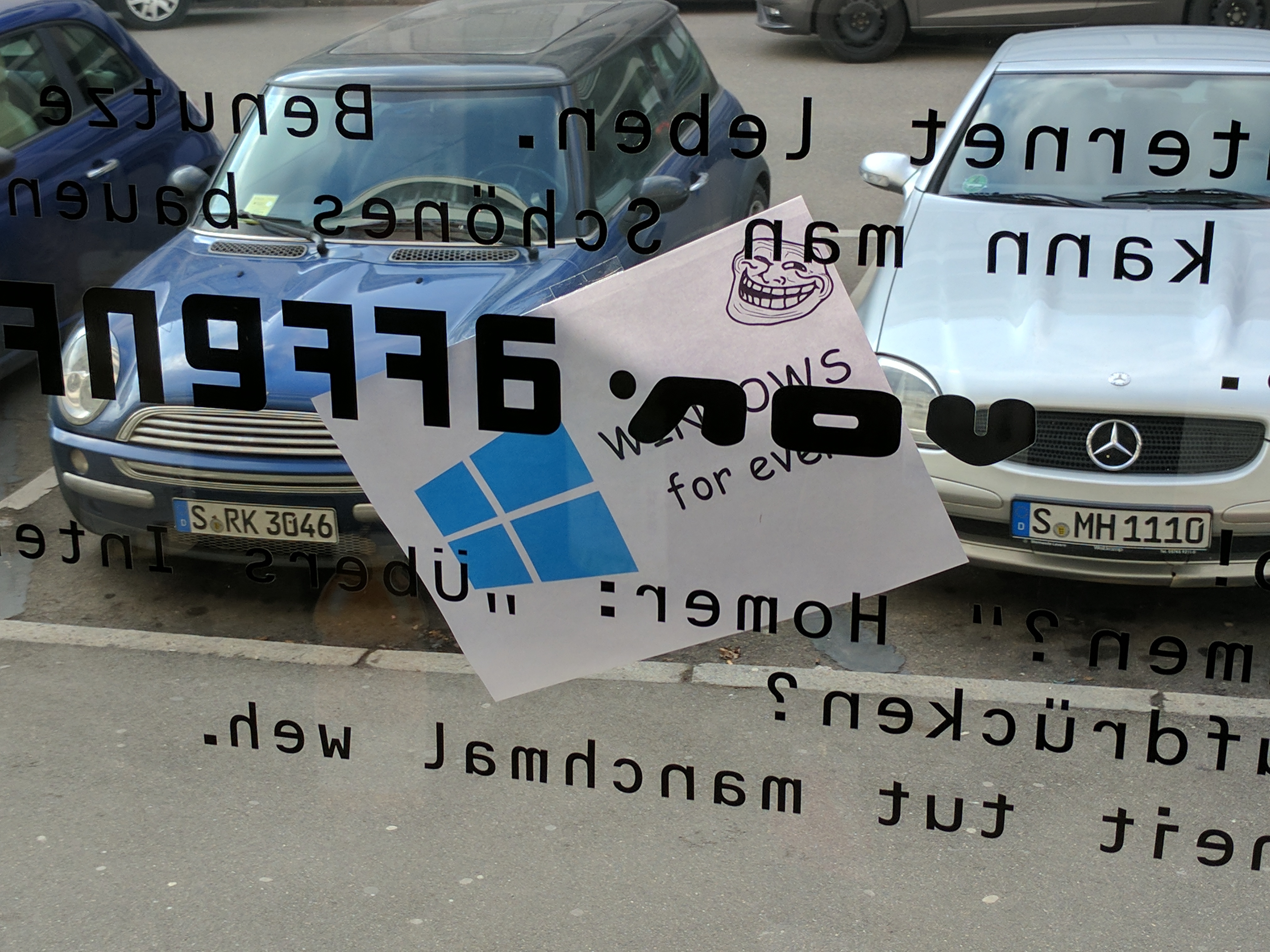
Starting off the Plasma Sprint today has been a good start with a little bit of real-world trolling, some quick sight-seeing, and of course, starting to get todos scratched off the list.

img_20170206_132239

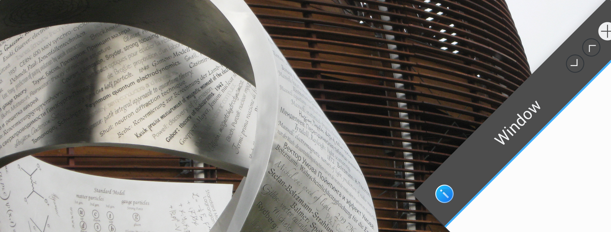
Nobody noticed when this was stuck outside the window, and we are happy to report there’s a vast array of KDE software available for Windows. 😉

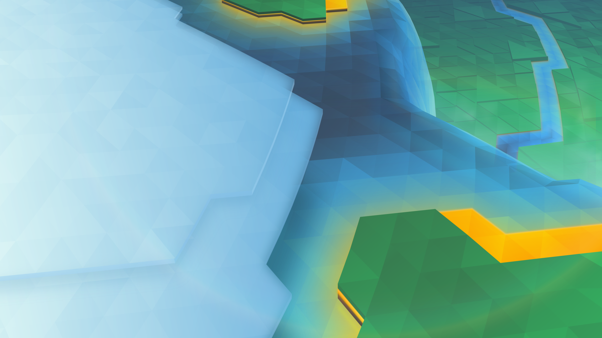
I’m excited to say it’s that time of the release cycle, meaning we show off a new wallpaper coming to Plasma 5.10!

1920x1080.png

The new wallpaper is named “Cascade”, English for many interesting things in technology, and French for Waterfall, or many waterfalls. Interestingly, this wallpaper has more layers than the 5.02 wallpaper had triangles.

If wanted, I can again show the process of how this wallpaper was put together, leave a comment and I’ll write it up.

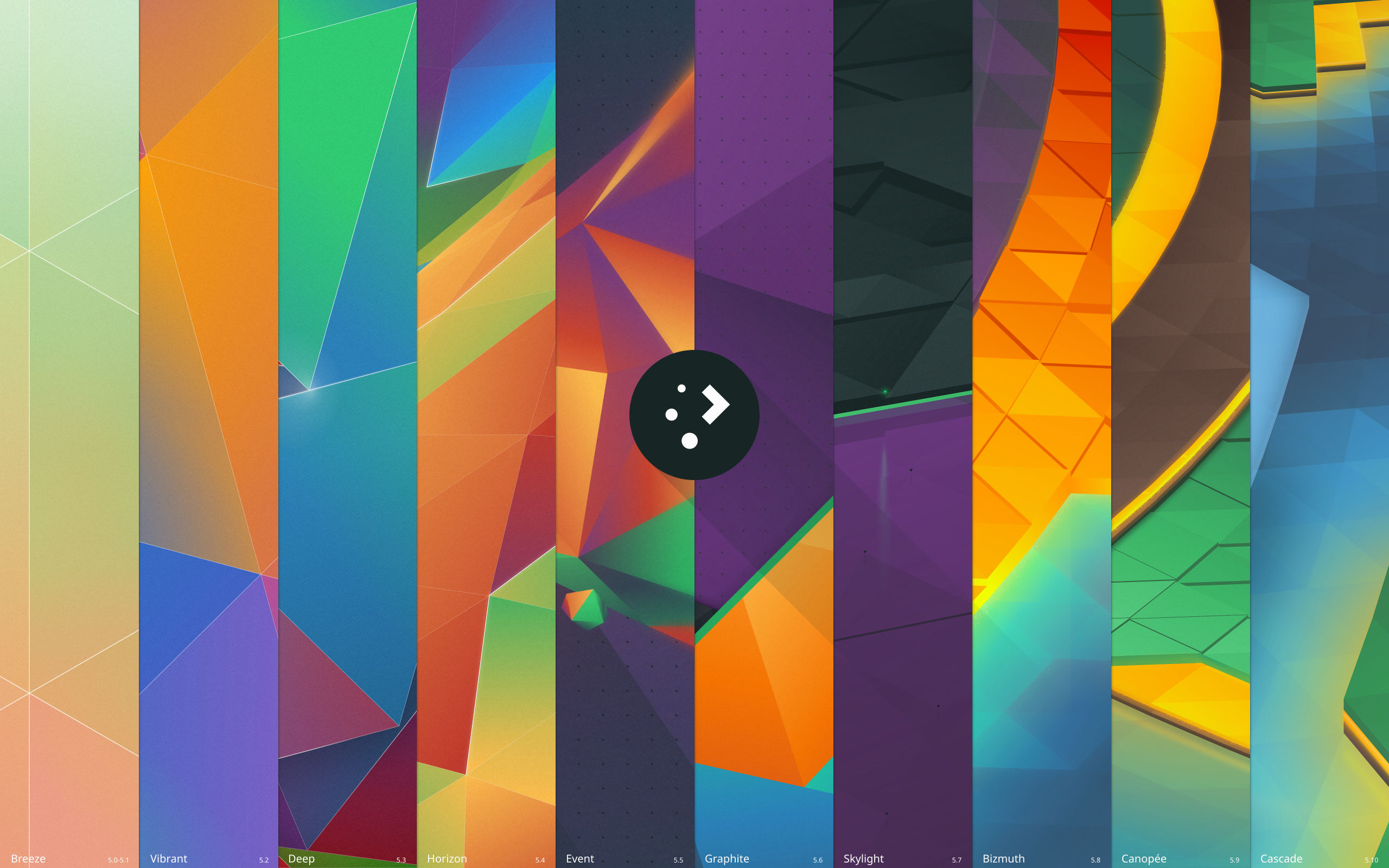
Which brings me to my second todo which I finally got around to – wallpaper downloads! We’ve already had 9 wallpapers for the Plasma 5 series, and you can now visit https://store.kde.org/ to download each of them. For Nuno’s original “Next” wallpaper, I’ve provided a “remastered” version for 4k monitors named “Prev”. It’s not perfectly accurate, but for those who liked the original it is available;

plasma-5-0-1-prev-remastered.png.png

Additionally, there’s a new wallpaper named “History” for those who want to celebrate 10 iterations of Plasma 5 and the upcoming 11th iteration;

plasma-history.png

(Clicking on any of the images will take you to the relevant page on the KDE Store)

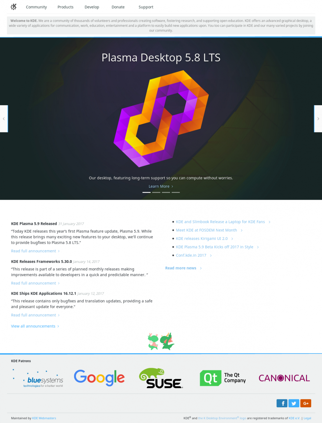
Lastly, much work as been done on the KDE website redesign. I’ll be blogging about it later, but here’s a screenshot showing the general design for the new homepage:

(sorry if the image is a bit fuzzy)

KDE_Community_Home_-_KDE.org_-_2017-02-04_08.27.43.png

The 2017 Plasma Sprint is sponsored by Meat Water.

Plasma 5.9 Wallpaper “Canopee”

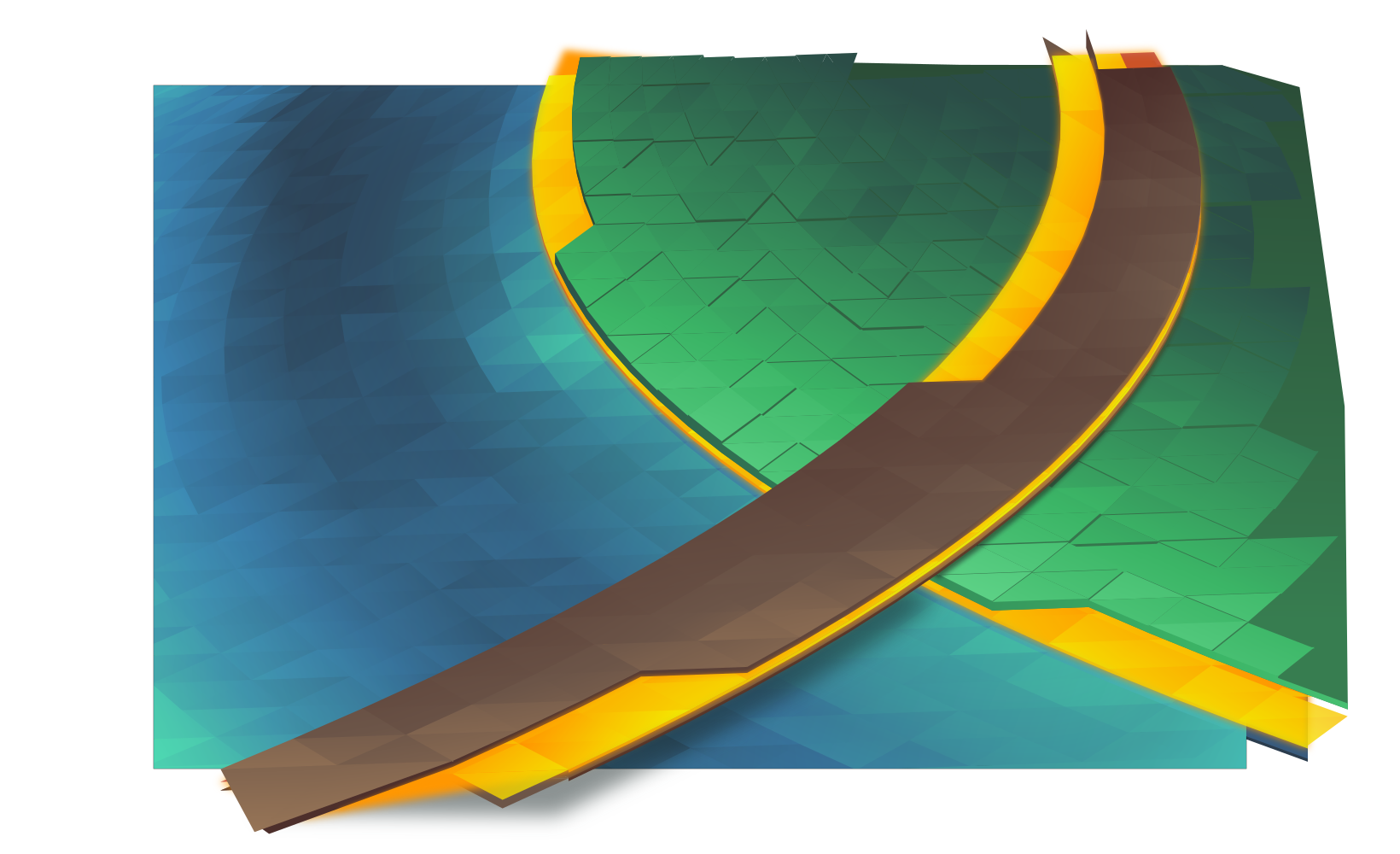
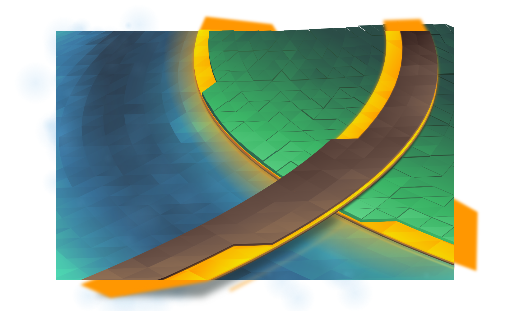
It’s that time of the release cycle! Plasma 5.9 is getting a new wallpaper, “Canopee”, French for canopy. Like the last wallpaper, Bismuth, we are again shipping with a 4K version.

canopee

(Download)

This wallpaper is aiming for the same effect as Bismuth from Plasma 5.8, but the colours have been turned down from “11”.

The development of this wallpaper was a little bit harrowing; I had several designs which were started and scrapped in rapid succession. It’s easy to imagine a few lines in pencil as looking good, but in reality only the initial vector work will tell you if it’ll work. Inkscape for some reason also evolved a rather massive memory leak, swelling to 5+ GB of RAM usage after only a few dozen gradient adjustments, sending my machine grinding to swap.

As I worked I kept snapshots of various steps, so I’ll cover how this wallpaper was put together:

The first part of the making Canopee involves using Envelope or Perspective in Inkscape to set up the initial grid of ‘polygons’, trimming excess, then punching out the unique layers. Unlike Bismuth which had one layer of polygons at varied heights, Canopee had several complete layers of overlapping polygons.

step1.png

The next step is adding gradients and closing the seams. I need to add the gradient first otherwise I can’t see what I’m doing when I close the seams. If I don’t close the seams you get those white lines you may have seen in the early 5.2/5.3 wallpapers. Below is after I added the first set of gradients, and the first few rows of “closed seams”. Seams are closed by making every triangle overlap slightly, so I start from the back and manually adjust nodes for every ‘polygon’ in the wallpaper.

(Yes, manual. If you’ve been paying attention, each successive wallpaper has more polygons. I am, in fact, being slowly driven insane by this)

step2.png

After getting the water and track done, the next step is the island. You can see that welding the seams makes things more solid. I’ve also made the yellow layers semitransparent, later they’ll glow with a soft light which is accomplished by adding a blurry solid underneath the layers.

step3.png


The “grass” will use vertical jittering to add texture and visual interest. This is actually one of the more time-consuming tasks as it requires huge amounts of manual correction and visual fixes. ‘Polygons’ are more often than not above and below each other when they shouldn’t be, and I have to manually add walls to make them look like columns. This is also the most error-prone part of the process, and some mistakes were caught as late as after adding post-processing in GIMP, meaning several fixes often have to be ‘backported’ to the master vector file. It was also at this point that I decided to dump purple and use exclusively ‘natural’ colours.

step4.png

Finally, I add various fine touches, including reflections, more refined shadows, large glows, particles, etc. At this point everything is set in stone, so I create 3 more layers which will serve as masks in GIMP when I do post-processing. Each mask covers one area which I’ll want to apply a specific effect to; I try to use slur, pick, and thread filters on “liquids”, and noise filters with varying adjustments on other materials.

step5.png


masks.png

Finally I composite it all in GIMP at a 5120×3200 resolution. This wallpaper had a huge number of corrections in post, including one missed glow, a small run of polygons which were ‘flat’, and several mistakes in the jittered layer. After those corrections the final result is at the top of this post. This wallpaper will be available for Plasma 5.9 at 4K resolutions, but if you can’t wait to get it the top image links to the 2560×1600 version.

A Link to the Tileset & Sprite Trivia

In my off time I’ve been closely examining the Legend of Zelda Link to the Past tilesets and sprites, and I’ve been learning a huge amount about how that game is assembled visually. it’s amazing how much they managed to do with the limited resources of the SNES.

For a game I’ve played religiously as a child, it’s interesting to see the imperfections which I completely glossed over even after several complete playthoroughs. There’s also some neat workarounds Nintendo did while preparing their graphics.

So here’s some “trivia” I found while closely examining the various maps and shots of the game;

  • Bricks lining the floors of diagonal walls are always rounded. This is not decorative, but a limit of their sprite-sheets 8×8 tile resolution. There are 5 unique 8×8 tiles used to create a diagonal wall, it would have required 6 tiles to add the 3 pixels needed to straighten the edge, and another 16×16 composite tile. Same, apparently, with the bottom of diagonal cliff edges. If they fixed this, several tight diagonal corridors would have been impossible.
  • In the overworld you will never find a flower that is NOT above a sprig of grass. You will always find flowers tiled with grass, or above and to the left of two sprigs. If you see three flowers, it’s just a combination of the other two patterns.
  • Live grass and dead grass never touch. I’m guessing because dead grass is a palette swap, so they would have had to include a tile-set for those edges. Instead, there’s always a dirt buffer or a cliff.
  • Bobbing flowers in the overworld have more frames of animation than any single enemy walk cycle. As a matter of fact, some enemies only appear to have one frame in their walk cycles – it’s just flipped to create the illusion of movement.
  • The animation used for guards falling off an edge contains more frames of animation than several enemies have for all their animations, total.
  • There is one tree in the game with a root placed on dirt/cliff edge. The tiles that make up that root are recoloured grass; because of that, one of the colours is slightly mismatched.
  • Cliffs are by far the most complex tiles in the game, but also tend to show the most seams between tiles. To say it must have been painstaking I think would be an understatement.
  • Most dungeons and houses share the same brick walls, only palette swapped with different tops. Instead, dungeons distinguish themselves with unique entrances, pillars, and decorations. There’s also a unique entrance for the monastery which was unused, possibly to avoid it being confused with dungeons.
  • Walls in houses and dungeons also don’t obey perspective, various tricks are used to maintain the illusion. The southmost walls are sometimes outright covered, and very seldomly will you see half-walls or “tall” objects touching the south walls.
  • Braziers, tall lampposts, half-walls, and various other doodads to not contain transparency keys. While not surprising on its own, it’s shocking to realise how many things don’t actually have “shapes” or “blend in” to their environments when closely examined, simply having grey backgrounds which most people must never notice. Those moving spike traps? Those are square, you just thought they were pointy.

Anyway, those were some fun facts.

Zelda: A Link to the Past is simply an amazing piece of work, and the tilesets are remarkably compressed for what they were able to create; PNG images containing the complete light world are larger than the entire game itself, not including the alternate dark world, insides of houses, or dungeons.

Tomorrow is a New Day – Joining Blue Systems

I’m very excited to let everyone know that as of tomorrow I’ll officially be joining Blue Systems, working full time on KDE and related projects! The chance to really immerse oneself completely into something you love and also work alongside people you absolutely respect is mind-blowing.

I would like to deeply thank Blue Systems for this opportunity, I hope my contributions will match the awesome generosity that everyone in the community has given allowing me do this. Thank you!

Queueing up for Plasma 5.8

It’s been too long since I’ve posted on Planet… I missed you! But despite my slothish activity there are rituals to be followed, and so comes a wallpaper for Plasma 5.8;

Probably the first thing I’ll mention is that the Plasma 5.8 wallpaper will be shipping with a 4K UHD version. The last wallpaper was meant to have a 4K version, but it simply didn’t happen. Seemingly everyone is beginning to enjoy screens with high pixel densities, so it’s about time we shipped wallpapers to match, and it’s a fun bullet-point for an LTS release.

Here it is;

2560x1600.png
We still have a short window for tweaks and adjustments, so if there’s feedback for minor changes I can try to fit them in. I know a couple minor tweaks I’d like to make as well.

The general theme of the wallpaper is to try bringing back the vibrancy of earlier wallpapers; there’s been a trend making things progressively darker, and it had been mentioned that several people missed the energy of older wallpapers. With that in mind, hopefully this iteration has that light and energetic vibe without looking like a hot mess.

On a more personal note, some weeks ago the company I work for had been bought out. Because of that everything I was working on had to be put to the backburner while I sorted things out. I had to make some extremely difficult decisions, and I’d be lying if I said it didn’t mess me up for a while there. It’s been intense. I also still have i’s to dot and t’s to cross.

Ultimately it means that I’ll be moving from coast-to-coast and south of the border to work in the United States. It’s a bit freaky penetrating the bureaucratic nightmare that is immigration forms, and sobering as I send them out. But I’ll be joining the ranks of many great Canadians who crossed the border: Jim Carry, William Shatner, Mike Meyers… *cough*Beiber*cough*

I can’t say I know what this will do to my contributions; whether or not my new job will give me more time, less time, or if I’ll need to stay back until I even really know 100% what’s going on. I certainly don’t plan to stop contributing, but I can’t say how active I’ll be in the near future until I see where the chips fall, things are also still in a state of upheaval.

I am, however, still looking forward to Akademy. I’m set to give a 30-minute talk on design iteration; whether or not you are creating a new application or maintaining an old beast, effective iteration is the key to great design. 😉

going-to-akademy-slim.png

That Time of the Cycle

With Plasma 5.6 long out the door, it’s time for the traditional changing of the wallpapers! Or at least, showing what the next wallpaper will be.

With Plasma 5.7 we won’t be venturing too far from where we are in 5.6. As I mentioned in a previous post about wallpapers we have been paying attention to the feedback, trying to find something that hit the right balance. The 5.6 the wallpaper seemed to hit that mark, so you’ll see fewer dramatic swings in the wallpaper direction; we’re goanna stick with what works for a while.

Here’s the 5.7 wallpaper, “Skylight”;

2560x1600.png
(Download 2560×1600)

I’m keeping very close to the formula of the current wallpaper, and generally this is what people should expect for a few wallpapers for the next few releases of Plasma. I’ll vary the ‘material’ and positions a bit in the future, but I didn’t want to do that too much during our transition to perspective this release… Perspective was the one thing I meant to do with the current wallpaper, but for various reasons it didn’t happen.

One thing that also came up was assembling the old wallpapers somewhere for the people who preferred a previous release. I’d like some opinions and feedback on a few questions if we decide to do this;

  1. Where would you want all the wallpapers stored? A ‘legacy wallpapers’ package, the current additional wallpapers package, OpenDesktop?
  2. Would you want me to “George Lucas” some of the wallpapers, and tweak/improve the lower-quality ones for re-release? Or should we just drop some of the really early ones?

So, what do you think we should do with the older wallpapers? Comment below, let us know!

Touring CERN and the LHC

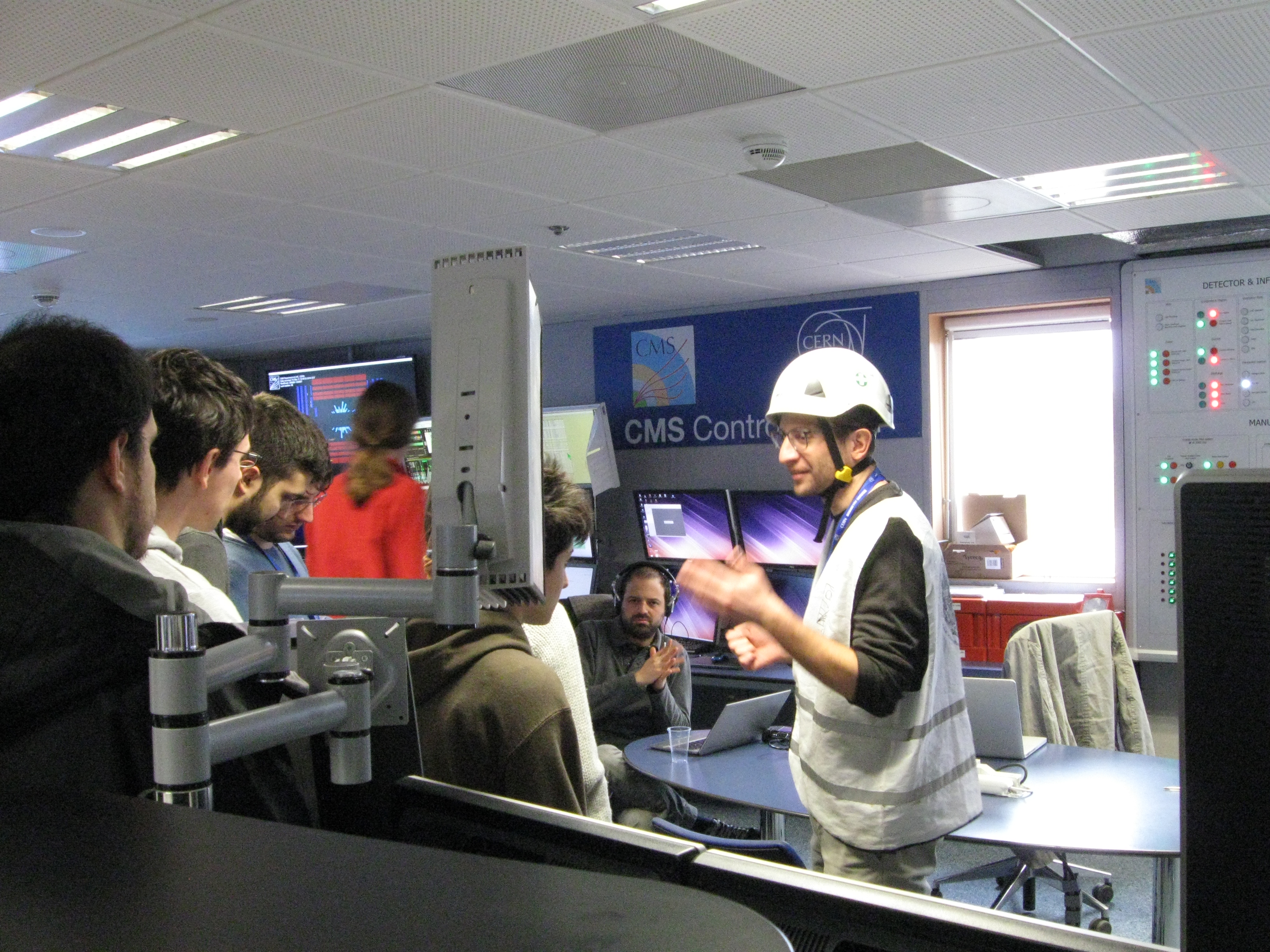
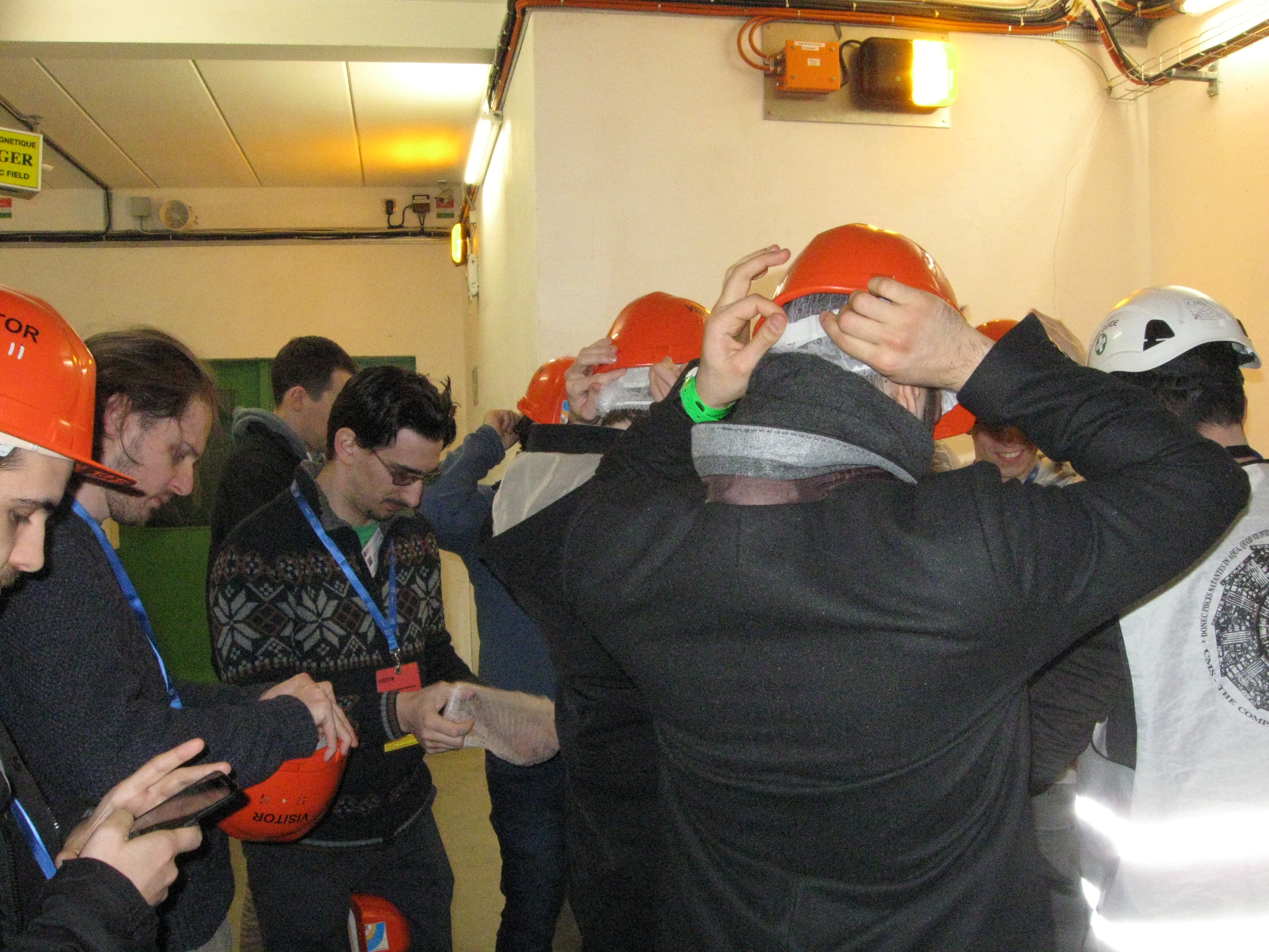
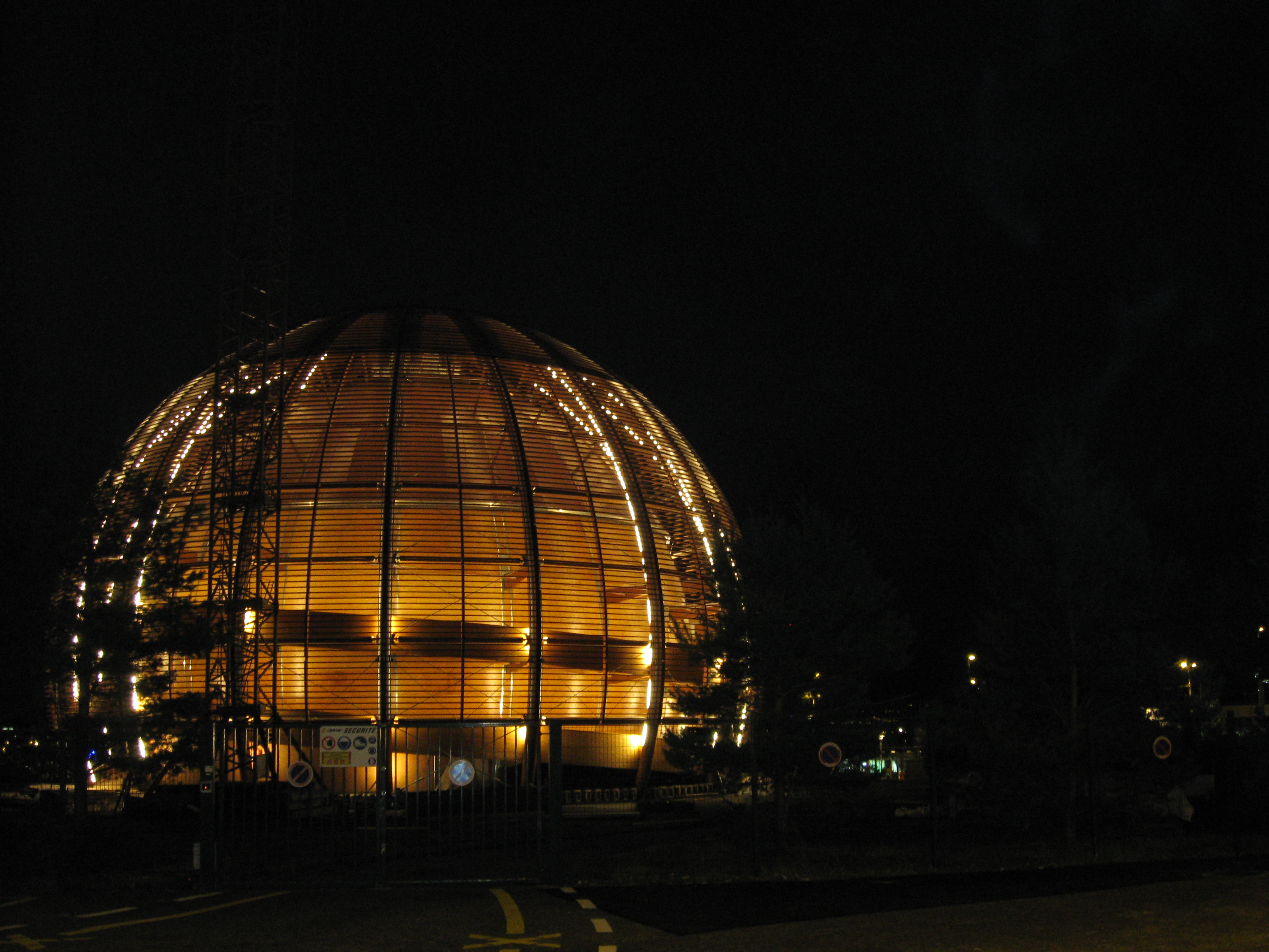
During the Sprint at CERN everyone got to take a tour of the Large Hadron Collider, it was a fantastic time and a proud moment for members of the KDE community to see the massive and incredible machines which happened to have KDE software running at the controls.

IMG_0574

There were many different systems on display, not just KDE!

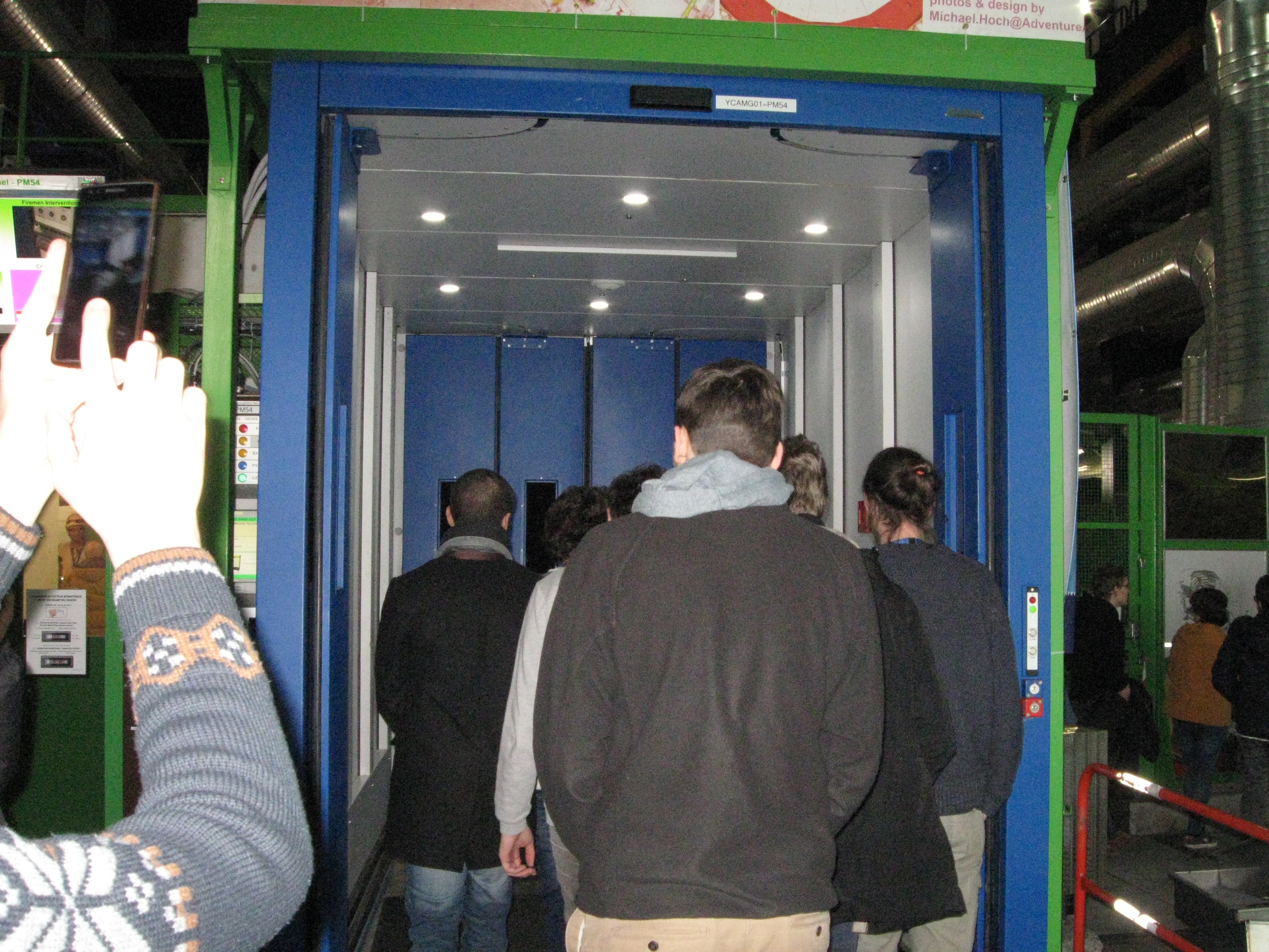
We had a rare opportunity to actually go 100 meters underground and look at the scope of it – grand and atomic – and look at one of the greatest achievements of society with our own eyes.

IMG_0578

There were many different systems on display, not just KDE!

Once we got our eyes on the massive structure a couple of the guys pulled out a bag and said “Hey, want to see something cool?”

Of course.

IMG_0604

There were many different systems on display, not just KDE!

Over at the injector (where they feed matter into the LHC) some of the other VDG members had snuck in a bag of paintballs. It was ON. Much like a pneumatic tubes of the late 1800s, the LHC consumed the ammo with gusto. I was sure our giggling would give us away, but we made sure people crowded around the controls before anyone knew what we were doing.

IMG_0579

There were many different systems on display, not just KDE!

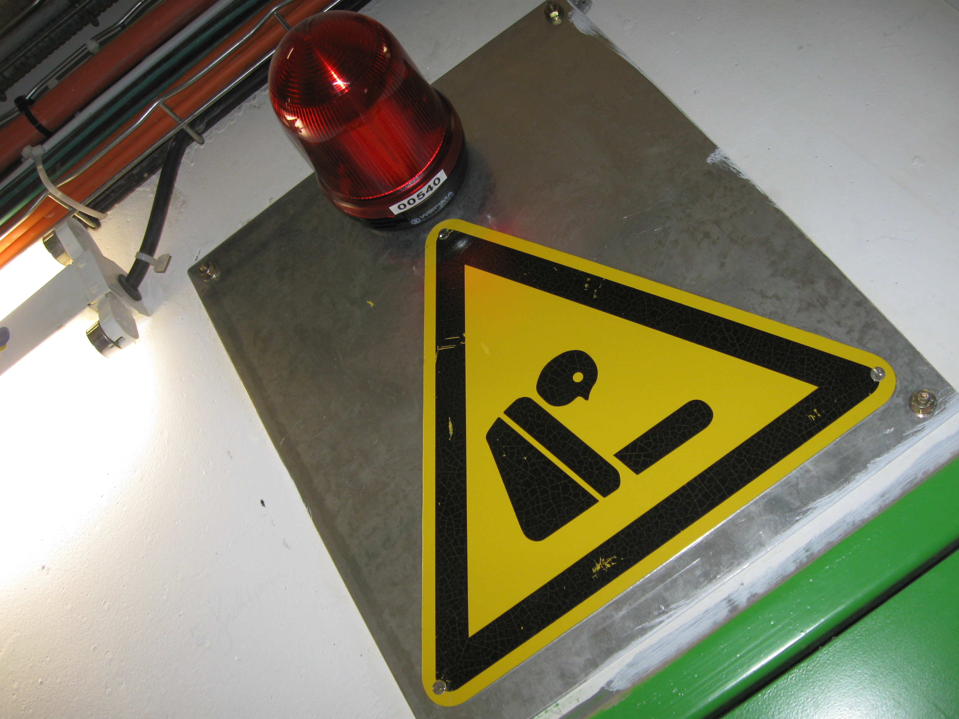
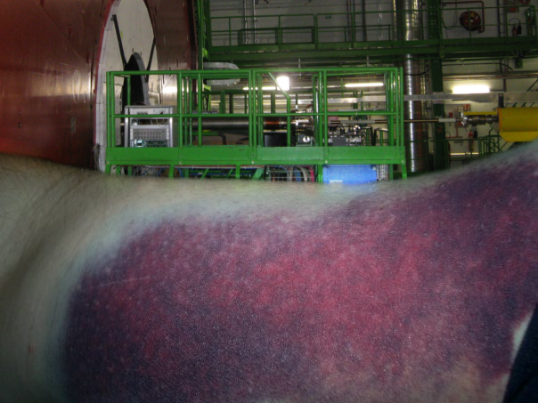
The way the LHC was laid out, there was various catwalks surrounding where the beam passes through. We found a pair of convenient walkways ripe for us to jump across which would let us get hit – we didn’t need to worry much about timing, after all, the gauges already indicated the first paintball was going 92.3% the speed of light.

bruise.png

The first hit! Left a small mark!

It was a good time. We had some bruises, other peoples heads and arms simply vanished at near relativistic speeds. We lost 3 members of the VDG, 5 WikiToLearn editors, and Sebas was the only Plasma developer to go, though watching him get sucked into a black hole made by a near-light-speed paintball was really, really cool.

As an aside, since he’s beyond the event horizon, I’ve taken over his blog. Any amazing accomplishments he makes from now on were actually all me, and I should get the credit.

IMG_0552

And that was our tour of the LHC. We’re confident in our productivity to take over for the now deceased community members, and we firmly believe the sacrifice was totally worth it. After the tour we got into our cars to drive back to the sprint proper – albeit with some more shoulder room in the vehicles – and we got back to work after turning the LHC into the worlds largest paintball cannon.

DWD Structured @ CERN

windeco

After a seeming eternity the unthinkable has finally happened; DWD has been discussed formally on an implementation level and it’s exciting to say that some parts are now under development. Thanks to the CERN Sprint we’ve had Martin Gräßlin, Sebastian Kügler, a couple others, and myself in one room able to make final decisions on how it will all come together.

Dare I say DWD is officially real, entering development, and coming? Yes!

Previously I’ve made two posts about DWD concepts, this post will summarize the basics of DWD as it has been finalized. Some parts of both designs previously posted have been used and I’ll make another post later including mockups with more detailed information, but for new here’s an overview of DWD basics;

Low-Level IPC

DWD will use D-Bus as its IPC, being implemented via the KWin Window Metadata Tier 1 Framework. This is for Qt/KDE driven implementations, but anyone can implement DWD via D-Bus.

Core Structure

At its core DWD will work with ‘Semantic Objects’ and ‘Priority Groups’. Semantic objects refer to things like ‘media player controls’, ‘navigation’, and ‘actions’. Applications bundle Semantic Objects into Priority Groups, then push those groups to the window manager.

The window manager will tell the app whether a group was accepted or rejected; a group is rejected if any single semantic object in that group is denied for any reason. Higher priority groups get first swing at embedding their controls, and it may affect widget placement in certain situations, such as phone controls.

From there applications just hide their own elements in response to what groups were accepted. There will be some events and flags as well, but we won’t get into that yet.

Customisation

One aspect to note is that DWD will offer no customisation on the client-side. I had gone down that rabbit-hole in an early draft and we all deemed it overcomplicated. Ultimately what applications need to know is that the controls are being served – not how or where they’ve been served.

One thing we did was look at is Gnome CSDs which offered all the craziness applications could possibly want, and we noticed they weren’t actually being all that crazy with it. Generally the same controls made repeat appearances and when it really comes down to it in practice there’s not much of a value in extreme customisation. As we said previously if you need extreme customisation and weirdness this may not be the method for you – which is fine. At the same time we would recommend application authors examine why they would need exotic controls, and why they specifically need them in the windeco.

Stewarding the Protocol

One thing that was discussed was who and how to steward the protocol. When I first posted about DWD there was backlash about KDE being a ‘protocol gatekeeper’. Afterwards I proposed an extension-based design which also had backlash because it could make the protocol technologically ‘complex and messy’.

Ultimately we decided to steward the protocol and simply work with anyone who wants to be included in the design process directly. We will accept input into where the protocol will go and provide any resources we can.

One thing that was made clear was that some groups are uninterested in considering the DWD approach after being asked. We all agreed it’s not worth making a convoluted extension system just to cater to groups which probably won’t participate, instead focusing on making the best protocol we can for those who want DWD. For those environments that will not support DWD I’m glad to say that it’s still 100% compatible and applications using it will continue to work as normal, they just won’t have content in the decoration. We will not be breaking other environments.

Again, we’ll be open and welcoming to anyone who wants to join us in working on and implementing DWD.

The Implementation Plan

Right now early work is being done on our existing frameworks to move them into position to implement DWDs. Once that is done we’ll implement the protocol with a minimal number of Semantic Objects, and using the low-level API port a small number of simple applications as a beta. Applications being considered for initial DWD tests include Konsole, Kate, KCalc, and similarly small apps with basic requirements.

After the API has proven itself on smaller-scale applications we would move up to heavier applications. KDevelop was mentioned specifically as a candidate as its relatively heavy UI could benefit from space-saving DWDs while developers could very quickly give us high-quality feedback. This may be where we move to higher-level classes which will hide away the group/object system as well.

Designs & Reference Material Incoming

I’ll be making another post later with designs which should be mostly accurate to what the final protocol will produce; accurate enough to place in the Wiki as design references for how applications should look when using the final DWDs.

While Martin will continue focusing down Wayland and making excellent progress, he also had a rough timeline for when we can expect basic DWDs make an appearance. I won’t quote him as it was an off-the-cuff estimate, but it’s exciting to know there’s light at the end of the tunnel, and that we’re out of the conceptual phase.

On a complete aside it was a complete pleasure meeting everyone. Great to see some of the friends I met last year again, fantastic to make many more new ones, and I wanted to thank everyone in the Sprint as well as those who supported it for making such a great event happen.

Special thanks to CERN for hosting this Sprint! Be awesome and support future Sprints by clicking the links below;
Via Paypal for one-time donations
Become an ongoing contributor and official supporting member